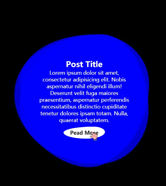
效果展示
代码展示
html代码
 <div class="square">
    <span></span>
    <span></span>
    <span></span>
    <div class="content">
      <h2>Post Title</h2>
      <p>Lorem ipsum dolor sit amet, consectetur adipisicing elit. Nobis aspernatur nihil eligendi illum! Deserunt velit
        fuga maiores praesentium, aspernatur perferendis necessitatibus distinctio cupiditate tenetur dolores ipsam
        totam. Nulla, quaerat voluptatem.
      </p>
      <a href="#">Pead More</a>
    </div>
  </div>
css代码
  * {
      margin: 0;
      padding: 0;
      box-sizing: border-box;
      font-family: "Open Sans", sans-serif;
    }

    body {
      display: flex;
      justify-content: center;
      align-items: center;
      min-height: 100vh;
      background: #000;
    }

    .square {
      position: relative;
      width: 400px;
      height: 400px;
      display: flex;
      justify-content: center;
      align-items: center;
    }

    .square span:nth-child(1) {
      position: absolute;
      top: 0;
      left: 0;
      width: 100%;
      height: 100%;
      border: 2px solid #fff;
      border-radius: 38% 62% 63% 37% / 41% 44% 56% 59%;
      transition: .5s;
      animation: animate 6s linear infinite;
    }

    .square:hover span:nth-child(1) {
      border: none;
      background: rgba(0, 0, 255, .8);
    }

    .square span:nth-child(2) {
      position: absolute;
      top: 0;
      left: 0;
      width: 100%;
      height: 100%;
      border: 2px solid #fff;
      border-radius: 38% 62% 63% 37% / 41% 44% 56% 59%;
      transition: .5s;
      animation: animate 4s linear infinite;
    }

    .square:hover span:nth-child(2) {
      border: none;
      background: rgba(0, 0, 255, .8);
    }

    .square span:nth-child(3) {
      position: absolute;
      top: 0;
      left: 0;
      width: 100%;
      height: 100%;
      border: 2px solid #fff;
      border-radius: 38% 62% 63% 37% / 41% 44% 56% 59%;
      transition: .5s;
      animation: animate2 10s linear infinite;
    }

    .square:hover span:nth-child(3) {
      border: none;
      background: rgba(0, 0, 255, .8);
    }

    @keyframes animate {
      0% {
        transform: rotate(0deg);
      }

      100% {
        transform: rotate(360deg);
      }
    }

    @keyframes animate2 {
      0% {
        transform: rotate(360deg);
      }

      100% {
        transform: rotate(0deg);
      }
    }

    .content {
      position: relative;
      padding: 40px 60px;
      color: #fff;
      text-align: center;
      transition: .5s;
      z-index: 1000;
    }

    .content a {
      position: relative;
      display: inline-block;
      margin-top: 10px;
      border: 2px solid #fff;
      padding: 6px 18px;
      text-decoration: none;
      color: #fff;
      font-weight: 600;
      border-radius: 73% 27% 44% 56% / 49% 44% 56% 51%;
      transition: .2s;
    }

    .content a:hover {
      background: #fff;
      color: #000;
    }


