

d3.js
d3.js是一个Javascript库,全称为Data-Driven Documents,重点是数据驱动 ,结合SVG做数据可视化,且相较echarts/charts等更为灵活,可定制。
Following Fullstack Data Visualization with D3 (Amelia Wattenberger)
绘折线图
工具:Vscode(插件live server)
准备工作
html
-
图表的外层div
-
d3.js引入(可官网下载、直接网址引入、按需引入)
-
js文件引入
<!--html可直接在Vscode中右击选择“Open with Live Server”在浏览器中打开-->

<div id="wrapper"></div>

<script src="https://d3js.org/d3.v5.min.js"></script>
<script src="./lineChart.js"></script>
lineChart.js
-
数据可视化必不可少的就是数据啦,书写逻辑前,准备好需要可视化的数据。
-
数据文件可以是.json、.csv、.xml等格式,d3有相应的方法去解析它们d3.json()、d3.csv()、d3.xml()等。
async function drawLineChart(){ //... const dataset = await d3.json("./../../weather_data.json") //... } drawLineChart() -
书中所用数据为json文件,整体为一个数组,里面每个对象元素格式如下:
{"time": 1514782800, "summary": "Clear throughout the day.", "icon": "clear-day", "sunriseTime": 1514809280, "sunsetTime": 1514842810, "moonPhase": 0.48, "precipIntensity": 0, "precipIntensityMax": 0, "precipProbability": 0, "temperatureHigh": 18.39, "temperatureHighTime": 1514836800, "temperatureLow": 12.23, "temperatureLowTime": 1514894400, "apparentTemperatureHigh": 17.29, "apparentTemperatureHighTime": 1514844000, "apparentTemperatureLow": 4.51, "apparentTemperatureLowTime": 1514887200, "dewPoint": -1.67, "humidity": 0.54, "pressure": 1028.26, "windSpeed": 4.16, "windGust": 13.98, "windGustTime": 1514829600, "windBearing": 309, "cloudCover": 0.02, "uvIndex": 2, "uvIndexTime": 1514822400, "visibility": 10, "temperatureMin": 6.17, "temperatureMinTime": 1514808000, "temperatureMax": 18.39, "temperatureMaxTime": 1514836800, "apparentTemperatureMin": -2.19, "apparentTemperatureMinTime": 1514808000, "apparentTemperatureMax": 17.29, "apparentTemperatureMaxTime": 1514844000, "date": "2018-01-01"}
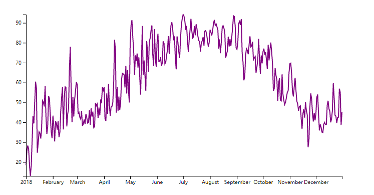
画图(每天最高温度的折线图)
y轴--左侧--温度值
x轴--底部--时间
-
从数据文件中取所需值
const yAccessor = d => d.temperatureMax
// const xAccessor = d => d.date 由于d.date值为字符串,如"2018-01-01",需要转换成日期格式
const dateParser = d3.timeParse("%Y-%m-%d")
const xAccessor = d => dateParser(d.date)
d3.timeParse() 类似
new Date()%Y- year with century as a decimal number, such as1999%m- month as a decimal number[01,12]%d- zero-padded day of the month as a decimal number[01,31]
-
画图
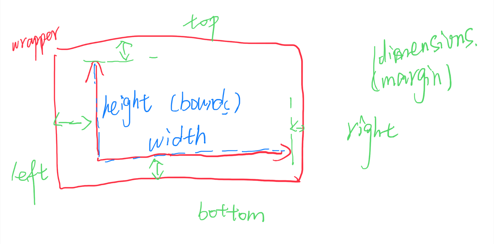
两层:
- wrapper中(svg视口)包含坐标轴、标签、数据等所需展示的所有内容
- bounds中(g)是可视化的数据
- 仿照css定义值,用作宽/高/边距
let dimensions = {
    width: window.innerWidth * 0.9, //wrapper
    height: 500,
    margin:{                       //bounds
        top: 100,
        right: 50,
        bottom: 100,
        left: 100
    }
};
dimensions.boundedWidth = dimensions.width - dimensions.margin.left - dimensions.margin.right;
dimensions.boundedHeight = dimensions.height - dimensions.margin.top - dimensions.margin.bottom;
-
创建画图区(svg视口)
-
在wrapper下添加子元素svg
d3.select()选择元素,()里是css选择器(#id、.class、...)。- 使用
d3.select("#wrapper")选中最外层div,添加子元素.append("svg")。 - svg默认是300px * 150px ,因此需要按需设置svg元素的属性width/height,d3中可链式简洁表示如下:
const wrapper = d3.select("#wrapper") .append("svg") .attr("width",dimensions.width) .attr("height",dimensions.height) -
在svg下添加g元素,包裹数据视图,并使元素在合适的位置(可使用transform属性)
const bounds = wrapper.append("g") .style("transform",`translate(${dimensions.margin.left}px,${dimensions.margin.top}px)`) -
创建比例尺映射(原数据——>坐标轴)(domain->range)
- 由于数据可能在大小上差异过大,直接反映在坐标轴上可能会可视化效果较差,因此对数据进行一个比例映射,映射到坐标轴相应像素(px)位置:
对于 continuous(连续的) 定量数据,通常会使用 linear scale(线性比例尺)。 对于时间序列则使用 time scale(时间比例尺).
连续比例尺可以将连续的、定量的输入 domain [min,max] 映射到连续的输出 range [min,max]。
svg以页面的左上角为(0,0)坐标点,坐标以像素为单位,x轴正方向是向右,y轴正方向是向下。
const yScale = d3.scaleLinear() .domain(d3.extent(dataset, yAccessor)).range([dimensions.boundedHeight,0]) //yAccessor取dataset中所需的所有温度值 d3.extent()返回数组中的最小值和最大值 由于svg-y坐标轴正方向向下,所以映射出range是从大到小的范围 const xScale = d3.scaleTime().domain(dataset,xAccessor).range([0,dimensions.boundedWidth]) -
画折线
SVG中所有基本形状都是path的简写形式,但是建议使用简写形式,使SVG文档更可为语义化。path元素更通用,可以通过制定一系列相互连接的线、弧、曲线来绘制任意形状的轮廓,这些轮廓也可以填充或者绘制轮廓线,也可以用来定义裁剪区域或蒙版。
path元素有d属性,决定绘制的形状。d含有一些命令,大写表示绝对坐标位置,小写表示相对坐标位置。M移动到指定点;L画线到给定坐标;Z连线到起始点;......例如:
bounds.append("path").attr("d","M 100 100 L 100 200 L 150 150 L 150 50 Z")绘图如下(SVG默认填充黑色):

- 数据点字符串生成(数据点——>映射坐标数据——>string)
xAccessor/yAccessor取数据并转换为所需格式;xScale/yScale(比例尺)将数据映射到坐标轴;
d3.line()可将数据点转换为d字符串``` const lineGenerator = d3.line() .x(d => xScale(xAccessor(d))) .y(d => yScale(yAccessor(d))) const line = bounds.append("path") .attr("d",lineGenerator(dataset)) .attr("fill", "none") //svg默认填充黑色,所需为连线不需填充 .attr("stroke","purple") //线色 .attr("stroke-width", 2) //不设线宽,会无显示 ``` -
画坐标轴
d3中有d3-axis模块,可根据给定的比例尺生成坐标轴。四个方向都可以生成:
axisTop axisRight axisBottom axisLeft。根据需要,需要生成左y、下x轴,则:const yAxisGenerator = d3.axisLeft().scale(yScale); const xAxisGenerator = d3.axisBottom().scale(xScale);需要注意的是:生成坐标轴时,会同时创建很多元素,需要使用
g元素包裹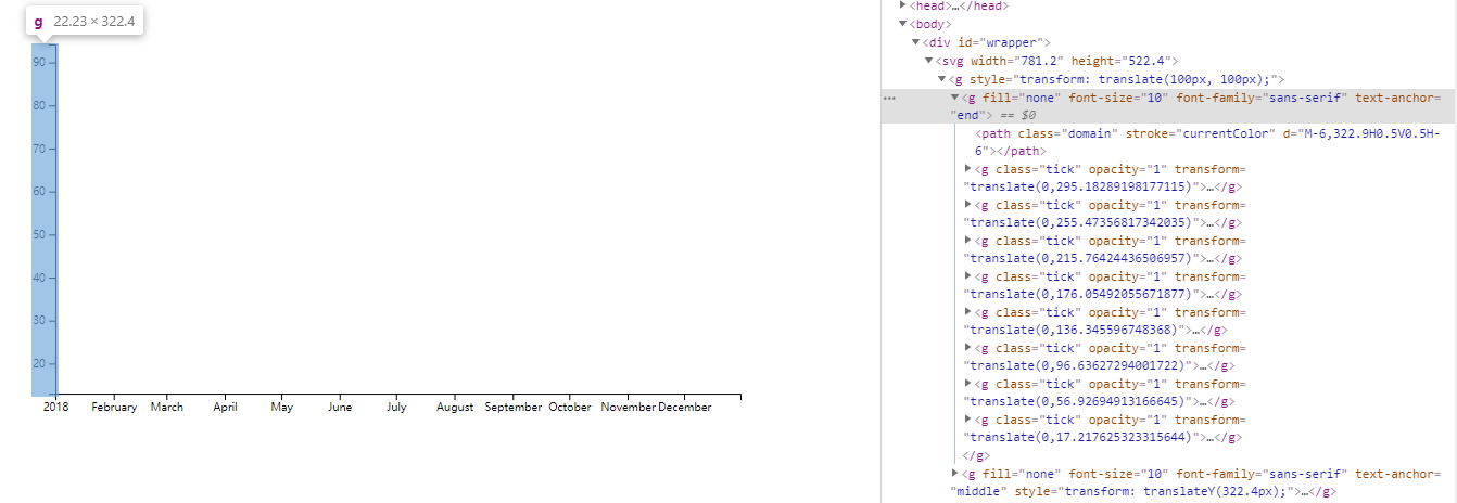
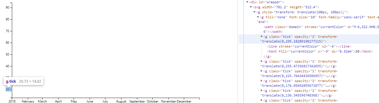
//const yAxis = bounds.append("g");
//yAxisGenerator(yAxis); //在g元素内画y轴
const yAxis = bounds.append("g").call(yAxisGenerator); //调用call(),写成链式; xxx.call(xx)以xxx作为第一个参数执行xx函数
const xAxis = bounds.append("g").call(xAxisGenerator)
            .style("transform",`translateY(${dimensions.boundedHeight}px)`);    //生成x轴时,默认在最上方,需要挪到所需底部位置
-
