void main() => runApp(MyApp());
// 无状态组件
class MyApp extends StatelessWidget {
// This widget is the root of your application.
@override
Widget build(BuildContext context) {
return MaterialApp(
title: 'Flutter Demo',
theme: ThemeData(
primarySwatch: Colors.blue,
),
home: MyHomePage(title: 'Flutter Demo Home Page'),
);
}
}
// 有状态组件
class MyHomePage extends StatefulWidget {
MyHomePage({Key key, this.title}) : super(key: key);
final String title;
@override
_MyHomePageState createState() => _MyHomePageState();
}
// 标签
class _MyHomePageState extends State<MyHomePage> with SingleTickerProviderStateMixin{
final List<Tab> myTabs = <Tab>[
Tab(text: '页签1'),
Tab(text: '页签2'),
];
TabController _tabController;
@override
void initState() {
super.initState();
_tabController = TabController(vsync:this,length: myTabs.length);
}
@override
void dispose() {
_tabController.dispose();
super.dispose();
}
@override
Widget build(BuildContext context) {
return Scaffold(
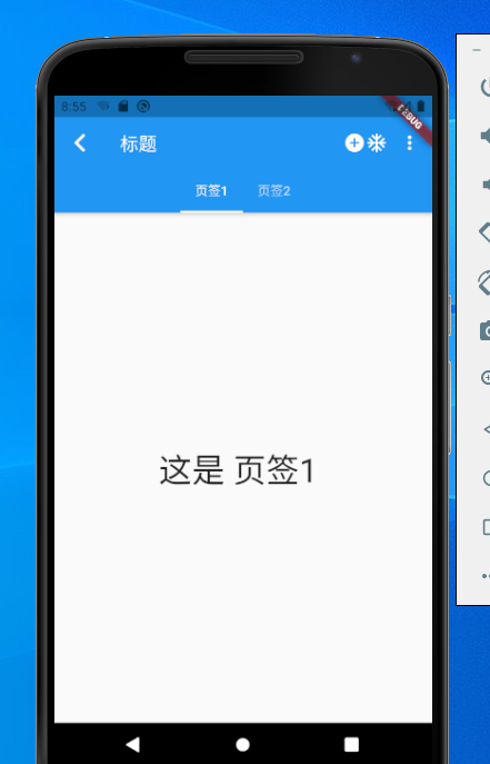
appBar: AppBar(
leading: new Icon(Icons.arrow_back_ios),//显示在左上角的view
automaticallyImplyLeading: true,//
title: Text("标题",style: TextStyle(color: Colors.white),),//显示在title位置的view
flexibleSpace: FlexibleSpaceBar(),//做折叠效果使用
elevation: 4,//控制阴影大小 ,没有默认ThemeData.appBarTheme.elevation属性,属性也没有默认4
shape: RoundedRectangleBorder(),//设置各种形状的边框 BeveledRectangleBorder,BoxBorder,CircleBorder,ContinuousRectangleBorder,InputBorder,RoundedRectangleBorder,StadiumBorder
backgroundColor: Colors.blue,//背景色
brightness: Brightness.light,//设置状态栏模式。有深色和浅色两种主题,
iconTheme: IconThemeData(color: Colors.white),//定义图标的颜色,不透明度和大小。
textTheme: Theme.of(context).textTheme,//设置文字样式
primary: true,//如果为false,会沉浸在状态栏下
centerTitle: false,//标题是否居中显示
titleSpacing: NavigationToolbar.kMiddleSpacing,//标题左右间距,默认NavigationToolbar.kMiddleSpacing,设置为0 占用所有可用空间
toolbarOpacity: 1.0,//工具栏透明度,值为1.0完全不透明,值为0.0完全透明。
bottomOpacity: 1.0,//bottom透明度,值为1.0完全不透明,值为0.0完全透明。
bottom: TabBar(//设置底部view,需要CupertinoTabBar,ObstructingPreferredSizeWidget,PreferredSize,TabBar包裹
controller: _tabController,
isScrollable: true,
tabs: myTabs,
),
actions: <Widget>[//功能按钮,PopupMenuButton添加扩展按钮
new Icon(Icons.add_circle),
new Icon(Icons.ac_unit),
PopupMenuButton(
itemBuilder: (BuildContext context) =>
<PopupMenuItem<String>>[
PopupMenuItem<String>(child: Text("扩展按钮1"), value: "1",),
PopupMenuItem<String>(child: Text("扩展按钮2"), value: "2",),
],
onSelected: (String action) {
switch (action) {
case "1":
print("扩展按钮1");
break;
case "2":
print("扩展按钮2");
break;
}
},
onCanceled: () {
print("onCanceled");
},
)
],
),
body: TabBarView(
controller: _tabController,
children: myTabs.map((Tab tab) {
final String label = tab.text.toLowerCase();
return Center(
child: Text(
'这是 $label ',
style: const TextStyle(fontSize: 36),
),
);
}).toList(),
),
);
}
}


