

之前的大数据项目又又又又改版啦,BTW,UI和生产童鞋又要给我们的工作增加难度啦。。。好吧,看下这次改版的一些目标样式吧~~
水滴柱状图:
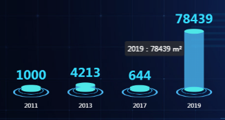
关键词:柱状图、水柱型
难点:光柱位置调整、颜色及阴影配置
// 水柱图
function getSolidBarOption(datalist, label) {
  var series = [];
  datalist = datalist.reverse()
  label = label.reverse()

  series.push(
    {
      "name": "",
      type: 'pictorialBar',
      symbolSize: [40, 10],
      symbolOffset: [0, -6],
      symbolPosition: 'end',
      z: 12,
      "label": {
        "normal": {
          "show": true,
          "position": "top",
          fontSize: 25,
          fontWeight: 'bold',
          color: '#34DCFF'
        }
      },
      color: "#4EE7E7",
      data: datalist
    }, {
      name: '',
      type: 'pictorialBar',
      symbolSize: [40, 10],
      symbolOffset: [0, 7],
      // "barWidth": "20",
      z: 12,
      "color": "#4EE7E7",
      "data": datalist
    }, {
      name: '',
      type: 'pictorialBar',
      symbolSize: [50, 15],
      symbolOffset: [0, 12],
      z: 10,
      itemStyle: {
        normal: {
          color: 'transparent',
          borderColor: '#2EA9E5',
          borderType: 'solid',
          borderWidth: 1
        }
      },
      data: datalist
    }, {
      name: '',
      type: 'pictorialBar',
      symbolSize: [70, 20],
      symbolOffset: [0, 18],
      z: 10,
      itemStyle: {
        normal: {
          color: 'transparent',
          borderColor: '#4AB6F1',
          borderType: 'solid',
          borderWidth: 2
        }
      },
      data: datalist
    },
    //中心部分
    {
      type: 'bar',
      //silent: true,
      "barWidth": "40",
      barGap: '10%', // Make series be overlap
      barCateGoryGap: '10%',
      itemStyle: {
        normal: {
          color: new echarts.graphic.LinearGradient(0, 0, 0, 0.7, [{
              offset: 0,
              color: "#4AB6F1"
            },
            {
              offset: 1,
              color: "#4AB6F1"
            }
          ]),
          opacity: .8
        },
      },
      data: datalist
    }
  )

  var option = {
    backgroundColor: 'transparent',
    tooltip: {
      show: true,
      formatter: '{b0}:{c0} m²'
    },
    animation: true,
    "xAxis": [{
      "type": "category",
      "data": label,
      "axisTick": {
        "alignWithLabel": true
      },
      "nameTextStyle": {
        "color": "#82b0ec"
      },
      "axisLine": {
        show: false,
        "lineStyle": {
          "color": "#82b0ec"
        }
      },
      "axisLabel": {
        "textStyle": {
          "color": "#fff"
        },
        margin: 30
      }
    }],
    "yAxis": [{
      show: false,
      "type": "value",
      "axisLabel": {
        "textStyle": {
          "color": "#fff"
        },
      },
      "splitLine": {
        "lineStyle": {
          "color": "#0c2c5a"
        }
      },
      "axisLine": {
        "show": false
      }
    }],
    grid: {top: '25%', left: '-2%', right: '2%', bottom: '2%', containLabel: true},
    series: series
  };
  return option;
}
堆叠柱状图:
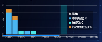
关键词:柱状图
难点:无(好吧,我是来水字数的 ╮(╯_╰)╭)
// 堆叠柱状图
function getStackBarOption(datalist=[{name: 1,value:[100,150]},{name: 2,value:[100,150]}], label=['11', '22'], slider = false) {
  var series = []
  var colors = colorGroup;
  for (var i = 0; i < datalist.length; i++) {
    var item = datalist[i]
    series.push({
      type: 'bar', barWidth: 25, name: item.name, stack: '区域',
      itemStyle: {
        // normal: { color: new echarts.graphic.LinearGradient(0, 0, 0, 1, [{offset: 0, color: '#0093FF'}, { offset: 1, color: '#00FFFF'}])}
        normal: { color: colors[i]}
      },
      data: item.value
    })
  }
  var option = {
    tooltip: {
      trigger: 'axis',
      backgroundColor: 'rgba(0,0,0,0.3)',
      axisPointer: {
        type: 'shadow',
        shadowStyle: { color: { type: 'linear', x: 0, y: 0, x2: 0, y2: 1, colorStops: [{offset: 0, color: 'rgba(0,255,255,0.2)'}, {offset: 1, color: 'rgba(0,247,255,0.2)'}], globalCoord: false}}
      }
    },
    grid: {top: '20%', left: '10%', right: '2%', bottom: '10%'},
    xAxis: [{
      type: 'category',
      data: label,
      axisTick: {show: false},
      axisLabel: {show: true, textStyle: {fontSize: 12, color: 'rgba(255,255,255,0.6)'}},
      axisLine: {show: true, lineStyle: {color: 'rgba(202,202,202,0.3)'}},
    }],
    yAxis: [{
      type: 'value',
      nameGap: 12,
      nameTextStyle: {color: 'rgba(255,255,255,0.6)', fontSize: 14, padding: [0, 40, 0, 0]},
      axisTick: {show: false},
      axisLabel: {show: true, textStyle: {fontSize: 14, color: 'rgba(255,255,255,0.6)'}
      },
      axisLine: {show: false},
      splitNumber: 4,
      splitLine: {lineStyle: {color: 'rgba(202,202,202,0.3)'}},
    }],
    series: series
  };
  if (slider === true) {
    option.dataZoom = [
      {
        show: true, type: 'slider', xAxisIndex: [0], handleSize:10, height: 8, left: 30, right: 10, bottom: 10,
        fillerColor: '#1890FF',  realtime: true, showDataShadow: false, showDetail: false, filterMode: 'filter',
        start: 1, end: 60
      },
      { type: 'inside',  realtime: true, show: true, xAxisIndex: [0], start: 1, end: 10 }]
  }
  return option;
}