

1.半透明边框
CSS:
height: 100px;
width: 100px;
border: 10px solid hsla(0, 0%, 100%, .5);
background: white;
padding: 10px;
background-clip: padding-box; // 默认值content-box,背景图裁剪区域
效果:
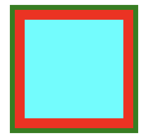
2. 多重边框
box-shadow 方案
需要注意:
- 投影的行为跟边框不完全一致,不受 box-sizing 属性影响。
- 创建的边框出现在元素外圈,是‘假’边框。
- 只能实现实线边框。
CSS:
margin: 20px;
height: 100px;
width: 100px;
background-color: aqua;
box-shadow: 0 0 0 10px red,
            0 0 0 15px green; // 可通过逗号无限添加边框
outline 方案
注意:
- 某些只需生成两层边框,常规边框加上outline。
- 样式灵活,可以生成实线和虚线边框。
CSS:
height: 100px;
width: 100px;
background-color: aqua;
border: 10px solid red;
outline: 5px solid green;
效果:
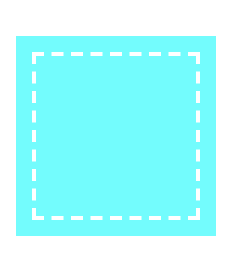
扩展: outline 实现简单缝边效果
CSS:
height: 100px;
width: 100px;
background-color: aqua;
outline: 2px dashed #fff;
outline-offset: -10px; // 对轮廓进行偏移,并在边框边缘进行绘制。
效果:
3. 背景定位
background-position 方案
CSS:
height: 100px;
width: 150px;
background: url('./image/log.png') no-repeat right bottom #58a;
background-position: right 20px bottom 10px;
background-origin 方案
注意:
- background-position 是根据padding box 为准进行定位。
- background-origin 可以改变 background-position 以谁定位的盒模型。
CSS:
height: 100px;
width: 150px;
background: url('./image/log.png') no-repeat right bottom #58a;
background-origin: content-box; // 改变 background-position 定位盒模型
padding: 10px;
padding-right: 20px
calc() 方案
CSS:
height: 100px;
width: 150px;
background: url('./image/log.png') no-repeat right bottom #58a;
background-position: calc(100% - 20px) calc(100% - 10px);
效果:
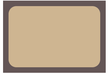
4.边框内圆角
CSS:
height: 100px;
width: 150px;
background-color: tan;
border-radius: .8rem;
padding: 1em;
outline: .6em solid #655;
box-shadow: 0 0 0 .5em #655;
效果:
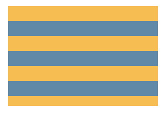
5. 条纹背景
水平条纹
CSS:
height: 100px;
width: 150px;
background: linear-gradient(#fb3 50%, #58a 50%);
background-size: 100% 30px;
效果:
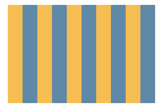
CSS;
height: 100px;
width: 150px;
background: linear-gradient(to right, #fb3 50%, #58a 50%);
background-size: 30px 100%;
效果:
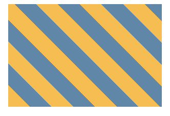
CSS:
height: 100px;
width: 150px;
background: repeating-linear-gradient(45deg, #fb3 0 15px, #58a 15px 30px);
效果:
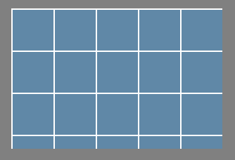
6. 复杂背景图案
网格
CSS:
height: 100px;
width: 150px;
background: #58a;
background-image: linear-gradient(white 1px, transparent 0),
                linear-gradient(90deg, white 1px, transparent 0);
background-size: 30px 30px;
效果:
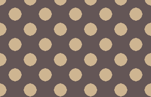
CSS:
height: 100px;
width: 150px;
background-image: radial-gradient(tan 30%, transparent 0),
                radial-gradient(tan 30%, transparent 0);
background-size: 30px 30px;
background-position: 0 0, 15px 15px;
效果:
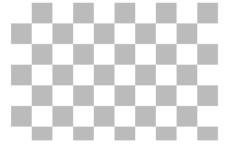
棋盘
CSS:
height: 100px;
width: 150px;
background-image: linear-gradient(45deg,
  #bbb 25%, transparent 0,
  transparent 75%, #bbb 0),
                linear-gradient(45deg,
  #bbb 25%, transparent 0,
  transparent 75%, #bbb 0);
background-position: 0 0, 15px 15px;
background-size: 30px 30px;
效果:
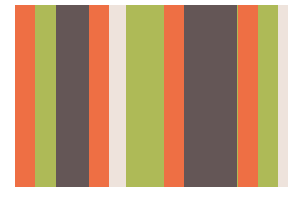
7.伪随机背景
CSS:
height: 100px;
  width: 150px;
  background: hsla(20, 40%, 90%);
  background-image: linear-gradient(90deg, #f63 11px, transparent 0),
  linear-gradient(90deg, #ab4 23px, transparent 0),
  linear-gradient(90deg, #655 41px, transparent 0);
  background-size: 41px 100%, 61px 100%, 83px 100%; // 宽度选择的数字都是互质
效果:
8.连续的图像边框
CSS:
height: 100px;
width: 150px;
padding: 10px;
box-sizing: border-box;
border: 10px solid transparent;
background:
  linear-gradient(transparent, transparent) padding-box,
  url('./image/1.jpg') border-box 0 0 /cover;

/* background 是下面的简写形式 */
background:
  linear-gradient(transparent, transparent),
  url('./image/1.jpg');
background-clip: padding-box, border-box;
background-size: cover;
background-origin: border-box; // 修正图片平铺到border box区域
效果:
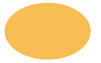
9.自适应椭圆
CSS:
background: #fb3;
width: 200px;
height: 150px;
border-radius: 50% / 50%;
效果:
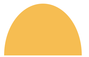
四分之一椭圆:
CSS:
background: #fb3;
width: 150px;
height: 100px;
border-radius: 50% / 100% 100% 0 0;
效果:
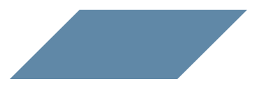
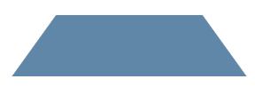
10.平行四边形
CSS:
.button {
  position: relative;
  width: 250px;
  height: 100px;
}
.button::before{
  content: '';
  position: absolute;
  background: #58a;
  top: 0;
  right: 0;
  left: 0;
  bottom: 0;
  transform: skew(-45deg);
}
效果:
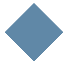
11.菱形图片
CSS:
height: 150px;
width: 150px;
background: #58a;
clip-path: polygon(50% 0, 100% 50%, 50% 100%, 0 50%);
效果:
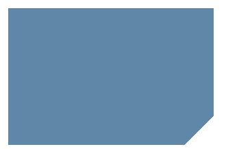
12.切角效果
CSS:
height: 100px;
width: 150px;
background: #58a; // 提供回退机制
background: linear-gradient(-45deg, transparent 15px, #58a 0);
效果:
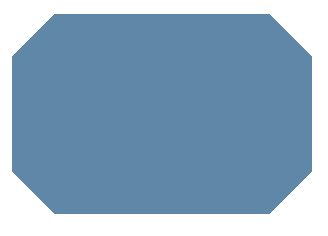
background: #58a;
height: 100px;
width: 150px;
background:
  linear-gradient(45deg, transparent 15px, #58a 0) bottom left,
  linear-gradient(-45deg, transparent 15px, #58a 0) bottom right,
  linear-gradient(135deg, transparent 15px, #58a 0) top left,
  linear-gradient(-135deg, transparent 15px, #58a 0) top right;
background-size: 50% 50%;
background-repeat: no-repeat;
效果:
background: #58a;
height: 100px;
width: 150px;
background:
  radial-gradient(circle at bottom left, transparent 15px, #58a 0) bottom left,
  radial-gradient(circle at bottom right, transparent 15px, #58a 0) bottom right,
  radial-gradient(circle at top left, transparent 15px, #58a 0) top left,
  radial-gradient(circle at top right, transparent 15px, #58a 0) top right;
background-size: 50% 50%;
background-repeat: no-repeat;
效果:

13.梯形标签页
CSS:
.nav {
  position: relative;
  height: 50px;
  width: 100px;
  margin: 40px;
  padding: .3em 1em 0;
}
.nav::before {
  content: '';
  position: absolute;
  top: 0;
  left: 0;
  background: #58a;
  right: 0;
  bottom: 0;
  z-index: -1;
  transform: perspective(.5em) rotateX(5deg);
  transform-origin: bottom;
}
效果:
