

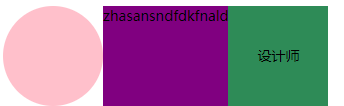
百度面试碰到的题,要实现如下布局效果
-
flex: 0 1 auto (自适应)
-
text-overflow:ellipsis;(自动省略文字)
overflow:hidden;
white-space: nowrap;
完整的代码如下
// CSS 部分
.container {
  display: flex;
}
.pic {
  width: 100px;
  height: 100px;
  border-radius: 50%;
  background-color: pink;
}
.name {
  flex:0 1 auto;
  height: 100px;
  background-color: purple;
  text-overflow:ellipsis;
  overflow:hidden;
  white-space: nowrap;
}
.tag {
  width: 100px;
  height: 100px;
  text-align: center;
  line-height: 100px;
  background-color: seagreen;
}
// HTML 部分
<div class="container">
    <div class="pic"></div>
    <div class="name">
        zhasansndfdkfnald
    </div>
    <div class="tag">设计师</div>
</div>
