

先上图
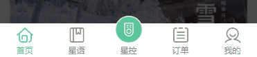
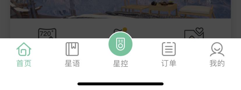
自定义tabBar组件介绍
- 标签方面用了
cover-view和couver-image,因为考虑到了navBar必须在最上层,且页面内存在canvasmap等最上级控件。(如果没有用这些控件可以直接使用普通div写) cover-view超出盒子大小必然会被隐藏,且内部只能存在cover-viewcover-imagebutton的特性,中间的凸出图标难以实现。- 我们的解决方法是,封装的
tabBar组件内,我们给了两个盒子,一个写普通的tabBar,另外一个只给了中间凸出的图标,高度设置对应,好让他们完全重叠;flex布局能让我们很好的实现它。 - 组件在每个
tabBar页面引入,给个参数标识active,好更改对应的字体颜色和icon。 - 最后我要实现像原始tabBar一样的自动留出底部安全距离,这需要用到以下代码,我也搞的不是很懂,怎么去监听底部边距的,但是它能很好的解决我的问题。
.tabBarAuto{
	padding-bottom: 0;
	padding-bottom: constant(safe-area-inset-bottom);
	padding-bottom: env(safe-area-inset-bottom);
}
组件全部代码
<template>
	<div>
		<cover-view class="TabBar tabBarAuto">
			<cover-view class="tab" v-for="(item,index) in list" :key="index" @click="navigatorTo(item.pagePath)">
				<!-- 普通navbar -->
				<cover-image class="plain" v-if="index !== 2" :src="current === index ? item.selectedIconPath : item.iconPath"></cover-image>
				<!-- 展示中间项 -->
				<cover-image class="special" v-else src="/static/tabbar/f.png"></cover-image>
				<cover-view :class="['text',{'active':current === index}]">{{item.text}}</cover-view>
			</cover-view>
		</cover-view>
		<cover-view  class="centerIcon tabBarAuto">
			<cover-image class="centerIcon-img" src="/static/tabbar/f.png" @click="navigatorTo('/pages/tabBar/xingkong/xingkong')"></cover-image>
		</cover-view>
	</div>
</template>

<script>
	export default {
		props: {
			//激活的tabbar,默认第一个页面tabbar激活
			current: {
				type: Number,
				default: 0
			}
		},
		data() {
			return {
				list: [{
						"pagePath": "/pages/tabBar/index/index",
						"iconPath": "/static/tabbar/ft1.png",
						"selectedIconPath": "/static/tabbar/ft1_in.png",
						"text": "首页"
					},
					{
						"pagePath": "/pages/tabBar/starLang/starLang",
						"iconPath": "/static/tabbar/ft2.png",
						"selectedIconPath": "/static/tabbar/ft2_in.png",
						"text": "星语"
					},
					{
						"pagePath": "/pages/tabBar/xingkong/xingkong",
						"iconPath": "/static/tabbar/f.png",
						"selectedIconPath": "/static/tabbar/f.png",
						"text": "星控"
					},
					{
						"pagePath": "/pages/tabBar/order/order",
						"iconPath": "/static/tabbar/ft3.png",
						"selectedIconPath": "/static/tabbar/ft3_in.png",
						"text": "订单"
					},
					{
						"pagePath": "/pages/tabBar/my/my",
						"iconPath": "/static/tabbar/ft4.png",
						"selectedIconPath": "/static/tabbar/ft4_in.png",
						"text": "我的"
					},
				]
			}
        },
		methods: {
			navigatorTo(params) {
				uni.switchTab({
					url: params,
				})
			}
		}
	}
</script>

<style lang="scss" scoped>
	//底部安全距离
	.tabBarAuto{
		padding-bottom: 0;
		padding-bottom: constant(safe-area-inset-bottom);
		padding-bottom: env(safe-area-inset-bottom);
	}
	.TabBar {
		position: fixed;
		bottom: 0;
		left: 0;
		height: 100upx;
		width: 750upx;
		background-color: #fff;
		z-index: 999;
		display:flex;
		align-ites:center;
		justify-content:sapce-between;
	}
	.tab {
		width: 150upx;
		height: 100upx;
		text-align: center;
		position: relative;
		display:flex;
		flex-flow:column nowrap;
		align-ites:center;
		justify-content:center;
		.plain{
			margin-top:8upx;
			width: 48upx;
			height: 48upx;
		}
		.special {
			width: 80upx;
			height: 80upx;
		}
		.text {
			text-align: center;
			line-height:1.7;
			font-size: 24upx;
			color: #8a8a8a;
			&.active {
				color: #5cc69a;
			}
		}
		&:nth-child(3) {
			margin-top: -25upx;
			height:120upx;
		}
	}
	.centerIcon {
		position: fixed;
		width: 100%;
		height: 123upx;
		bottom: 0;
		left:0;
		display:flex;
		align-items:flex-start;
		justify-content:center;
		z-index:998;
	}
	.centerIcon-img {
		width: 80upx;
		height: 80upx;
	}
</style>
然后在使用的时候把对应页面激活的下标传进去就可以了
<tabbar :current="1"></tabbar>
问题
自定义tabBar会存在首次打开tabBar页面会加载当前页面组件的问题,所以会出现闪屏,并没有很好的完美模仿官方的
tabber。
