Echarts 折线图 简单案例
1.下载Echarts
通过 npm 获取 echarts,npm install echarts --save
2.引入Echarts
在vue中找到 main.js:
Vue.prototype.$echarts = echarts
import echarts from 'echarts'
3.设置一个容器
<div id="myChart" style="width: 800px;height:600px;"></div>
4.初始化
let myChart = this.$echarts.init(document.getElementById("myChart"));
5.引入Echarts 官网提供的图标信息
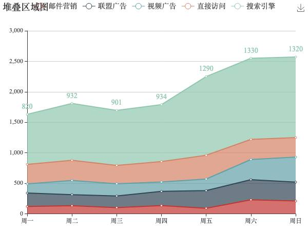
option = {

    title: {
      text: "堆叠区域图"
    },
    tooltip: {
      trigger: "axis",
      axisPointer: {
        type: "cross",
        label: {
          backgroundColor: "#6a7985"
        }
      }
    },
    legend: {
      data: ["邮件营销", "联盟广告", "视频广告", "直接访问", "搜索引擎"]
    },
    toolbox: {
      feature: {
        saveAsImage: {}
      }
    },
    grid: {
      left: "3%",
      right: "4%",
      bottom: "3%",
      containLabel: true
    },
    xAxis: [
      {
        type: "category",
        boundaryGap: false,
        data: ["周一", "周二", "周三", "周四", "周五", "周六", "周日"]
      }
    ],
    yAxis: [
      {
        type: "value"
      }
    ],
    series: [
      {
        name: "邮件营销",
        type: "line",
        stack: "总量",
        areaStyle: {},
        data: [120, 132, 101, 134, 90, 230, 210]
      },
      {
        name: "联盟广告",
        type: "line",
        stack: "总量",
        areaStyle: {},
        data: [220, 182, 191, 234, 290, 330, 310]
      },
      {
        name: "视频广告",
        type: "line",
        stack: "总量",
        areaStyle: {},
        data: [150, 232, 201, 154, 190, 330, 410]
      },
      {
        name: "直接访问",
        type: "line",
        stack: "总量",
        areaStyle: {},
        data: [320, 332, 301, 334, 390, 330, 320]
      },
      {
        name: "搜索引擎",
        type: "line",
        stack: "总量",
        label: {
          normal: {
            show: true,
            position: "top"
          }
        },
        areaStyle: {},
        data: [820, 932, 901, 934, 1290, 1330, 1320]
      }
    ]
}
// 使用刚指定的配置项和数据显示图表。
  myChart.setOption(option);
6.显示折线图
7.简单介绍相关属性
title:标题组件信息
tooltip: 提示框组件
xAxis :直角坐标系 grid 中的 x 轴
xAxis:直角坐标系 grid 中的 y轴
series:系列列表。每个系列通过 type 决定自己的图表类型
    type:'line' 折线图/面积图
    type:"bar" 柱状/条形图
    type:"pie" 饼状图
    type:"scatter" 散点(气泡)图
    ...
8.其他相关属性介绍
请 前往Echarts 官网查看 https://echarts.apache.org/
官方文档中:配置项 API 查询


