

flex
Flex是Flexible Box的缩写,意为弹性布局,可以为盒模型提供最大的灵活性。
任何一个容器都可以是flex布局。
.box{
    display:flex;
}
注意:使用flex布局后,子元素的float,clear,vertical-align属性将失效。
基本概念
设置了flex布局的元素,称为flex-container容器,它的所有子元素称作容器成员,flex-item。
容器有两根轴:水平主轴main-axis和垂直的交叉轴cross-axis。
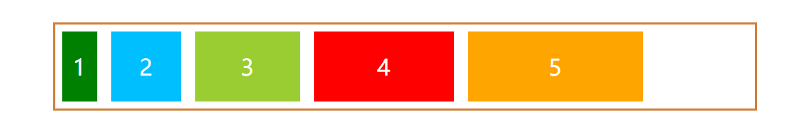
我们来简单的写一个flex布局容器,box容器只设置宽度,不设置高度。子元素高宽100px显示。
<!DOCTYPE html>
<html lang="en">
<head>
  <meta charset="UTF-8">
  <title>flex布局</title>
  <script src="https://cdn.jsdelivr.net/npm/vue/dist/vue.js"></script>
  <script src='js/jquery.min.js'></script>
  <style>
    .box{
      margin:50px auto;
      width:1400px;
      border:3px solid #ce7f3b;
    }
    .box-item{
      width:100px;
      height:100px;
      line-height: 100px;
      margin:10px;
      font-size:32px;
      color:white;
      text-align: center;
    }
    .flex{
      display: flex;
    }
    .flex-direction{
      flex-direction: row;
    }
    .green{
      background:green;
    }
    .blue{
      background: deepskyblue;
    }
    .yellow{
      background: yellowgreen;
    }
    .red{
      background: red;
    }
    .orange{
      background: orange;
    }
  </style>
</head>
<body>
<div id="app">
  <div class="box flex flex-direction">
    <div class="box-item green">1</div>
    <div class="box-item blue">2</div>
    <div class="box-item yellow">3</div>
    <div class="box-item red">4</div>
    <div class="box-item orange">5</div>
  </div>
</div>
<script>
  var app = new Vue({
    el: '#app'
  })
</script>
</body>
</html>
容器属性
它有六个属性
- flex-direction
- flex-wrap
- flex-flow
- justify-content
- align-items
- align-content
flex-direction
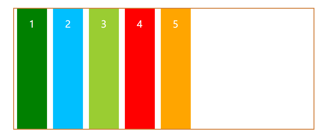
flex-direction决定主轴的方向,即子元素排列的方向。
它有四个值:
flex-direction: row | row-reverse | column | column-reverse;
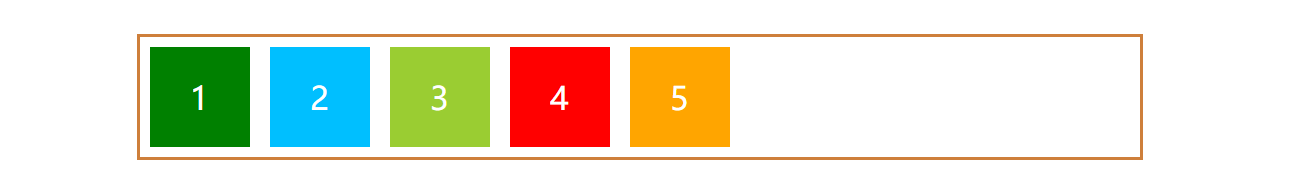
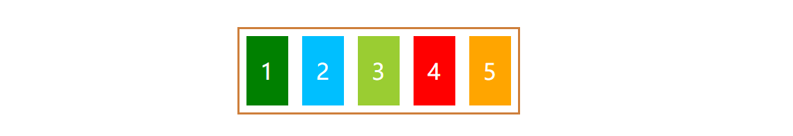
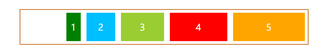
- row:默认值,主轴在水平方向,起点在左端
我们给box容器加上类flex-direction,并将它的值设置为row
<style>
    .flex-direction{
      flex-direction: row;
    }
</style>
<div class="box flex flex-direction"></div>
效果如图:
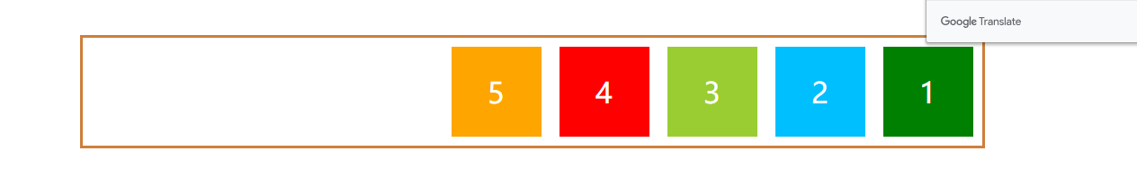
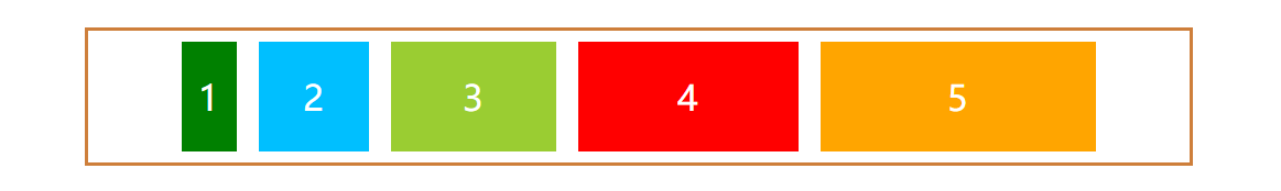
- row-reverse:主轴在水平方向,起点在右端
<style>
    .flex-direction{
      flex-direction: row-reverse;
    }
</style>
<div class="box flex flex-direction"></div>
效果如图:
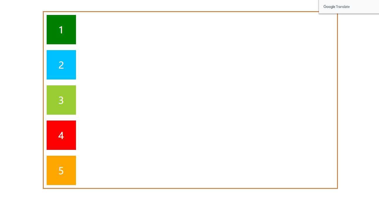
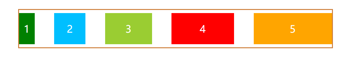
- column:主轴在垂直方向,起点在上沿
<style>
    .flex-direction{
      flex-direction: column;
    }
</style>
<div class="box flex flex-direction"></div>
效果如图:
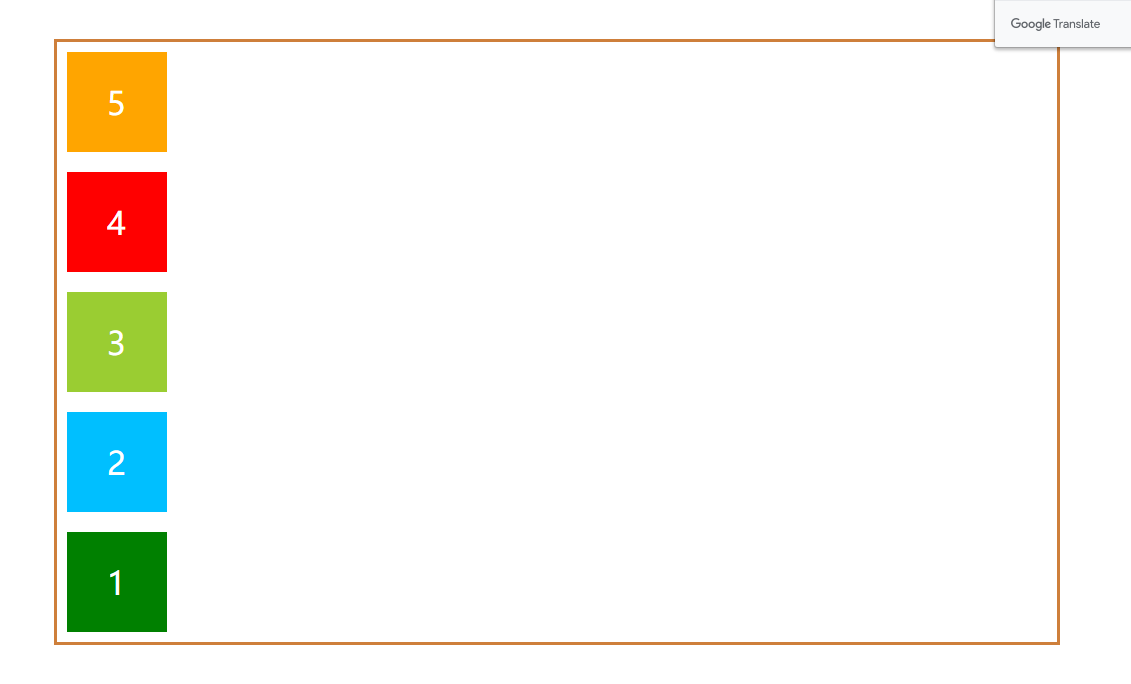
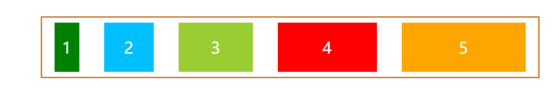
- column-reverse:主轴在垂直方向,起点在下沿
<style>
    .flex-direction{
      flex-direction: column-reverse;
    }
</style>
<div class="box flex flex-direction"></div>
效果如图:
flex-wrap
默认情况下,无论flex容器的宽度是多大,子元素都会排列在一条线上。如果flex容器的宽度小于所有子元素宽度的总和,那么子元素的宽度就会按比缩小,以至适应flex容器。
例如:我们把上述flex容器的宽度变为400px;
.box{
    width:400px;
}
效果如图:
如果我们想并不想压缩子元素的宽度,想换行,该怎么做?
flex-wrap决定是否换行显示以及换行之后子元素的排列方式。
它有三个值:
flex-wrap: nowrap | wrap | wrap-reverse;
- nowrap:默认值,不换行
我们给box容器加上类flex-wrap,并将它的值设置为row
<style>
    .flex-wrap{
      flex-wrap: row;
    }
</style>
<div class="box flex flex-wrap"></div>
效果如上。
- wrap:换行,第一行在上方
<style>
    .flex-wrap{
      flex-wrap: wrap;
    }
</style>
<div class="box flex flex-wrap"></div>
效果如图:
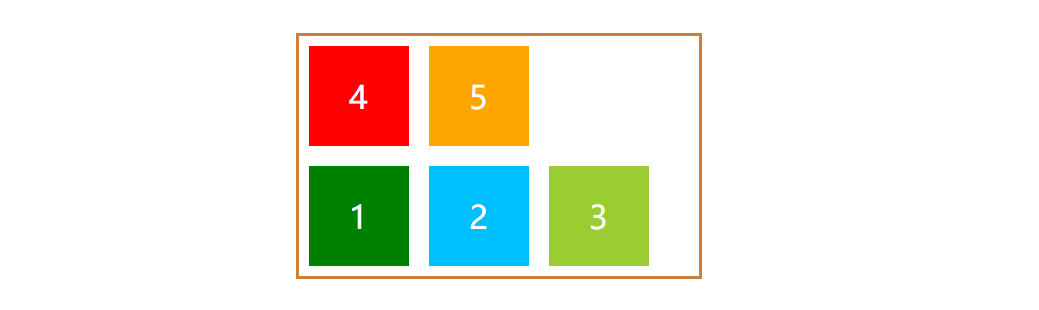
- wrap-reverse:换行,第一行在下方
<style>
    .flex-wrap{
      flex-wrap: wrap-reverse;
    }
</style>
<div class="box flex flex-wrap"></div>
效果如图:
flex-flow
flex-flow属性是flex-direction和flex-wrap属性的简写默认值为row nowrap。
.flex-flow{
    flex-flow: row nowrap;
}
justify-content
justify-content定义了子元素在主轴上的对齐方式。
它有五个值:
justify-content: flex-start | flex-end | center | space-between | space-around;
这里我们先把每个子元素的宽度改一下,改为不同的宽度。flex容器宽度改为1000px。
.box{
    width:1000px;
}
   .box-item.green{
      width:50px;
    }
    .box-item.blue{
      width:100px;
    }
    .box-item.yellow{
      width:150px;
    }
    .box-item.red{
      width:200px;
    }
    .box-item.orange{
      width:250px;
    }
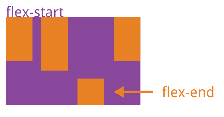
- flex-start:左对齐
我们给box容器加上类justify-content,并将它的值设置为flex-start
<style>
    .justify-content{
      justify-content: flex-start;
    }
</style>
<div class="box flex justify-content"></div>
效果如图:
- flex-end:右对齐
<style>
    .justify-content{
      justify-content: flex-end;
    }
</style>
<div class="box flex justify-content"></div>
效果如图:
- center:居中
<style>
    .justify-content{
      justify-content: center;
    }
</style>
<div class="box flex justify-content"></div>
效果如图:
- space-betwwen:两端对齐,子元素之间的间隔相等
<style>
    .justify-content{
      justify-content: space-betwwen;
    }
</style>
<div class="box flex justify-content"></div>
效果如图(为了直观感受,我把子元素的margin左右边距置为0):
- space-around:每个子元素两侧的间隔相等
项目之间的间隔比项目与边框的间隔大一倍。
<style>
    .justify-content{
      justify-content: space-betwwen;
    }
</style>
<div class="box flex justify-content"></div>
效果如图,可以看到,绿方块和蓝方块之间的距离,刚好是绿方块和容器边框距离的两倍。
align-items
align-items定义了子元素在交叉轴上的对齐方式。
它有五个值,具体的对齐方式与交叉轴的方向有关,下面假设交叉轴从上到下
交叉轴的方向与flex-direction的值有关。如果主轴为水平,交叉轴则为垂直,如果主轴为垂直,交叉轴为水平方向。
align-items: flex-start | flex-end | center | baseline | stretch;
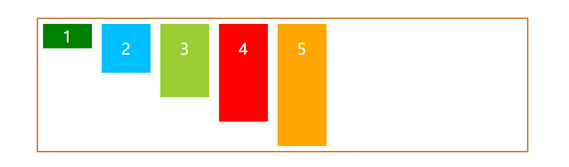
为了直观感受,我们再把子元素的宽度改为相等,高度不一致。
.box-item.green{
      height:50px;
    }
    .box-item.blue{
      height:100px;
    }
    .box-item.yellow{
      height:150px;
    }
    .box-item.red{
      height:200px;
    }
    .box-item.orange{
      height:250px;
    }
- flex-start:交叉轴的起点对齐
我们给box容器加上类align-items,并将它的值设置为flex-start
<style>
    .align-itemst{
      align-items: flex-start;
    }
</style>
<div class="box flex align-items"></div>
效果如图:
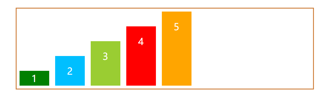
- flex-end:交叉轴的终点对齐
<style>
    .align-itemst{
      align-items: flex-end;
    }
</style>
<div class="box flex align-items"></div>
效果如图:
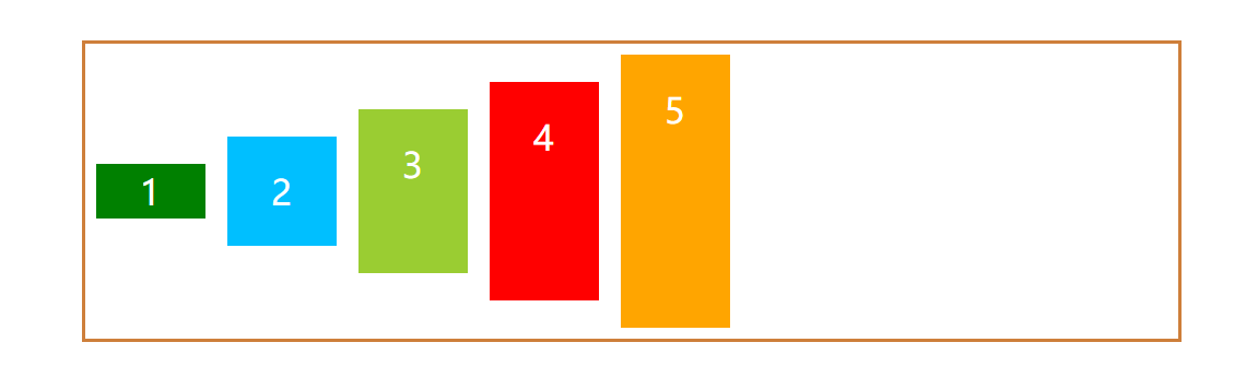
- center:交叉轴的中点对齐
<style>
    .align-itemst{
      align-items: center;
    }
</style>
<div class="box flex align-items"></div>
效果如图:
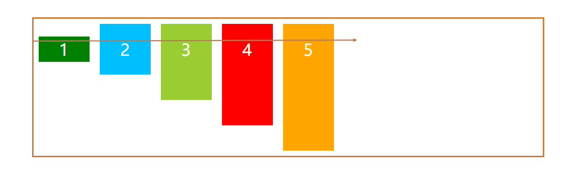
- baseline:子元素的第一行文字的基线对齐
<style>
    .align-itemst{
      align-items: baseline;
    }
</style>
<div class="box flex align-items"></div>
效果如图:
- stretch:如果子元素未设置高度或设为auto,将占满整个容器的高度
我们这里把所有子元素的高度设置为auto。flex容器的高度置为400px。
.box{
    height:400px;
}
.box-item.green,.box-item.blue, .box-item.yellow,.box-item.red,.box-item.orange{
      height:auto;
    }
<style>
    .align-itemst{
      align-items: baseline;
    }
</style>
<div class="box flex align-items"></div>
效果如图:
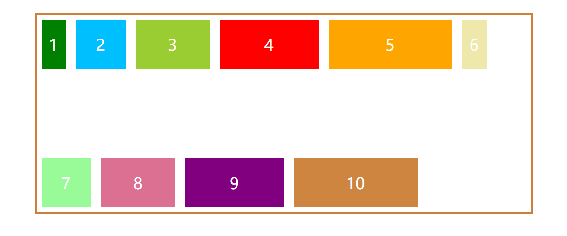
align-content
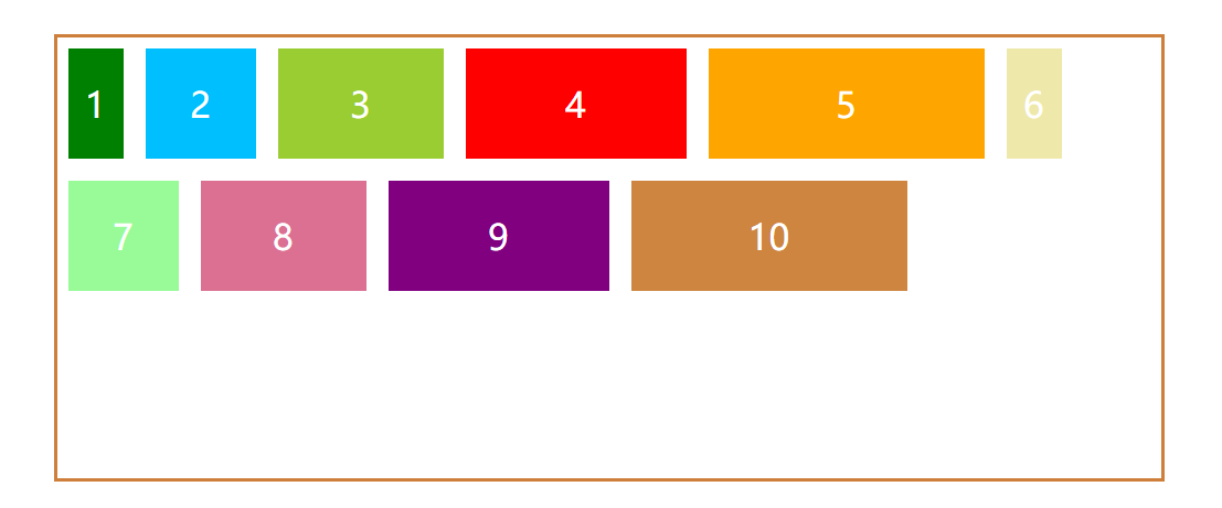
align-content属性定义了多根轴线的对齐方式。如果项目只有一根轴线,该属性不起作用。
多根轴线跟flex-wrap的取值有关,如果子元素换行显示,则存在多根轴线,如果不换行,则只有一根轴线。
它有六个值
align-items: flex-start | flex-end | center | baseline | stretch;
为了直观感受,我们多增加几个颜色方块,每个方块的高度相等,宽度不一致。设置容器宽度为400px,flex-wrap设置为换行。
<style>
.box{
    height:400px;
}
.orange2{
      background: palegoldenrod;
    }
    .orange3{
      background: palegreen;
    }
    .orange4{
      background: palevioletred;
    }
    .orange5{
      background: purple;
    }
    .orange6{
      background: peru;
    }
    .box-item.green{
      width:50px;
    }
    .box-item.blue{
      width:100px;
    }
    .box-item.yellow{
      width:150px;
    }
    .box-item.red{
      width:200px;
    }
    .box-item.orange{
      width:250px;
    }
      .box-item.orange2{
      width:50px;
    }
    .box-item.orange3{
      width:100px;
    }
    .box-item.orange4{
      width:150px;
    }
    .box-item.orange5{
      width:200px;
    }
    .box-item.orange6{
      width:250px;
    }
    .flex-wrap{
        flex-wrap:wrap;
    }
</style>
<div class="box flex flex-wrap align-content">
    <div class="box-item green">1</div>
    <div class="box-item blue">2</div>
    <div class="box-item yellow">3</div>
    <div class="box-item red">4</div>
    <div class="box-item orange">5</div>
    <div class="box-item orange2">6</div>
    <div class="box-item orange3">7</div>
    <div class="box-item orange4">8</div>
    <div class="box-item orange5">9</div>
    <div class="box-item orange6">10</div>
  </div>
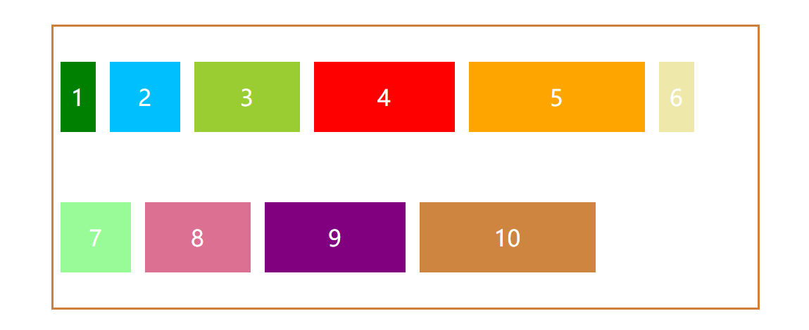
- flex-start:交叉轴的起点对齐
我们给box容器加上类align-content,并将它的值设置为flex-start
<style>
    .align-content{
      align-content: flex-start;
    }
</style>
<div class="box flex align-content"></div>
效果如图:
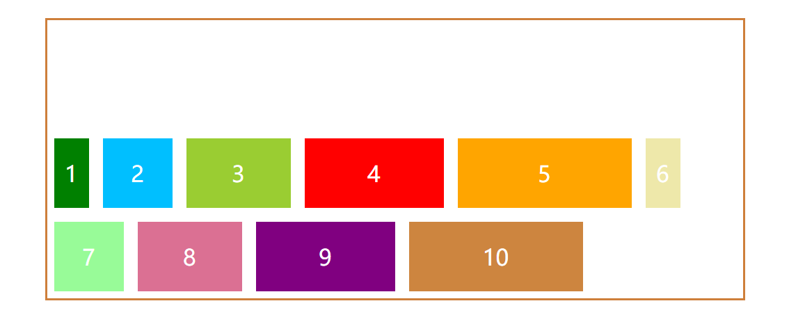
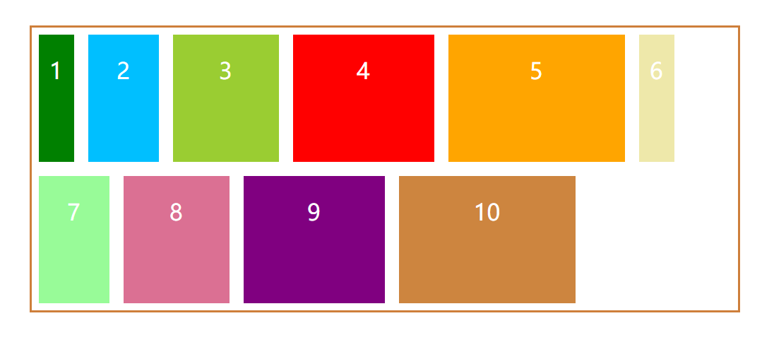
- flex-end:交叉轴的终点对齐
如果flex容器没有设置高度,值flex-start,flex-end作用相同。
<style>
    .align-content{
      align-content: flex-end;
    }
</style>
<div class="box flex align-content"></div>
效果如图:
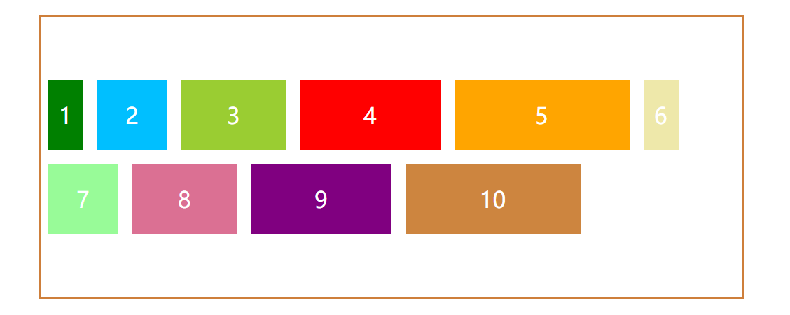
- center:交叉轴的中点对齐
<style>
    .align-content{
      align-content: center;
    }
</style>
<div class="box flex align-content"></div>
效果如图:
- space-between:与交叉轴的两端对齐,轴线之间的间隔相等
<style>
    .align-content{
      align-content: space-between;
    }
</style>
<div class="box flex align-content"></div>
效果如图:
- space-around:每根轴线两侧的间隔都相等
<style>
    .align-content{
      align-content: space-around;
    }
</style>
<div class="box flex align-content"></div>
效果如图:
- stretch:默认值,轴线沾满整个交叉轴
子元素没有设置高度或者高度为auto的情况下,会沾满容器,如果设置了,则显示子元素原本高度。
<style>
    .align-content{
      align-content: stretch;
    }
</style>
<div class="box flex align-content"></div>
效果如图:
子元素即项目属性
子元素有六个属性
- order
- flex-grow
- flex-shrink
- flex-basis
- flex
- align-self
order
order属性定义子元素的排列顺序。数值越小,排列越靠前,默认为0。
.box-item{
    order:1
}
flex-grow
flex-grow属性定义项目的放大比例,默认为0,即如果存在剩余空间,也不放大。
如果所有项目的flex-grow属性都为1,则它们将等分剩余空间(如果有的话)。如果一个项目的flex-grow属性为2,其他项目都为1,则前者占据的剩余空间将比其他项多一倍。
.box-item{
    flex-grow:1
}
flex-shrink
flex-shrink属性定义了子元素的缩小比例,默认为1,即如果空间不足,该子元素将缩小。
.box-item {
  flex-shrink: <number>; /* default 1 */
}
如果所有子元素的flex-shrink属性都为1,当空间不足时,都将等比例缩小。如果一个子元素的flex-shrink属性为0,其他子元素都为1,则空间不足时,前者不缩小。
负值对该属性无效。
flex-basis
flex-basis属性定义了在分配多余空间之前,子元素占据的主轴空间(main size)。浏览器根据这个属性,计算主轴是否有多余空间。它的默认值为auto,即子元素的本来大小。
它可以设为跟width或height属性一样的值(比如350px),则子元素将占据固定空间。
.box-item {
  flex-basis: <length> | auto; /* default auto */
}
flex属性
flex属性是flex-grow, flex-shrink 和 flex-basis的简写,默认值为0 1 auto。后两个属性可选。
.box-item {
  flex: none | [ <'flex-grow'> <'flex-shrink'>? || <'flex-basis'> ]
}
align-self属性
align-self属性允许单个子元素有与其他项目不一样的对齐方式,可覆盖align-items属性。默认值为auto,表示继承父元素的align-items属性,如果没有父元素,则等同于stretch。
.box-item {
  align-self: auto | flex-start | flex-end | center | baseline | stretch;
}
总结
有一次面试,面试官问了我一个问题:一个页面中有很多div1,div2,div3..divn,从上到下排列,有什么方法,用css布局,能让这些div反转,变成divn..div3,div2,div1。
想了片刻,没想出什么果子。
后来,面试官提了提flex布局,作为小白的我,当然只是稍微了解一点,说又说不出来个啥。emmmm.....
自己动手总结,丰衣足食。
面试题:一个页面中有很多div1,div2,div3..divn,从上到下排列,有什么方法,用css布局,能让这些div反转,变成divn..div3,div2,div1?
利用flex-direction属性改变主轴方向,并且反转。
<style>
.box{
    display:flex;
    flex-direction:column-reverse;
}
</style>
<div class="box">
 <div>1</div>
 <div>2</div>
 <div>3</div>
</div>
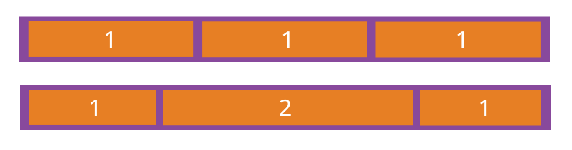
面试题:如何让项目内容宽度等分?
利用子元素的放大比例属性flex-grow。
<style>
.box{
    display:flex;
}
.box div{
    flex-grow:1;
}
</style>
<div class="box">
 <div></div>
 <div></div>
 <div></div>
</div>
面试题:左右布局,一侧定宽,一侧自适应撑满
利用子元素的放大比例属性flex-grow,设置为1,让右布局自适应。
<style>
.box{
    display:flex;
}
.box.left{
    flex-basis:300px;
}
.box.right{
    flex-grow:1;
}
</style>
<div class="box">
 <div class="left">固定</div>
 <div class="right">自适应宽度</div>
</div>
面试题:未知高宽,水平垂直居中
<style>
.box{
    display:flex;
    align-items:center;
    justify-content:center;
}
</style>
<div class="box">
 <div>垂直水平居中</div>
</div>
面试题:在一个横向布局上,假设有三个div,每个宽度为定宽apx,如果想使两侧宽度为x,中间div间间隔为2x。x可以自适应。
<style>
.box{
    display:flex;
    justify-content:space-around;
}
</style>
<div class="box">
 <div class="left">1</div>
 <div class="center">2</div>
 <div class="right">3</div>
</div>
- 本文中,部分图片转载Flex 布局教程-阮一峰的网络日志
