

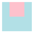
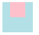
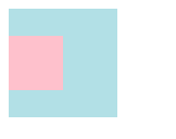
水平居中
- 行内元素居中:父元素设置
text-align: center;
<style>
.parent{ width: 100px; height: 100px; text-align: center;background-color: powderblue;}
.child{ width: 50px; height: 50px; background-color: pink;display: inline-block;}
</style>
<div class="parent"> <div class="child"></div> </div>
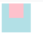
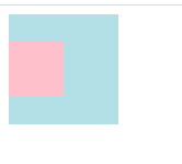
margin 为 auto
<style>
    .parent{ width: 100px; height: 100px; background-color: powderblue;}
    .child{ width: 50px; height: 50px;background-color: pink; margin: 0 auto;}
</style>
<div class="parent">
    <div class="child"></div>
</div>
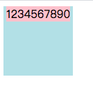
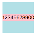
display: inline,父元素设置text-align: center;
<style>
    .parent{ width: 100px; height: 100px; background-color: powderblue; text-align: center;}
    .child{  height: 50px;background-color: pink; display: inline;}
</style>
<div class="parent">
    <div class="child">1234567890</div>
</div>
- 通用方案,采用
flex布局,父元素设置display:flex; justify-content:center;
// 子元素不定宽的情况
<style>
    .parent{ width: 100px; height: 100px; background-color: powderblue;display: flex; justify-content: center;}
    .child{  height: 100px;background-color: pink; }
</style>
<div class="parent">
    <div class="child">1234567890</div>
</div>

// 子元素定宽的情况
<style>
    .parent{ width: 100px; height: 100px; background-color: powderblue;display: flex; justify-content: center;}
    .child{ width: 50px; height: 50px;background-color: pink; }
</style>
<div class="parent">
    <div class="child"></div>
</div>
// 子元素不定宽的情况
// 子元素定宽的情况
垂直居中
子元素是单行内联文本、多行内联文本和块元素情况是不同,下边具体分析。
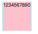
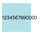
- 父元素高度一定,子元素是单行内联文本,父元素设置
line-height和height一致。
<style>
    .parent{ width: 100px; height: 100px; background-color: powderblue; line-height: 100px;}
</style>
<div class="parent">
    <p class="child">1234567890000</p>
</div>
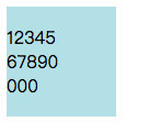
- 父元素高度一定,子元素是多行内联文本,父元素设置
display: table-cell;,再设置vertical-align: middle;
<style>
    .parent{ width: 100px; height: 100px; background-color: powderblue; display: table-cell; vertical-align: middle;}
    .child{ width: 50px;word-wrap: break-word; }
</style>
<div class="parent">
    <p class="child">1234567890000</p>
</div>
- 块元素,子元素高度一定,父元素设置
positon:relative;,子元素设置position:absolute; top:50%; margin:-子元素高度一半;
<style>
    .parent{ width: 100px; height: 100px; background-color: powderblue;position: relative; }
    .child{ width: 50px;height: 50px; background-color: pink; position: absolute; top:50%; margin-top: -25px;  }
</style>
<div class="parent">
    <div class="child"></div>
</div>
- 块元素,子元素高度一定,父元素设置
positon:relative;,子元素设置position:absolute; top:0; bottom:0; margin:auto;
<style>
    .parent{ width: 100px; height: 100px; background-color: powderblue;position: relative; }
    .child{ width: 50px;height: 50px; background-color: pink; position: absolute; top:0; bottom: 0; margin: auto;  }
</style>
<div class="parent">
    <div class="child"></div>
</div>
- 通用
flex布局
// 子元素高度一定
<style>
    .parent{ width: 100px; height: 100px; background-color: powderblue;display: flex; align-items: center; }
    .child{ width: 50px;height: 50px; background-color: pink;  }
</style>
<div class="parent">
    <div class="child"></div>
</div>


// 子元素高度不定
<style>
    .parent{ width: 100%; height: 500px; background-color: powderblue;display: flex; align-items: center; }
    .child{ width: 100px; background-color: pink;  }
</style>
<div class="parent">
    <div class="child">12345678900</div>
</div>
// 子元素高度一定
// 子元素高度不定
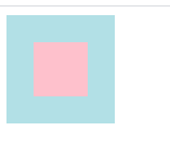
水平垂直居中
- 父元素设置
position:relative;,子元素设置position:absolute;margin:auto;
<style>
   .parent{ width: 100px; height: 100px; background-color: powderblue;position: relative; }
   .child{ position:absolute;width: 50px; height: 50px;left:0;top: 0;bottom: 0;right: 0;margin: auto;background-color: pink;  }
</style>
<div class="parent">
    <div class="child"></div>
</div>
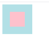
- 父元素设置
position:relative;,子元素设置position:absolute;margin:-宽度一半;margin:-高度一半;left:50%;top:50%;
<style>
   .parent{ width: 100px; height: 100px; background-color: powderblue;position: relative; }
   .child{ position:absolute;width: 50px; height: 50px;left:50%;top: 50%;margin-left: -25px; margin-top: -25px; background-color: pink;  }
</style>
<div class="parent">
    <div class="child"></div>
</div>
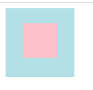
3.父元素设置position:relative;,子元素设置position:absolute;left:50%;top: 50%;transform:translate(-50%,-50%);
<style>
   .parent{ width: 100px; height: 100px; background-color: powderblue;position: relative; }
   .child{width: 50px; height: 50px;left:50%;top: 50%; transform: translate(-50%,-50%); background-color: pink;  }
</style>
<div class="parent">
    <div class="child"></div>
</div>
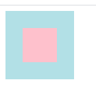
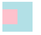
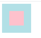
- 父元素设置
display:flex; justify-content:center; align-items:center;
<style>
   .parent{ width: 100px; height: 100px; background-color: powderblue;display: flex; justify-content: center; align-items: center; }
   .child{ width: 50px; height: 50px;background-color: pink;  }
</style>
<div class="parent">
    <div class="child"></div>
</div>
- 父元素设置
display:table-cell; text-align:center; vertical-align: middle;,父元素外需要套一层,设置为display: table;,子元素设置display: inline-block;
<style>
   .out{ display: table;}
   .parent{ width: 100px; height: 100px; background-color: powderblue;display:table-cell; text-align:center; vertical-align: middle; }
   .child{ width: 50px; height: 50px;background-color: pink; display: inline-block; }
</style>
<div class="out">
    <div class="parent">
        <div class="child"></div>
    </div>
</div>
