

Flext布局,也被称为弹性布局,之所以会有这种布局出现,肯定是因为传统的布局不能够满足一些需求,例如,垂直居中在传统布局中不容易实现。
任何容器都可以设置成为flex布局
设置为flex布局的子元素的float clear vertial-align属性都将失效
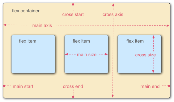
容器
设置flex布局的元素为”容器“,被称为容器的子元素被称为”项目“。
容器有两根轴,水平的主轴和垂直的交叉轴。主轴和交叉轴都可能是多个。
容器的属性
-
flex-direction
-
flex-wrap
-
flex-flow
-
justify-content
-
align-items
-
align-content
接下里让我们用实例来对容器的属性一一进行说明:
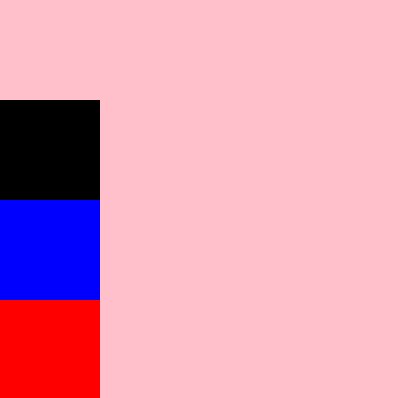
flex-direction: row | row-reverse | column | column-reverse;
所有的项目都是沿着主轴起点位置进行排列,当flex的选值不同时,主轴的起点位置也会不一样。
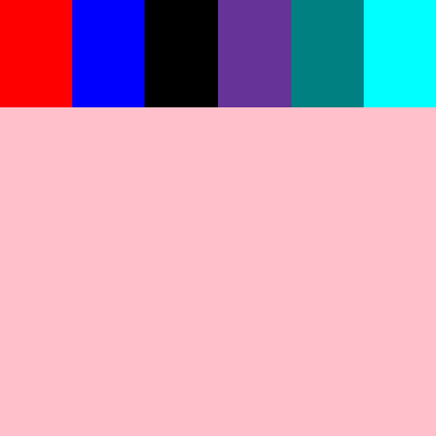
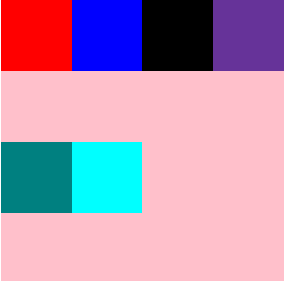
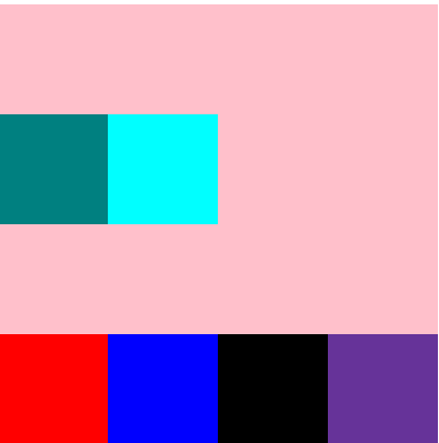
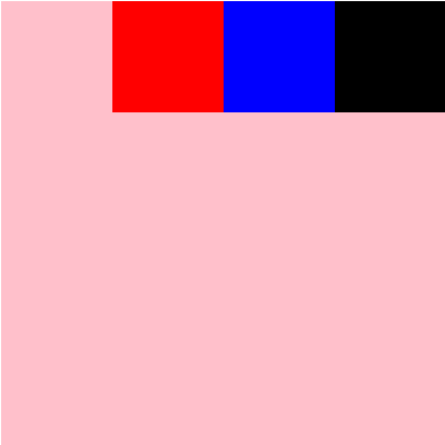
flex-direction:定义主轴的起点与方向,容器内所有的项目都会根据主轴起点和方向进行顺序排列。
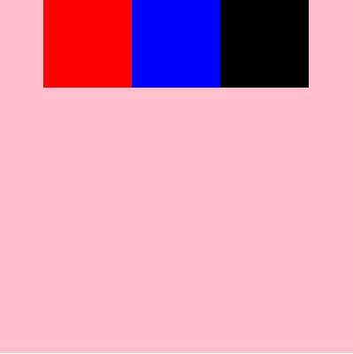
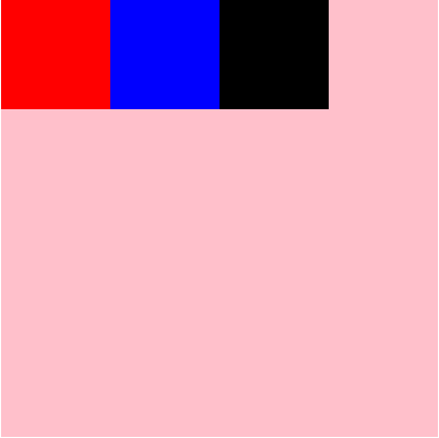
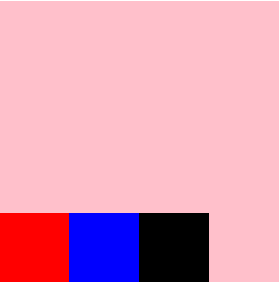
row:定义主轴为水平方向,主轴起点在左端,项目从主轴起点,沿着主轴方向进行排列,所有的项目都会横向向右排列。
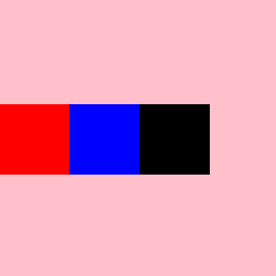
row-reverse:定义主轴为水平方向,主轴起点在右端,项目从主轴起点,沿着主轴方向进行排列,所有的项目都会横向向左排列。
column: 定义主轴垂直方向,主轴起点在上端,项目从主轴起点,沿着主轴方向进行排列,所有的项目都会纵向向下排列。
column-reverse:定义主轴为垂直方向,主轴起点在下端,项目从主轴起点,沿着主轴方向进行排列,所有的项目都会纵向向上排列。
 <style>
        #root{
            display: flex;
            flex-direction: row;
        }
</style>
<div id="root">
    <div class="div1"></div>
    <div class="div2"></div>
    <div class="div3"></div>
</div>
 <style>
        #root{
            display: flex;
            flex-direction: row-reverse;
        }
</style>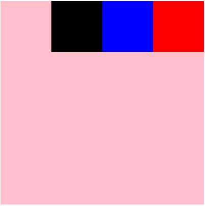
 <style>
        #root{
            display: flex;
            flex-direction: column;
        }
</style>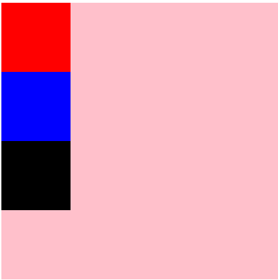
 <style>
        #root{
            display: flex;
            flex-direction: column-reverse;
        }
</style>
flex-wrap:flex-wrap: nowrap | wrap | wrap-reverse;默认值:nowrap
flexwrap:确定项目换行的方式
nowrap:不换行,所有项目会自行更改大小,以适应容器大小
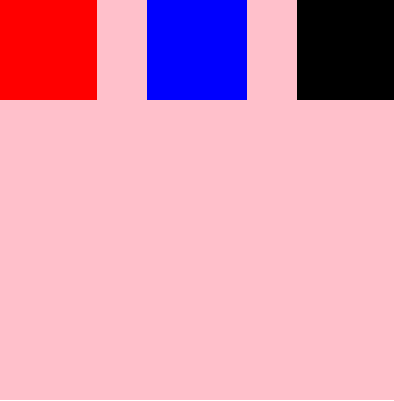
wrap :换行,第一行在上方
wrap-reverse:换行,第一行在下方
 #root{
            display: flex;
            flex-direction: row;
            flex-wrap: nowrap;
        }
 #root{
            display: flex;
            flex-direction: row;
            flex-wrap: wrap;
        }
  #root{
            display: flex;
            flex-direction: row;
            flex-wrap: wrap-reverse;
        }
flex-flow:flex-direction || flex-wrap;
flex-flow是flex-direction和flex-wrap的缩写,这里不再做演示。
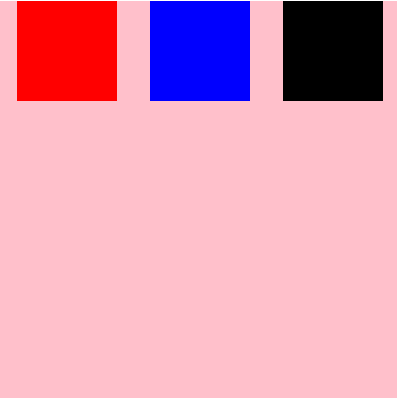
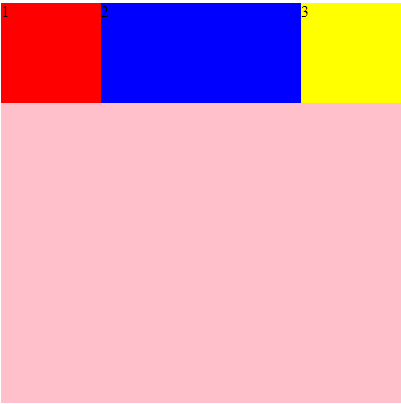
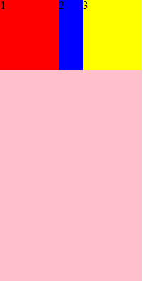
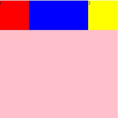
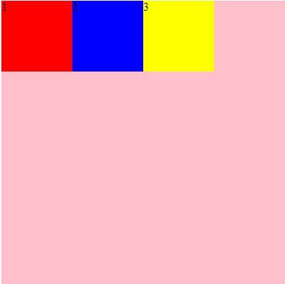
justify-content:flex-start | flex-end | center | space-between | space-around;
justify-content定义了项目在主轴上的对齐方式
flex-start:与主轴的起点对齐
flex-end:与主轴的终点对齐
center:居中主轴
space-between:两边分别对齐主轴的两端,中间的均匀分布
space-around:每个项目的两端距离都相等。
注意:与flex-direction属性的区分,flex-direction只是定义了项目的排列方向,而不是对齐方式,在没有定义justify-content的时候,所有的项目都是沿着主轴地方向顺序排列,并且默认从主轴的开始轴进行排列,当定义了justify-content,项目的排列方式将不再仅仅是从主轴起点排列,右多种方式选择,不管与justify-content的值是什么,项目的排列顺序始终不会改变,因为排列顺序是由flex-direction来控制的
 #root{
            display: flex;
            flex-direction: row;
            flex-wrap: wrap;
            justify-content: flex-start;
        }

 #root{
            display: flex;
            flex-direction: row;
            flex-wrap: wrap;
            justify-content: flex-end;
        }
#root{
            display: flex;
            flex-direction: row;
            flex-wrap: wrap;
            justify-content: center;
        }
#root{
            display: flex;
            flex-direction: row;
            flex-wrap: wrap;
            justify-content: space-between;
        }
#root{
            display: flex;
            flex-direction: row;
            flex-wrap: wrap;
            justify-content: space-around;
        }
align-items:flex-start | flex-end | center | baseline | stretch;
align-items定义了项目在交叉轴上的对齐方式
flex-start:交叉轴的起点对齐
flex-end:交叉轴的终点对齐
center:交叉轴的中间对齐
baseline:项目中第一行文字基线对齐
stretch:如果项目未设置高度或者auto,将占领整个屏幕的高度。
#root{
            display: flex;
            flex-direction: row;
            flex-wrap: wrap;
            justify-content: flex-start;
            align-items: flex-start;
        }
#root{
            display: flex;
            flex-direction: row;
            flex-wrap: wrap;
            justify-content: flex-start;
            align-items: flex-end;
        }
#root{
            display: flex;
            flex-direction: row;
            flex-wrap: wrap;
            justify-content: flex-start;
            align-items: center;
        }
#root{
            display: flex;
            flex-direction: row;
            flex-wrap: wrap;
            justify-content: flex-start;
            align-items: baseline;
        }
#root{
            display: flex;
            flex-direction: row;
            flex-wrap: wrap;
            justify-content: flex-start;
            align-items: stretch;
        }

align-content:flex-start | flex-end | center | space-between | space-around | stretch;
align-content属性定义了多根轴线的对齐方式。如果项目只有一根轴线,该属性不起作用。
-
flex-start:与交叉轴的起点对齐。 -
flex-end:与交叉轴的终点对齐。 -
center:与交叉轴的中点对齐。 -
space-between:与交叉轴两端对齐,轴线之间的间隔平均分布。 -
space-around:每根轴线两侧的间隔都相等。所以,轴线之间的间隔比轴线与边框的间隔大一倍。 -
stretch(默认值):轴线占满整个交叉轴。项目属性
-
order -
flex-grow -
flex-shrink -
flex-basis -
flex -
align-selforder:
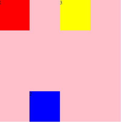
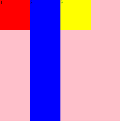
order定义了项目的排列顺序,数字越小,排列越靠前
 .div1{
        background-color: red;
        order:2;
      }
 .div2{
       background-color: blue;
       order:3;
      }
 .div3{
        background-color: yellow;
        order:1;
       }

<div id="root">
    <div class="div1">1</div>
    <div class="div2">2</div>
    <div class="div3">3</div>
</div>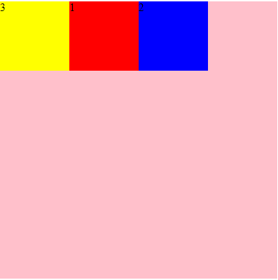
-
flex-grow
定义项目的放大比例,默认为0,即如果存在剩余空间,也不放大
.div2{
    background-color: blue;
    flex-grow:1;
}
flex-shrink
属性定义了项目的缩小比例,默认为1,即如果空间不足,该项目将缩小
只有当空间不足的时候这个属性才有用,否则就会正常显示
.div2{
    background-color: blue;
    flex-shrink:4;
}
flex-basis: | auto;
flex-basis:定义了项目的初始大小,属性定义了在分配多余空间之前,项目占据的主轴空间(main size)。浏览器根据这个属性,计算主轴是否有多余空
.div2{
       background-color: blue;
       flex-basis: 200px;
      }
flex:none | [ <'flex-grow'> <'flex-shrink'>? || <'flex-basis'> ]
flex属性是flex-grow, flex-shrink 和 flex-basis的简写,默认值为0 1 auto。后两个属性可选。
align-self:auto | flex-start | flex-end | center | baseline | stretch;
默认auto继承复父元素的align-items属性,允许单个项目在交叉轴有不一样的对齐方式
该属性可能取6个值,除了auto,其他都与align-items属性完全一致。
.div2{
            background-color: blue;
            align-self: auto;
     }
.div2{
            background-color: blue;
            align-self: flex-start;
        }
.div2{
            background-color: blue;
            align-self: flex-end;
        }
.div2{
            background-color: blue;
            align-self: stretch;
        }
