

一.开启了flex布局的元素叫做flex container
flex items默认都是沿着main axis(主轴)从main start开始往main end方向排布
.al{ display: flex; }<div class="al"> <div class="z2">z2</div> <div class="cl">c1</div> <div class="z1">z1</div> </div> 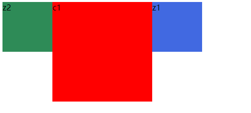
虽然z2,c1,z1是盒子块级,但是当父级al设置成 display: flex;他就不在成块级排列,默认成沿着main axis(主轴)从main start开始往main end方向排布。
1.开启flex布局
设置display属性为flex或者inline-flex可以成为flex container
flex以块级元素存在,inline-flex则会变成行内级
2.flex-direction:设置主轴方向
默认是row:flex-direction:row横向从左向右,row-reverse:横向反向,从右向左
column主轴方向从上向下,column-reverse:反向
.al{ display: flex; flex-direction: column; }3.justify-content:设置flex-items在主轴的对齐方式
flex-start:与main-start对齐;
flex-end:与main-end对齐;
center:居中对齐;
space-between:flex item间的距离相等,与main-start和main-end对齐
.al{            width: 500px;            background-color: chocolate;            display: flex;            flex-direction: row; //横向主轴排列            justify-content: space-between;        }

<div class="al"> <div class="z2">z2</div> <div class="cl">c1</div> <div class="z1">z1</div> </div> 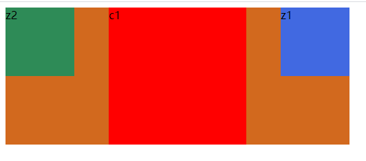
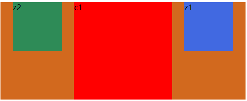
space-around:flex item间的距离相等,flex item与main-start和main-end之间的距离是flex item间的距离的一半
.al{            width: 500px;            background-color: chocolate;            display: flex;            flex-direction: row;            justify-content: space-around;        }

<div class="al">        <div class="z2">z2</div>        <div class="cl">c1</div>        <div class="z1">z1</div> </div>
space-evenly:flex item间的距离相等,flex item与main-start和main-end之间的距离是flex item间的距离也相等
.al{            width: 500px;            background-color: chocolate;            display: flex;            flex-direction: row;            justify-content: space-evenly;        }
<div class="al">        <div class="z2">z2</div>        <div class="cl">c1</div>        <div class="z1">z1</div>    </div>
4.align-items:决定flex-items在cross axis(交叉轴)上的对齐方式
normal:在弹性布局中和stretch一样
stretch:当flex items在交叉轴方向的size为auto时,会自动拉伸填充flex container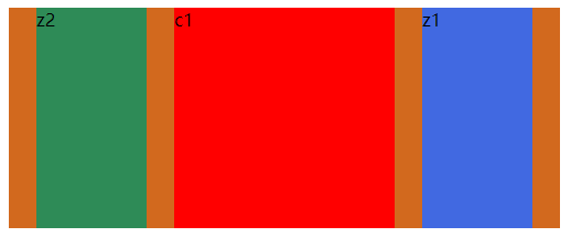
start:与cross start对齐
end:与cross end对齐
center:居中对齐
baseline:基线对齐
5.flex-wrap:默认情况下flex items是在一行显示的,当不够时候会压缩item宽度
normal:默认,单行显示
wrap:多行
wrap-reverse:多行相反
6.flex-flow是flex-direction和flex-wrap的缩写属性
flex-flow: row wrap;7.align-content:决定了flex items在交叉轴的对齐方式,用法和justify-content类似
二.flex container里面的直接子元素叫flex items
1.order:决定了flex items的排列顺序
默认值是0,可以设置成任意的整数,值越小就排在前面。
<style> .al{ width: 600px; height: auto; background-color: chocolate; display: flex; flex-direction: row; justify-content: space-evenly; } .z1{ width: 200px; height: 200px; order: 5; background-color: red; } .z2{ width: 100px; height: 100px; order: 2; background-color: royalblue; } .z3{ width: 100px; height: 100px; order: 10; background-color: seagreen; display: inline-block; transition: width 5s linear 2s; } .z2:hover{ width:200px; } </style></head><body> <div class="al"> <div class="z1">z1</div> <div class="z2">z2</div> <div class="z3">z3</div> </div> </body>2.align-self:可以给item设置align-self来覆盖flex container设置的align-items
默认auto:遵从align-items设置。
3.flex-grow:决定items如何扩展。
可以设置任意的非负数,默认为0.当在主轴上有剩余空间时,才会生效。当所有的items的grow的总和sum大于一,则每个items扩展大小是:剩余size*flex-grow/sum;如果sum小于1,则则每个items扩展大小是:剩余size*flex-grow。
4.flex-shrink:决定items如何收缩
如果items的宽度和大于父元素即container,那么他们就会进行收缩。默认收缩时1.就是每个等分。
5.flex-basis:设置主轴的大小,不过一般用width直接设置。
6.flex:是flex-grow,flex-shrink,flex-basis的简写,可以指定一个值,两个值,三个值
单值:值必须是下面之一:1.一个无单位的数,它会被当flex-grow的值;2.一个有效的宽度值
双值:,第一个必须是无单位的数,它会被当flex-grow的值;第二个值:可以是无单位的数,可以是一个宽度值
三值:第一,第二必须是无单位的值,第三必须是有效的宽度值
