

Flutter TextField 的详细使用
TextField 用于文本输入,提供了很多属性,下面详细讲解一下该如何去使用这个widget.
1.属性
const TextField({
    Key key,
    this.controller,
    this.focusNode,
    this.decoration = const InputDecoration(),
    TextInputType keyboardType,
    this.textInputAction,
    this.textCapitalization = TextCapitalization.none,
    this.style, // 文本样式
    this.strutStyle,
    this.textAlign = TextAlign.start, // 文本水平方向对齐方式
    this.textAlignVertical, // 本文垂直方向对齐方式
    this.textDirection, // 文本方向
    this.readOnly = false, // 是否是只读
    ToolbarOptions toolbarOptions,
    this.showCursor,
    this.autofocus = false,
    this.obscureText = false,
    this.autocorrect = true,
    this.enableSuggestions = true,
    this.maxLines = 1,
    this.minLines,
    this.expands = false,
    this.maxLength,
    this.maxLengthEnforced = true,
    this.onChanged, // 内容发生改变方法回调
    this.onEditingComplete, // 完成编辑方法回调,实现了这个方法,键盘不再会自动收起
    this.onSubmitted, // 提交方法回调
    this.inputFormatters,
    this.enabled,
    this.cursorWidth = 2.0, // 光标宽度
    this.cursorRadius, // 光标圆角
    this.cursorColor, // 光标颜色
    this.keyboardAppearance,
    this.scrollPadding = const EdgeInsets.all(20.0),
    this.dragStartBehavior = DragStartBehavior.start,
    this.enableInteractiveSelection = true,
    this.onTap, // 点击方法回调(开始编辑)
    this.buildCounter, // (BuildContext context, {int currentLength, int maxLength, bool isFocused, }) {} counter 回调
    this.scrollController, // 滚动
    this.scrollPhysics,
  })
1.1 controller
编辑框的控制器,通过它可以设置/获取编辑框的内容、选择编辑内容、监听编辑文本改变事件。大多数情况下我们都需要显式提供一个controller来与文本框交互。如果没有提供controller,则TextField内部会自动创建一个。
1.1.1 TextEditingController
class _YXCContentState extends State<YXCContent> {

  final TextEditingController _editingController = TextEditingController();

  @override
  void initState() {
    super.initState();
    // 添加监听
    _editingController.addListener((){
      print("addListener() -- ${_editingController.text}");
      final text = _editingController.text.toLowerCase();
      _editingController.value = _editingController.value.copyWith(
        text: text,
      );
    });
  }

  @override
  void dispose() {
    // 释放
    _editingController.dispose();
    super.dispose();
  }

  @override
  Widget build(BuildContext context) {

    return Container(
      padding: EdgeInsets.only(left: 20, right: 20),
      child: Center(
        child: TextField(
          controller: _editingController,
        ),
      ),
    );
  }
}
以上代码,使用 TextEditingController 对 TextField 输入进行监听,并且将输入的字母全部转成小写字母功能
注意:别忘记了释放TextEditingController
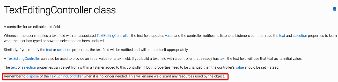
Remember to dispose of the TextEditingController when it is no longer needed. This will ensure we discard any resources used by the object.
1.2 focusNode
用于控制TextField是否占有当前键盘的输入焦点,可以用来处理键盘事件
class _YXCContentState extends State<YXCContent> {
// focusNode
final FocusNode _focusNode = FocusNode(debugLabel: "Button");
@override
void initState() {
super.initState();
// 焦点监听
_focusNode.addListener(() {
if (_focusNode.hasFocus == true) {
print("输入框成为焦点");
} else {
print("输入框失去焦点");
}
});
}
@override
void dispose() {
_focusNode.dispose();
super.dispose();
}
@override
Widget build(BuildContext context) {
return Container(
padding: EdgeInsets.only(left: 20, right: 20),
child: Column(
children: <Widget>[
Center(
child: TextField(
focusNode: _focusNode,
),
),
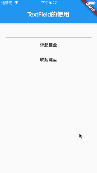
FlatButton(
onPressed: () {
if (_focusNode.canRequestFocus) {
FocusScope.of(context).requestFocus(_focusNode);
}
},
child: Text('弹起键盘'),
),
MaterialButton(
onPressed: () {
_focusNode.unfocus();
},
child: Text('收起键盘'),
)
],
),
);
}
}
以上代码,通过点击按钮来实现对 TextField 进行焦点控制(键盘的弹起与收起)
1.3 decoration
用于控制 TextField 的外观设置,比如:提示语、背景颜色、边框等
const InputDecoration({
this.icon, // 左边添加一个 Widget
this.labelText, // 顶部描述字符串,如果输入框成为焦点,会发生改变
this.labelStyle, // 设置顶部描述的文字样式
this.helperText, // 底部描述文字
this.helperStyle, // 底部描述文字样式
this.helperMaxLines, // 底部描述文字最大行数
this.hintText, // 占位文字,类似于iOS中的 placeholder,只有当输入框没有输入内容并且成为焦点才会显示出来
this.hintStyle, // 占位文字样式
this.hintMaxLines, // 占位文字最大行数
this.errorText, // 错误提示文字,如果同时设置helperText,会优先显示 errorText
this.errorStyle, // 错误提示文字样式
this.errorMaxLines, // 错误文字提示最大行数
this.hasFloatingPlaceholder = true, // 设置是否需要展示 labelText,如果设置为false,TextField 成为焦点时不显示labelText,未成为焦点还会显示出来
this.isDense,
this.contentPadding, // 设置内容padding(内切),设置后输入框内容、helperText、counterText、errorText都会影响
this.prefixIcon, // 在 icon 和 prefix(prefixText) 之间的一个 Widget
this.prefix, // 输入之前的一个Widget,基线与输入框基线对齐,如果同时设置了 prefixIcon,则会排布到prefixIcon后面去
this.prefixText, // 文本,如果设置了 prefix 就不能设置 prefixText,这两者是冲突的
this.prefixStyle, // 设置文本样式
this.suffixIcon, // 类似 prefixIcon,只不过这是在尾部
this.suffix, // 类似 suffix
this.suffixText, // 类似 prefixText,在这里也不能同时设置 suffix
this.suffixStyle, // suffixText 的样式
this.counter, // 一般用来文字计数的Widget,如果同时设置了 counterText,优先展示 counter Widget
this.counterText, // 计数文本展示
this.counterStyle, // 计数文本样式
this.filled, // 是否需要装饰容器
this.fillColor, // 设置容器的颜色
this.focusColor, //
this.hoverColor, //
this.errorBorder, // 输入框输入错误时,并且没有成为焦点边框展示样式
this.focusedBorder, // 输入框成为了焦点并且没有设置 errorText 展示样式
this.focusedErrorBorder, // 当设置了 errorText时,输入成为焦点边框展示样式
this.disabledBorder, // 当输入框不可用时,边框样式
this.enabledBorder, // 输入框可用没有成为焦点时边框展示样式
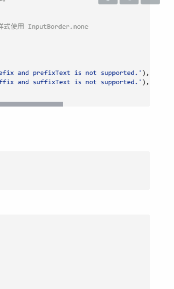
this.border, // 设置边框样式,优先级低于其他 border,如果需要设置没有边框样式使用 InputBorder.none
this.enabled = true, // 设置输入框是否可用
this.semanticCounterText,
this.alignLabelWithHint,
}) : assert(enabled != null),
assert(!(prefix != null && prefixText != null), 'Declaring both prefix and prefixText is not supported.'),
assert(!(suffix != null && suffixText != null), 'Declaring both suffix and suffixText is not supported.'),
isCollapsed = false;
1.3.1 border
设置无边框样式
final InputDecoration _decoration = InputDecoration(
  border: InputBorder.none, // 无边框设置
);
1.3.2 UnderlineInputBorder (边框下划线样式)
enabledBorder: UnderlineInputBorder(
    borderSide: BorderSide(
    color: Colors.red,
    width: 5,
    style: BorderStyle.none, // 隐藏边框
  ),
),
1.3.3 OutlineInputBorder(边框环绕)
focusedBorder: OutlineInputBorder(
      borderSide: BorderSide(
        color: Colors.orange,
        width: 3,
    ),
  borderRadius: BorderRadius.circular(10),
  gapPadding: 20, // 设置 labelText 与边框的间距
),
1.4 keyboardType (键盘样式)
有以下键盘类型(有些经过测验,发现有些类型没什么很大的区别)
static const List<String> _names = <String>[
    'text',
    'multiline',
    'number',
    'phone',
    'datetime',
    'emailAddress',
    'url',
    'visiblePassword',
  ];
1.5 textInputAction
设置return的显示样式,有以下枚举值
enum TextInputAction {
  none, // 没有键盘
  unspecified, // 换行
  done, // 完成
  go, // 前往
  search, // 搜索
  send, // 发送
  next, // 下一步
  previous, // iOS下无反应
  continueAction, // 继续
  join, // 加入
  route, // 路线
  emergencyCall, // 紧急电话
  newline, // 换行
}
1.6 textCapitalization
设置平台键盘的大小写
enum TextCapitalization {
  words, // 每个单词首字母大写
  sentences, // 首字母大写,其他的都是小写
  characters, // 默认字母大写
  none, // 默认小写键盘
}
1.7 strutStyle
设置文本段落的样式
1.7.1 StrutStyle
以下属性
const StrutStyle({
    String fontFamily, // 字体名称
    List<String> fontFamilyFallback, // fontFamily 找不到字体时搜索字体名称的有序列表
    this.fontSize, // 字体大小
    this.height, // 设置每行的高度,按照比例来计算的
    this.leading, // 设置每行的间距,也是按照比例来计算的
    this.fontWeight,
    this.fontStyle,
    this.forceStrutHeight,
    this.debugLabel,
    String package,
}) : fontFamily = package == null ? fontFamily : 'packages/$package/$fontFamily',
      _fontFamilyFallback = fontFamilyFallback,
      _package = package,
      assert(fontSize == null || fontSize > 0),
      assert(leading == null || leading >= 0),
      assert(package == null || (package != null && (fontFamily != null || fontFamilyFallback != null)));
1.8 cursorWidth
设置光标的宽度
1.9 cursorColor
设置光标的颜色
1.10 scrollController
当输入框能进行滚动的时候,一般用来监听滚动事件
1.10.1 ScrollController
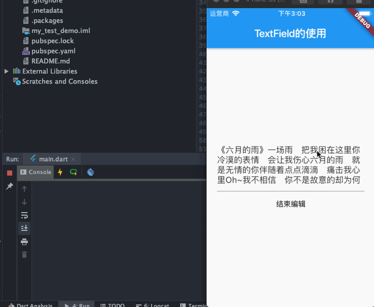
通过 ScrollController 对输入框的滚动监听
class _YXCContentState extends State<YXCContent> {

  final FocusNode _focusNode = FocusNode();

  final ScrollController _scrollController = ScrollController();
  final TextEditingController _editingController = TextEditingController(
    text: "《六月的雨》"
        "一场雨 把我困在这里"
        "你冷漠的表情 会让我伤心"
        "六月的雨 就是无情的你"
        "伴随着点点滴滴 痛击我心里"
        "Oh~我不相信 你不是故意的"
        "却为何把我丢弃在风雨里"
        "Oh~我不忍心 也不想背叛你"
        "惟有默默等你 回心转意"
        "我没有放弃 也不会离你而去"
        "哪怕要分开 我依然等你"
        "我全心全意 等你的消息"
        "总会有一天 你会相信我 我爱你"
        "一场雨 想念你"
        "在我的心中都不可比拟"
        "你走后 什么都 已经消失在风雨里"
        "一场雨 想念你 我爱你 我爱你",
  );

  @override
  void initState() {
    _scrollController.addListener((){
      print("${_scrollController.offset.toString()}");
    });

    super.initState();
  }

  @override
  void dispose() {
    _focusNode.dispose();
    _scrollController.dispose();
    super.dispose();
  }

  @override
  Widget build(BuildContext context) {

    return Container(
      padding: EdgeInsets.only(left: 20, right: 20),
      child: Column(
        mainAxisAlignment: MainAxisAlignment.center,
        children: <Widget>[
          Center(
            child: Container(
              height: 100,
              child: TextField(
                focusNode: _focusNode,
                scrollController: _scrollController,
                controller: _editingController,
                maxLines: null,
              ),
            ),
          ),
          FlatButton(
              onPressed: () {
                _focusNode.unfocus();
              },
              child: Text('结束编辑')),
        ],
      ),
    );
  }
}
自己摸索,有不正确的地方,欢迎大佬指出!!!
