

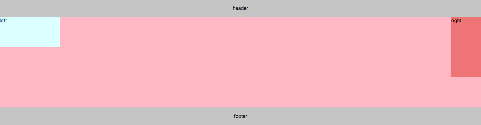
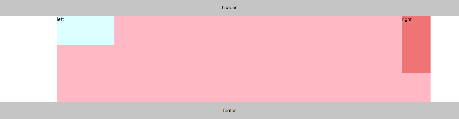
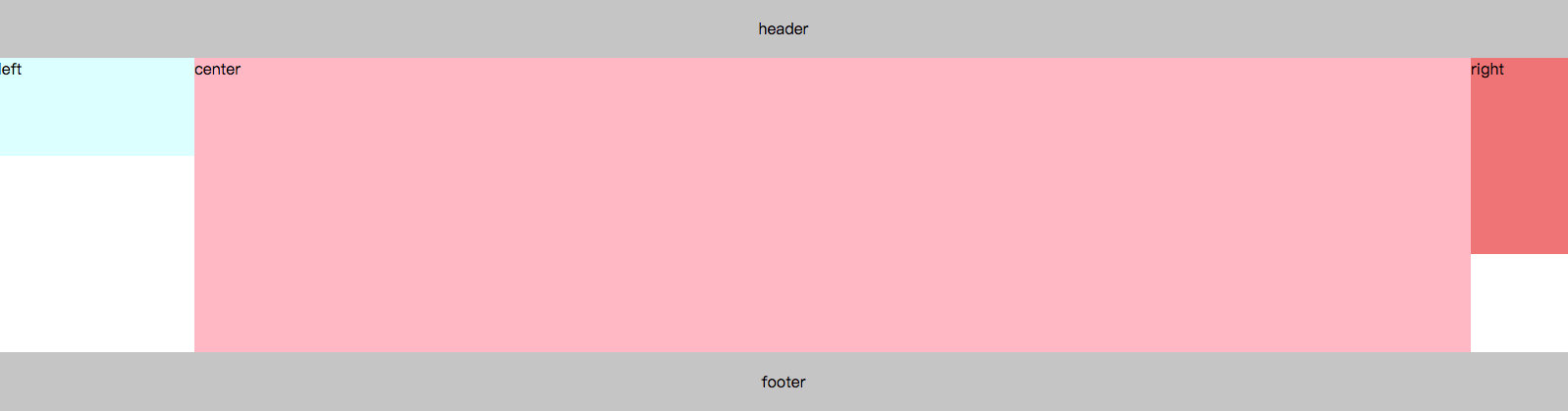
圣杯布局是经典的三栏布局,左右两栏固定宽度,中间自适应。
一、html结构
由于希望中间主体部分center先被加载,所以center写在left和right之前。
<header></header>
<main>
    <div class="center"></div>
    <div class="left"></div>
    <div class="right"></div>
</main>
<footer></footer>
二、样式部分
body {
    margin: 0;
}

header,
footer {
    background: #ccc;
    text-align: center;
    height: 60px;
    line-height: 60px;
}

main {
    /* BFC 使得footer部分不会受到中间部分浮动影响 */
    overflow: hidden;
    padding: 0 100px 0 200px;
}

.center,
.left,
.right {
    float: left;
}

.center {
    width: 100%;
    height: 300px;
    background-color: pink;
    /* margin: 0 100px 0 200px; */
}

.left {
    width: 200px;
    height: 100px;
    background-color: lightcyan;
    margin-left: -100%;
    position: relative;
    left: -200px;
}

.right {
    width: 100px;
    height: 200px;
    background-color: lightcoral;
    margin-left: -100px;
    position: relative;
    right: -100px;
}
步骤解析
1、设置.center、.left、.right三者浮动,float:left;
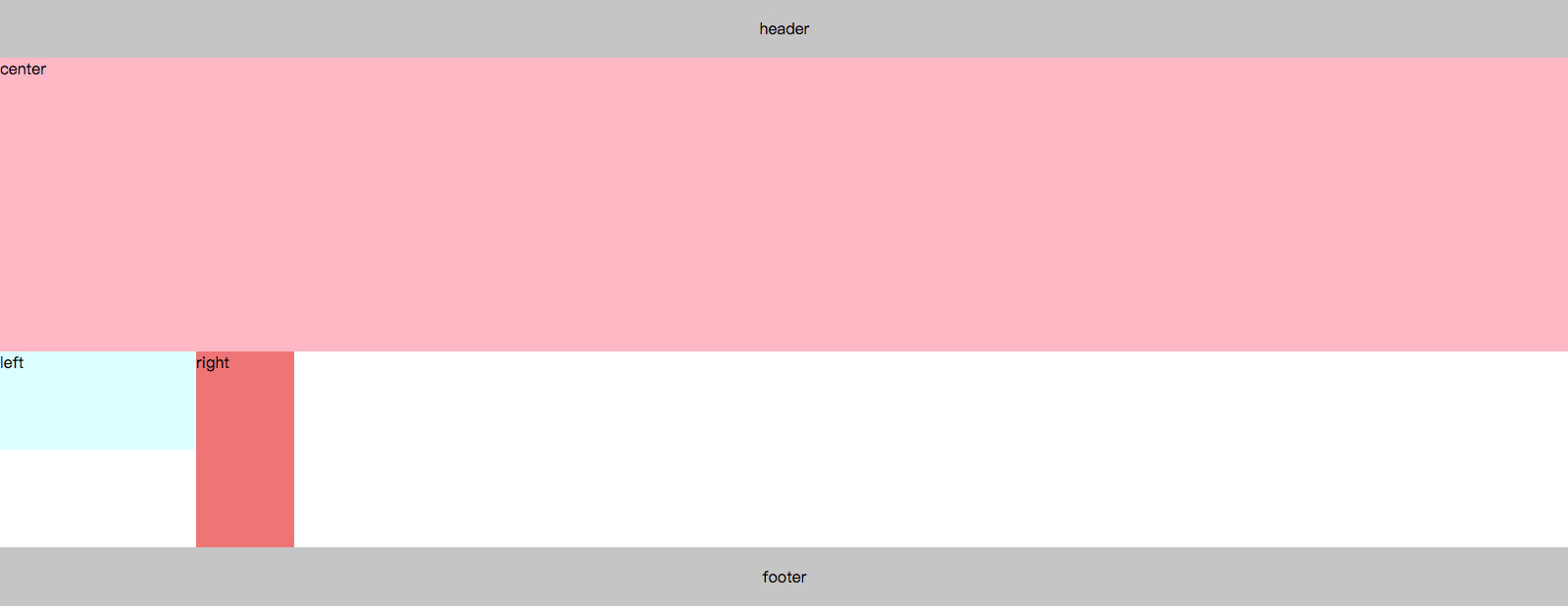
2、.left向左移动100%,即margin-left: -100%; .right向左移动负的自身宽度,即margin-left: -100px;
