

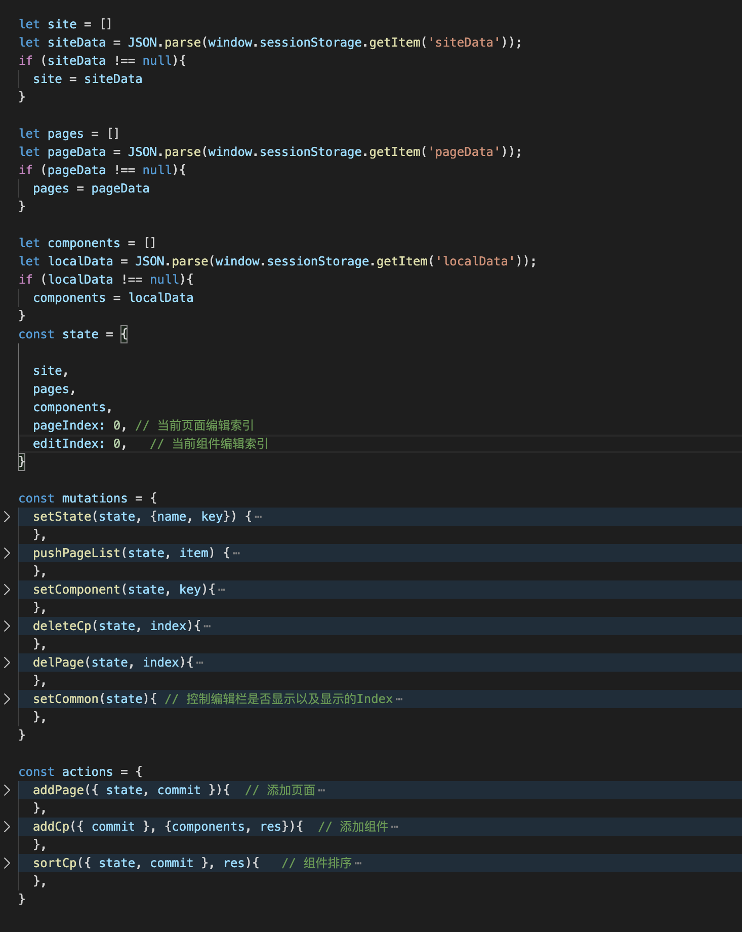
梳理dataJson数据流
页面生成后台主要是视图驱动模型,所以在开发开发第一步需要先定义好数据格式。
1、一个网站包含几个页面,一个页面包含几个组件。可以看出这是一个树形结构
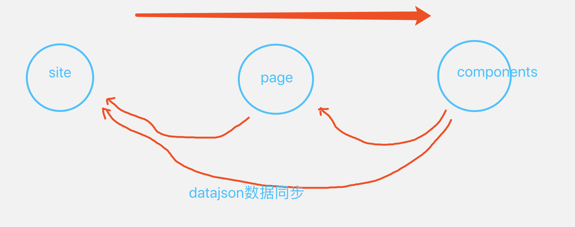
2、数据监听以及响应,项目中站点、页面以及组件三个概念的数据需要相互牵制并保持同步,网站数据填充是从顶层向下浸润,网站数据变动是从底层像顶层发布更新。数据流变动如下图所示:
3、编写datajson,分别理清site、page、以及components相关属性
用 JSON 格式可以把它表示成:
{
    "id":10,
    "name":"测试公司",
    "pages":[
        {
            "pgId":4,
            "name":"新建页面",
            "isIndex":1,
            "content":{
                "name":"新建页面",
                "background":"#F1E5E5"
            },
            "components":[
                {
                    "type":"0",
                    "name":"TextCom",
                    "desc":"文本",
                    "content":{
                        "text":"请输入文本内容发发发",
                    },
                    "style":{},
                    "event":{}
                },
            ]
        },
    ]
}
综上,一个网站可以完整的表示为一个树形 JSON。该树中包含了站点下所有页面和页面下所有组件内容和配置。
前置知识
Vue.Draggable
在动手实现编写页面和组件之前,需要了解vuedraggable作为前置知识
Draggable为基于Sortable.js的vue组件,用以实现拖拽功能。 对vuedraggable插件api还不熟悉的童鞋可以参考我的另一篇文章Vue.Draggable使用文档总结
开撸
项目准备
1、vue-cli
2、vuedraggable
3、sortablejs
4、vuex
5、element-ui或者antd-vue,可以自已选择ui框架
vue-cli是vue官方推荐的脚手架还很适合有vue基础的人使用。
在这个项目中由于用到了拖拽元素就为了方便就使用了vuedraggable,vuedraggable是基于sortablejs的封装所以也要引入。
由于组件中会存在大量的数据所以为了数据的统一管理,这里就使用了vuex。
element-ui/antd-vue这个我就不解释了,为了好看点就引入。
vuexjs 状态管理
组件分区
可以分为三块区域:
1、左侧——widget
2、中间——页面组件
3、右侧——编辑区
左侧可拖动的组件
左侧的可拖拽widgets被包裹在一组draggable拖拽组件中,要实现的效果是拖动左侧的widget到中间的页面生成区,所以两个draggable需要设置相同的group名称,需要注意的是左侧draggable只允许拖拽不允许拖放,pull时需要克隆一个元素在中间的draggable组件中。
    <draggable
        class="list-group"
        :list="list1"
        :group="{ name: 'widgets', put: false, pull: 'clone' }"
        v-bind="dragOptionsLeft"
      >
        <transition-group type="transition" :name="'flip-list'">
          <div
            class="dragType"
            id="dragItem"
            v-for="(element, index) in list1"
            :key="element.name + index"
            :type="element.type"
            :name="element.name"
            :desc="element.desc"
            :version='element.version'
          >
            <img
              :src="
                require(`../assets/img/decoration/${element.name.split('Com')[0]}Test.png`)
              "
              style="width:32px;height:32px;display:block;margin:auto;"
            />
            <p>{{ element.desc }}</p>
          </div>
        </transition-group>
      </draggable>
    ...
    data() {
        return {
            list1: [
                { name: "TextCom", type: 0, desc: "文本", version: "v1.0.0" },
                { name: "PicCom", type: 1, desc: "图片", version: "v1.0.0" },
                { name: "BtnCom", type: 2, desc: "按钮", version: "v1.0.0" },
            ]
        }
    },
    computed:{
        dragOptionsLeft() {
            return {
                animation: 300,           // 动画过渡时间
                ghostClass: "ghostLeft",  // 给影子单元添加一个class
                chosenClass: "chosen",    // 目标被选中时添加class
                dragClass: "drag"         // 目标被拖动时添加class
            };
        },
    },
中间的页面生成区
这个区域需要再包裹一个draggable拖放组件,用来接受从左侧拖放过来的widget,所以需要设置和左侧相同的group名称 注意这里用到了vue动态组件,相关概念不清楚可以区官方文档关于动态组件。
<template>
    <div :style="{background:pages[pageIndex].content.background}" class="phoneShow"> // 设置页面背景色
      <draggable
        class="list-group"
        :group="{ name: 'widgets' }"
        v-bind="dragOptionsMiddle"
        :emptyInsertThreshold="800"
        @add="onAdd"
        @sort="onSort"
      >
        <transition-group type="transition" :name="'flip-list'">
          <div
            v-for="(appUi,index) in components"
            :is="appUi.name"
            :content="appUi.content"
            :oStyle="appUi.style"
            :aIndex="index"
            @click.native="getIndex(index)"

            :key="appUi.content.code"></div>
        </transition-group>
      </draggable>
    </div>
    ...
</template>
<script>
import { mapState, mapMutations } from 'vuex';
import draggable from "vuedraggable";
import BtnCom from '@/components/Widgets/Btn.vue'  // 这里导入widget对应的组件
import TextCom from '@/components/Widgets/Text.vue'
import PicCom from '@/components/Widgets/Pic.vue'

export default {
  components: {draggable, BtnCom, TextCom, PicCom},
  computed: {
    ...mapState({
      pages: state=>state.site.pages,  // 页面
      pageIndex:state=>state.site.pageIndex,  // 激活的pageIndex
      components:state=>state.site.components, // 组件

    }),
    dragOptionsMiddle() {
      return {
        animation: 300,
        ghostClass: "ghost",         // 给影子单元添加一个class
        chosenClass: "chosenMiddle", // 目标被选中时添加class
        dragClass: "dragMiddle"      // 目标被拖动时添加class
      };
    },
  },
  methods: {
    onAdd (res) {
      this.$store.dispatch('site/addCp',{components: this.components,res: res})
    },
    getIndex(index){
      this.$store.commit('site/setCommon',{index: index, flag: true});

    },
    onSort(res){
      if (res.from === res.to){
        this.$store.dispatch('site/sortCp',res)
      }
    },
  }
}
</script>
右侧组件编辑区
  <div
    v-for="(appUi,index) in components"
    :is="appUi.name.split('Com')[0]+'Edit'"    // 根据component的name属性加载对应的edit组件
    :content="appUi.content"
    :oStyle="appUi.style"
    :editPartShow="appUi.editPartShow"
    :aIndex="index"
    :currentIndex="editIndex"
    :key="appUi.content.code"
    :activeTab="activeTab"
    @changeTab="toggleTab"
    >
  </div>
  ...
<script>
  import { mapState, mapMutations } from 'vuex';
  import BtnEdit from "@/components/Editors/BtnEdit.vue";   // 导入有三种widget的edit组件
  import TextEdit from "@/components/Editors/TextEdit.vue";
  import PicEdit from '@/components/Editors/PicEdit.vue'

  export default {
    name: 'BaseEdit',
    components: {
      BtnEdit,
      TextEdit,
      PicEdit
    },

    computed: {
      ...mapState({
        pages: state=>state.site.pages,
        pageIndex: state=>state.site.pageIndex,
        editIndex:state=>state.site.editIndex,
        components:state=>state.site.components,
        isComponent:state=>state.site.isComponent,
        activeTab: state=>state.site.activeTab
      })
    },
    methods: {
      handleInput(item, value) {
        this.setStyle(value+item.suffix, item.style)
      },
      setStyle(value, style){
        this.$set(this.components[this.editIndex].style, style, value);
      },
      toggleTab(name) {
        // this.activeName = name
        this.$store.commit('site/setActiveTab',name)
      }
    }
  }
</script>
接下里我们需要实现动态导入的widget组件以及widget对应的编辑组件实现,这里是实现页面生成的核心,需要widgetEdit组件控制widget组件,实现widget属性的联动,这里以Text组件为例:
TextCom组件
<template>
  <div class="widget">
    <div
      class="text-box ui-sortable relative textActive"
      :data-code="content.code"
      :class="[
        aIndex == editIndex ? 'active' : '',
      ]"
      :style="oStyle"
    >
      <p
        class="showtext"
        >
       {{ content.text }}
      </p>
    </div>

  </div>
</template>

<script>
import { mapState } from 'vuex'

export default {
name: 'TextCom',
  props: {
    content: Object,
    oStyle: Object,
    aIndex: Number
  },
  data(){
    return {
      delFlag: -1
    }
  },
  computed: {
    ...mapState({
      editIndex: state=>state.site.editIndex
    })
  },
  methods: {}
}
</script>
TexteEdit.vue
TexteEdit组件从父组件接受props参数oStyle作为填充的样式,属性的更改不能直接修改父组件,所以这里使用vue.$set方法直接设置vuex 中存储的当前widget组件字段。实现组件字段的动态响应。
<template>
  <div class="edit-wrapper" v-if="aIndex === currentIndex">
    <div class="text-edit" :data-code="content.code" v-if="activeTab==='first'" @click="handleTabChange('first')">
      <div class="input-area">
        <a-input
          type="textarea"
          :autoSize="{ minRows: 4, maxRows: 8 }"
          placeholder="请输入内容"
          v-model="content.text"
        ></a-input>
      </div>
      <!-- 字体样式设置 -->
      <div class="fontAttribute">
        <div class="firstLine">
          <ul class="fontSetting1">
            <li style="width:50px">  // 修改字体大小
              <a-dropdown>
                <span class="a-dropdown-link">
                  {{ oStyle["font-size"] }}
                  <a-icon type="down" />
                </span>
                <a-menu slot="overlay" @click="handleCommand">
                  <a-menu-item key="16px">16px</a-menu-item>
                  <a-menu-item key="14px">14px</a-menu-item>
                  <a-menu-item key="12px">12px</a-menu-item>
                  <a-menu-item key="10px">10px</a-menu-item>
                </a-menu>
              </a-dropdown>
            </li>
            <li @click="toggleAttrValue('font-weight', 'bold', 'normal')">  // 切换字体粗细
              <img src="../../assets/img/decoration/A3.png" alt />
            </li>
            <li @click="toggleAttrValue('font-style', 'italic', 'normal')">  // 切换字体斜体
              <img src="../../assets/img/decoration/A4.png" alt />
            </li>
          </ul>
          <ul class="fontSetting2">
            <li @click="toggleAttrValue('text-decoration', 'line-through', 'none')">  // 切换字体中划线
              <img src="../../assets/img/decoration/A5.png" alt />
            </li>
            <li @click="toggleAttrValue('text-decoration', 'underline', 'none')">  // 切换字体下划线
              <img src="../../assets/img/decoration/A6.png" alt />
            </li>
          </ul>
        </div>
      </div>
    </div>
    <div v-if="activeTab==='second'" @click="handleTabChange('second')">
      <!-- 边距样式设置 -->
      <div class="edgeSetting">
        <div>边距</div>
        <div class="edge">
          <span class="demonstration">上下边距</span>
          <a-slider
            :max="30"
            class="slider"
            :default-value="parseInt((oStyle['padding-top'] || '0px').split('px')[0])"
            @change="sliderTop"
          />
          <div class="edgeShow">{{ oStyle["padding-top"] }}</div>
        </div>
        <div class="edge">
          <span class="demonstration">左右边距</span>
          <a-slider
            :max="30"
            class="slider"
            :default-value="parseInt((oStyle['padding-left'] || '0px').split('px')[0])"
            @change="sliderLeft"
          />
          <div class="edgeShow">{{ oStyle["padding-left"] }}</div>
        </div>
      </div>
    </div>
  </div>
</template>
<script>
import { mapState } from 'vuex'

export default {
  name: 'TextEditor',
  props: {
    content: Object,
    oStyle: Object,
    aIndex: Number,
    currentIndex: Number,
    activeTab: String
  },
  data(){
    return {
      centered: require("../../assets/img/decoration/A9.png"),
      centeredChecked: require("../../assets/img/decoration/B9.png"),
    }
  },
  computed: {
    ...mapState({
      editIndex: state=>state.site.editIndex,
      components: state=>state.site.components,
    })
  },
  methods: {
    handleTabChange(name){
      this.$emit('changeTab', name)
    },
    handleCommand({ key }) {    // 字体大小
      this.setStyle(key, 'font-size')
    },
    toggleAttrValue(attr, value, antValue) {  // 切换字体属性
      let newVal
      if (this.oStyle[attr] == antValue){
        newVal = value
      }else {
        newVal = antValue
      }
      this.setStyle(newVal, attr)
    },
    sliderTop(value) {     // 上下边距
      this.setStyle(value+'px', 'padding-top')
      this.setStyle(value+'px', 'padding-bottom')
    },
    sliderLeft(value){   // 左右边距
      this.setStyle(value+'px', 'padding-left')
      this.setStyle(value+'px', 'padding-right')
    },
    setStyle(value, style){  // vue.$set方法直接设置vuex 中存储的当前widget组件字段
      this.$set(this.components[this.editIndex].style, style, value);
    },
  }
}
</script>
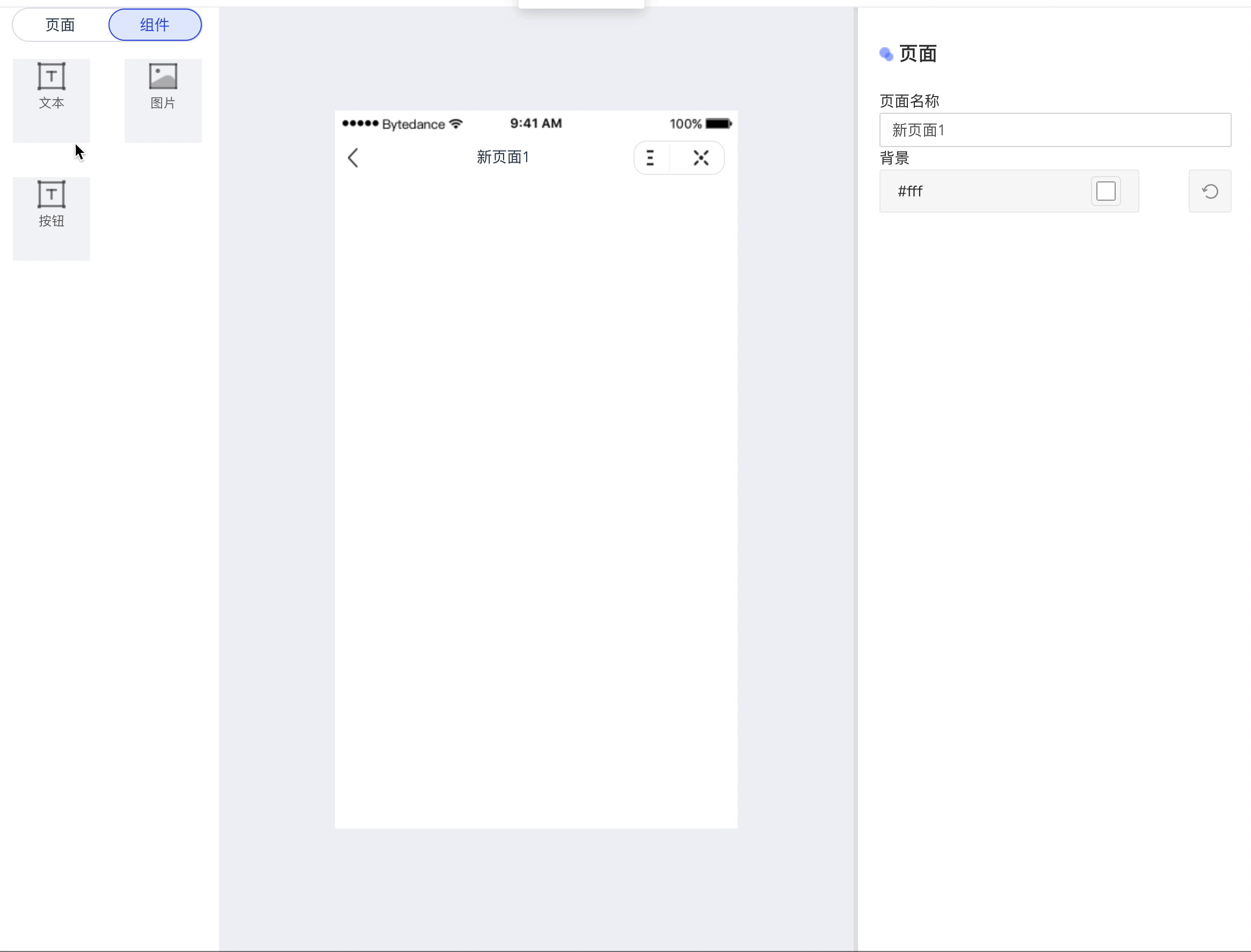
实现效果
总结
说一下编写组件的基本流程
1、左侧编辑区添加需要拖拽生成的widgets
2、vuex 添加组件创建时需要初始化的数据
3、写xxx.vue组件(在mainView视图中显示)
4、写xxxEdit.vue组件(组件的特有编辑器)
最后把源码附上 源码地址
