<!DOCTYPE html>
<html>
<head>
<meta charset="utf-8">
<meta name="viewport" content="width=device-width, initial-scale=1, maximum-scale=1, minimum-scale=1, user-scalable=no">
<title></title>
</head>
<style>
body {
padding: 2em;
text-align: center;
}
.block {
position: relative;
display: inline-block;
width: 10em;
height: 10em;
vertical-align: middle;
}
.block_content {
position: absolute;
top: 0;
left: 0;
width: 100%;
height: 100%;
text-align: center;
line-height: 10em;
background:
color:
}
.block_hoverer {
position: absolute;
width: 100%;
height: 100%;
z-index: 1;
opacity: 0;
transition: all 0.3s ease;
}
.block_hoverer:nth-child(1) {
background: red;
top: -90%;
}
.block_hoverer:nth-child(2) {
background: lime;
top: 90%;
}
.block_hoverer:nth-child(3) {
background: orange;
left: -90%;
}
.block_hoverer:nth-child(4) {
background: blue;
left: 90%;
}
.block_hoverer:hover {
opacity: 1;
top: 0;
left: 0;
}
</style>
<body>
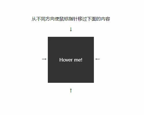
<p class="text">从不同方向使鼠标指针移过下面的内容</p>
<p>↓</p>
<span>→ </span>
<div class="block">
<div class="block_hoverer">上</div>
<div class="block_hoverer">下</div>
<div class="block_hoverer">左</div>
<div class="block_hoverer">右</div>
<div class="block_content">
Hover me!
</div>
</div>
<span> ←</span>
<p>↑</p>
</body>
<script>
</script>
</html>


