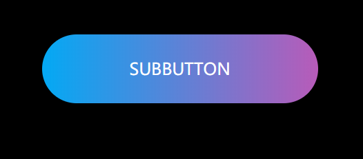
1.基本样式搭建
第一步当然是写一个<a><a/>标签
<a href="javascript:;">subbutton</a>第二部写一些基本的样式,例如去除浏览器的padding和margin,再给body来个背景颜色
*{
margin: 0;
padding: 0;
}

body{
background:#000;
}

a{
text-decoration: none;
position: absolute;
left: 50%;
top: 50%;
transform: translate(-50%,-50%);
font-size: 24px;
background: linear-gradient(90deg,#03a9f4,#f441a5,#ffeb3b,#03a9f4);
width: 400px;
background-size: 400%;
height: 100px;
line-height: 100px;
text-align: center;
color: #fff;
text-transform: uppercase;
border-radius: 50px;
z-index: 1;
}
2.流光按钮制作
    a:hover{
animation: sun 8s infinite;
}

@keyframes sun{
100%{
background-position: -400% 0;
}
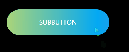
动态效果出来了
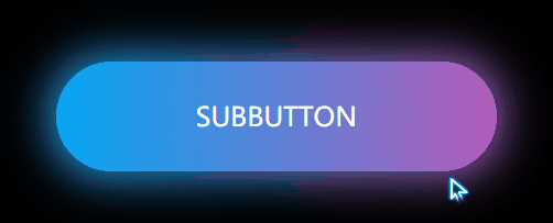
3.炫酷的发光图层
a::before{
content: "";
position:absolute;
left: -5px;
right: -5px;
top: -5px;
bottom: -5px;
background: linear-gradient(90deg,#03a9f4,#f441a5,#ffeb3b,#03a9f4);
background-size: 400%;
border-radius: 50px;
filter: blur(20px);
z-index: -1;
}


a:hover::before{
animation: sun 8s infinite;
}