

文字超出部分以省略号形式显示
- 单行
overflow: hidden;
text-overflow:ellipsis;
white-space: nowrap;
- 多行
如果未换行,需要设置word-break:break-all
display: -webkit-box;
-webkit-box-orient: vertical;
-webkit-line-clamp: 3;
overflow: hidden;
文字超出横向滚动显示
a. css
.animate {
  display: inline-block;
  animation: 25s textScroll linear infinite normal;
}
@keyframes textScroll {
  0% {
    transform: translateX(0);
    -webkit-transform: translateX(0);
  }
  100% {
    transform: translateX(-100%);
    -webkit-transform: translateX(-100%);
  }
}
@-webkit-keyframes textScroll {
  0% {
    transform: translateX(0);
    -webkit-transform: translateX(0);
  }
  100% {
    transform: translateX(-100%);
    -webkit-transform: translateX(-100%);
  }
}
b. html
<p class="animate">
  一段文字一段文字一段文字一段文字一段文字一段文字一段文字一段文字一段文字一段文字一段文字一段文字
</p>
flex
- 设置flex:1
.father {
  width: 1000px;
  .children {
    flex:1 ; // 假设children有5个,则每个children的宽度为1000px / 4 = 200px
  }
}
绘制三角形
- 向右的三角形
.play{
    height: 20px;
    border-width:10px 0 10px 20px;
    border-style:solid;s
    border-color:transparent transparent transparent #fff;
}
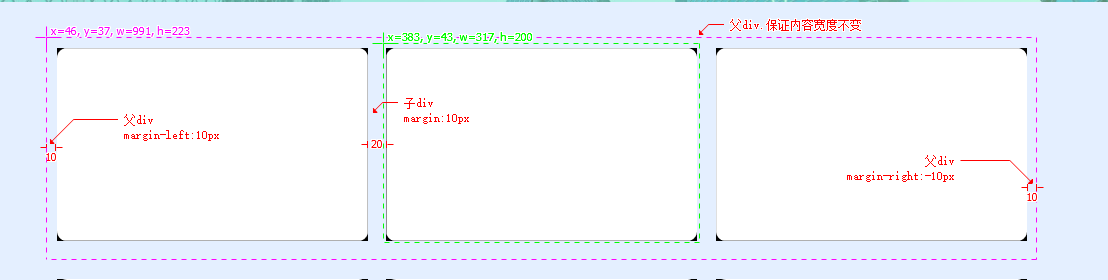
父div在整体框架中居中,子div均分间距
以下为子div宽度:31%间距:20px;父div宽度:1000px显示效果
cursor图标图片
.cursorPen{
  cursor: url('../../assets/img/mouse_clear.png'), auto;
}
background
body
  {
  background: #00FF00 url(bgimage.gif) no-repeat fixed top;
  }
渐变色CSS linear-gradient() 函数
background:linear-gradient(to right, #08DE80, #F8DC1E)
文字间距
.spacing5px
{
  text-indent: 5px; //缩进了5px(距离开头)
  letter-spacing: 5px;//字间距为5px
}
滚动条
教程
/* 定义滚动条 */
//  滚动条整体部分
::-webkit-scrollbar {
  width: 15px;//竖向滚动条宽度
  height: 15px;//横向滚动条高度
}
// 滚动条里面的小方块,能向上向下移动(或往左往右移动,取决于是垂直滚动条还是水平滚动条
::-webkit-scrollbar-thumb {
  background: #aaa;
  min-width: 1.5rem;
  border-radius:@border-radius-large;
  //   background-color: #0ae;
  //   background-image: -webkit-gradient(
  //     linear,
  //     0 0,
  //     0 100%,
  //     color-stop(0.5, rgba(255, 255, 255, 0.2)),
  //     color-stop(0.5, transparent),
  //     to(transparent)
  //   );
}
::-webkit-scrollbar-thumb:vertical:hover {
  background: #555555;
}
::-webkit-scrollbar-thumb:horizontal:hover {
  background: #555555;
}
// 滚动条的轨道(里面装有Thumb)
// ::-webkit-scrollbar-track
// {
//     -webkit-box-shadow: inset 0 0 6px rgba(0,0,0,0.3);
//     border-radius: @border-radius-large;
//     background-color: #F5F5F5;
// }
// 滚动条的轨道的两端按钮,允许通过点击微调小方块的位置。
// ::-webkit-scrollbar-button {
//   width: 0.1rem;
//   height: 0.2rem;
//   background: aquamarine;
// }
// 内层轨道,滚动条中间部分(除去)
::-webkit-scrollbar-track-piece {
  background-color: #eee;
  border-radius: @border-radius-middle;
}
// ::-webkit-scrollbar-corner 边角,即两个滚动条的交汇处
// :-webkit-resizer 两个滚动条的交汇处上用于通过拖动调整元素大小的小控件
使用案例
/* 定义滚动条 */
//  滚动条整体部分
::-webkit-scrollbar {
  width: 15px;
  height: 15px;
}
// 滚动条里面的小方块,能向上向下移动(或往左往右移动,取决于是垂直滚动条还是水平滚动条
::-webkit-scrollbar-thumb {
  background: #aaa;
  min-width: 150px;
  border-radius: 10px;
}
::-webkit-scrollbar-thumb:vertical:hover {
  background: #555;
}
::-webkit-scrollbar-thumb:horizontal:hover {
  background: #555;
}
// 内层轨道,滚动条中间部分(除去)
::-webkit-scrollbar-track-piece {
  background-color: transparent;
  border-radius: 10px;
}
