tab面板在app中经常会用到,下面记录一下在flutter中tab面板的写法
这个tabbar的功能自动就可以滑动预览了,非常方便
1、tab面板的组成部分为三个
a、DefaultTabController,是tab面板最外层包裹的widget
DefaultTabController(
    length: 3,
)// 这个是tab的数量
b、TabBar,是tab面板的切换标题部分
TabBar可以配置下划线样式,tab字体颜色等,其他更多配置参考文档
unselectedLabelColor: Colors.black12, // 没有选中时候的颜色
indicatorColor: Colors.black87, // tab下划线的颜色
indicatorSize: TabBarIndicatorSize.label, //下划线是整个tab还是tab里面的文字
indicatorWeight: 2.0, // 下划线的大小
TabBar(
unselectedLabelColor: Colors.black12,
indicatorColor: Colors.black87,
indicatorSize: TabBarIndicatorSize.label,
indicatorWeight: 2.0,
tabs: <Widget> [
Tab(icon: Icon(Icons.send)),
Tab(icon: Icon(Icons.sentiment_neutral)),
Tab(icon: Icon(Icons.security))
]
),
c、TabBarView,是tab面板主体内容
TabBarView(
  children: <Widget>[
    Icon(Icons.send, size: 128, color: Colors.black12),
    Icon(Icons.sentiment_neutral, size: 128, color: Colors.black12),
    Icon(Icons.security, size: 128, color: Colors.black12)
  ]
),
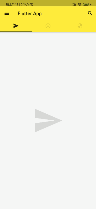
页面代码
class Home extends StatelessWidget {
@override
Widget build(BuildContext context) {
return DefaultTabController(
length: 3,
child: Scaffold(
backgroundColor: Colors.grey[100],
appBar: AppBar(
leading: IconButton(
icon: Icon(Icons.menu),
tooltip: 'Navigation',
onPressed: () => print('onpress menu')
),
title: Text('Flutter App'),
actions: <Widget>[
IconButton(
icon: Icon(Icons.search),
onPressed: () => print('onpress search')
)
],
bottom: TabBar(
unselectedLabelColor: Colors.black12,
indicatorColor: Colors.black87,
indicatorSize: TabBarIndicatorSize.label,
indicatorWeight: 2.0,
tabs: <Widget> [
Tab(icon: Icon(Icons.send)),
Tab(icon: Icon(Icons.sentiment_neutral)),
Tab(icon: Icon(Icons.security))
]
),
),
body: TabBarView(
children: <Widget>[
Icon(Icons.send, size: 128, color: Colors.black12),
Icon(Icons.sentiment_neutral, size: 128, color: Colors.black12),
Icon(Icons.security, size: 128, color: Colors.black12)
]
),
)
);
}
}


