

flex有两个重要的东西,弹性容器、弹性盒子
01 弹性容器通过display:flex指定,它里面的盒子就变成了弹性盒子
align-items
标记弹性布局里的元素在侧轴(也就是与flex-direction垂直的轴)
- stretch(默认),元素进行抻拉来填满,如果盒子有指定大小,那么以指定的大小为准。
- center,元素会布局在容器侧轴的中间位置。
- flex-start,元素位于容器的开头。
- flex-end,元素位于容器的结尾。
- baseline,元素位于第一行文本的基准线位置,这里要注意是第一行的文本,而不是第一个元素。
.tt-search > .tt-search-form{
    display: flex;
    height: 2.3rem;
    align-items:center;
}
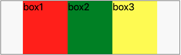
justify-content
定义主轴上元素的排列方式,受“flex-direction”影响 flex-start 默认
flex-end
center
space-between
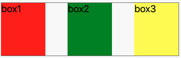
space-around
flex-wrap
指定弹性盒子里的元素换行方式 nowrap:不换行,如果元素总宽度超过容器宽度,就会根据 flex-shrink 属性指定的方式进行压缩。 wrap:自动进行折行。 no-wrap:折行,但是这种折行方式比较特殊,折出来的多行是从下向上排列的
/* 网格组件 */
.tt-grid{
    display: flex;
    flex-wrap: wrap;
}
/* 网格中的格子 */
.tt-grid > .tt-grid-item{
    position: relative;
    flex: 1 1 33%;
    border-right: 1px solid #ddd;
}
/* 默认是3列 */
.tt-grid .tt-grid-item:nth-child(3n){
    border-right: none;
}
02 弹性盒子有特点:
- 弹性容器的默认宽度是 100%,和块级元素一样。
- 横向布局的弹性盒子里的块级元素不再占用一整行,而是像 float 元素一样按一个方向排列。
- 弹性盒子可以伸展,也可以压缩,尺寸可以随着容器大小而变化。
- 多个弹性盒子的排布顺序、对齐方式等都是可以设置的。
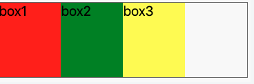
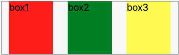
flex-grow
指定拉伸方式默认值0,即不占用空闲区域,非0数字时,会拉伸。具体拉伸多少,要看有多少个需要拉伸的对象
/* CSS */
.flex-box{
    display: flex;
}
.flex-box > .box{
    width: 50px;  //整个屏幕是 300px宽,所以会有 150px 的空白区域
    height: 100px;
}
.flex-box > .box1{
    flex-grow: 1;  // 分得3/1
    background: red;
}
.flex-box > .box2{ // 不拉伸
    background: green;
}
.flex-box > .box3{
    flex-grow: 2; // 分得3/2
    background: yellow;
}
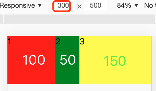
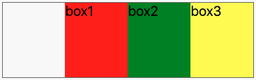
flex-shrink
指定收缩方式,默认值1,即所有盒子平分
/* CSS */
.flex-box{
    display: flex;
}
.flex-box > .box{
    width: 150px;  // 每个150px宽,容器300px,多出150px
    height: 100px;
}
.flex-box > .box1{
    flex-shrink: 1;  // 收缩3/1
    background: red;
}
.flex-box > .box2{
    flex-shrink: 0;  // 不收缩
    background: green;
}
.flex-box > .box3{
    flex-shrink: 2;  // 收缩3/2
    background: yellow;
}
flex-basis
指定弹性盒子的基准宽度,作用可width类似,优先级高于width
flex
flex:
当不指定flex值时,默认的就是“flex: 0 1 auto;”
flex的值为none时,表示的意思是“flex: 0 0 auto;” 不伸展也不收缩
flex值为auto时,表示的意思是“flex: 1 1 auto;” 即伸展又收审
flex值为1(也可以是其他非0数值)时,表示的意思是“flex: 1 1 0;” 平分
flex-direction
指定方向 “row” 默认 左到右 “row-reverse” 右到左 “column” 上到下 “column-reverse” 下到上
实例

/* 头部导航条 */
.tt-header{
+   display: flex;
    position: fixed;
    box-sizing: border-box;
    width: 100%;
}
/* 左侧功能区 */
.tt-header > .left{
    flex-basis: 3rem;
    text-align: center;
    flex-shrink: 0;
}
/* 中间标题部分 */
.tt-header > .title{
    flex-grow: 1;
    overflow: hidden;
    white-space: nowrap;
    text-overflow: ellipsis;
}
/* 右侧功能区 */
.tt-header > .right{
    flex-basis: 3rem;
    flex-shrink: 0;
}
