

前言
做业务遇到的一些坑,总结的一些方案希望能帮助到你
下面我将从一些我尝试过的方案讲起,遇到的哪些坑,想要我觉得最好的方案直接跳到最后拿取
所用代码非小程序原生代码,为mpx代码,有vue和小程序基础无障碍阅读代码
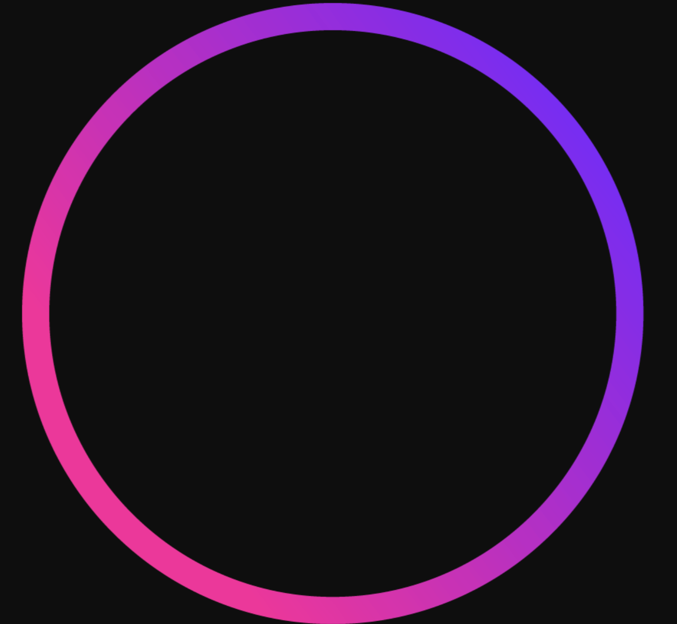
需求
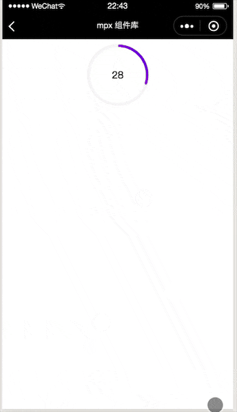
看似实现一个倒计时的圆环,想实现这个能想到几个属性吧
- 灰色的底环
- 移动的彩色环
- 时间,根据倒计时移动彩色环
- 中间的部分可以展示一些内容
- 更细节的是彩色圆环的头部是有圆角的
canvas
这个其实是简化后的需求版本,之前的需求还要恶心一些,灰色底环和彩色的环粗细不一致,所以我第一想到的是canvas版本,canvas可以画的更自由,彩色环的圆角也比较好实现,但是不辛的是这个方案被pass的原因是模拟器上移动屏幕还在原位置,遮罩层盖不住canvas,真机上直接崩溃或者不展示,我想可能是因为高频率的画canvas,我们手机的gpu受不了了,总之这个方法不要轻易尝试
css&animation
animation主要运用了css3的keyframes&animation来实现,主要原理: 左右两个容器,两个半圆,通过容器的overflow:hidden,以及半圆的旋转
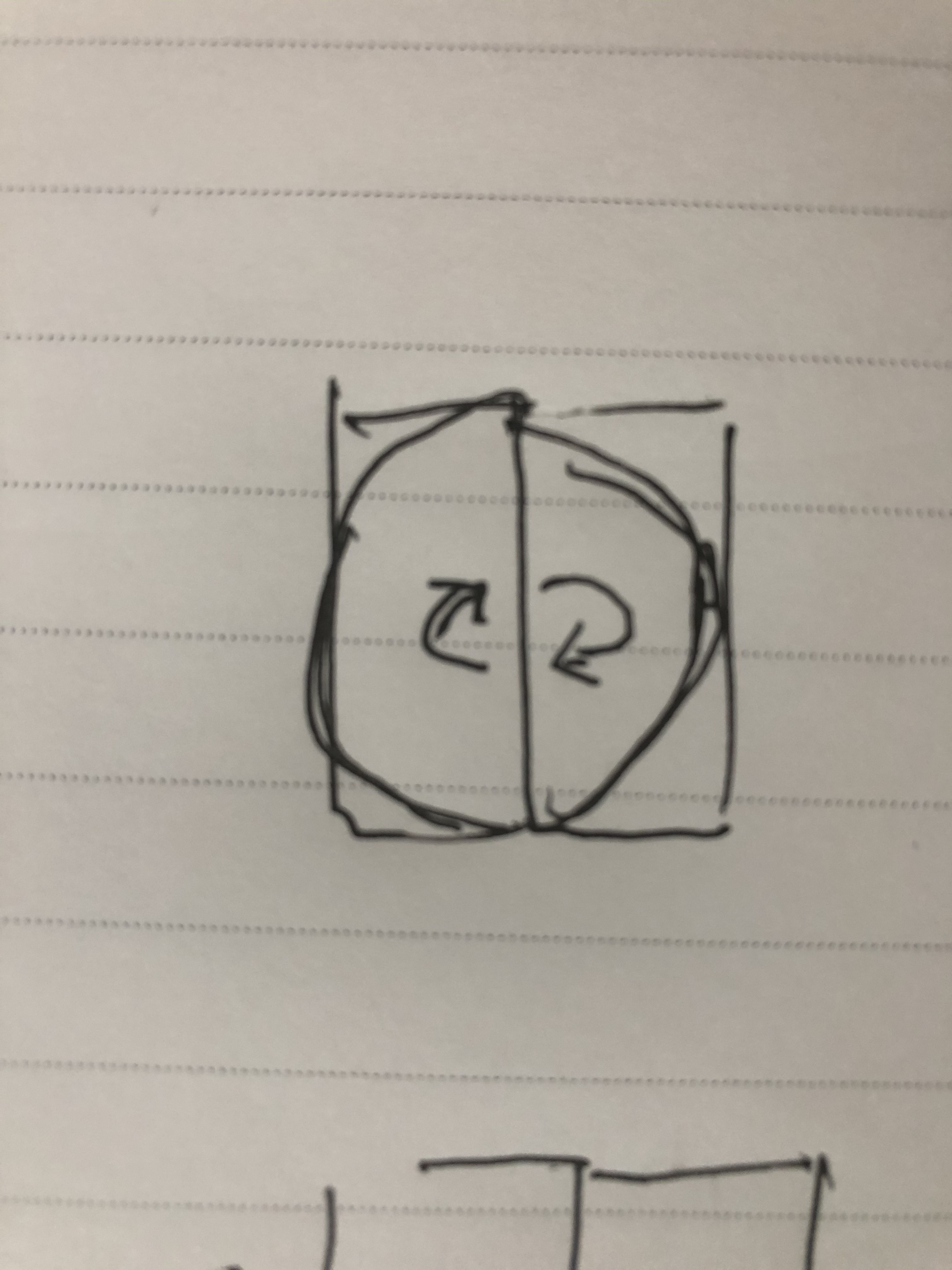
这种也存在一些问题,比如无法初始化,只能从头走到尾,如果想从圆的某一位置开始旋转是无法满足的,以下是animation源码
<template>
  <view class="circle-countdown-wrapper">
    <view class="circle-countdown-box" style="{{boxStyle}}">
      <view class="left-box" style="{{subBoxStyle}}">
        <view class="left-item" style="{{leftItemStyle}}">
        </view>
      </view>
      <view class="right-box" style="{{subBoxStyle}}">
        <view class="right-item" style="{{rightItemStyle}}">
        </view>
      </view>
      <view class="circle-mask" style="{{circleMaskStyle}}">
        <slot></slot>
      </view>
      <view class="dot-mask" style="{{dotMaskStyle}}" wx:if="{{hasDot}}">
        <view class="dot" style="{{dotStyle}}"></view>
      </view>
    </view>
  </view>
</template>

<script>
  import {createComponent} from '@mpxjs/core'
  createComponent({
    properties: {
      boxWidth: {
        type: Number,
        value: 24
      },
      boxHeight: {
        type: Number,
        value: 24
      },
      boxBgColor: {
        type: String,
        value: ''
      },
      hasDot: {
        type: Boolean,
        value: false
      },
      progressLineWidth: {
        type: Number,
        value: 1
      },
      progressLineColor: {
        type: String,
        value: '#FF8449'
      },
      bgColor: {
        type: String,
        value: '#FFF1EA'
      },
      dotBgColor: {
        type: String,
        value: 'red'
      },
      dotWidth: {
        type: Number,
        value: 4
      },
      dotHeight: {
        type: Number,
        value: 4
      },
      timeCount: {
        type: Number,
        value: 10
      },
      dir: {
        type: String,
        value: 'z'
      }
    },
    computed: {
      boxStyle() {
        return `width: ${this.boxWidth}px;height: ${this.boxHeight}px;background-color:${this.boxBgColor};`
      },
      subBoxStyle() {
        return `width: ${this.boxWidth / 2}px;height: ${this.boxHeight}px;`
      },
      leftItemStyle() {
        return `border-top-left-radius: ${this.boxWidth / 2}px;border-bottom-left-radius: ${this.boxHeight / 2}px;background-color:${this.progressLineColor};animation: loading-left-${this.dir} ${this.timeCount}s linear infinite;`
      },
      rightItemStyle() {
        return `border-top-right-radius: ${this.boxWidth / 2}px;border-bottom-right-radius: ${this.boxHeight / 2}px;background-color:${this.progressLineColor};animation: loading-right-${this.dir} ${this.timeCount}s linear infinite;`
      },
      circleMaskStyle() {
        return `top: ${this.progressLineWidth}px;left: ${this.progressLineWidth}px;right: ${this.progressLineWidth}px;bottom: ${this.progressLineWidth}px;background-color:${this.bgColor};`
      },
      dotStyle() {
        return `width: ${this.dotWidth}px;height: ${this.dotHeight}px;background-color:${this.dotBgColor};margin-top:-${this.dotHeight / 2}px`
      },
      dotMaskStyle() {
        return `animation: dot-mask ${this.timeCount}s linear infinite;`
      }
    }
  })
</script>

<style lang="stylus">
.circle-countdown-wrapper
  .circle-countdown-box
    position: relative
    border-radius: 50%
    .left-box, .right-box
      position: absolute
      top: 0
      overflow: hidden
      z-index: 1
    .left-box
      left: 0
    .right-box
      right: 0
    .left-item,.right-item
      width: 100%
      height: 100%
    .left-item
      transform-origin: right center
    .right-item
      transform-origin: left center
    .circle-mask
      position: absolute
      z-index: 2
      border-radius: 50%
    .dot-mask
      position relative
      z-index: 3
      border-radius: 50%
      width: 100%
      height: 100%
      .dot
        position absolute
        left 50%
        transform translateX(-50%)
        margin 0 auto
        border-radius: 50%
    @-webkit-keyframes loading-left-z{
        0%{
            -webkit-transform: rotate(0deg)
        }
        50%{
            -webkit-transform: rotate(0deg)
        }
        100%{
            -webkit-transform: rotate(180deg)
        }
    }
    @-webkit-keyframes loading-left-f{
        0%{
          -webkit-transform: rotate(-180deg)
        }
        50%{
          -webkit-transform: rotate(-180deg)
        }
        100%{
          -webkit-transform: rotate(0deg)
        }
    }
    @-webkit-keyframes loading-right-z{
        0%{
          -webkit-transform: rotate(0deg)
        }
        50%{
          -webkit-transform: rotate(180deg)
        }
        100%{
          -webkit-transform: rotate(180deg)
        }
    }
    @-webkit-keyframes loading-right-f{
         0%{
            -webkit-transform: rotate(-180deg)
        }
        50%{
            -webkit-transform: rotate(0deg)
        }
        100%{
            -webkit-transform: rotate(0deg)
        }
    }
    @-webkit-keyframes dot-mask{
        0%{
            -webkit-transform: rotate(0deg)
        }
        50%{
            -webkit-transform: rotate(180deg)
        }
        100%{
            -webkit-transform: rotate(360deg)
        }
    }
</style>

<script type="application/json">
  {
    "component": true
  }
</script>
css&transform(最终方案)
最终选择transfrom&transition的方案,基本上满足了上诉问题的需求,圆角需要三张图片的配合
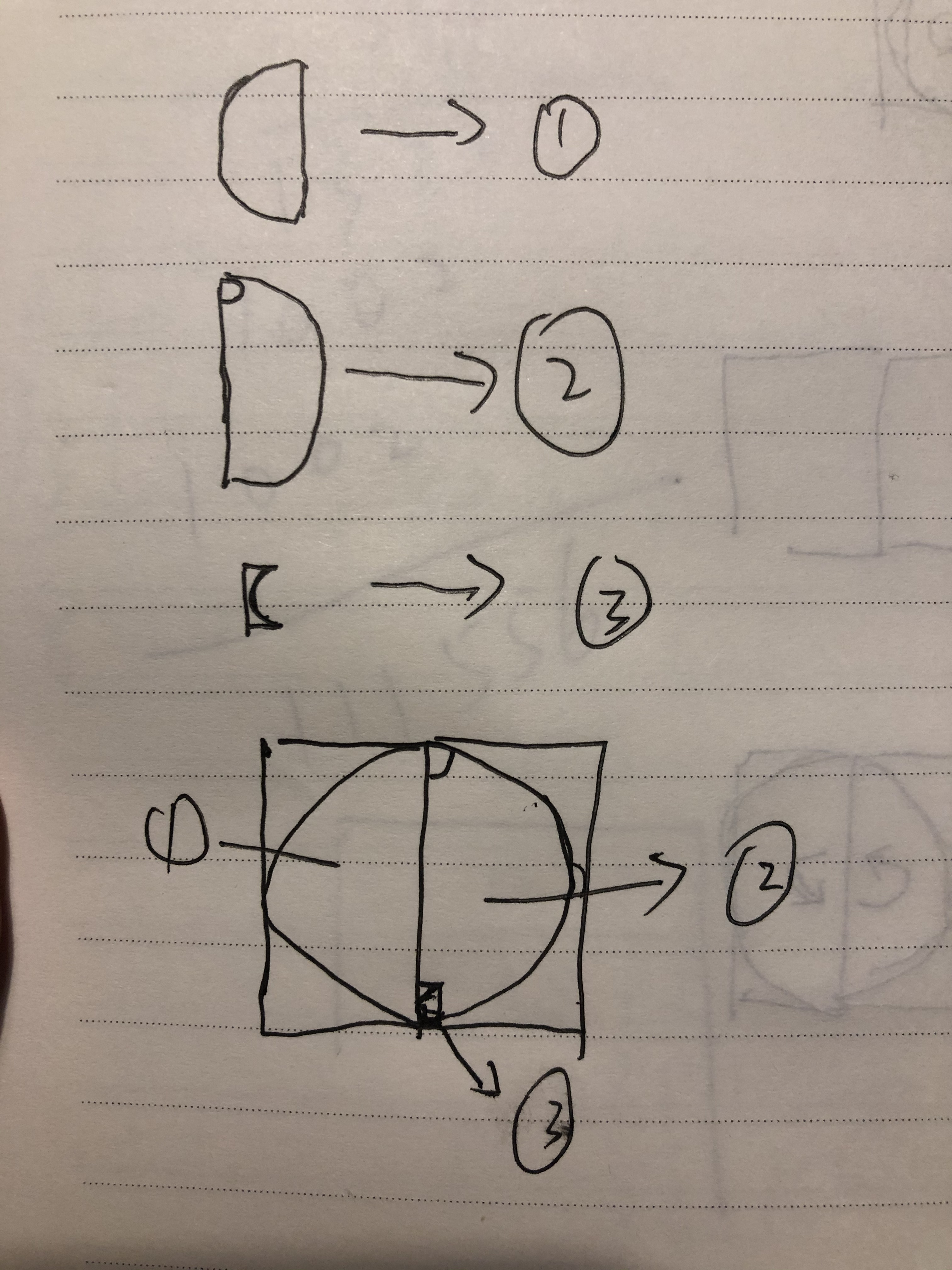
然后盖在第四张图片
最后让右左半圆以此旋转起来就ok了
最后上代码 替换下自己的图片就可以了
<template>
  <view wx:if="{{show}}" class="circle-countdown-wrapper">
    <view class="circle-countdown-box" style="{{boxStyle}}">
      <view class="left-box" style="{{subBoxStyle}}">
        <view class="left-item" style="{{leftItemStyle}}">
          <image style="width:100%;height:100%;" src="https://s1.ax1x.com/2020/04/15/JPnrAx.png" mode="widthFix" />
          <view class="hack-circle-left">
          </view>
        </view>
      </view>
      <view class="right-box" style="{{subBoxStyle}}">
        <view class="hack-circle-right">
        </view>
        <view class="right-item" style="{{rightItemStyle}}">
          <image style="width:100%;height:100%;" src="https://s1.ax1x.com/2020/04/15/JPnsN6.png" mode="widthFix" />
        </view>
      </view>
      <view class="circle-mask" style="{{circleMaskStyle}}">
        <view>
          {{initialTimeCount}}
        </view>
        <slot></slot>
      </view>
      <view class="hack-layer">
      </view>
    </view>
  </view>
</template>

<script>
  import {createComponent} from '@mpxjs/core'
  createComponent({
    data: {
      leftItemStyle: '',
      rightItemStyle: '',
      timer: null,
      count: 0,
      show: true
    },
    properties: {
      boxWidth: {
        type: Number,
        value: 24
      },
      boxHeight: {
        type: Number,
        value: 24
      },
      boxBgColor: {
        type: String,
        value: ''
      },
      progressLineWidth: {
        type: Number,
        value: 1
      },
      progressLineColor: {
        type: String,
        value: '#F7F7F7'
      },
      bgColor: {
        type: String,
        value: '#FFFFFF'
      },
      timeCount: {
        type: Number,
        value: 10
      },
      initialTimeCount: {
        type: Number,
        value: 1
      }
    },
    attached() {
      this.init()
      this.start()
    },
    pageShow() {
      this.show = true
      if (this.count > 0) {
        this.init()
        this.start()
      }
      this.count += 1
    },
    pageHide() {
      this.show = false
    },
    clear() {
      this.leftItemStyle = ''
      this.rightItemStyle = ''
    },
    detached () {
      clearTimeout(this.timer)
    },
    computed: {
      boxStyle() {
        return `width: ${this.boxWidth}px;height: ${this.boxHeight}px;background-color:${this.boxBgColor};`
      },
      subBoxStyle() {
        return `width: ${this.boxWidth / 2}px;height: ${this.boxHeight}px;`
      },
      circleMaskStyle() {
        return `top: ${this.progressLineWidth}px;left: ${this.progressLineWidth}px;right: ${this.progressLineWidth}px;bottom: ${this.progressLineWidth}px;background-color: ${this.bgColor};`
      }
    },
    methods: {
      init () {
        const {
          topRadius,
          bottomRadius,
          rightData,
          leftData
        } = this.computedData()
        this.leftItemStyle = `transform: rotate(${leftData.deg}deg);
                              transition: transform ${leftData.dur}s linear ${leftData.delay}s;`
        this.rightItemStyle = `transform: rotate(${rightData.deg}deg);
                              transition: transform ${rightData.dur}s linear;`
        console.log(this.leftItemStyle)
        console.log(this.rightItemStyle)
      },
      start () {
        this.timer = setTimeout(() => {
          this.leftItemStyle = this.leftItemStyle + 'transform: rotate(180deg);'
          this.rightItemStyle = this.rightItemStyle + 'transform: rotate(180deg);'
        }, 1000)
      },
      computedData () {
        const topRadius = this.boxWidth / 2
        const bottomRadius = this.boxHeight / 2
        const halfTimeCount = this.timeCount / 2
        let leftData = {}
        let rightData = {}
        if (this.initialTimeCount - halfTimeCount < 0) {
          leftData = {
            deg: 0,
            dur: halfTimeCount,
            delay: halfTimeCount - this.initialTimeCount
          }
          rightData = {
            deg: this.initialTimeCount / halfTimeCount * 180,
            dur: halfTimeCount - this.initialTimeCount,
            delay: 0
          }
        } else if (this.initialTimeCount - halfTimeCount > 0) {
          leftData = {
            deg: (this.initialTimeCount - halfTimeCount) / halfTimeCount * 180,
            dur: this.timeCount - this.initialTimeCount,
            delay: 0
          }
          rightData = {
            deg: 180,
            dur: halfTimeCount,
            delay: 0
          }
        } else {
          leftData = {
            deg: 0,
            dur: halfTimeCount,
            delay: 0
          }
          rightData = {
            deg: 180,
            dur: halfTimeCount,
            delay: 0
          }
        }
        return {
          topRadius,
          bottomRadius,
          rightData,
          leftData
        }
      }
    }
  })
</script>

<style lang="stylus">
.circle-countdown-wrapper
  margin 8px 0
  justify-content center
  display flex
  .circle-countdown-box
    position: relative
    border-radius: 50%
    .hack-circle-left
      width 4.5px
      height 4.5px
      background url('https://s1.ax1x.com/2020/04/15/JPnBH1.png') no-repeat
      background-size contain
      position absolute
      transform rotate(180deg)
      left -4.5px
      top 0px
    .hack-circle-right
      width 4.5px
      height 4.5px
      background url('https://s1.ax1x.com/2020/04/15/JPnBH1.png') no-repeat
      background-size contain
      position absolute
      left 0px
      top 0px
    .left-box, .right-box
      position: absolute
      top: 0
      overflow: hidden
      z-index: 1
    .left-box
      transform rotate(180deg)
      left: 0px
    .right-box
      right: 0px
    .left-item,.right-item
      width: 100%
      height: 100%
    .left-item
      transform-origin: left center
    .right-item
      transform-origin: left center
    .circle-mask
      position: absolute
      z-index: 2
      border-radius: 50%
      display flex
      justify-content center
      align-items center
    .hack-layer
      background url('https://s1.ax1x.com/2020/04/15/JPny4K.png') no-repeat
      background-size cover
      position absolute
      width 100px
      height 100px
      border-radius 50%
      left 50%
      margin-left -50px
      top 50%
      margin-top -50px
    .hack-layer-inner
      background #f7f7f7
      position absolute
      width 92px
      height 92px
      border-radius 50%
      left 50%
      margin-left -46px
      top 50%
      margin-top -46px
</style>

<script type="application/json">
  {
    "component": true
  }
</script>
微信进入后台bug
为什么要加pageShow和pageHide是因为当微信切入后台,gpu暂停,动画未执行的就不执行了,这点也是上线之后才发现,所以在pageShow和pageHide的时候进行了根据当前初始值重启操作。
