定位
布局的核心:css摆放盒子的位置
定位:将盒子定在某一个位置,自由的漂浮其它盒子上面
定位=定位模式+边偏移
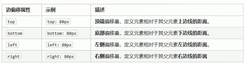
边偏移
三种布局机制的上下顺序
标准流 + 浮动 + 定位
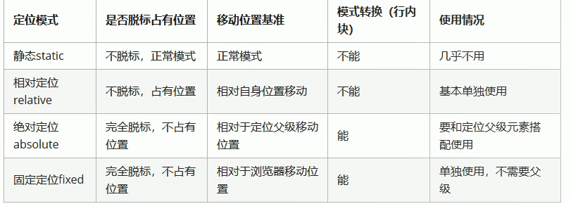
定位模式
选择器 {position:属性值}
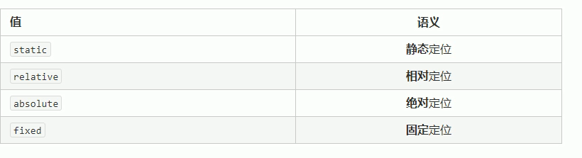
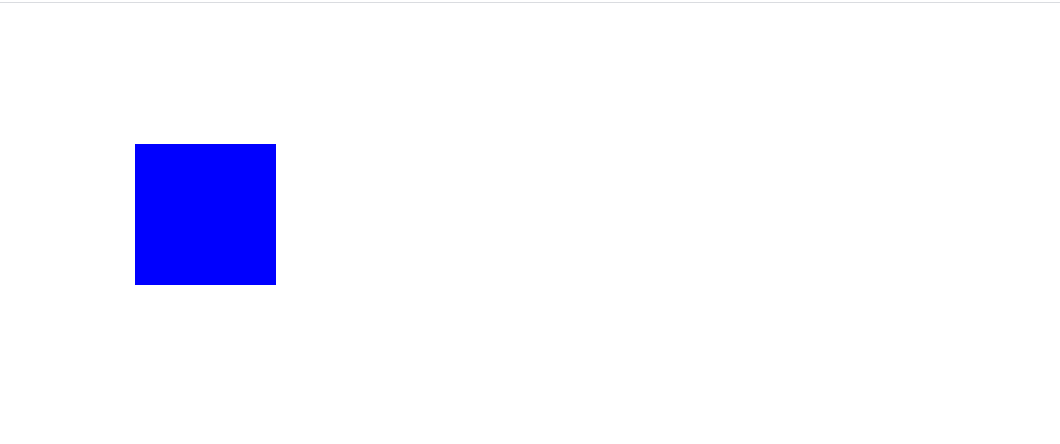
静态定位(了解)
static:静态定位 静态定位是定位模式中的默认属性,没有边偏移,在网布布局中几乎不用
<!DOCTYPE html>
<html lang="en">

<head>
    <meta charset="UTF-8">
    <meta name="viewport" content="width=device-width, initial-scale=1.0">
    <title>Document</title>
    <style>
        * {
            margin: 0;
            padding: 0;
        }

        div {
            width: 200px;
            height: 200px;
            background-color: blue;
            position: static;
            top: 200px;
            left: 200px;
        }
    </style>
</head>

<body>
    <div></div>
</body>

</html>
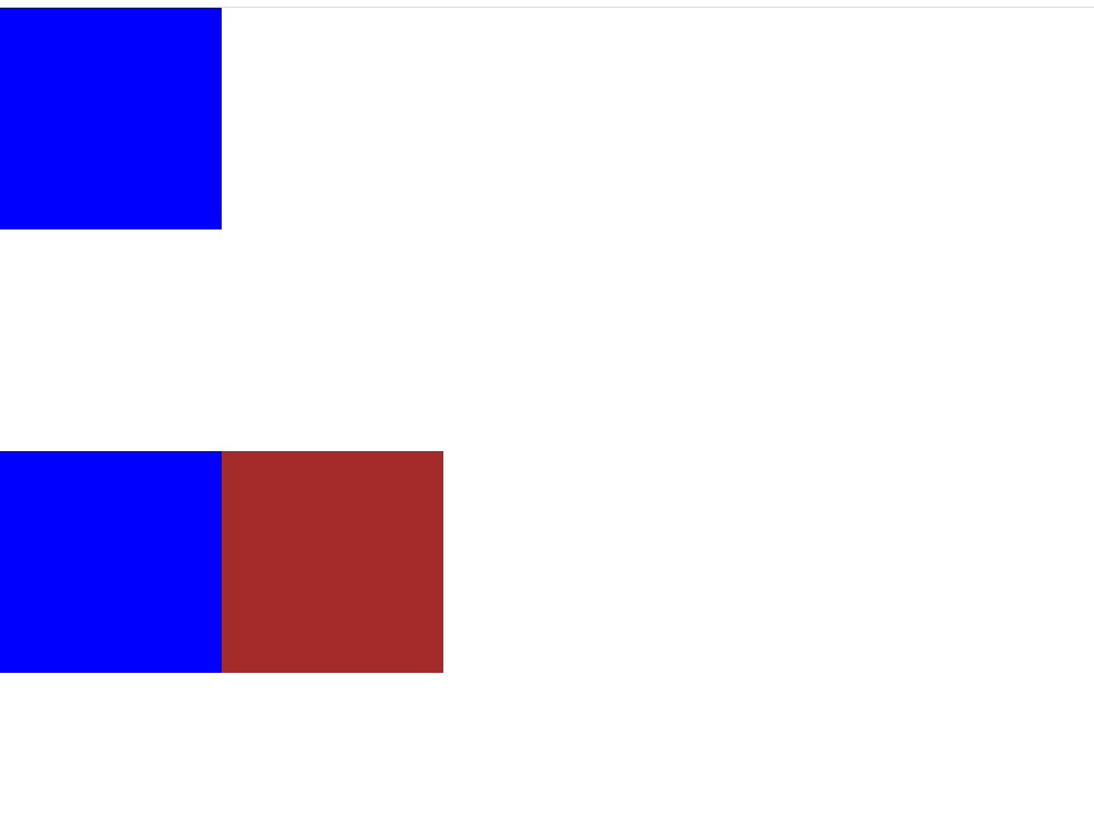
relative(了解)
相对定位根据自身标准流的位置来进行边偏移。
<!DOCTYPE html>
<html lang="en">

<head>
    <meta charset="UTF-8">
    <meta name="viewport" content="width=device-width, initial-scale=1.0">
    <title>Document</title>
    <style>
        * {
            margin: 0;
            padding: 0;
        }

        div {
            width: 200px;
            height: 200px;
            background-color: blue;
            /*改为相对定位*/
            position: relative;
            top: 200px;
            left: 200px;
        }
    </style>
</head>

<body>
    <div></div>
</body>

</html>
相对定位的两个特性
- 继续占有原来的位置
- 相对于它本身的位置来进行边偏移
<!DOCTYPE html>
<html lang="en">

<head>
    <meta charset="UTF-8">
    <meta name="viewport" content="width=device-width, initial-scale=1.0">
    <title>Document</title>
    <style>
        * {
            margin: 0;
            padding: 0;
        }

        div {
            width: 200px;
            height: 200px;
            background-color: blue;
        }

        .box2 {
            position: relative;
            top: 200px;
            left: 200px;
            background-color: brown;
        }
    </style>
</head>

<body>
    <div class="box1"></div>
    <div class="box2"></div>
    <div class="box3"></div>
</body>

</html>
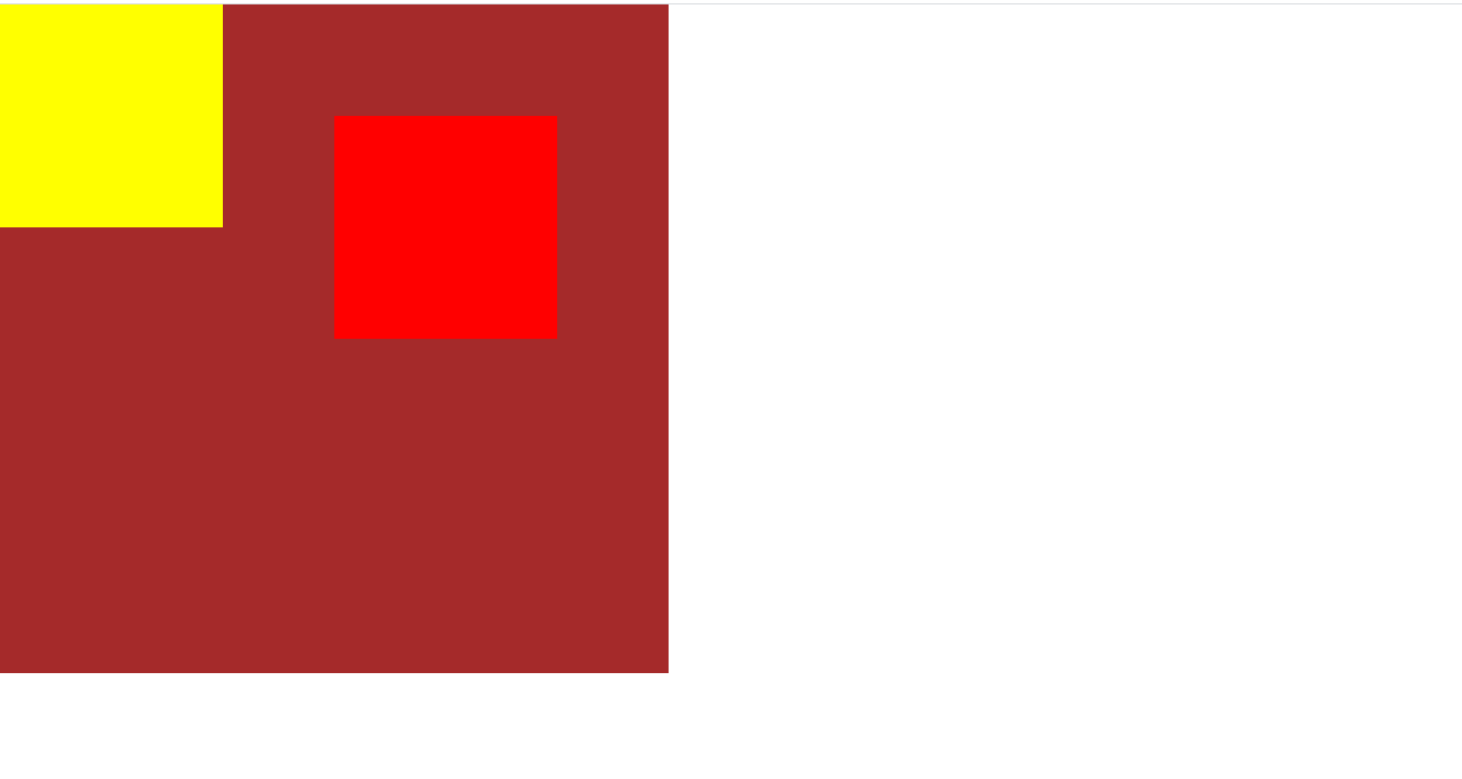
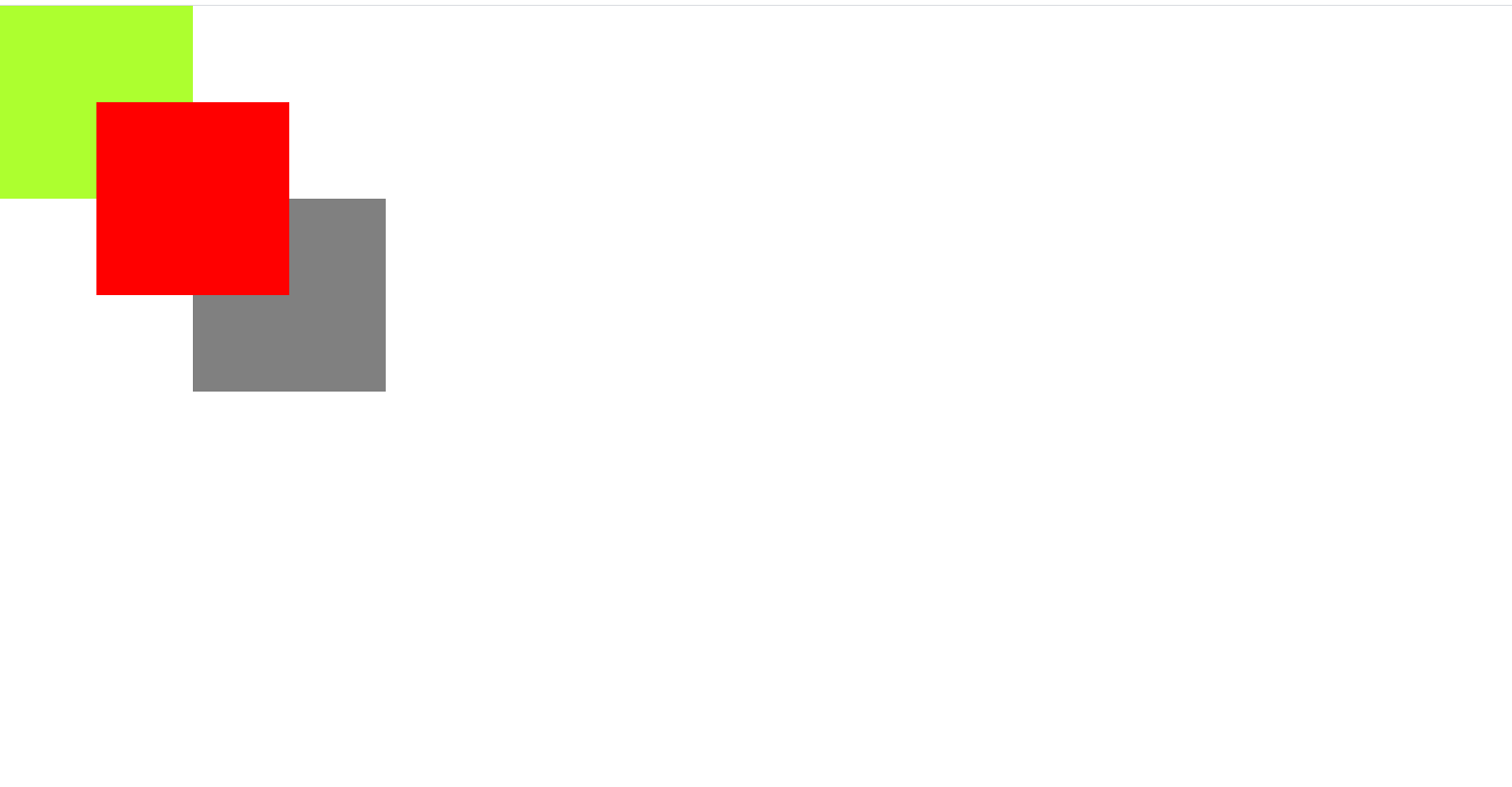
绝对定位
绝对定位的特点
- 不占有原来的位置,脱离标准流
- 绝对定位以父元素的定位为准,父元素不能是静态定位,如若父元素没有定位,便以浏览器的视口为准
<!DOCTYPE html>
<html lang="en">

<head>
    <meta charset="UTF-8">
    <meta name="viewport" content="width=device-width, initial-scale=1.0">
    <title>Document</title>
    <style>
        * {
            margin: 0;
            padding: 0;
        }

        .box {
            width: 600px;
            height: 600px;
            background-color: brown;
            position: relative;
        }

        .box1,
        .box2 {
            width: 200px;
            height: 200px;
            background-color: yellow;
        }

        .box1 {
            background-color: red;
            position: absolute;
            top: 100px;
            left: 300px
        }
    </style>
</head>

<body>
    <div class="box">
        <div class="box1"></div>
        <div class="box2"></div>
    </div>
</body>

</html>
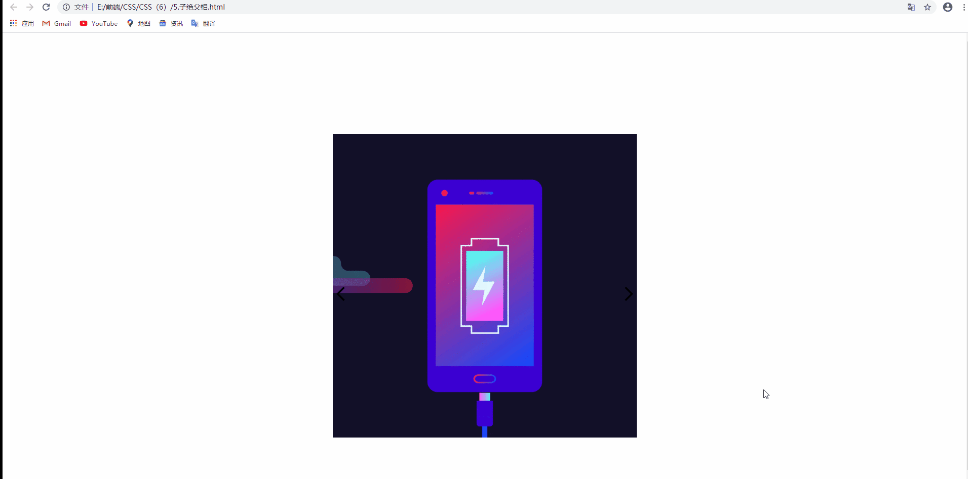
子绝父相
简单而言。就是子元素用绝对定位,父元素用相对定位,只要这样,才不会影响下面的标准流布局
在此案例中,两个箭头使用的是绝对定位,而父元素使用的是相对定位
<!DOCTYPE html>
<html lang="en">

<head>
    <meta charset="UTF-8">
    <meta name="viewport" content="width=device-width, initial-scale=1.0">
    <title>Document</title>
    <style>
        * {
            margin: 0;
            padding: 0;
        }

        .pic {
            position: relative;
            width: 600px;
            height: 600px;
            margin: 200px auto;
        }

        .arr-left {
            position: absolute;
            top: 300px;
            left: 0;
        }

        .arr-right {
            position: absolute;
            top: 300px;
            right: 0!important;
        }
    </style>
</head>

<body>

    <div class="pic">
        <img src="./image/img-1.gif" alt="">
        <img src="./image/箭头_线性_左.png" alt="" class="arr-left">
        <img src="./image/箭头_线性_右.png" alt=" " class="arr-right ">
    </div>
    < </body>

</html>
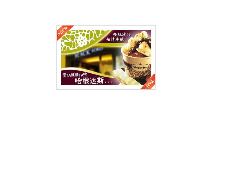
哈格达斯案例
<!DOCTYPE html>
<html lang="en">

<head>
    <meta charset="UTF-8">
    <meta name="viewport" content="width=device-width, initial-scale=1.0">
    <title>Document</title>
    <style>
        * {
            margin: 0;
            padding: 0;
        }

        .box {
            position: relative;
            width: 310px;
            height: 190px;
            padding: 15px;
            margin: 100px auto;
            border: 1px solid #ccc;
        }

        img:nth-child(2) {
            position: absolute;
            top: 0;
            left: 0;
        }

        img:nth-child(3) {
            position: absolute;
            bottom: 0;
            right: 0;
        }
    </style>
</head>

<body>
    <div class="box">
        <img src="./image/adv.jpg" alt="">
        <img src="./image/top.gif" alt="">
        <img src="./image/right.gif" alt="">
    </div>
</body>

</html>
固定定位
固定定位的特点
- 脱离标准流
- 不随滚动条滚动而滚动,只认浏览器视口
<!DOCTYPE html>
<html lang="en">

<head>
    <meta charset="UTF-8">
    <meta name="viewport" content="width=device-width, initial-scale=1.0">
    <title>Document</title>
    <style>
        * {
            margin: 0;
            padding: 0;
        }

        body {
            height: 3000px;
        }

        img {
            position: fixed;
            width: 200px;
            top: 200px;
            left: 0;
        }

        p {
            width: 100%;
            height: 100px;
            margin: 50px 0px;
            background-color: blue;
        }
    </style>
</head>

<body>
    <img src="./image/img-1.gif" alt="">
    <p></p>
    <p></p>
    <p></p>
    <p></p>
    <p></p>
    <p></p>
    <p></p>
    <p></p>
    <p></p>
    <p></p>
    <p></p>
    <p></p>
    <p></p>
    <p></p>
    <p></p>
    <p></p>
    <p></p>
    <p></p>
    <p></p>
    <p></p>
</body>

</html>
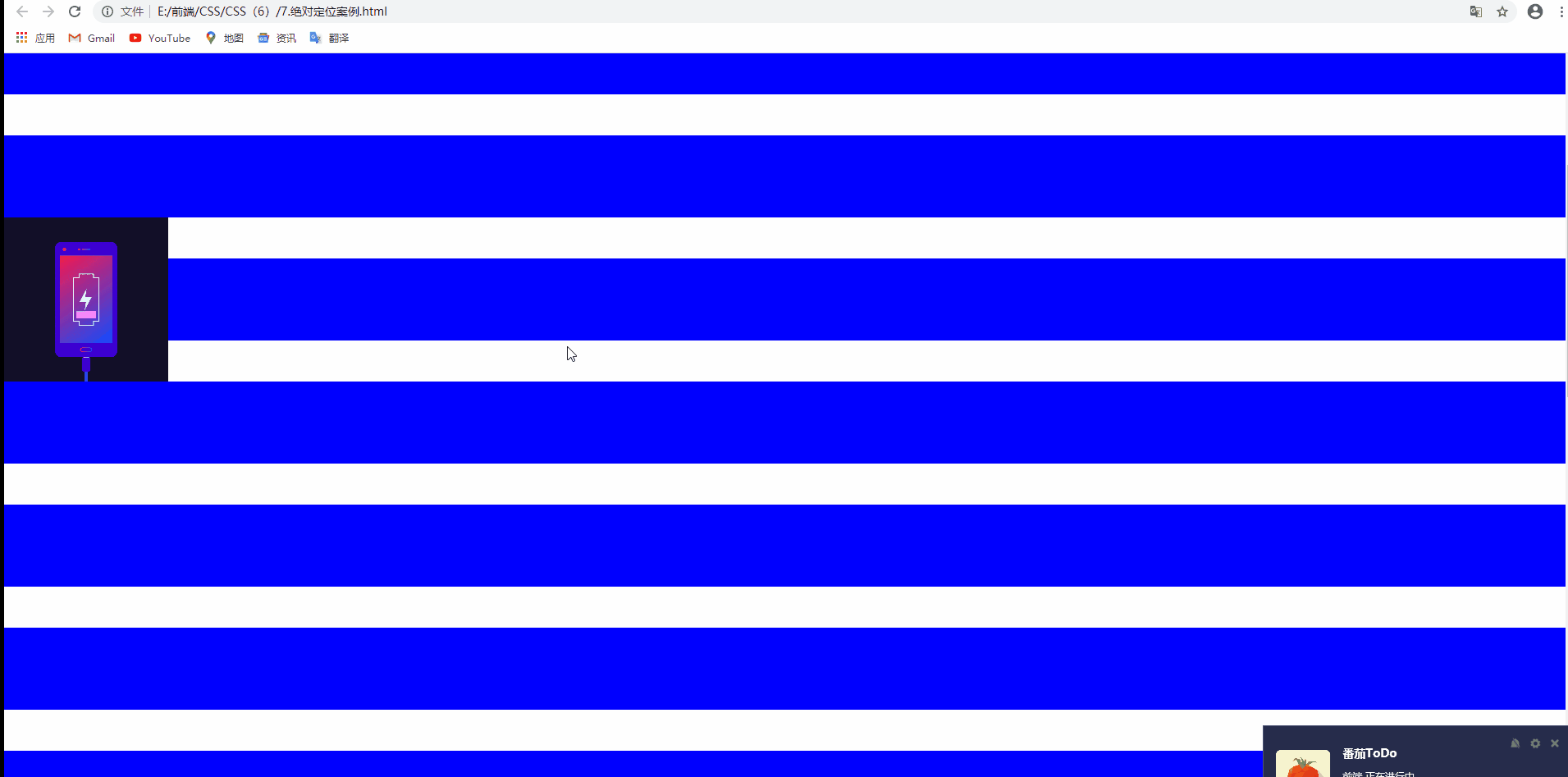
新浪案例
注意在这里新浪导航是一张图片 头部以及两侧的广告栏使用的是固定定位
<!DOCTYPE html>
<html lang="en">

<head>
    <meta charset="UTF-8">
    <meta name="viewport" content="width=device-width, initial-scale=1.0">
    <title>Document</title>
    <style>
        * {
            margin: 0;
            padding: 0;
        }

        .header {
            position: fixed;
            top: 0;
            width: 100%;
            background-color: #FCFCFC;
            text-align: center;
        }

        .content {
            width: 1020px;
            height: 1760px;
            margin: auto;
            margin-top: 44px;
        }

        .ad-l {
            position: fixed;
            top: 200px;
            left: 0;
        }

        .ad-r {
            position: fixed;
            top: 200px;
            right: 0;
        }
    </style>
</head>

<body>
    <img src="./image/ad-l.png" alt="" class="ad-l">
    <img src="./image/ad-r.png" alt="" class="ad-r">
    <div class="header">
        <img src="./image/top.png" alt="" class="top">
    </div>
    <div class="content">
        <img src="./image/box.png" alt="">
    </div>


</body>

</html>
绝对定位的盒子居中对齐
原理
- 先移动父元素的一半 left:50%
- 移动自身宽度的负一半
<!DOCTYPE html>
<html lang="en">

<head>
    <meta charset="UTF-8">
    <meta name="viewport" content="width=device-width, initial-scale=1.0">
    <title>Document</title>
    <style>
        .box {
            position: absolute;
            left: 50%;
            margin-left: -200px;
            width: 400px;
            height: 400px;
            background-color: green;
        }
    </style>
</head>

<body>
    <div class="box"></div>
</body>

</html>
堆叠顺序
使用定位布局时,通常会出现盒子堆叠的情况下,定位的盒子后来居上,z-index可以改变定位的盒子堆叠顺序的问题
1.z-index的值可以是正整数  负整数 0等等。数值越大,盒子越靠上
2.z-index的值不能跟单位,否则不生效
<!DOCTYPE html>
<html lang="en">

<head>
    <meta charset="UTF-8">
    <meta name="viewport" content="width=device-width, initial-scale=1.0">
    <title>Document</title>
    <style>
        * {
            margin: 0;
            padding: 0;
        }

        div {
            position: absolute;
            width: 200px;
            height: 200px;
            background-color: greenyellow;
        }

        .box2 {
            top: 100px;
            left: 100px;
            background-color: red;
            z-index: 6;
        }

        .box3 {
            top: 200px;
            left: 200px;
            background-color: grey;
        }
    </style>
</head>

<body>
    <div class="box1"></div>
    <div class="box2"></div>
    <div class="box3"></div>
</body>

</html>
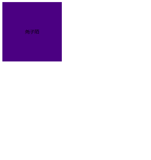
定位改变display属性
display是显示模式 可以通过以下模式改变display属性
- 使用inline-block转换行内块显示模式
- 使用float转换类似行内块显示模式,但是脱离标准流
- 使用定位模式中的absolute或fixed也可以改变显示模式
通过以上结论得知:加了浮动或绝对定位 固定定位就不需要转换显示模式了
<!DOCTYPE html>
<html lang="en">

<head>
    <meta charset="UTF-8">
    <meta name="viewport" content="width=device-width, initial-scale=1.0">
    <title>Document</title>
    <style>
        span {
            position: absolute;
            width: 200px;
            height: 200px;
            text-align: center;
            line-height: 200px;
            background-color: indigo;
        }
    </style>
</head>

<body>
    <span>尧子陌</span>
</body>

</html>
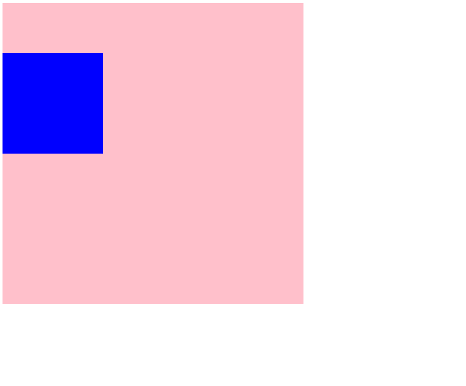
外边距合并问题
浮动 绝对定位(固定定位)都可以改变外边距合并问题
<!DOCTYPE html>
<html lang="en">

<head>
    <meta charset="UTF-8">
    <meta name="viewport" content="width=device-width, initial-scale=1.0">
    <title>Document</title>
    <style>
        .father {
            width: 600PX;
            height: 600PX;
            background-color: PINK;
        }

        .son {
            position: absolute;
            width: 200px;
            height: 200px;
            background-color: blue;
            margin-top: 100px;
        }
    </style>
</head>

<body>
    <div class="father">
        <div class="son"></div>
    </div>
</body>

</html>
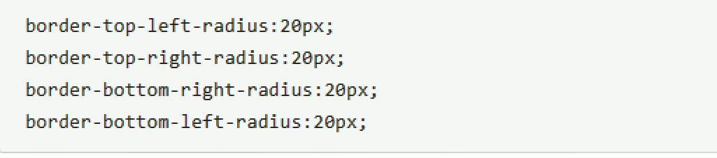
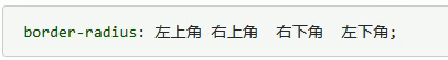
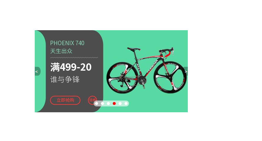
圆角矩形设置四个角
注意 有顺序,可以简写
<!DOCTYPE html>
<html lang="en">
<head>
<meta charset="UTF-8">
<meta name="viewport" content="width=device-width, initial-scale=1.0">
<title>Document</title>
<style>
* {
margin: 0;
padding: 0;
}
.container {
position: relative;
width: 520px;
height: 280px;
margin: 200px auto;
background-color: pink;
}
li {
list-style: none;
}
.arr-left,
.arr-right {
/* 设置定位的元素 可以不用转换显示模式 */
position: absolute;
/* 定位盒子的盒子要实现居中对齐的效果 先走父元素的一半 再走自身的负一半 */
top: 50%;
margin-top: -15px;
width: 20px;
height: 30px;
color: white;
line-height: 30px;
text-decoration: none;
background-color: rgba(0, 0, 0, 0.3);
}
.arr-left {
text-align: left;
left: 0;
border-radius: 0px 50% 50% 0px;
}
.arr-right {
text-align: right;
right: 0;
border-radius: 50% 0px 0px 50%;
}
/* 并集选择器集体声明 */
.arr-left:hover,
.arr-right:hover {
color: royalblue;
background-color: rgba(0, 0, 0, 0.8);
}
.circle {
position: absolute;
left: 50%;
margin-left: -60px;
bottom: 20px;
width: 120px;
height: 20px;
background-color: pink;
border-radius: 10px;
background-color: rgba(255, 255, 255, 0.6);
}
.circle li {
float: left;
width: 10px;
height: 10px;
margin: 5px;
background-color: white;
border-radius: 50%;
}
/* 权重问题 所以要权重叠加 确保当前li生效 */
.circle .current {
background-color: red;
}
</style>
</head>
<body>
<div class="container">
<!-- 左按钮 -->
<a href="#" class="arr-left"><</a>
<!-- 右按钮 -->
<a href="#" class="arr-right">></a>
<!-- 图片-->
<img src="./image/taobao.jpg" alt="">
<!-- 底部导航栏 -->
<ul class="circle">
<li></li>
<li></li>
<li></li>
<li class="current "></li>
<li></li>
<li></li>
</ul>
</div>
</body>
</html>
定位总结
- left right不能同时使用
- top bottom不能同时使用
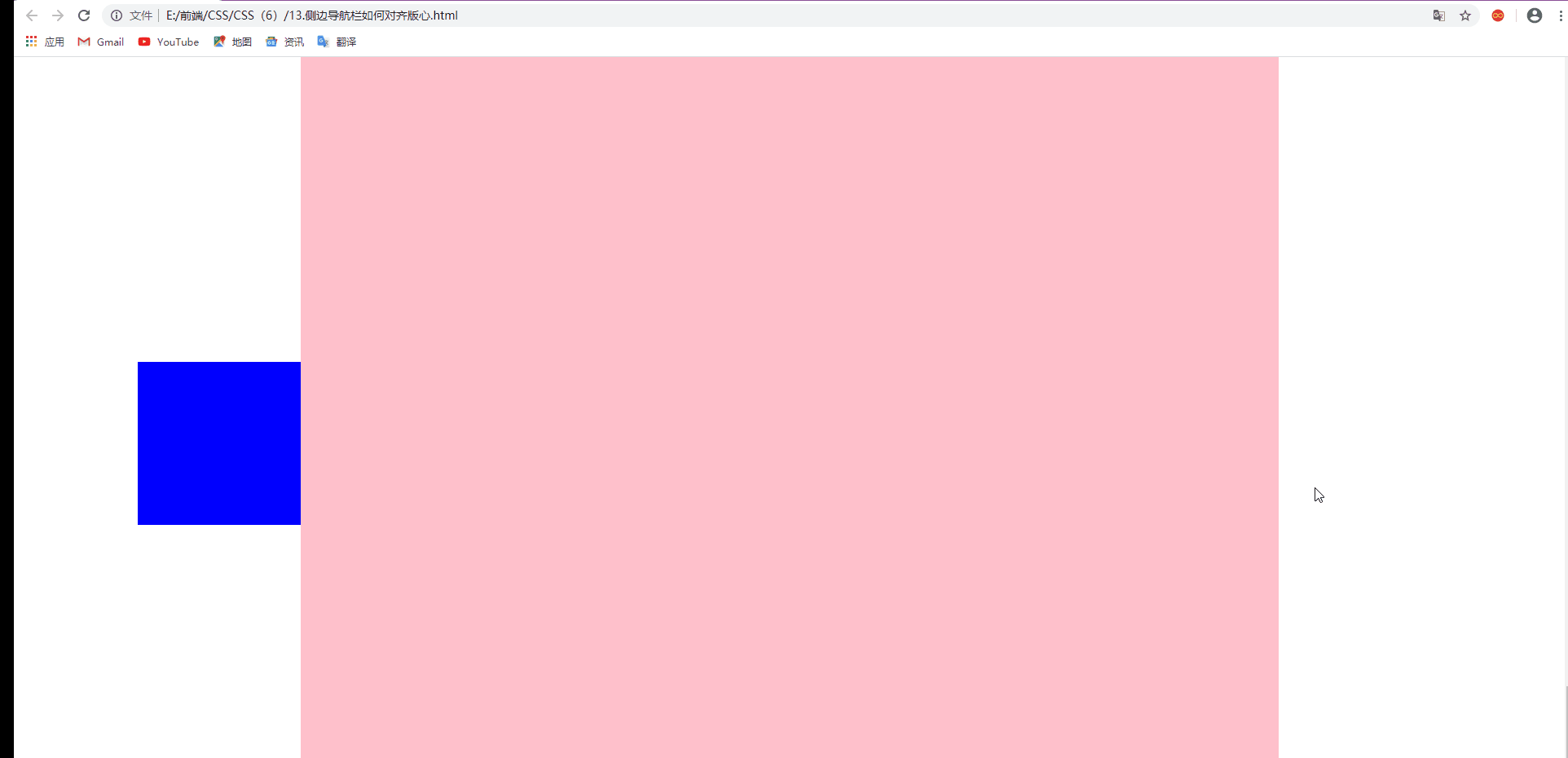
网页布局的侧边广告栏问题
如何让一个侧边栏靠近版心对齐呢,使用固定定位,走浏览器视口的一半,再走版心的一半+自身的宽度
<!DOCTYPE html>
<html lang="en">

<head>
    <meta charset="UTF-8">
    <meta name="viewport" content="width=device-width, initial-scale=1.0">
    <title>Document</title>
    <style>
        * {
            margin: 0;
            padding: 0;
        }

        .side-nav {
            position: fixed;
            top: 50%;
            margin-top: -100px;
            left: 50%;
            margin-left: -800px;
            width: 200px;
            height: 200px;
            background-color: blue;
        }

        .container {
            width: 1200px;
            height: 1800px;
            background-color: pink;
            margin: auto;
            margin-bottom: 20px;
        }
    </style>
</head>

<body>
    <div class="side-nav"></div>
    <div class="container"></div>
    <div class="container"></div>
    <div class="container"></div>

</body>

</html>