

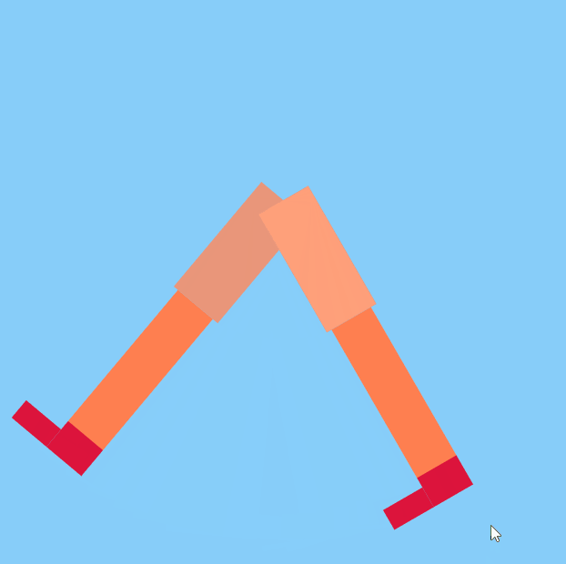
#html部分:
<!DOCTYPE html>
<html>

<head>
  <meta charset="UTF-8">
  <title>魔鬼的步伐</title>
</head>

<body>
  <div class="container">
    <div class="leg rightleg">
      <div class="calf rightcalf">
        <div class="foot">
          <div class="sole rightSole"></div>
        </div>
      </div>
    </div>
    <div class="leg leftleg">
      <div class="calf leftcalf">
        <div class="foot">
          <div class="sole leftSole"></div>
        </div>
      </div>
    </div>
  </div>
</body>

</html>
#CSS部分
.container {
      width: 500px;
      height: 500px;
      margin: 0 auto;
      background-color: lightskyblue;
      position: relative;
    }

    .container .leg {
      width: 50px;
      height: 120px;
      position: absolute;
      left: 225px;
      top: 180px;
      transform-origin: 50% 0;
    }

    @keyframes rightLeg {
      0% { transform: rotate(40deg); }
      50% { transform: rotate(-30deg); }
      100% { transform: rotate(40deg); }
    }

    div.leg:nth-child(1) {
      background-color: darksalmon;
      animation: rightLeg 2.3s ease-in-out;
      animation-iteration-count: infinite;
    }

    @keyframes leftLeg {
      0% { transform: rotate(-30deg); }
      50% { transform: rotate(40deg); }
      100% { transform: rotate(-30deg); }
    }

    div.leg:nth-child(2) {
      background-color: lightsalmon;
      transform: rotate(-30deg);
      animation: leftLeg 2.3s ease-in-out;
      animation-iteration-count: infinite;
    }

    div.calf {
      width: 40px;
      height: 150px;
      position: absolute;
      top: 100%;
      left: 5px;
      transform-origin: 50% 0;
    }

    @keyframes rightCalf {
      0% { transform: rotate(0deg); }
      50% { transform: rotate(-20deg); }
      100% { transform: rotate(0deg); }
    }

    div.calf:nth-child(1) {
      transform: rotate(0deg);
      background-color: coral;
      animation: rightCalf 2.3s ease-in-out;
      animation-iteration-count: infinite;
    }

    @keyframes leftCalf {
      0% {transform: rotate(-20deg);}
      50% {transform: rotate(0deg);}
      100% {transform: rotate(-20deg);}
    }

    div.calf:nth-child(2) {
      transform: rotate(0deg);
      background-color: lightcoral;
      animation: leftCalf 2.3s ease-in-out;
      animation-iteration-count: infinite;
    }

    div.foot {
      width: 40px;
      height: 30px;
      position: absolute;
      top: 100%;
      background-color: crimson;
    }

    div.sole {
      width: 40px;
      height: 20px;
      position: absolute;
      top: 10px;
      left: -100%;
      background-color: crimson;
      transform-origin: 100% 50%;
    }

    @keyframes rightSole {
      0% {        transform: rotate(0deg);      }
      40% {        transform: rotate(20deg);      }
      50% {        transform: rotate(0deg);      }
      100% {        transform: rotate(0deg);      }
    }

    div.rightSole {
      animation: rightSole 2.3s ease-in-out;
      animation-iteration-count: infinite;
    }

    @keyframes leftSole {
      0% {        transform: rotate(0deg);      }
      50% {        transform: rotate(0deg);      }
      90%{        transform: rotate(20deg);      }
      100% {        transform: rotate(0deg);      }
    }

    div.leftSole {
      animation: leftSole 2.3s ease-in-out;
      animation-iteration-count: infinite;
    }
