

废话不多说,上代码
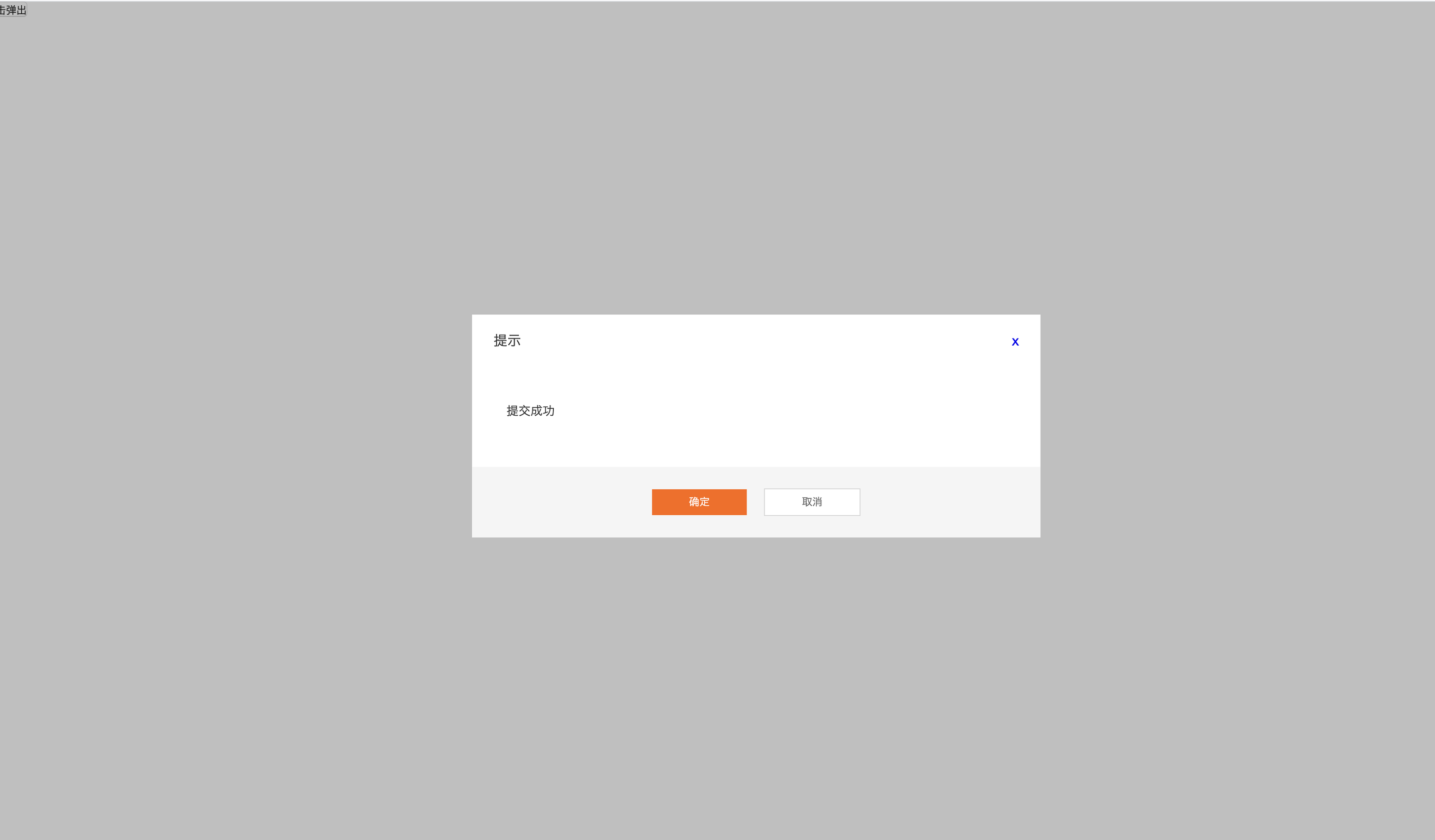
    <template>
  <transition name="slide">
    <div class="modal" v-show="showModal">
      <div class="mask"></div>
      <div class="modal-dialog">
        <div class="modal-header">
          <span>{{title}}</span>
          <a href="javascript:;" @click="$emit('cancel')">x</a>
        </div>
        <div class="modal-body">
          <slot name="body"></slot>
        </div>
        <div class="modal-footer">
          <a href="javascript:;" v-if="btnType==1" @click="$emit('submit')" class="btn">{{sureText}}</a>
          <a href="javascript:;" class="btn btn-default" v-if="btnType==2" @click="$emit('cancel')">{{cancelText}}</a>
          <div class="btn-group" v-if="btnType==3">
            <a href="javascript:;" @click="$emit('submit')" class="btn">{{sureText}}</a>
            <a href="javascript:;" class="btn btn-default" @click="$emit('cancel')">{{cancelText}}</a>
          </div>
        </div>
      </div>
    </div>
  </transition>
</template>
<script>
    export default {
      name: 'modal',
      props: {
        showModal: Boolean,
        // 弹框的类型: 小small 中middle 大 large  form 指的是表单
        modalType: {
          type: String,
          default: 'form'
        },
        // 模太框的标题
        title: String,
        // 按钮类型 1.确定按钮 2.取消按钮 3.确定取消按钮
        btnType: String,
        sureText: {
          type: String,
          default: '确定'
        },
        cancelText: {
          type: String,
          default: '取消'
        }
      }
    }
</script>
<style lang="stylus">
  @import "./../assets/button.styl"
  @import "./Modal.styl"
</style>
stylus
.modal {
  position: fixed;
  top: 0;
  left: 0;
  width: 100%;
  height: 100%;
  z-index: 10;
  transition: all .8s;

  .mask {
    position: fixed;
    top: 0;
    left: 0;
    width: 100%;
    height: 100%;
    background-color: #00000060;
  }

  .modal-dialog {
    position: absolute;
    left: 50%;
    top: 50%;
    width: 660px;
    height: auto;
    background-color: #fff;
    transform: translate(-50%, -50%);

    .modal-header {
      height: 60px;
      line-height: 60px;
      font-size: 16px;
      background-color: #fff;
      padding: 0 25px;
      a {
        position: absolute;
        top: 0;
        right: 25px;
        height: 14px;
      }
    }
    .modal-body {
      padding: 42px 40px 54px;
      font-size: 14px;
    }
    .modal-footer {
      height: 82px;
      line-height: 82px;
      text-align: center;
      background-color: #F5F5F5;
    }
  }
}

.slide-enter-active {
  top: 0;
}
.slide-leave-active {
  top: -100%;
}
.slide-enter {
  top: -100%;
}
button按钮的stylus
.btn {
  display inline-block;
  width: 110px;
  height: 30px;
  line-height: 30px;
  text-align: center;
  background-color: #FF6600;
  color: #fff;
  border: none;
  cursor: pointer;
}
.btn-default {
  background-color: #fff;
  color: #666;
  border: 1px solid #D7D7D7;
}
.btn-large {
  width: 202px;
  height: 50px;
  line-height: 50px;
  font-size: 18px;
}
.btn-huge {
  width: 300px;
  height: 54px;
  font-size 20px;
}
.btn-group {
  .btn {
    margin-right: 20px;
    &:last-child {
      margin-right: 0;
    }
  }
}
