一、图表的作用
统计学在我们的日常生活扮演着一个重要的角色,因为它可以帮助我们理解人类生存所必需的数据。 数据可视化非常重要,数据的可视化可以帮助我们更直观的理解数据。可视化就是数据的绘制过程,包括绘制各种曲线(curves)/图表(charts)/图形(graphs)/平面图(plots)以使数据易于理解。
图表是许多应用程序的主要组成部分之一。许多应用程序(例如Medium,StackOverflow,GitHub等)都在大量应用程序中使用图形和图表。直接看原始数据使人非常失望沮丧。因此,在应用程序中使用图片,图形和图表可以让我们操作的数据更加直观。
一图胜千言

易卜生(Henrik Ibsen)说得好,因为我们的人性使我们更容易被图形和图表吸引,而不是原始文本。如果直接以行或者列的方式展示数据,则可能无法轻松获得数据的关系,数据间的依赖关系和数据趋势,如果基于数据绘制图表,这些可能更轻松的理解。
Flutter 是一个现代化的 UI 框架,为我们提供了非常多优雅使用图表和图形的选择。使用 Flutter 的原始性能,可以使绘制的 Graphs 和 Charts 有非常好的用户体验。要在 Flutter中使用图表,可能有很多种方式,但是在本文中,我们将重点介绍其中一些。
Flutter框架(更准确地说是pub.dev)包含一个名为 Charts_flutter 的程序包,它为使用Flutter中的图表提供了非常庞大而优雅的工具包。该软件包为我们提供了许多绘制不同类型的图和图表的选项。接下来基于这个包来展示图形和图标的绘制。
二、基于 charts_flutter 进行图形绘制
首先,再使用之前,需要在 pubspec.yaml 文件中添加 Charts_flutter 依赖。
现在,在完成依赖项设置后,我们将绘制不同类型的图表
1、条形图绘制
步骤1:准备数据
在绘制条形图之前,我们将首先准备数据。为此,我们以最近几年的美国人口数据绘制为例,先定义一个PopulationData类。
import 'package:charts_flutter/flutter.dart' as charts;
import 'package:flutter/material.dart';

class PopulationData {
  int year;
  int population;
  charts.Color barColor;
  PopulationData({
    @required this.year,
    @required this.population,
    @required this.barColor
  });
}
接下来为绘制的图形准备一些假数据,并将其绘制在条形图中
final List<PopulationData> data = [
    PopulationData(
      year: 1880,
      population: 50189209,
      barColor: charts.ColorUtil.fromDartColor(Colors.lightBlue)
    ),
    PopulationData(
      year: 1890,
      population: 62979766,
      barColor: charts.ColorUtil.fromDartColor(Colors.lightBlue)
    ),
    PopulationData(
      year: 1900,
      population: 76212168,
      barColor: charts.ColorUtil.fromDartColor(Colors.lightBlue)
    ),
    PopulationData(
      year: 1910,
      population: 92228496,
      barColor: charts.ColorUtil.fromDartColor(Colors.lightBlue)
    ),
    PopulationData(
      year: 1920,
      population: 106021537,
      barColor: charts.ColorUtil.fromDartColor(Colors.blue)
    ),
    PopulationData(
      year: 1930,
      population: 123202624,
      barColor: charts.ColorUtil.fromDartColor(Colors.blue)
    ),
    PopulationData(
      year: 1940,
      population: 132164569,
      barColor: charts.ColorUtil.fromDartColor(Colors.blue)
    ),
    PopulationData(
      year: 1950,
      population: 151325798,
      barColor: charts.ColorUtil.fromDartColor(Colors.blue)
    ),
    PopulationData(
      year: 1960,
      population: 179323175,
      barColor: charts.ColorUtil.fromDartColor(Colors.blue)
    ),
    PopulationData(
      year: 1970,
      population: 203302031,
      barColor: charts.ColorUtil.fromDartColor(Colors.purple)
    ),
    PopulationData(
      year: 1980,
      population: 226542199,
      barColor: charts.ColorUtil.fromDartColor(Colors.purple)
    ),
    PopulationData(
      year: 1990,
      population: 248709873,
      barColor: charts.ColorUtil.fromDartColor(Colors.purple)
    ),
    PopulationData(
      year: 2000,
      population: 281421906,
      barColor: charts.ColorUtil.fromDartColor(Colors.purple)
    ),
    PopulationData(
      year: 2010,
      population: 307745538,
      barColor: charts.ColorUtil.fromDartColor(Colors.black)
    ),
    PopulationData(
      year: 2017,
      population: 323148586,
      barColor: charts.ColorUtil.fromDartColor(Colors.black)
    ),

  ];
第2步:定义UI
准备好要绘制的数据后,接下来定义需要展示数据的 UI。
@override
  Widget build(BuildContext context) {
    return Scaffold(
      appBar: AppBar(title: Text('Bar Chart Example'), centerTitle: true,),
      body: Center(
      child: Container(
          height: 400,
          padding: EdgeInsets.all(20),
          child: Card(
            child: Padding(
              padding: const EdgeInsets.all(8.0),
              child: Column(
                children: <Widget>[
                  Text(
                    "Population of U.S. over the years",
                    style: TextStyle(
                      fontWeight: FontWeight.bold
                    ),
                  ),
                  SizedBox(height: 20,),
                  Expanded(
                    child: charts.BarChart(
                      _getSeriesData(),
                      animate: true,
                      domainAxis: charts.OrdinalAxisSpec(
                        renderSpec: charts.SmallTickRendererSpec(labelRotation: 60)
                      ),
                    ),
                  )
                ],
              ),
            ),
          ),
        ),
      ),
    );
  }
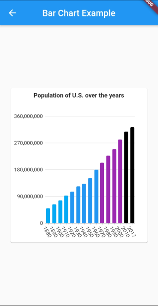
在上面的代码中,我们使用BarChart()小部件来绘制条形图,BarChart 这个 Widget 有很多编辑图的选项,在上面的示例中,我们旋转了 x 轴标签,不旋转的话会有重叠。这个 Widget 还有其他的属性,可以在图表中完成其他的图形操作 。上面代码里面使用到的 _getSeriesData() 函数定义如下:
_getSeriesData() {
    List<charts.Series<PopulationData, String>> series = [
      charts.Series(
        id: "Population",
        data: data,
        domainFn: (PopulationData series, _) => series.year.toString(),
        measureFn: (PopulationData series, _) => series.population,
        colorFn: (PopulationData series, _) => series.barColor
      )
    ];
    return series;
}
结果:
2、绘制线形图
第1步:定义数据
在绘制折线图之前,我们将首先准备要处理的数据。以公司的销售数据为例,先准备一个 SalesData类。
class SalesData {
  final int year;
  final int sales;

  SalesData(this.year, this.sales);
}
接着准备一些绘制时用的假数据。
final data = [
    new SalesData(0, 1500000),
    new SalesData(1, 1735000),
    new SalesData(2, 1678000),
    new SalesData(3, 1890000),
    new SalesData(4, 1907000),
    new SalesData(5, 2300000),
    new SalesData(6, 2360000),
    new SalesData(7, 1980000),
    new SalesData(8, 2654000),
    new SalesData(9, 2789070),
    new SalesData(10, 3020000),
    new SalesData(11, 3245900),
    new SalesData(12, 4098500),
    new SalesData(13, 4500000),
    new SalesData(14, 4456500),
    new SalesData(15, 3900500),
    new SalesData(16, 5123400),
    new SalesData(17, 5589000),
    new SalesData(18, 5940000),
    new SalesData(19, 6367000),
 ];

_getSeriesData() {
    List<charts.Series<SalesData, int>> series = [
      charts.Series(
        id: "Sales",
        data: data,
        domainFn: (SalesData series, _) => series.year,
        measureFn: (SalesData series, _) => series.sales,
        colorFn: (SalesData series, _) => charts.MaterialPalette.blue.shadeDefault
      )
    ];
    return series;
}
步骤2:定义UI
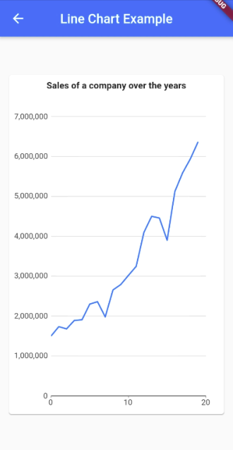
接下来使用 charts_flutter 包里面的 LineChart 来展示图表。
Expanded(
  child: new charts.LineChart(_getSeriesData(), animate: true,),
)
结果:
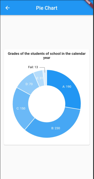
3、绘制饼状图
步骤1:定义数据
以绘制学校里面的学生的成绩为例,先定义一个 GradesData 类。
class GradesData {
  final String gradeSymbol;
  final int numberOfStudents;

  GradesData(this.gradeSymbol, this.numberOfStudents);
}
接下来准备一些绘制用的假数据:
final data = [
  GradesData('A', 190),
  GradesData('B', 230),
  GradesData('C', 150),
  GradesData('D', 73),
  GradesData('E', 31),
  GradesData('Fail', 13),
];

_getSeriesData() {
  List<charts.Series<GradesData, String>> series = [
    charts.Series(
      id: "Grades",
      data: data,
      labelAccessorFn: (GradesData row, _) => '${row.gradeSymbol}: ${row.numberOfStudents}',
      domainFn: (GradesData grades, _) => grades.gradeSymbol,
      measureFn: (GradesData grades, _) => grades.numberOfStudents
    )
  ];
  return series;
}
步骤2:定义UI
接下来使用 charts_flutter 里面的 PieChart 来绘制饼状图。
Expanded(
  child: new charts.PieChart(
    _getSeriesData(),
    animate: true,
    defaultRenderer: new charts.ArcRendererConfig(
      arcWidth: 60,
      arcRendererDecorators: [new charts.ArcLabelDecorator()]
    ),
  ),
)
结果:
完整示例:
最后
欢迎关注「Flutter 编程开发」微信公众号 。