

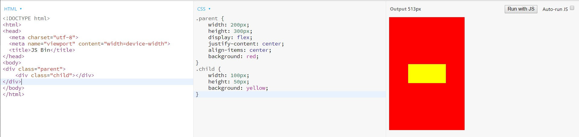
居中
水平居中
行内
在其父元素中设置text-align: center;
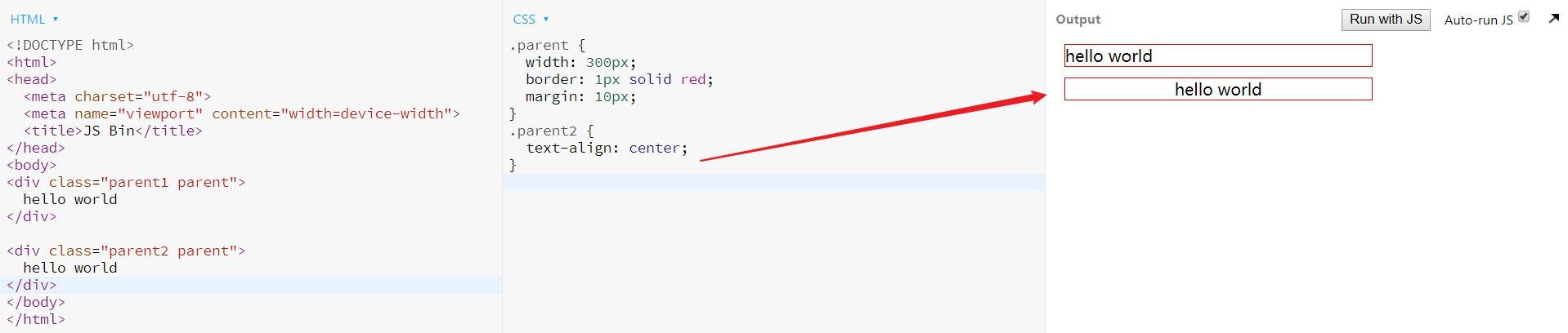
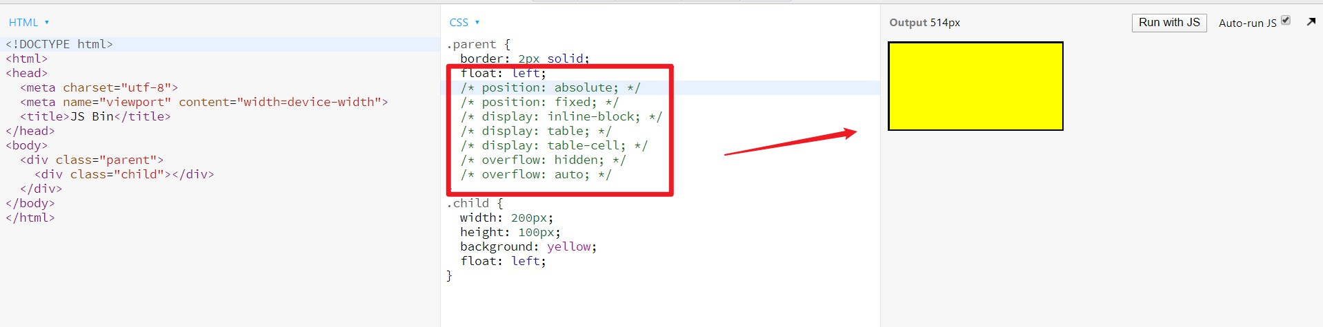
块级
定宽
设置margin: 0 auto;
不定宽度
在子元素中设置display: inline;或display: inline-block;
再给其父元素设置text-align: center;
(即将块级元素设置成行内元素,用行内元素水平的方式)
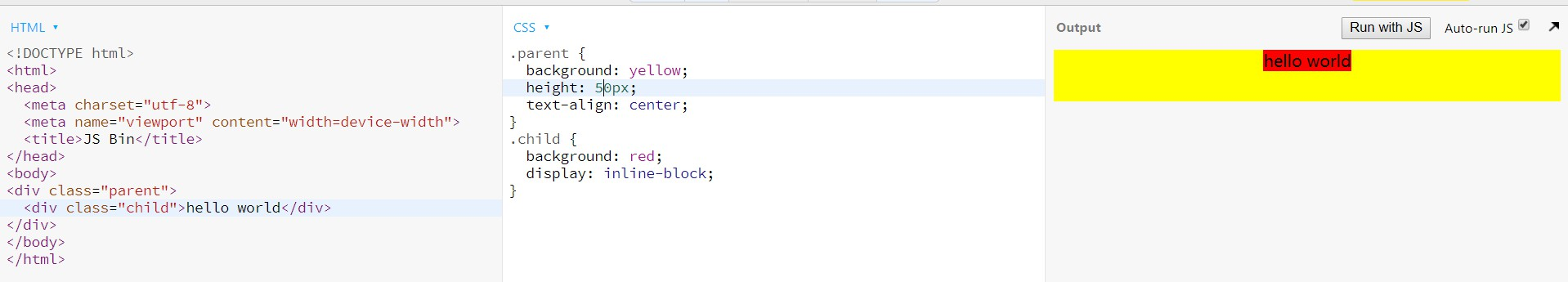
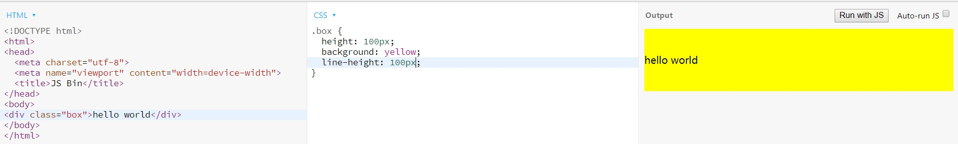
垂直居中
主要使用table、flex,不写父元素高度就很容易垂直居中
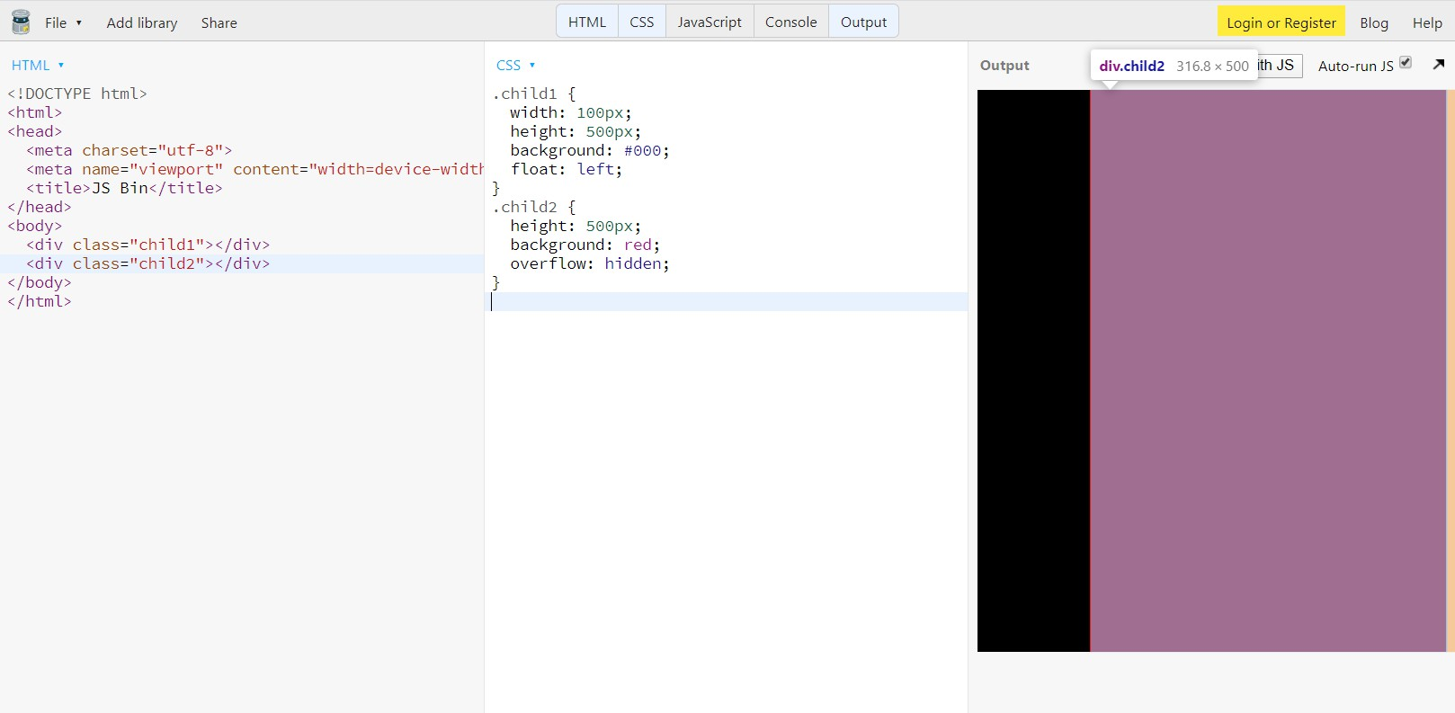
行内元素
单行
行高等于盒高
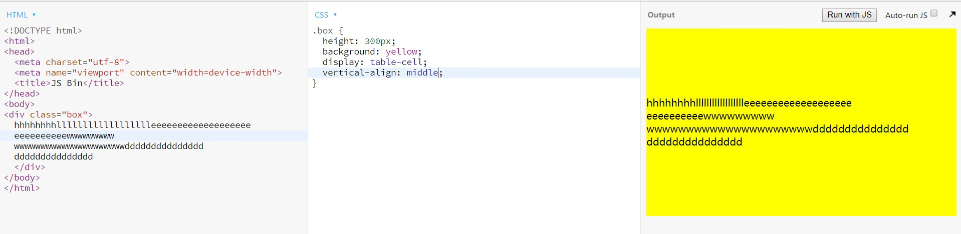
多行
父元素设置display: table-cell;和vertical-align: middle;
块级元素
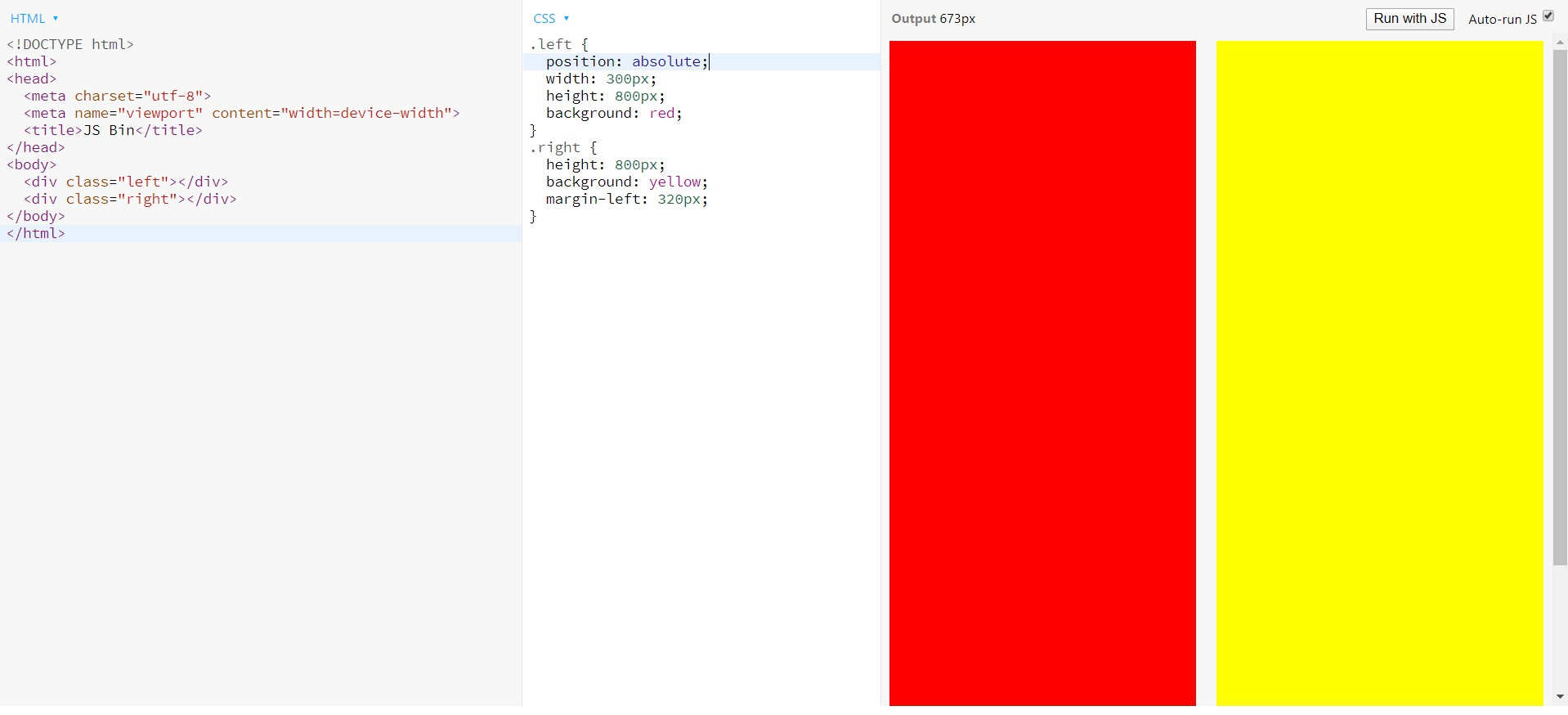
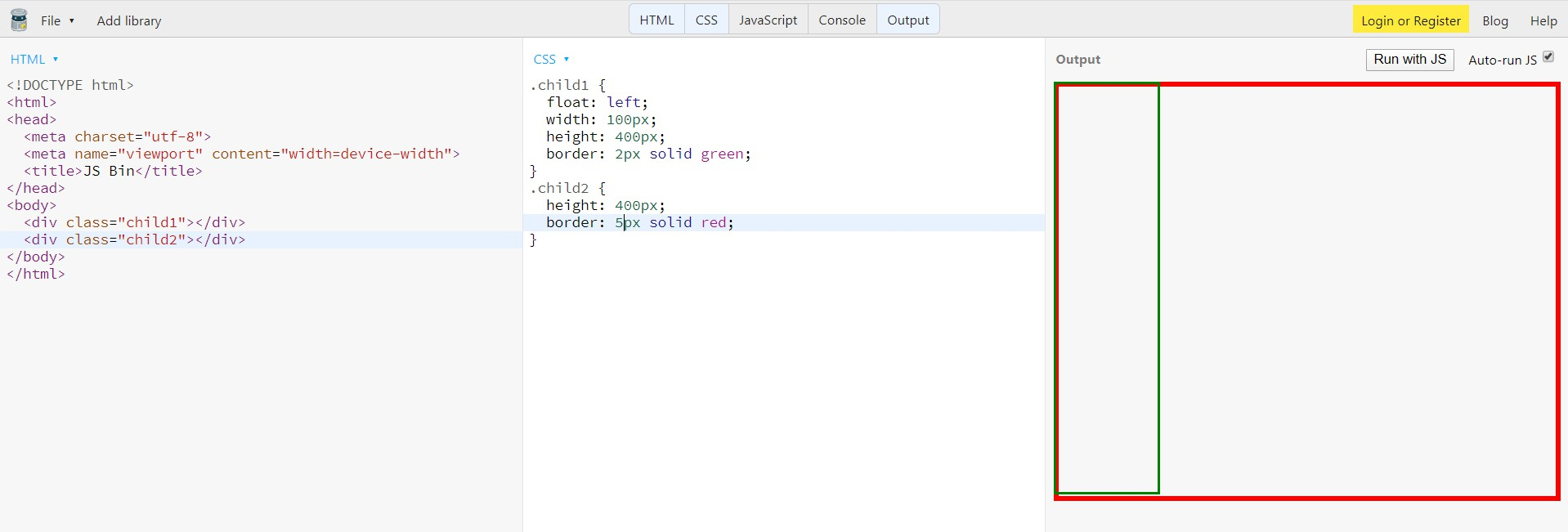
定位
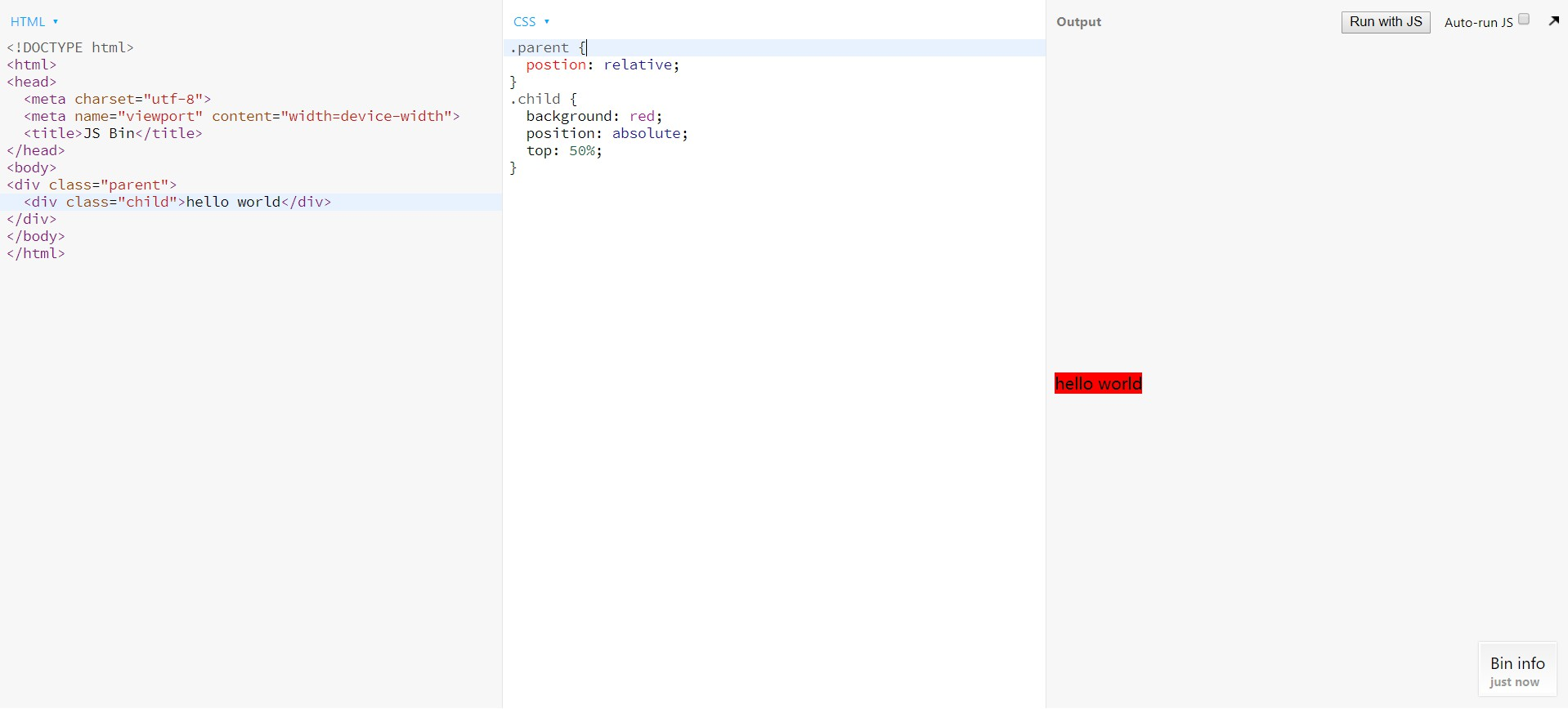
不定高度
父元素设置position: relative;
再子元素设置position: absolute;和top: 50%
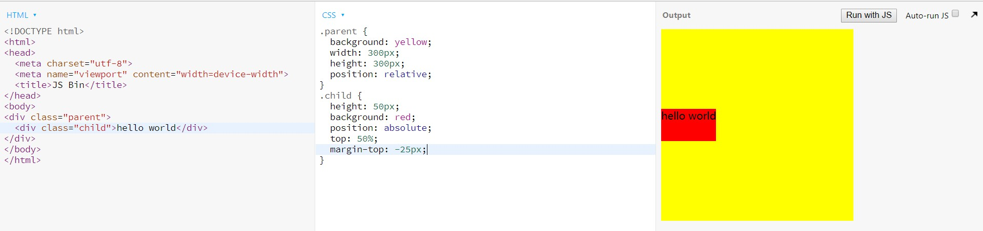
定高度
父元素设置position: relative;
子元素设置position: absolute;、top: 50%和margin-top: -元素高度的一半或者position: absolute;、top: 50%和transform: translateY(-50%)
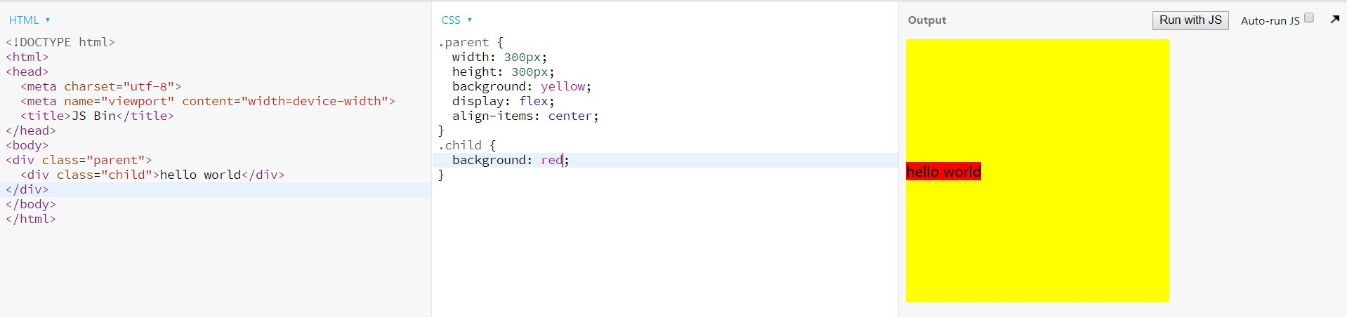
flex
父元素添加属性display: flex;和align-items: center
水平垂直居中
已知高度
table
父元素设置``<table>(给高度)``<tr>``<td> `
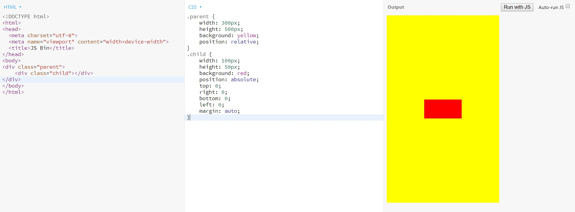
margin: auto;
父元素设置position: relative;
子元素设置position: absolute; 、top:0;、right: 0;、bottom: 0;、left: 0;、margin: auto;
margin-left/top: -元素高度的一半px;
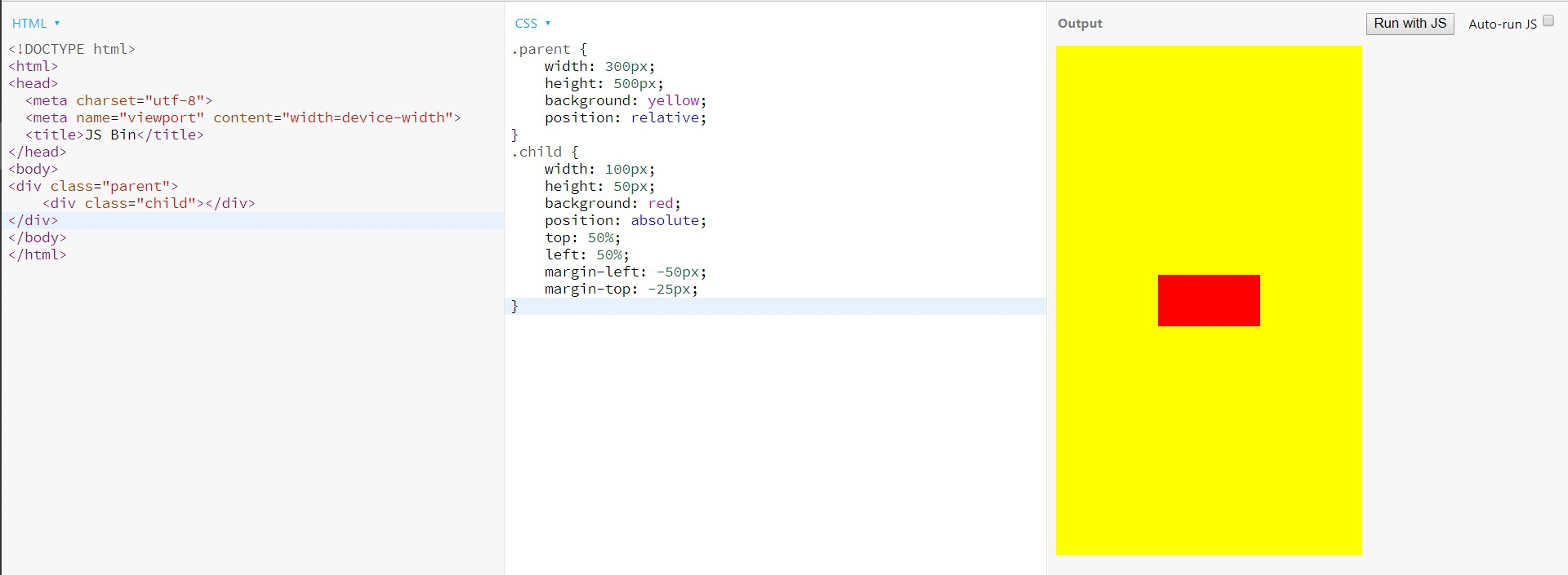
父元素设置position: relative;
子元素设置position: absolute;、left: 50%;、top: 50%;、margin-left: -元素宽度的一半px;、margin-top: -元素高度的一半px;
未知高度
transform
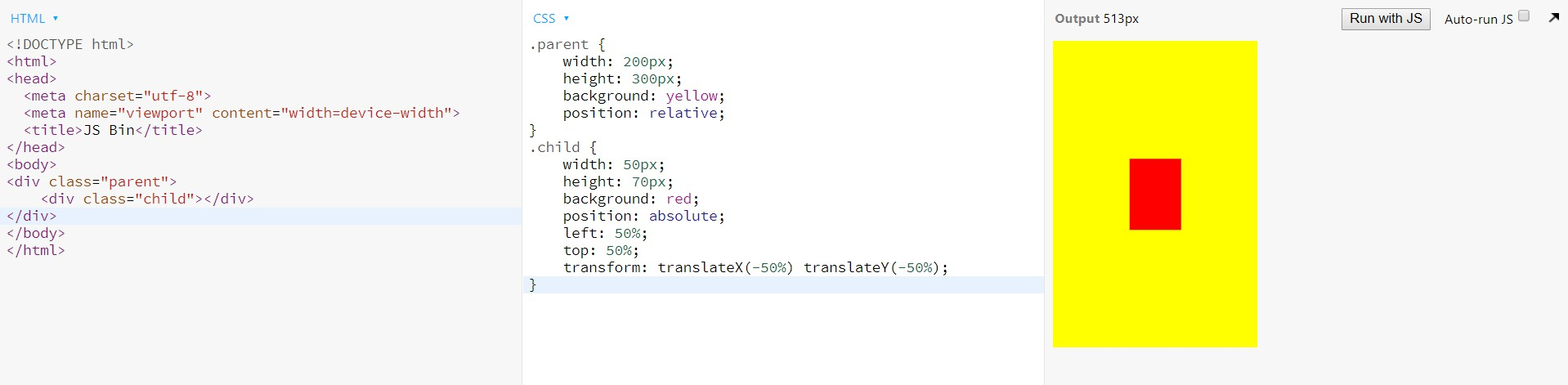
父元素设置position: relative;
子元素设置position: absolute;、left: 50%;、top: 50%;、transform: translateX(-50%) translateY(-50%);
flex
父元素设置display:flex;、justify-content: center;、align-items: center;
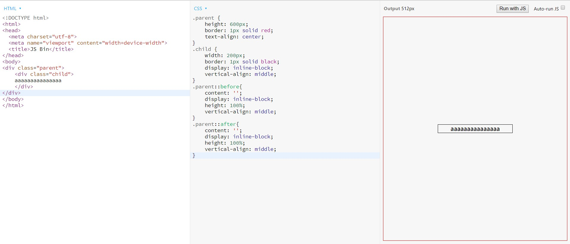
before,after
父元素设置伪元素before、after、height: 100%;、display: inline-block;
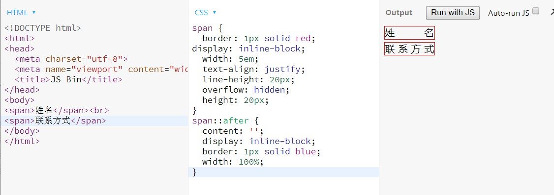
文字对齐小技巧
多列布局
单列布局
双栏布局
一列固定,一列自适应
float + margin
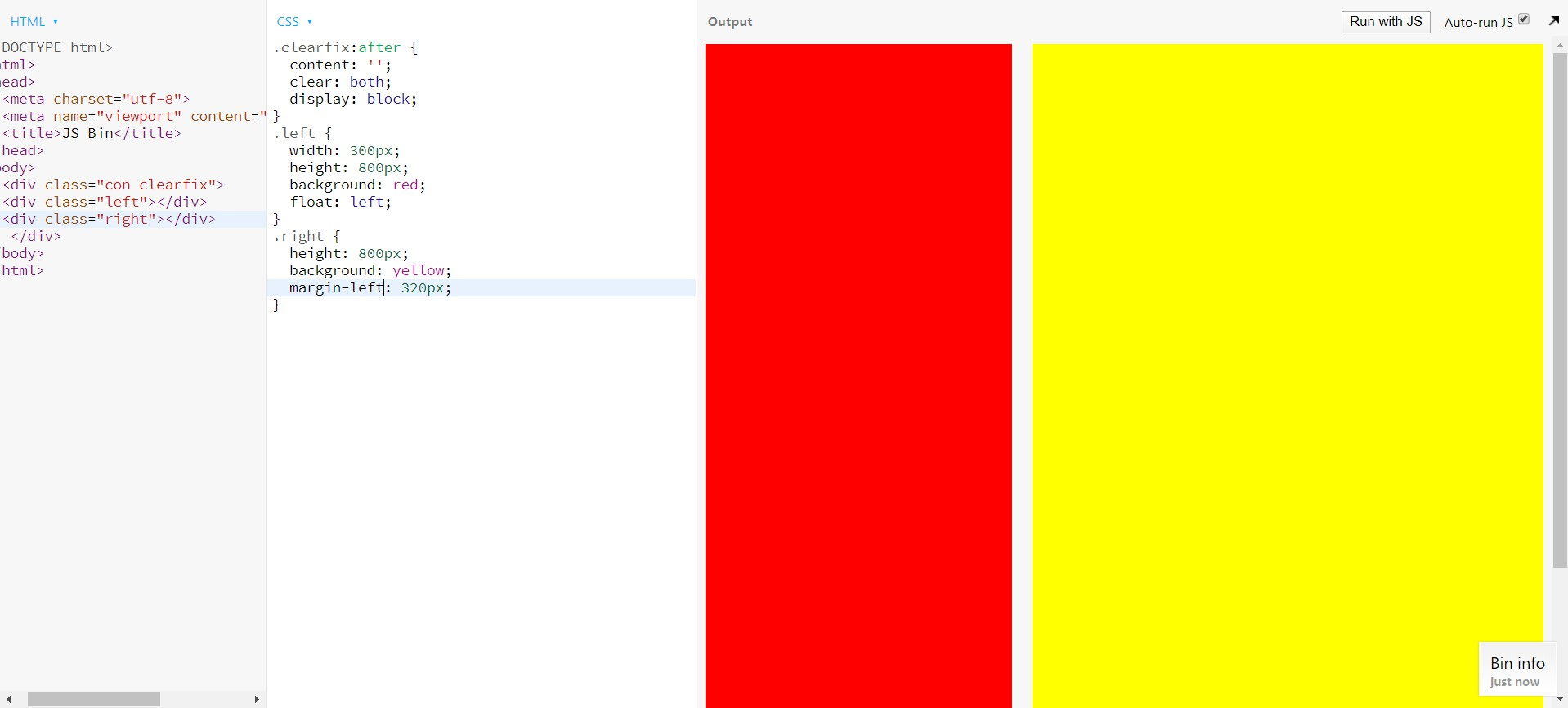
position + margin
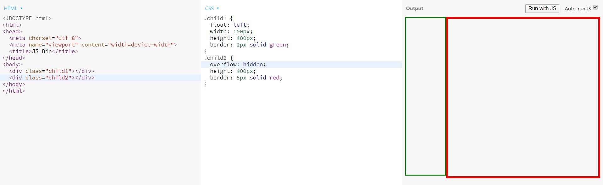
BFC布局
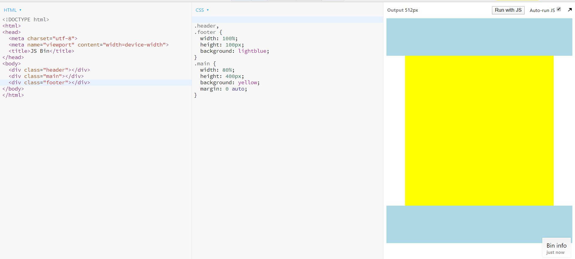
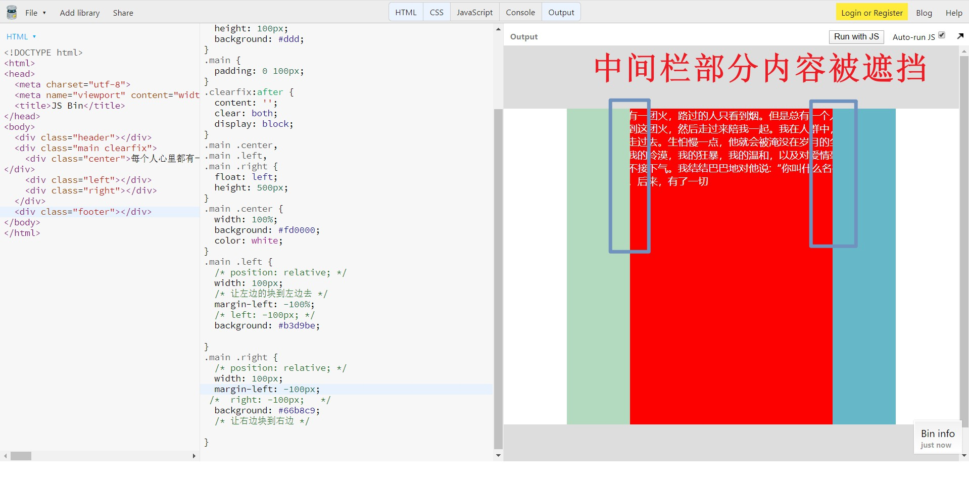
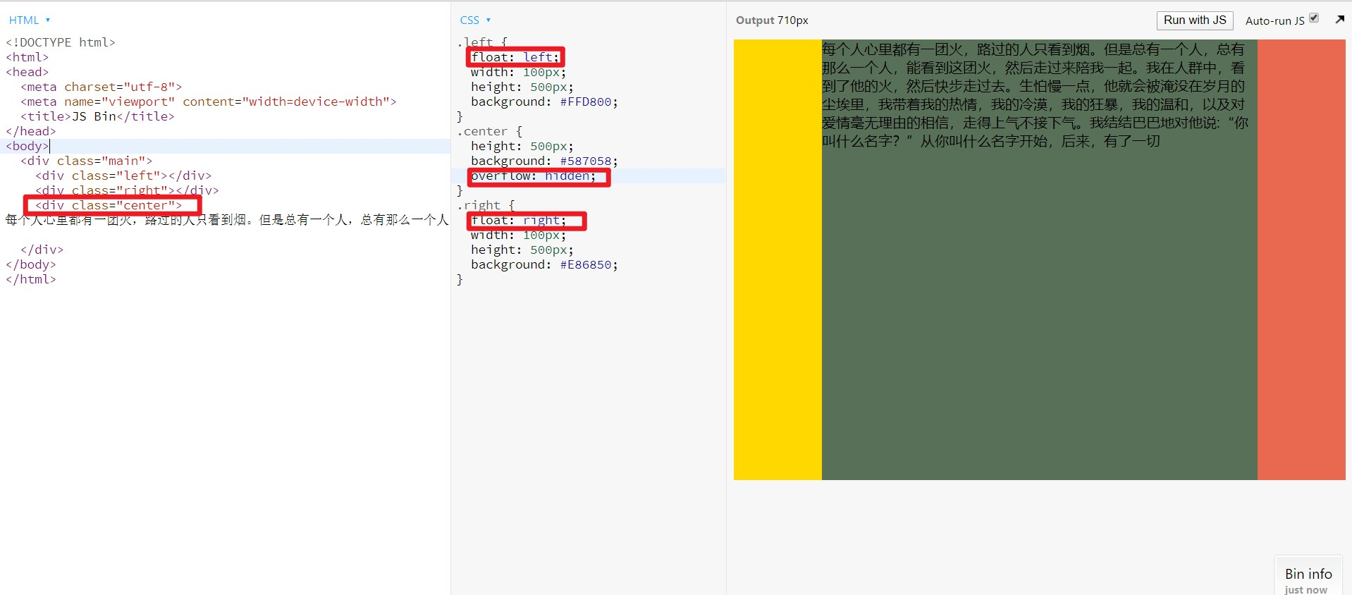
三栏布局
左右定宽 中间自适应 中间栏放在左右栏之前渲染
圣杯布局
<div class="main">
<div class="center"></div>
<div class="left"></div>
<div class="right"></div>
</div>
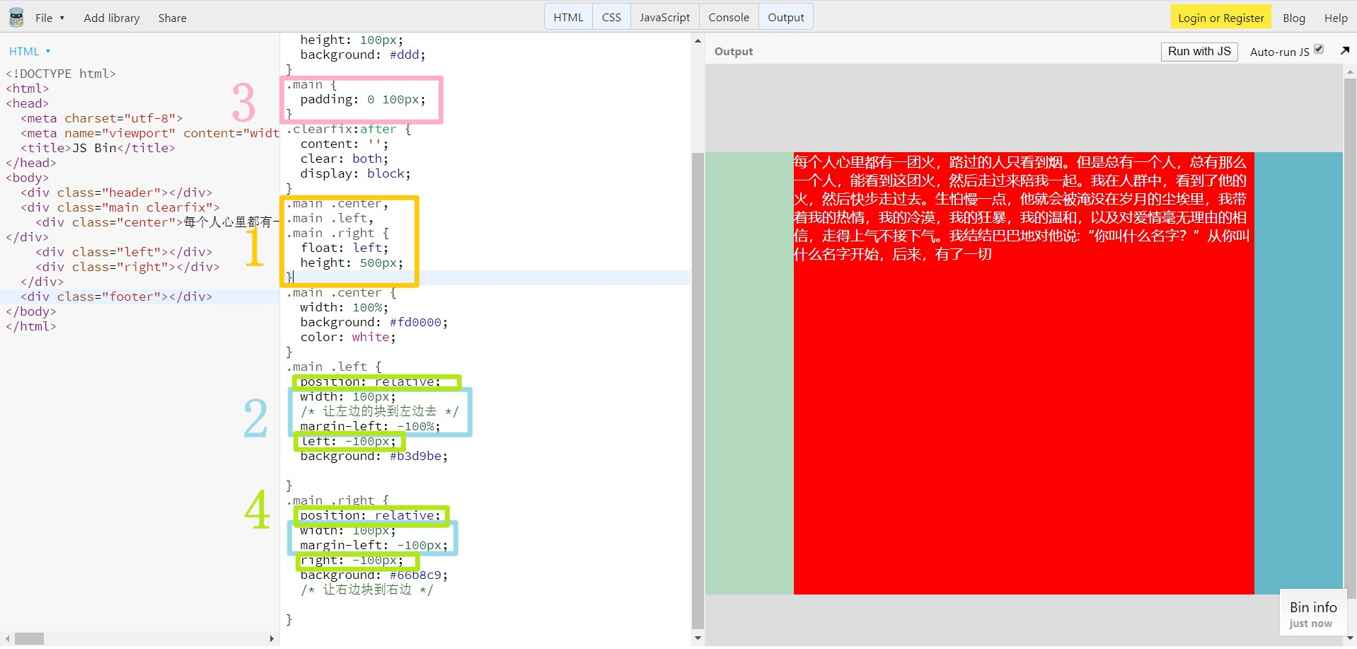
步骤
- left、center、right三个子元素设置float: left;
- 设置负边距(使左右元素回到左右位置),left负边距设置为100%,right负边距设置为负的自身宽度。
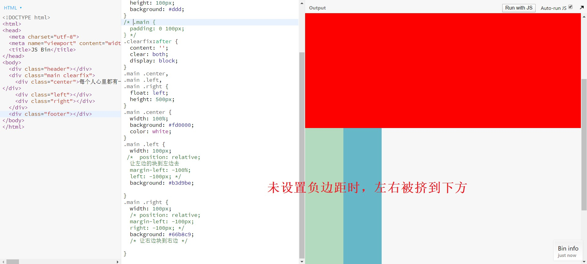
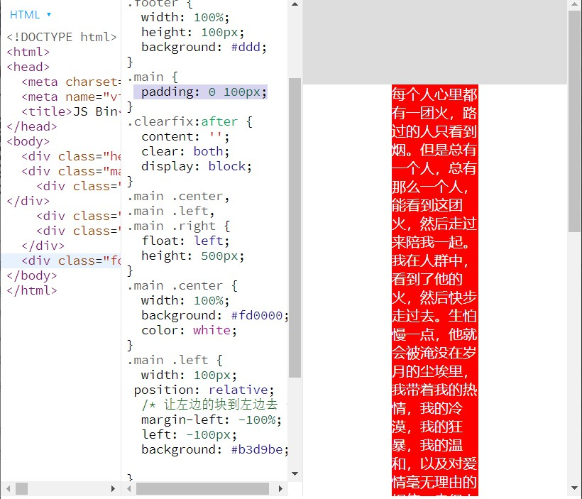
- 设置父元素main的padding值给左右子元素留出空间。
- 将左右子元素设置为position: relative;(解决中间区域部分内容被遮挡的问题),left元素的left值为负width,left元素的right值为负width。
效果
问题
- center宽度小于左右元素宽度时,布局出现问题(双飞翼布局解决了这个问题)
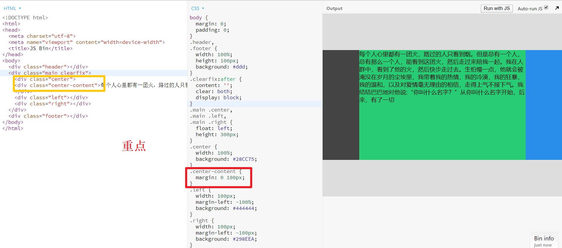
双飞翼布局
将内容放置在中间div设置的子div中
<div class="main">
<div class="center">
<div class="center-content"></div>
</div>
<div class="left"></div>
<div class="right"></div>
</div>
步骤
- left、center、right三个子元素设置float: left;
- 设置负边距(使左右元素回到左右位置),left负边距设置为100%,right负边距设置为负的自身宽度。
- 设置center-content的margin值给左右子元素留出空间。(解决中间栏部分内容被遮挡的问题)
效果
圣杯布局和双飞翼布局区别
- 圣杯布局使用position: relative;及相对的left和right值,双飞翼布局使用中间栏嵌套div块的方法,解决部分内容被遮挡的问题。
- 圣杯布局采用父元素padding预留空间,双飞翼布局使用嵌套的div元素的margin预留空间,解决了中间栏小于左右栏布局紊乱的问题。
- 双飞翼布局比圣杯布局代码更简洁。
BFC布局
注意:中间栏无法先加载需放到最后渲染,左右元素先浮动。
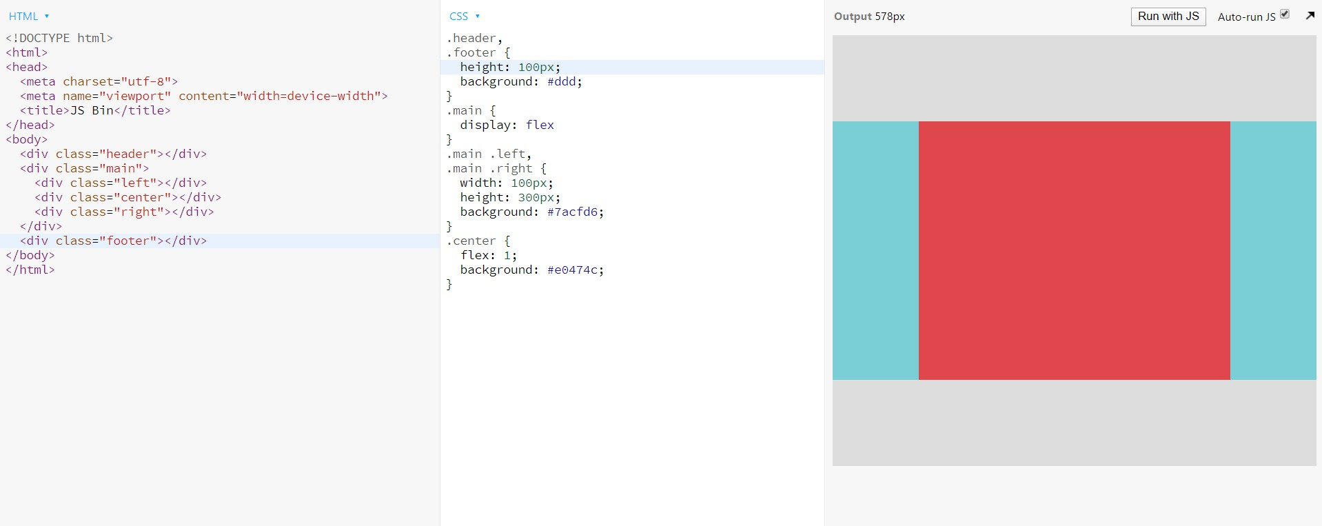
flex布局
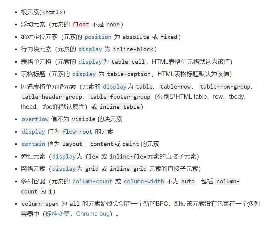
BFC
块级格式化上下文,BFC可以清除浮动
触发BFC条件
父子元素
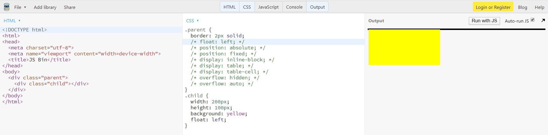
兄弟元素
