

本片笔记完全仿照【Flutter高级玩法-shape】Path在手,天下我有来学习的,感谢博主的分享。
平时在使用一些Widget的时候,有时候会碰到shape属性,但是完全没有用过,也只是在使用Card的时候看到过这个属性,今天偶然看到这个博客,想不到这个属性这么有用,所以就学习记录一下。
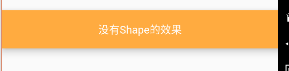
- 下面是一个完全没有使用
shape属性绘制出来的的一个Material控件:
Material(
  color: Colors.orangeAccent,
  elevation: 8.0,
  child: Container(
    alignment: Alignment.center,
    padding: EdgeInsets.all(10.0),
    constraints: BoxConstraints.expand(height:50.0),
    child: Text("没有Shape的效果",style: TextStyle(color: Colors.white),),
  ),
),
执行效果如下:
BoxBorder,BorderDirectional,Border
BoxBorder主要掌管边线方面的事,自身是一个abstract,不能直接使用。
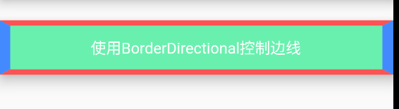
BorderDirectional通过top,bottom,start,end分别控制上下左右的边线对象BorderSide。
下面使用BorderDirectional控制一个Material的边线:
Material(
    color: Colors.pinkAccent,
    elevation: 10.0,
    shape: BorderDirectional(
      top: BorderSide(color:Colors.redAccent,width: 5.0),
      start: BorderSide(color: Colors.blueAccent,width: 10.0),
      bottom: BorderSide(color: Colors.redAccent,width: 5.0),
      end: BorderSide(color:Colors.blueAccent,width: 10.0),
    ),
    child: Container(
      alignment: Alignment.center,
      constraints: BoxConstraints.expand(height: 50.0),
      color: Colors.greenAccent,
      child: Text("使用BorderDirectional控制边线",style: TextStyle(color: Colors.white),),
    ),
 ),
最终的运行效果如下:
使用Border也可以达到上面的效果:
Material(
    color: Colors.pinkAccent,
    elevation: 10.0,
    shape: Border(
      top: BorderSide(color: Colors.redAccent, width: 5.0),
      left: BorderSide(color: Colors.blueAccent, width: 10.0),
      bottom: BorderSide(color: Colors.redAccent, width: 5.0),
      right: BorderSide(color: Colors.blueAccent, width: 10.0),
    ),
    child: Container(
      constraints: BoxConstraints.expand(height: 50.0),
      child: Text(
        "使用Border控制边线",
        style: TextStyle(color: Colors.white),
      ),
      alignment: Alignment.center,
    ),
),
从代码上来看,不管是BorderDirectional还是Border,内部都是使用BorderSide来设置边线的颜色和宽度的。
程序运行效果如下:
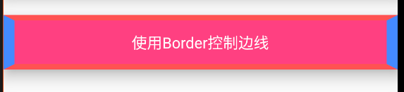
可以看到,和BorderDirectional运行效果是一致的。
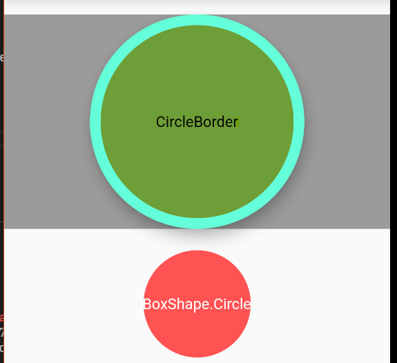
CircleBorder
CircleBorder会以min(width,height)为直径,裁切出一个圆形
//使用CircleBorder
  Material(
    color: Colors.lightGreenAccent,
    elevation: 10.0,
    shape: CircleBorder(side: BorderSide(color: Colors.tealAccent,width: 10.0)),
    child: Container(
      color: Colors.black38,
      alignment: Alignment.center,
      height: 200,
      child: Text("CircleBorder",style: TextStyle(color: Colors.black),),
    ),
),
在Container中的decoration属性里面也可以指定shape的类型,现在将它指定为BoxShape.circle对比一下效果:
 //对Container使用BorderShape.circle
Container(
    alignment: Alignment.center,
    margin: EdgeInsets.only(top: 20.0),
    constraints: BoxConstraints.tightForFinite(height: 100.0),
    child: Text("BoxShape.Circle",style: TextStyle(color: Colors.white),),
    decoration: BoxDecoration(
      shape: BoxShape.circle,
      color: Colors.redAccent,
    ),
 ),
RoundedRectangleBorder和ContinuousRectangleBorder
圆角矩形:
Material(
    color: Colors.limeAccent,
    elevation: 10.0,
    shape: RoundedRectangleBorder(
      side: BorderSide(color: Colors.yellowAccent,width: 5.0),
      borderRadius: BorderRadius.all(Radius.circular(5.0))
    ),
    child: Container(
      alignment: Alignment.center,
      constraints: BoxConstraints.expand(height: 50.0),
      color: Colors.black26,
      child: Text("RoundedRectangleBorder圆角矩形",style: TextStyle(color: Colors.white),),
    ),
),
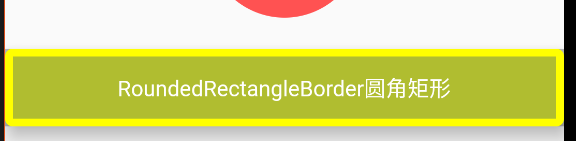
从上面的效果图也可以看出,最好是就别给Container中再设置颜色了,否则圆角的效果就没有了。
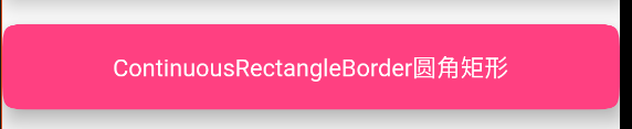
ContinuousRectangleBorder的效果如下:
Material(
    color: Colors.pinkAccent,
    elevation: 10.0,
    shape: ContinuousRectangleBorder(
      side: BorderSide.none,
      borderRadius: BorderRadius.circular(20.0),
    ),
    child: Container(
      alignment: Alignment.center,
      constraints: BoxConstraints.expand(height: 50.0),
      child: Text("ContinuousRectangleBorder圆角矩形",style: TextStyle(color: Colors.white),),
    ),
    ),
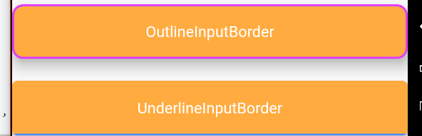
OutlineInputBorder和UnderlineInputBorder
这两个是常用的输入框的边线:
Material(
    color: Colors.orangeAccent,
    elevation: 10.0,
    shape: OutlineInputBorder(
      borderSide: BorderSide(color: Colors.purpleAccent,width: 2.0),
      borderRadius: BorderRadius.circular(10.0),
      gapPadding: 10.0
    ),
    child: Container(
      alignment: Alignment.center,
      height: 50.0,
      child: Text("OutlineInputBorder",style: TextStyle(color: Colors.white),),
    ),
     ),

     Padding(padding: EdgeInsets.only(top: 20.0)),

     Material(
    color: Colors.orangeAccent,
    elevation: 2.0,
    shape: UnderlineInputBorder(
      borderSide: BorderSide(color: Colors.blueAccent,width: 3.0),
      borderRadius: BorderRadius.circular(5.0),
    ),
    child: Container(
      alignment: Alignment.center,
      height: 50.0,
      child: Text("UnderlineInputBorder",style: TextStyle(color: Colors.white),),
    ),
),
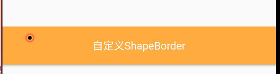
自定义ShapeBorder
共有5个抽象方法:
class _MyShapeBorder extends ShapeBorder{
  @override
  // TODO: implement dimensions
  EdgeInsetsGeometry get dimensions => null;

  @override
  Path getInnerPath(Rect rect, {TextDirection textDirection}) {
    // TODO: implement getInnerPath
    return null;
  }

  @override
  Path getOuterPath(Rect rect, {TextDirection textDirection}) {
    // TODO: implement getOuterPath
    return null;
  }

  @override
  void paint(Canvas canvas, Rect rect, {TextDirection textDirection}) {
    // TODO: implement paint
  }

  @override
  ShapeBorder scale(double t) {
    // TODO: implement scale
    return null;
  }

}
可以看到有一个paint方法,在里面提供了Canvas和Rect,也就是可以在这个区域里面绘制,首先可以看一下这个Rect的参数:
shape rect is Rect.fromLTRB(0.0, 0.0, 360.0, 50.0)
可以看到直接拿到了可以绘制的区域。
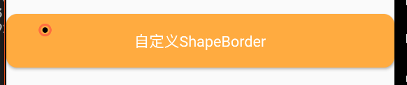
首先在左上角绘制一个圆:
class _MyShapeBorder extends ShapeBorder {
  //外部圆的paint
  Paint _outPaint;
  //内部圆的Paint
  Paint _innerPaint;

  _MyShapeBorder(){
    _outPaint =  Paint()
      ..color = Colors.deepOrangeAccent
      ..strokeWidth = 2.0
      ..style = PaintingStyle.stroke
      ..strokeJoin = StrokeJoin.round;

    _innerPaint = Paint()
      ..color = Colors.black
      ..strokeWidth = 2.0
      ..style = PaintingStyle.fill
      ..strokeJoin = StrokeJoin.round;
  }

  @override
  // TODO: implement dimensions
  EdgeInsetsGeometry get dimensions => null;

  @override
  Path getInnerPath(Rect rect, {TextDirection textDirection}) {
    // TODO: implement getInnerPath
    return null;
  }

  @override
  Path getOuterPath(Rect rect, {TextDirection textDirection}) {
    // TODO: implement getOuterPath
    return null;
  }

  @override
  void paint(Canvas canvas, Rect rect, {TextDirection textDirection}) {
    print("shape rect is${rect}");
    double width = rect.width;
    double height = rect.height;
    canvas.drawCircle(Offset(0.1 * width, 0.3 * height), 0.1 * height, _outPaint);
    canvas.drawCircle(Offset(0.1 * width, 0.3 * height), 0.05 * height, _innerPaint);
  }

  @override
  ShapeBorder scale(double t) {
    // TODO: implement scale
    return null;
  }
}
在Material中使用:
Material(
    color: Colors.orangeAccent,
    elevation: 2.0,
    shape: _MyShapeBorder(),
    child: Container(
      alignment: Alignment.center,
      height: 50.0,
      child: Text(
        "自定义ShapeBorder",
        style: TextStyle(color: Colors.white),
      ),
    ),
),
运行效果:
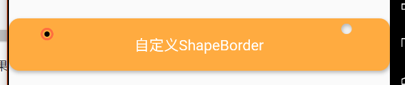
getOuterPath可以返回一个Path对象,也就是形状的裁剪,下面将上面的_MyShapeBorder裁剪为圆角矩形:
@override
Path getOuterPath(Rect rect, {TextDirection textDirection}) {
    Path outerPath = Path();
    outerPath.addRRect(RRect.fromRectAndRadius(rect, Radius.circular(10.0)));
    return outerPath;
}
还可以做一些其它效果,比如在右边打个洞,具体实现就是将圆角矩形和圆形两个路径叠加,使用奇偶环绕来处理路径:
  @override
  Path getOuterPath(Rect rect, {TextDirection textDirection}) {
    Path outerPath = Path();
    outerPath.addRRect(RRect.fromRectAndRadius(rect, Radius.circular(10.0)));

    var width = rect.width;
    var height = rect.height;

    //圆的直径
    var radius = 0.2 * (min(width, height));

    //计算圆所在的矩形的点
    var pl = 0.1 * width;
    var pt = 0.1 * height;

    var left = width - radius - pl;
    var top = pt;
    var right = left + radius;
    var bottom = top + radius;

    outerPath.addOval(Rect.fromLTRB(left, top, right, bottom));
    outerPath.fillType = PathFillType.evenOdd;

    return outerPath;
  }
运行效果如下:
上面已经做了在右上角添加一个洞,相应的,也可以抽象出一个类来在指定的位置添加一个洞:
//在指定位置打洞的ShapeBorder
class HoleShapeBorder extends ShapeBorder {
  //指定圆角的大小
  final Radius radius;
  //洞的直径
  final double diameter;
  //指定偏移量
  final Offset offset;
  //可以不指定偏移量,指定宽度和高度的位置百分比
  final double widthPercentage;
  final double heightPercentage;

  HoleShapeBorder(this.radius,
      {this.offset,
      this.widthPercentage = 0.0,
      this.heightPercentage = 0,
      this.diameter = 20})
      : assert(
            !(offset == null && (widthPercentage == 0 && heightPercentage == 0))),
        assert(widthPercentage <= 1 && heightPercentage <= 1);

  @override
  EdgeInsetsGeometry get dimensions => null;

  @override
  Path getInnerPath(Rect rect, {TextDirection textDirection}) {
    // TODO: implement getInnerPath
    return null;
  }

  @override
  Path getOuterPath(Rect rect, {TextDirection textDirection}) {
    //首先根据指定的Radius在外边绘制一个圆角
    Path path = Path();
    path.addRRect(RRect.fromRectAndRadius(rect, radius));

    var width = rect.width;
    var height = rect.height;
    //定义坐标
    var left;
    var top;
    var right;
    var bottom;
    //距离左边的距离
    var pl;
    //距离上边的距离
    var pt;
    //判断offset是否为空
    if (offset == null) {
      pl = width * widthPercentage - diameter / 2;
      pt = height * heightPercentage - diameter / 2;
    } else {
      //指定的偏移量大于可用的宽度
      if (offset.dx > width)
        pl = width - diameter;
      else
        pl = offset.dx;
      //指定的偏移量大于可用的高度
      if (offset.dy > height)
        pt = height - diameter;
      else
        pt = offset.dy;
    }
    left = pl;
    right = left + diameter;
    top = pt;
    bottom = top + diameter;
    path.addOval(Rect.fromLTRB(left, top, right, bottom));
    path.fillType = PathFillType.evenOdd;
    return path;
  }

  @override
  void paint(Canvas canvas, Rect rect, {TextDirection textDirection}) {
    // TODO: implement paint
  }

  @override
  ShapeBorder scale(double t) {
    // TODO: implement scale
    return null;
  }
}
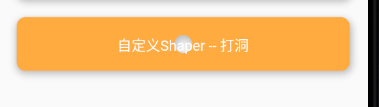
在上面的代码中,可以通过指定Offset(dx,dy)来设置打洞的位置,也可以通过设置洞的宽高比来设置所在的位置,如:
 //自定义ShapeBorder -- 打洞
            Padding(
              padding: EdgeInsets.only(top: 20.0, left: 20.0, right: 20.0),
              child: Material(
                color: Colors.orangeAccent,
                elevation: 5.0,
                shape: HoleShapeBorder(
                  Radius.circular(10.0),
                  widthPercentage: 0.5,
                  heightPercentage: 0.5,
                ),
                child: Container(
                  constraints: BoxConstraints.expand(height: 60.0),
                  child: Text(
                    "自定义Shaper -- 打洞",
                    style: TextStyle(color: Colors.white, fontSize: 16.0),
                  ),
                  alignment: Alignment.center,
                ),
              ),
            ),
这里将指定的位置设置中间,执行效果如下:
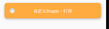
根据指定偏移量打洞,下面根据Offset(20,20)打洞:
Padding(
              padding: EdgeInsets.only(top: 20.0, left: 20.0, right: 20.0),
              child: Material(
                color: Colors.orangeAccent,
                elevation: 5.0,
                shape: HoleShapeBorder(
                  Radius.circular(10.0),
                  offset: Offset(20, 20),
                ),
                child: Container(
                  constraints: BoxConstraints.expand(height: 60.0),
                  child: Text(
                    "自定义Shaper -- 打洞",
                    style: TextStyle(color: Colors.white, fontSize: 16.0),
                  ),
                  alignment: Alignment.center,
                ),
              ),
            ),
运行效果如下:
打多个洞
在上面我们抽象出一些属性来做了一个简单继承的打洞的Shape,下面继续学习打多个洞:
//打多个洞的Shape
class MutilHoldShapeBorder extends ShapeBorder{
  @override
  // TODO: implement dimensions
  EdgeInsetsGeometry get dimensions => null;

  @override
  Path getInnerPath(Rect rect, {TextDirection textDirection}) {
    // TODO: implement getInnerPath
    return null;
  }

  @override
  Path getOuterPath(Rect rect, {TextDirection textDirection}) {
    Path path = Path();
    //首先仍然是绘制一个圆角
    path.addRRect(RRect.fromRectAndRadius(rect, Radius.circular(10.0)));
    //设置要绘制的洞的直径
    double diameter = 20;
    //洞之间的间距
    double holePadding = 10;
    //允许打洞的数量
    int holeNum = rect.width ~/ (diameter + holePadding);
    path.fillType = PathFillType.evenOdd;
    //for循环打出每一个洞
    int i = 0;
    //距离左边的距离
    var pl = holePadding;
    //距离上边的距离
    var pt = rect.height * 0.1;
    double left = pl;
    double top = pt;
    for(i; i < holeNum; i++){
      path.addOval(Rect.fromLTRB(left, top, left + diameter, top + diameter));
      left += (holePadding + diameter);
    }
    return path;
  }

  @override
  void paint(Canvas canvas, Rect rect, {TextDirection textDirection}) {
    // TODO: implement paint
  }

  @override
  ShapeBorder scale(double t) {
    // TODO: implement scale
    return null;
  }

}
运行上面的代码,执行效果如下:
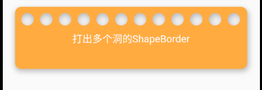
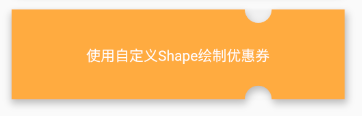
优惠券相关
使用Path也可以绘制出优惠券的背景,如下:
 @override
  Path getOuterPath(Rect rect, {TextDirection textDirection}) {
    Path path = Path();
    path.addRect(rect);
    path.fillType = PathFillType.evenOdd;
    //设置直径为30
    var diameter = 30.0;
    //上边缺口
    //距离左边为0.7 * width
    var gapTopPl = 0.7 * rect.width;
    var gapTopPt = 0.0;
    //首先在优惠券靠近右边的地方上下个绘制一个半圆
    path.addArc(Rect.fromLTRB(gapTopPl, -diameter / 2, gapTopPl + diameter,diameter / 2 ),0,pi);
    //下边缺口
    var gapBottomPt = rect.height - diameter / 2;
    path.addArc(Rect.fromLTRB(gapTopPl, gapBottomPt, gapTopPl + diameter, gapBottomPt + diameter),0,-pi);

    return path;
  }
需要注意的是,此时由于我们需要绘制的是半圆,所以这里使用path.addArc(Rect,startAngle,sweepAngle)来设置半圆的弧度。运行上面的代码,效果如下:
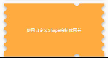
之后我们就需要切出左右两边的效果了,这个直径看起来有点大,可以小一点.
    //优惠券左右两边的缺口
    var gapPadding = 10.0;
    //距离上边的偏移量
    var gapLeftPt = gapPadding;
    //计算可以切出的个数
    var gapNum = (rect.height - gapPadding) ~/ (gapPadding + diameter);
    print("可绘制的个数$gapNum");
    for(int i = 0; i < gapNum; i++){
        //绘制左边的缺口
        path.addArc(Rect.fromLTRB(-diameter / 2 , gapLeftPt, diameter / 2 , gapLeftPt + diameter),-0.5 * pi, pi);
        //绘制右边的缺口
        path.addArc(Rect.fromLTRB(rect.width - (diameter / 2), gapLeftPt, rect.width + diameter / 2 , gapLeftPt + diameter), -0.5 * pi, -pi);
        gapLeftPt += (gapPadding + diameter);
    }
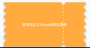
接着就是在上下两个缺口的位置绘制一条虚线:
  @override
  void paint(Canvas canvas, Rect rect, {TextDirection textDirection}) {
    //绘制一条白色的虚线
    var enableHeight = rect.height - diameter;
    //虚线的高度为5,间隔为5
    int dashNum = enableHeight ~/ 10;
    var dashTop = diameter / 2;
    var dashleft = rect.width * 0.7 + diameter / 2;
    for(int i = 0; i < dashNum; i++){
      if(dashTop + 5 > rect.height - diameter)
        dashTop = rect.height - diameter;
      canvas.drawLine(Offset(dashleft, dashTop), Offset(dashleft, dashTop + 5), _paint);
      dashTop += 15;
    }
  }
运行效果如下:
ClipPath和Card
上面的示例都是在Material中使用,在ClipPath中也可以使用:
Padding(
                padding: EdgeInsets.only(top: 20.0, left: 20.0, right: 20.0),
                child: ClipPath(
                  child: Image.asset(
                    "image/test.jpg",
                    fit: BoxFit.cover,
                  ),
                  clipper: ShapeBorderClipper(shape: CouponShapeBorder()),
                ),
              ),
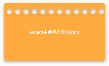
在Card中使用:
Padding(
                padding: EdgeInsets.only(top: 20.0, left: 20.0, right: 20.0),
                child: Card(
                  shape: MutilHoldShapeBorder(),
                  color: Colors.orangeAccent,
                  child: _ContentWidget("在Card中使用自定义Path"),
                  elevation: 5.0,
                ),
              ),
运行效果如下:
最后,再次感谢博主的分享,笔记中绘制的效果还有很多不尽如人意的地方,不满意可以查看原博主的文章:【Flutter高级玩法-shape】Path在手,天下我有
