

1、css变色icon

filter: drop-shadow(28vw 0 #cf3b2b);
filter 很牛逼,用好了可以实现很多的效果,常用的是图片置灰
drop-shadow: 这个属性用于向下投影阴影,类似于box-shadow,但是drop-shadow会穿过png图片的透明部分,不透明部分留下阴影。
// jsx
<div className="iconCon">
  <img src={require('../../assets/images/icon1_03.png')} alt=""/>
</div>

// less
.iconCon{
  @width: 28vw; // 保持img元素偏移与夫元素宽度相同
  width: @width;
  position: fixed;
  overflow: hidden; // 结合图片的border-right,隐藏掉图片
  right: 4vw;
  bottom: 5vw;
  img{
    width: @width;
    left: -@width;
    position: relative;
    filter: drop-shadow(@width 0 #cf3b2b);
    box-sizing: content-box;
    border-right: @width solid transparent; // 此处造成图片产生偏移,展示底层阴影
  }
}
2、邮票背景
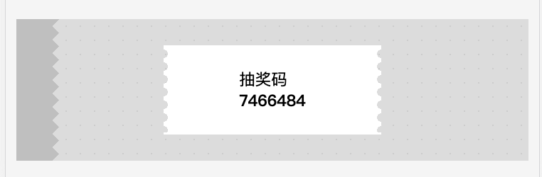
2、background-position,使背景产生小移动
mdn: radial-gradient
$radio: 2vw;
background: radial-gradient(transparent,transparent $radio,white $radio,white); //
background-size: $radio*3 $radio*3;
background-position: -$radio*1.5 0; //
border-top: .1rem solid #fff;
border-bottom: .1rem solid #fff;
