

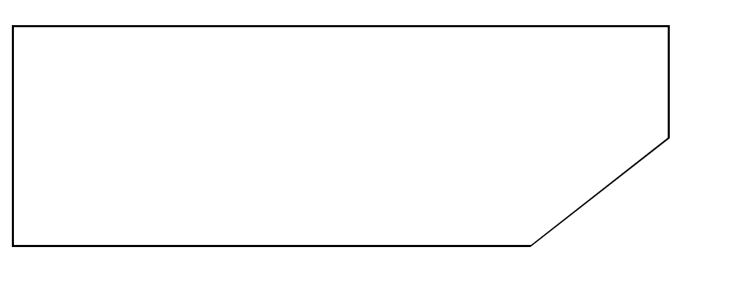
遇到这样一个问题,如何用css实现一个下面的效果
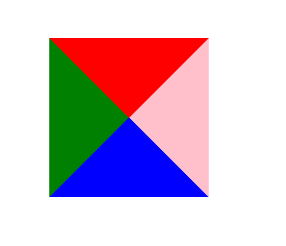
看着很复杂的问题,其实很简单,我们知道利用css的border是可以画出一个三角形的,例如
<div class="test-wrap"></div>
.test-wrap {
    width: 0;
    height: 0;
    border-top: 50px solid red;
    border-bottom: 50px solid blue;
    border-left: 50px solid green;
    border-right: 50px solid pink;
}
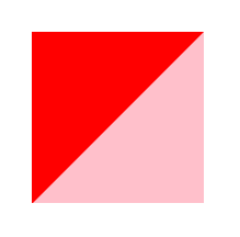
我们也可以通过不同的组合形式,例如
.test-wrap {
    width: 0;
    height: 0;
    border-top: 50px solid red;
    border-right: 50px solid pink;
}
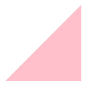
border-top设置为transparent,就可以实现下面的效果
.test-wrap {
    width: 0;
    height: 0;
    border-top: 50px solid transparent;
    border-right: 50px solid pink;
}
了解了这个方法之后我们就可以转换一下思路来完成之前的问题,如何画出一个有斜线的图形,我们可以同时画两个三角,将两个三角叠加,下面一层的颜色设置为图形的border颜色,上面一层的三角设置为北京颜色,将下面的三角的尺寸设置的比上面的要大1px(可以根据border的宽度适当调整)就可以实现上面的效果
代码如下:
<div class="box-wrap">
    <div class="outer-triangle"/>
    <div class="inner-triangle"/>
</div>
.box-wrap {
    width: 300px;
    height: 100px;
    border: 1px solid #000;
    position: relative;
}

.outer-triangle {
    width: 0;
    height: 0;
    border-top: 51px solid transparent;
    border-right: 65px solid black;
    position: absolute;
    right: -1px;
    bottom: -1px;
}

.inner-triangle {
    width: 0;
    height: 0;
    border-top: 50px solid transparent;
    border-right: 64px solid #ffffff;
    position: absolute;
    right: -1px;
    bottom: -1px;
}
