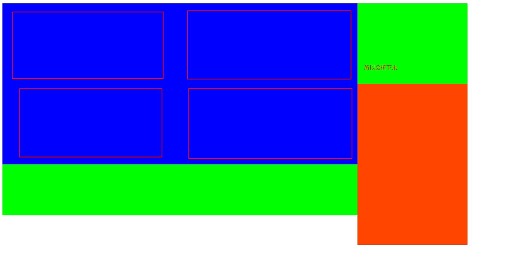
要做图片展示的布局:

方法一:
基础代码:
<!DOCTYPE html>
<html lang="en">
<head>
<meta charset="UTF-8">
<title>布局</title>
<style>
ul{
margin: 0;
padding: 0;
list-style: none;
}
.container{
width: 1100px;
height: 500px;
background-color: #0f0;
}
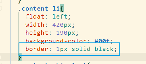
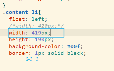
.content li{
float: left;
width: 420px;
height: 190px;
background-color: #00f;
}
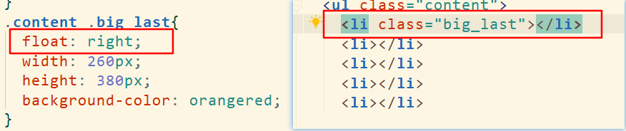
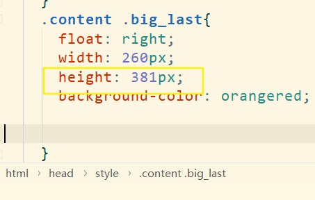
.content .big_last{
width: 260px;
height: 380px;
background-color: orangered;
}
</style>
</head>
<body>
<div class="container">
<ul class="content">
<li></li>
<li></li>
<li></li>
<li></li>
<li class="big_last"></li>
</ul>
</div>
</body>
</html>
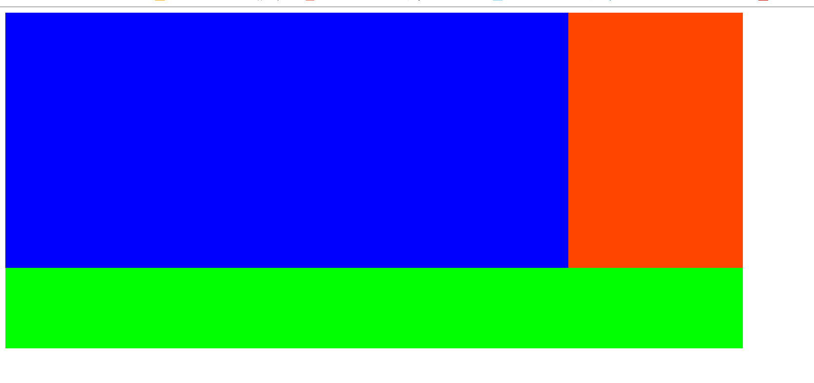
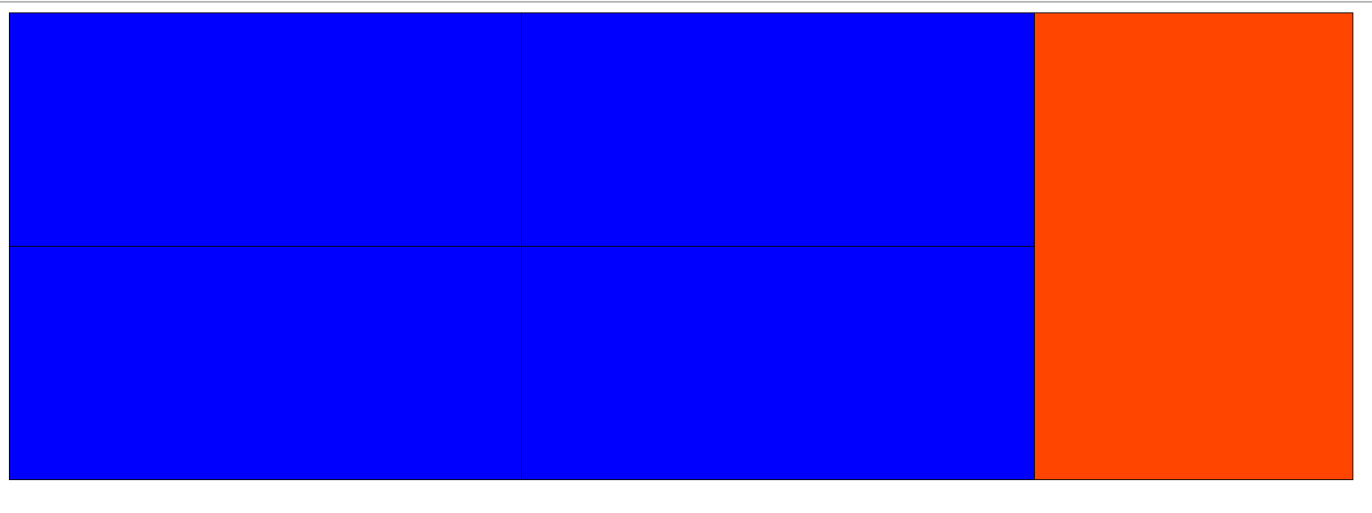
加上浮动:
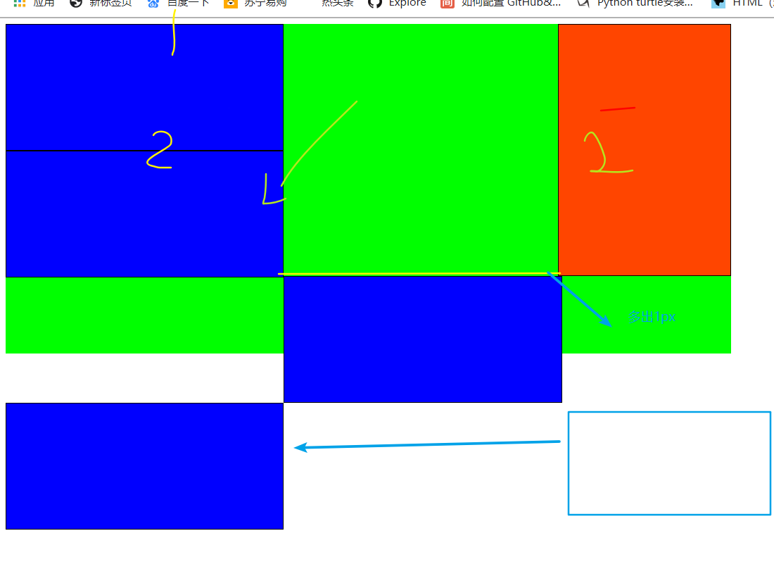
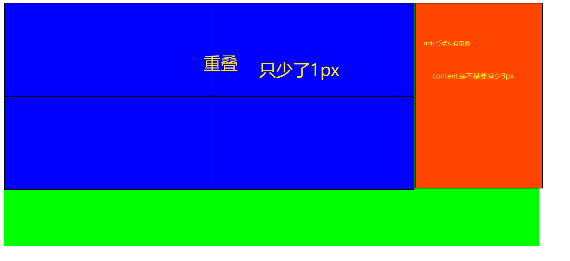
为什么是3px?
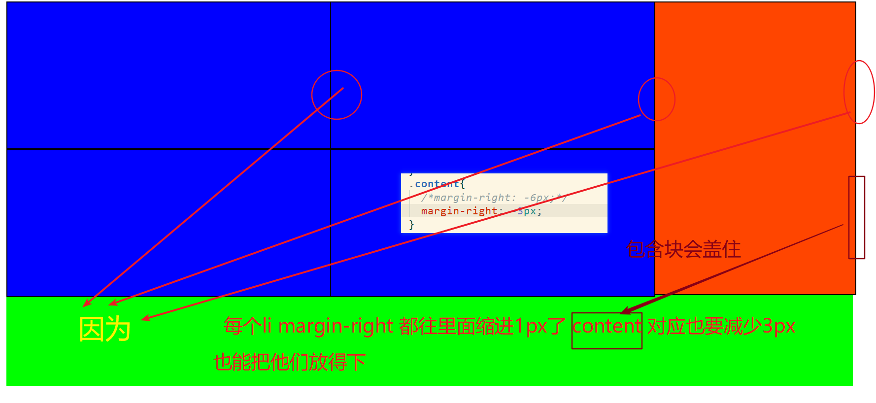
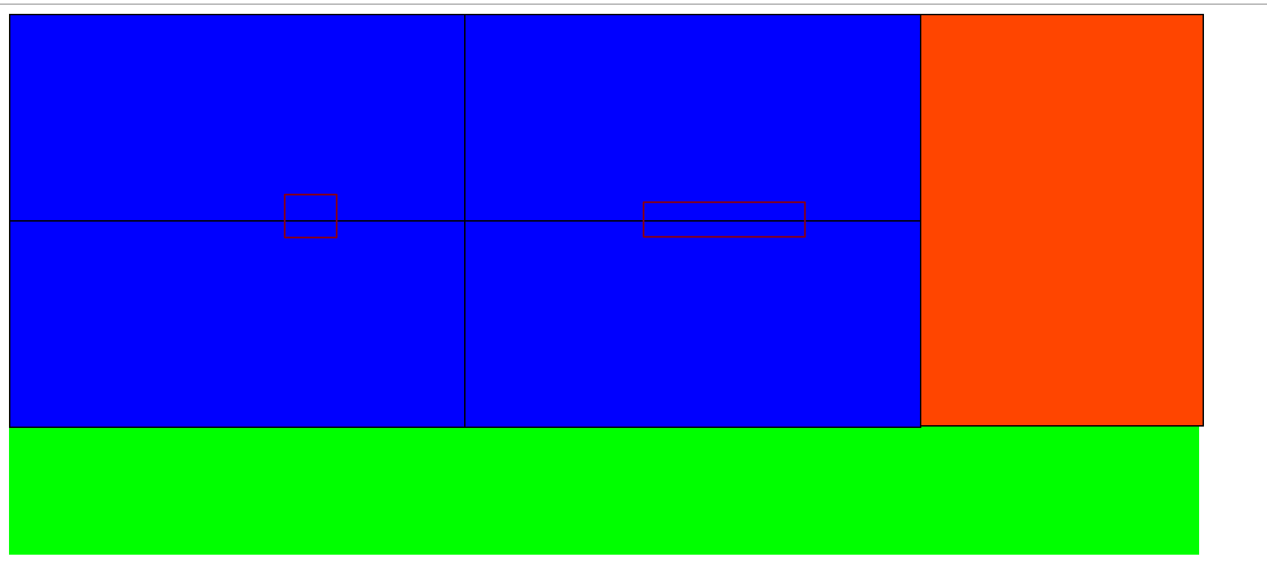
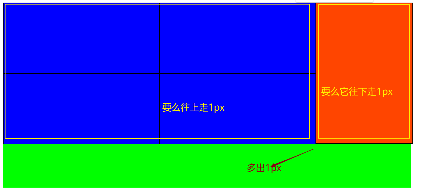
右边多出3px 让width减少1px 减少2px 多出1px:
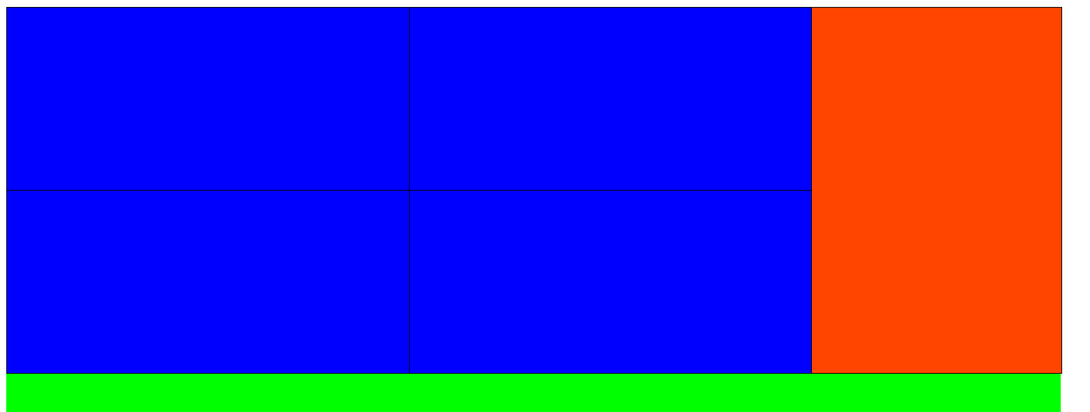
最终成型:
最终代码:
<!DOCTYPE html>
<html lang="en">
<head>
<meta charset="UTF-8">
<title>布局</title>
<style>
ul{
margin: 0;
padding: 0;
list-style: none;
}
.container{
width: 1100px;
height: 500px;
margin: 0 auto;
}
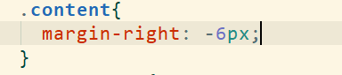
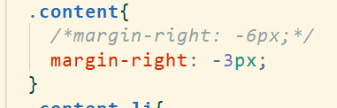
.content{
margin-right: -1px;
}
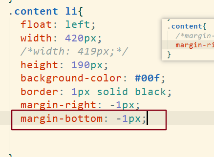
.content li{
float: left;
width: 419px;
height: 190px;
background-color: #00f;
border: 1px solid black;
margin-right: -1px;
margin-bottom: -1px;
}
.content .big_last{
float: right;
width: 260px;
height: 381px;
background-color: orangered;
}
</style>
</head>
<body>
<div class="container">
<ul class="content">
<li class="big_last"></li>
<li></li>
<li></li>
<li></li>
<li></li>
</ul>
</div>
</body>
</html>
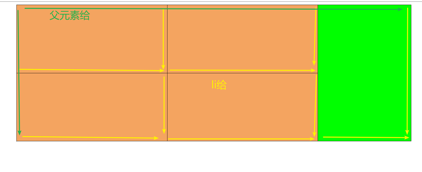
方法二:
<!DOCTYPE html>
<html lang="en">
<head>
<meta charset="UTF-8">
<title>Title</title>
<style>
ul{
margin: 0;
padding: 0;
list-style: none;
}
.container{
width: 1100px;
height: 500px;
margin: 0 auto;
}
.content{
height: 381px;
margin-right: -1px;
border-top: 1px solid black;
border-left: 1px solid black;
}
ul li{
float: left;
width: 419px;
height: 189px;
background-color: sandybrown;
border-bottom: 1px solid black;
border-right: 1px solid black;
}
.big_last{
float: right;
width: 259px;
height: 379px;
background-color: lime;
}
</style>
</head>
<body>
<div class="container">
<ul class="content">
<li class="big_last"></li>
<li></li>
<li></li>
<li></li>
<li></li>
</ul>
</div>
</body>
</html>


