

前言
此处省略八百字的前言......
怕内容太多理解需要点时间,我一句话做总结。创作使我快乐。
疫情当前愉快的心情提高了我的免疫力。
今天分享我的第N个Vue组件,Checkbox
1.组件设计
- 把组件拆分为
Checkbox和CheckboxGroup两个组件。 - Checkbox API
| 参数 | 说明 | 类型 | 可选值 | 默认值 |
|---|---|---|---|---|
| type | 类型 | String | default errer success warning |
default |
| value / v-model | 绑定值 | Boolean | 无 | 无 |
| label | 选中状态的值 | String | 无 | 无 |
| icon | 自定义选中的icon |
String | 无 | iconselected |
| disabled | 是否禁用Checkbox |
Boolean | 无 | 无 |
- CheckboxGroup API
| 参数 | 说明 | 类型 | 可选值 | 默认值 |
|---|---|---|---|---|
| type | 类型 | String | default errer success warning |
default |
| value / v-model | 绑定值 | Array | 无 | 无 |
| inline | 是否串联成一行 | Boolean | 无 | true |
| icon | 自定义选中的icon |
String | 无 | iconselected |
| disabled | 是否禁用Checkbox |
Boolean | 无 | 无 |
CheckboxCheckboxGroup配合使用时CheckboxGroup设置typeicondisabled属性可控制Checkbox的typeicondisabled属性。
2.实现
1.子组件获取父组件实例的方法
/utils/index.js

/**
  * 查找上级是否有存在对应组件
  * @param {*} context
  * @param {*} componentName
  * @param {*} componentNames
  */
export const findComponentUpward = (context, componentName, componentNames) => {
    if (typeof componentName === 'string') {
        componentNames = [componentName];
    } else {
        componentNames = componentName;
    }
    let parent = context.$parent;
    let name = parent.$options.name;
    while (parent && (!name || componentNames.indexOf(name) < 0)) {
        parent = parent.$parent;
        if (parent) { name = parent.$options.name; }
    }
    return parent;
};
2.mixins
/mixins/props.js

const type = {
    props: {
        type: {
            type: String,
            default: "default",
            validator: function (value) {
                return ["default", "errer", "success", "warning"].includes(value);
            }
        }
    }
}

module.exports = { type };
3.父组件获取指定子组件的方法
/utils/index.js

/**
 * 根据组件名称查找所有下级对应的组件(特定的层级关系,没法跨级查询)
 * @param {*} context
 * @param {*} componentName
 */
export const findComponentsDownward = (context, componentName) => {
    const array = [];
    for (let i = 0; i < context.$children.length; i += 1) {
        if (context.$children[i].$options.name === componentName) {
            array.push(context.$children[i]);
        }
    }
    return array;
};
4.Checkbox组件实现
template
<template>
  <label class="g7-Checkbox">
    <span :class="['g7-Checkbox-icon',`g7-text-color-${parentType}`,{['disabled']:parenDisabled}]">
      <transition name="fade">
        <Icon v-show="currentValue" :size="20" :icon="parentIcon" />
      </transition>
    </span>
    <span :class="['g7-Checkbox-text',{['disabled']:parenDisabled}]">
      <slot>{{label}}</slot>
    </span>
    <!-- 依据是否存在CheckboxGroup父组件,而使用不同的处理方式 -->
    <input
      v-if="parent"
      type="checkbox"
      :value="label"
      class="g7-Checkbox-input"
      @change="change"
      v-model="model"
      :disabled="parenDisabled"
    />
    <input
      v-else
      type="checkbox"
      class="g7-Checkbox-input"
      :checked="currentValue"
      @change="change"
      :disabled="parenDisabled"
    />
  </label>
</template>
javaScript
<script>
import Icon from "../Icon";  //自定义的组件
import { findComponentUpward } from "../../utils";
import { type } from "../../mixins/props";
export default {
  name: "G-Checkbox",
  components: { Icon },
  mixins: [type],
  data() {
    return {
      parent: "",
      currentValue: this.value,
      model: []
    };
  },
  props: {
    label: {
      type: String
    },
    icon: {
      type: String,
      default: "iconselected"
    },
    value: {
      type: Boolean
    },
    disabled: {
      type: Boolean
    }
  },
  watch: {
    value(val) {
      this.currentValue = val;
    },
    model(val) {
      for (let i = 0; i < val.length; i += 1) {
        if (!this.label) {
          return;
        }
        if (val[i] === this.label) {
          this.currentValue = true;
          break;
        }
        this.currentValue = false;
      }
    }
  },
  methods: {
    /**
     * 根据入参判断CheckboxGroup组件是否有指定的的值
     */
    parentFnc(options, value) {
      if (value) {
        return this.parent[options] === value
          ? this[options]
          : this.parent[options];
      }
      return this.parent[options] ? this.parent[options] : this[options];
    },
    change(e) {
      if (this.parenDisabled) {
        return;
      }
      //如果存在父组件的实例,则触发父组件对应的方法
      if (this.parent) {
        this.parent.change(this.model);
        return;
      }
      this.currentValue = e.target.checked;
      this.$emit("input", this.currentValue);
      this.$emit("on-change", this.currentValue);
    }
  },
  computed: {
    parentIcon() {
      if (this.parent) {
        const { parentFnc } = this;
        return parentFnc("icon", "iconselected");
      }
      return this.icon;
    },
    parentType() {
      if (this.parent) {
        const { parentFnc } = this;
        return parentFnc("type", "default");
      }
      return this.type;
    },
    parenDisabled() {
      if (this.parent) {
        const { parentFnc } = this;
        return parentFnc("disabled");
      }
      return this.disabled;
    }
  },
  mounted() {
    const parent = findComponentUpward(this, "G-Checkbox-Group");
    if (parent) {
      this.parent = parent;
      parent.updateModel();
    }
  }
};
</script>
5.CheckboxGroup组件实现
/CheckboxGroup/index.vue

<template>
  <div :class="['g7-CheckboxGroup',{['inline']:inline}]">
    <slot></slot>
  </div>
</template>

<script>
import { type } from "../../mixins/props";
import { findComponentsDownward } from "../../utils/index";
export default {
  name: "G-Checkbox-Group",
  mixins: [type],
  data() {
    return {
      childrens: [],
      currentValue: this.value
    };
  },
  props: {
    value: {
      type: Array,
      default() {
        return [];
      }
    },
    inline: {
      type: Boolean,
      default: true
    },
    disabled: {
      type: Boolean
    },
    icon: {
      type: String,
      default: "iconselected"
    }
  },
  watch: {
    value(val) {
      this.currentValue = val;
      this.updateModel();
    }
  },
  methods: {
    updateModel() {
      this.childrens = findComponentsDownward(this, "G-Checkbox");
      if (this.childrens) {
        this.childrens.forEach(element => {
          element.model = this.currentValue;
          element.currentValue = this.currentValue.indexOf(element.label) >= 0;
        });
      }
    },
    change(value) {
      this.currentValue = value;
      this.$emit("input", value);
      this.$emit("on-change", value);
      this.updateModel();
    }
  },
  mounted() {
    this.updateModel();
  }
};
</script>
调用代码
<template>
  <demoTop gray text="Checkbox">
    <section class="demo-button-row">
      <h3>基本用法</h3>
      <div class="cell">
        <G-Checkbox>选项</G-Checkbox>
      </div>
    </section>
    <section class="demo-button-row">
      <h3>type类型</h3>
      <div class="cell">
        <G-Checkbox-Group>
          <G-Checkbox type="default" label="default"></G-Checkbox>
          <G-Checkbox type="errer" label="errer"></G-Checkbox>
          <G-Checkbox type="success" label="success"></G-Checkbox>
          <G-Checkbox type="warning" label="warning"></G-Checkbox>
        </G-Checkbox-Group>
      </div>
    </section>
    <section class="demo-button-row">
      <h3>搭配CheckboxGroup使用</h3>
      <div class="cell">
        <G-Checkbox-Group>
          <G-Checkbox label="选项一" />
          <G-Checkbox label="选项二" />
          <G-Checkbox label="选项三" />
        </G-Checkbox-Group>
      </div>
    </section>
    <section class="demo-button-row">
      <h3>v-model绑定</h3>
      <div class="cell">
        <G-Checkbox-Group v-model="model">
          <G-Checkbox label="选项一" />
          <G-Checkbox label="选项二" />
          <G-Checkbox label="选项三" />
        </G-Checkbox-Group>
      </div>
    </section>
    <section class="demo-button-row">
      <h3>禁用</h3>
      <div class="cell">
        <G-Checkbox-Group :value="['选项二']">
          <G-Checkbox disabled label="选项一" />
          <G-Checkbox disabled label="选项二" />
          <G-Checkbox label="选项三" />
        </G-Checkbox-Group>
      </div>
    </section>
    <section v-if="false" class="demo-button-row">
      <h3>禁用</h3>
      <div class="cell">
        <G-Checkbox-Group disabled :value="['选项二']">
          <G-Checkbox label="选项一" />
          <G-Checkbox label="选项二" />
          <G-Checkbox label="选项三" />
        </G-Checkbox-Group>
      </div>
    </section>
    <section v-if="false" class="demo-button-row">
      <h3>禁用</h3>
      <div class="cell">
        <G-Checkbox-Group type="success" :value="['选项二']">
          <G-Checkbox label="选项一" />
          <G-Checkbox label="选项二" />
          <G-Checkbox label="选项三" />
        </G-Checkbox-Group>
      </div>
    </section>
    <section v-if="false" class="demo-button-row">
      <h3>禁用</h3>
      <div class="cell">
        <G-Checkbox-Group icon="iconradioactive" :value="['选项二']">
          <G-Checkbox label="选项一" />
          <G-Checkbox label="选项二" />
          <G-Checkbox label="选项三" />
        </G-Checkbox-Group>
      </div>
    </section>
    <section class="demo-button-row">
      <h3>change事件</h3>
      <div class="cell">
        <G-Checkbox-Group @on-change="change">
          <G-Checkbox label="选项一" />
          <G-Checkbox label="选项二" />
          <G-Checkbox label="选项三" />
        </G-Checkbox-Group>
      </div>
    </section>
  </demoTop>
</template>

<script>
export default {
  data() {
    return {
      model: ["选项二"]
    };
  },
  methods: {
    change(val) {
      this.$Toast.info(`选中:${val}`);
    }
  }
};
</script>

<style lang="less" scoped>
.demo-button-row {
  padding: 0 15px;
  h3 {
    margin: 0;
    padding: 15px 0;
    color: #84849a;
    font-weight: normal;
    font-size: 14px;
  }
}
</style>
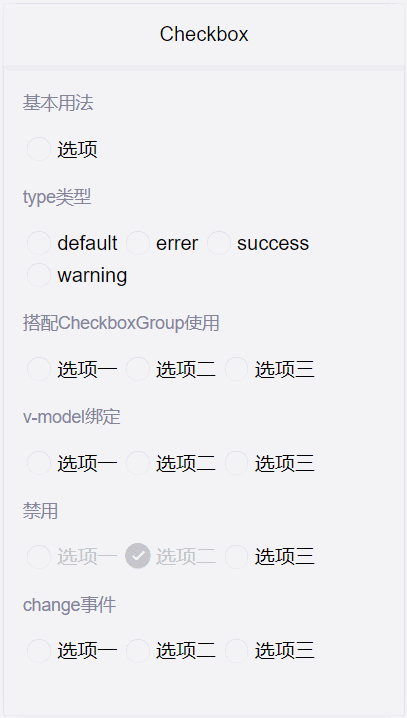
效果图
总结
本人水平有限,搬砖不易,不足之处请多指教!
各种各样的业务组件经过内部业务的打磨后,会慢慢整理共享给各位大佬......
