

HTML5/css3
实现盒子垂直水平居中的几种方案
定位三种方式:
- 案例中实践
<html>
    <head>
        <meta charset="UTF-8">
        <title>欢迎关注的我的掘金Randall,我们一起成长~</title>
    </head>
    <style>
        html,
        body{
            height: 100%;
            width: 100%;
            overflow: hidden;
        }
        .box{
            box-sizing: border-box;
            width: 100px;
            height: 50px;
            border: 1px solid lightblue;
            line-height: 48px;
            text-align: center;
            background-color: lightcoral;
        }


    </style>
    <body>
        <div class="box">掘金社区</div>
    </body>
</html>
如何让box在body中居中
第一种解决方案
body{
        position: relative;
    }

    .box{
        position: absolute;
        top: 50%;
        right: 50%;
        margin-top: -50px;
        margin-left: -50px;
    }
缺点: box盒子必须有宽高,且需要用到宽高
第二种解决方案
        body{
                position: relative;
            }
        .box{
            position: absolute;
            top: 0px;
            right: 0px;
            left: 0px;
            bottom: 0px;
            margin: auto;
        }
缺点: box盒子必须有宽高,可以不使用
第三种解决方案 使用css3中transform
        body{
                position: relative;
            }
        .box{
            position:absolute;
            top:50%;
            left: 50%;
            transform: translate(-50%,-50%);
        }
优点: 盒子可以没有宽高,内容自适应宽高
缺点: 浏览器兼容性问题
第四种解决方案 使用弹性伸缩布局 display:flex
        body{
            display: flex;
            justify-content: center;
            align-items: center;
        }
优点: 盒子可以没有宽高,内容自适应宽高
缺点: 浏览器兼容性问题
第五种解决方案,display:table-cell
        body{
            display: table-cell;
            text-align: center;
            vertical-align: middle;
            /* 固定宽高 */
            width: 800px;
            height: 800px;
        }

        .box{
            display: inline-block;
        }
优点: 子盒子可以不需要宽高,内容自适应
缺点: 父容器必须固定宽高
css中的盒子模型
标准盒子模型
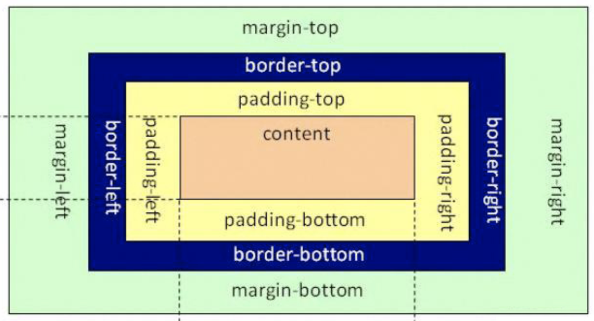
box-sizing: content-box;
盒子大小就是content大小
IE盒子模型
盒子大小=content+padding+border
flex盒子模型
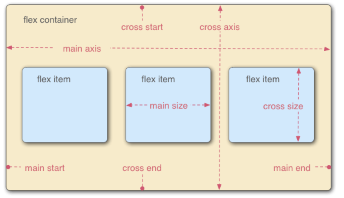
采用 Flex 布局的元素,称为 Flex 容器(flex container),容器默认存在两根轴:水平的主轴(main axis)和垂直的交叉轴(cross axis)。主轴的开始位置(与边框的交叉点)叫做main start,结束位置叫做main end;交叉轴的开始位置叫做cross start,结束位置叫做cross end。
项目默认沿主轴排列。单个项目占据的主轴空间叫做main size,占据的交叉轴空间叫做cross size。
掌握经典布局方案
圣杯布局

<!DOCTYPE html>
<html>

<head>
    <style>
        html,
        body {
            height: 100%;
            overflow: hidden;
            width: 100%;
            padding: 0;
            margin: 0px;
        }

        .content-box {
            box-sizing: border-box;
            width: 100%;
            height: 100%;
            padding-left:200px;
            padding-right: 200px;
        }

        .center-box {
            width: 100%;
            box-sizing: border-box;
            float: left;
            background: lightblue;
            min-height: 800px;
        }

        .left-box {
            box-sizing: border-box;
            float: left;
            margin-left: -100%;
            width: 200px;
            background: red;
            position: relative;
            left: -200px;
            min-height: 600px;
        }

        .right-box {
            box-sizing: border-box;
            float: left;
            width: 200px;
            background: lightsalmon;
            margin-right: -200px;
            min-height: 600px;
        }
    </style>
</head>

<body>
    <div>
        <div class="content-box">
            <div class="center-box"></div>
            <div class="left-box"></div>
            <div class="right-box"></div>
        </div>

    </div>
</body>

</html>
使用flex 实现左右固定,中间自适应
<!DOCTYPE html>
<html>

<head>
    <style>
        html,
        body {
            height: 100%;
            overflow: hidden;
            width: 100%;
            padding: 0px;
            margin: 0px;
        }
        .content-box {
            display: flex;
            justify-content: space-between;
            height: 100%;
        }
        .left-box,
        .right-box{
            flex: 0 0 200px;
            min-height: 600px;
            background: red;
        }
        .center-box {
            flex: 1;
            min-height: 600px;
            background-color: rosybrown;
        }
    </style>
</head>

<body>
    <div class="content-box">
        <div class="left-box"></div>
        <div class="center-box"></div>
        <div class="right-box"></div>
    </div>

</body>

</html>
使用定位 实现左右固定,中间自适应
<!DOCTYPE html>
<html>

<head>
    <style>
        html,
        body {
            height: 100%;
            overflow: hidden;
            width: 100%;
            padding: 0px;
            margin: 0px;
        }

        .content-box {
            position: relative;
            width: 100%;
        }

        .left-box,
        .right-box {
            position: absolute;
            width: 200px;
            background-color: red;
            min-height: 600px;
            box-sizing: border-box;
            top: 0;
        }

        .left-box {
            left: 0;
        }

        .right-box {
            right: 0;
        }

        .center-box {
            box-sizing: border-box;
            margin: 0px 200px;
            min-height: 600px;
            background-color: sandybrown;
        }
    </style>
</head>

<body>
    <div class="content-box">
        <div class="left-box"></div>
        <div class="center-box"></div>
        <div class="right-box"></div>
    </div>

</body>

</html>
总结: 如果不考虑兼容性,推荐使用flex进行布局,考虑兼容性就使用定位。
结语
由于内容较多,接下来会持续分类整理各个大厂的面试题,希望能帮助到你,早日实现自己的目标,共同进步。
喜欢的小伙伴,点赞、关注、转发,永远不迷路💗
