

效果如下
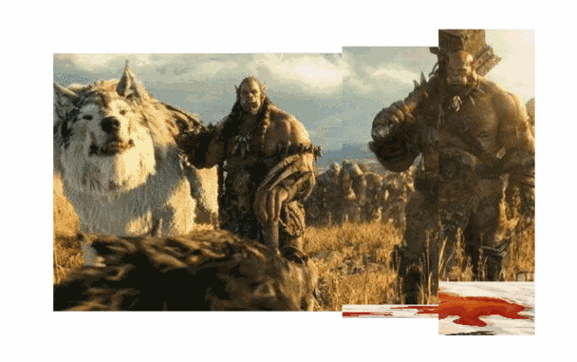
也可以去www.dh70.top/CSS3/6.html看效果。
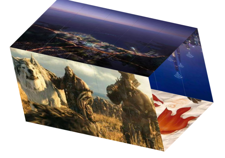
主要原理:
1、每张图由5部分组成,分别存在5个元素(ul)里,每个ul里有4个li来保存4幅图的部分内容
2、用transform 3D 把4张图组成一个正方体
如下:
3、用动画及延时做旋转效果
需要注意的点:
1、总div和字ul之间是:子绝父相弹性布局
2、为了显示3D化,总div和ul都应该加transform-style: preserve-3d;
源码:
<!DOCTYPE html>
<html lang="en">
<head>
    <meta charset="UTF-8">
    <meta name="viewport" content="width=device-width, initial-scale=1.0">
    <meta http-equiv="X-UA-Compatible" content="ie=edge">
    <title>Document</title>
    <style>
    *{
        margin: 0;
        padding: 0;
        list-style: none;
    }
    .show{
        width: 560px;
        height: 300px;
        display: flex;
        transform-style: preserve-3d;
        margin: 100px auto;
        /* background-color: #ccc; */
        transform: rotate3d(1,1,0,-50deg)
    }
    ul{
        flex: 1;
        position: relative;
        transform-style: preserve-3d;
        animation-name: "roll";
        animation-duration: 10s;
        animation-iteration-count: infinite;
        animation-fill-mode:none;
    }
    ul:nth-of-type(1){
        animation-delay: 0;
    }
    ul:nth-of-type(2){
        animation-delay: 0.2s;
    }
    ul:nth-of-type(3){
        animation-delay: 0.4s;
    }
    ul:nth-of-type(4){
        animation-delay: 0.6s;
    }
    ul:nth-of-type(5){
        animation-delay: 0.8s;
    }
    ul>li{
        width: 112px;
        height: 300px;
        position: absolute;
    }
    ul:nth-of-type(1)>li:nth-of-type(1){
        background-position-x: 0;
    }
    ul:nth-of-type(2)>li{
        background-position-x: -112px;
    }
    ul:nth-of-type(3)>li{
        background-position-x: -224px;
    }
    ul:nth-of-type(4)>li{
        background-position-x: -336px;
    }
    ul:nth-of-type(5)>li{
        background-position-x: -448px;
    }
    ul li:nth-of-type(1){
        background-image: url("image/qiege/sb1.jpg");
        transform: translateZ(150px);
    }
    ul li:nth-of-type(2){
        background-image: url("image/qiege/sb2.jpg");
        transform: translateY(-150px)  rotateX(90deg);
    }
    ul li:nth-of-type(3){
        background-image: url("image/qiege/sb3.jpg");
        transform: translateZ(-150px) rotateX(180deg);
    }
    ul li:nth-of-type(4){
        background-image: url("image/qiege/sb4.jpg");
        transform:translateY(150px) rotateX(-90deg);
    }

    @keyframes roll{
        0%{
            transform: rotateX(0deg)
        }
        10%{
            transform: rotateX(-90deg)
        }
        25%{
            transform: rotateX(-90deg)
        }
        35%{
            transform: rotateX(-180deg)
        }
        50%{
            transform: rotateX(-180deg)
        }
        60%{
            transform: rotateX(-270deg)
        }
        75%{
            transform: rotateX(-270deg)
        }
        85%{
            transform: rotateX(-360deg)
        }
        100%{
            transform: rotateX(-360deg)
        }
    }
    </style>
</head>
<body>
    <div class="show">
        <ul>
            <li></li>
            <li></li>
            <li></li>
            <li></li>
        </ul>
        <ul>
            <li></li>
            <li></li>
            <li></li>
            <li></li>
        </ul>
        <ul>
            <li></li>
            <li></li>
            <li></li>
            <li></li>
        </ul>
        <ul>
            <li></li>
            <li></li>
            <li></li>
            <li></li>
        </ul>
        <ul>
            <li></li>
            <li></li>
            <li></li>
            <li></li>
        </ul>
    </div>
</body>
</html>
