

欢迎点赞,转载请注明出处
本节示例项目源代码下载点击这里 control_demos
有些widgets是有状态的, 有些是无状态的。如果用户与widget交互,widget外观形态会发生变化,那么它就是有状态的,否则它就是无状态的widget。一个有状态的widget的状态保存在一个State对象中,它和 Widget的显示分离。
Widget状态管理
- 如果状态是用户数据,如复选框的选中状态、滑块的位置,则该状态最好由父Widget管理。
- 如果所讨论的状态是有关界面外观效果的,例如动画,那么状态最好由Widget本身来管理。
一般来说父 widget 管理状态并告诉其子 widget 何时更新通常是最合适的,我们看下官方的一个例子如下图:

- TapboxB是ParentWidget的子Widget,控制TapBoxB的外观的关键变量active是由ParentWidget的变量 _active(代码第12行)赋值控制的(代码第24行);
- 第32行TapboxB构造函数的命名参数this.onChanged的修饰符@required表示this.onChanged是必须要初始化的。当然你也可以这样定义 TapboxB( this.onChanged,{Key key, this.active: false}),但是调用时没有命名参数那么直观。
- 第36行final ValueChanged<bool> onChanged的ValueChanged是Dart内置的一种类型,它的定义如下:
typedef ValueChanged<T> = void Function(T value);
如果你还不习惯这种用法,第36行可以直接改为final Function onChanged,也不影响程序运行效果。或者是改成下面的形式:
typedef TapboxBChanged = void Funtion(bool);

...

final TapboxBChanged onChanged;
我们要逐步习惯将函数(事件)作为另外一个函数参数的使用方法,这是一种委托(delegate)的设计模式。
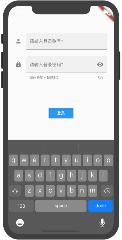
一个登录页面示例
我们开始做一个登录界面,巩固下我们前几章学习的知识,以及了解一些新的Widget的用法。界面图大致如下:
- Form Widget是将多个表单域(如TextField)组合显示的一种容器Widget。每个单独的表单域需要被它们父类FormField包裹。通过调用FormState对象方法保存、重置或验证每个表单域。我们可以通过Form.of(context)方法或者GlobalKey.currentState的方式获取到FormState对象。(注:通过Form的父context,得到的Form.of(context)可能是null,所以推荐使用currentState的方式。)
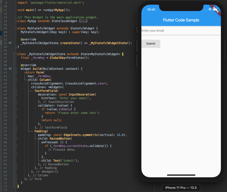
- TextField Widget是一种Material Design风格的文本域。TextField允许用户通过硬件键盘或屏幕上的软键盘输入文本信息。当用户改变文本内容时,TextField会调用onChange回调函数。当用户结束输入时,则会调用onSubmitted回调函数。如果要将TextField跟其他表单域一起放在表单中,则考虑使用TextFormField Widget。下面是一个TextFormFiled的基本使用方式:
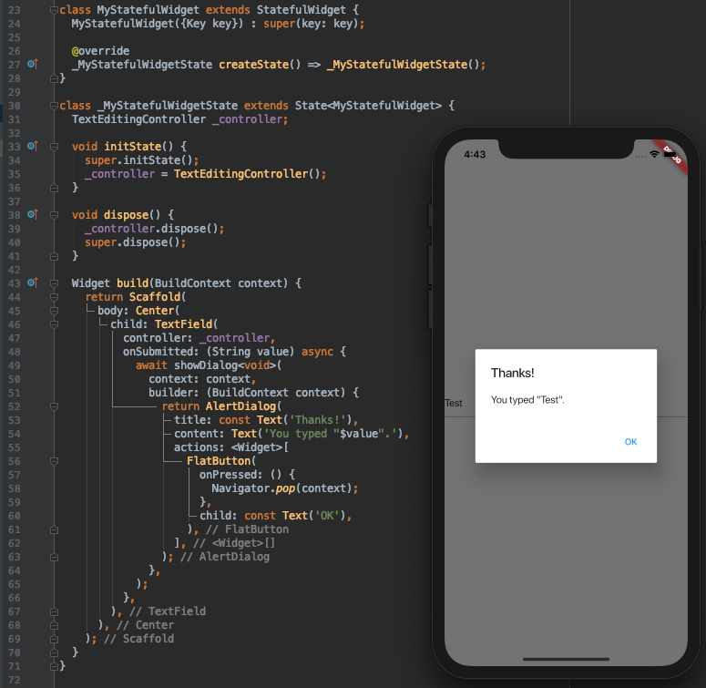
- 可以使用TextEditingController控制TextField和TextFormField文本的显示,选中以及撰写部分。下例展示检测文本变化的2个方法。其中,在State的initState方法中增加TextEditingController监听,在dispose方法里释放TextEditingController对象。initState在State创建时只调用一次,dispose在state完全释放时调用。
import 'package:flutter/material.dart';

void main() => runApp(MyApp());

class MyApp extends StatelessWidget {
  @override
  Widget build(BuildContext context) {
    return MaterialApp(
      title: 'Retrieve Text Input',
      home: MyCustomForm(),
    );
  }
}

class MyCustomForm extends StatefulWidget {
  @override
  _MyCustomFormState createState() => _MyCustomFormState();
}

class _MyCustomFormState extends State<MyCustomForm> {

  final myController = TextEditingController();

  @override
  void initState() {
    super.initState();
    myController.addListener(_printLatestValue);
  }

  @override
  void dispose() {
    myController.dispose();
    super.dispose();
  }

  _printLatestValue() {
    print("Second text field: ${myController.text}");
  }

  @override
  Widget build(BuildContext context) {
    return Scaffold(
      appBar: AppBar(
        title: Text('Retrieve Text Input'),
      ),
      body: Padding(
        padding: const EdgeInsets.all(16.0),
        child: Column(
          children: <Widget>[
            TextField(
              onChanged: (text) {
                print("First text field: $text");
              },
            ),
            TextField(
              controller: myController,
            ),
          ],
        ),
      ),
    );
  }
}
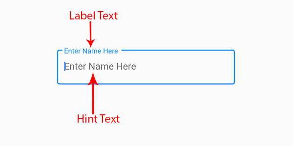
- 默认地,TextField和TextFormField有个decoration参数指明用来绘制文本区域的边界类型,decoration参数是InputDecoration类。InputDecoration类的labelText和hintText的基本属性效果如下,其他属性也很容易理解,限于篇幅这里不展开表述了。
学习了上面Form表单的一些概念,下面的完整的登录页面布局和交互逻辑代码理解起来相对会容易一些:
import 'package:flutter/material.dart';

void main() => runApp(MyApp());

class MyApp extends StatelessWidget {
  @override
  Widget build(BuildContext context) {
    return MaterialApp(
      title: 'Flutter Login Demo',
      theme: ThemeData(
        primarySwatch: Colors.blue,
      ),
      home: LoginWidget(),
    );
  }
}

class LoginWidget extends StatelessWidget {
  @override
  Widget build(BuildContext context) {
    return Scaffold(
      body: LoginForm(),
    );
  }
}

class LoginForm extends StatefulWidget {
  const LoginForm({Key key}) : super(key: key);

  @override
  LoginFormState createState() => LoginFormState();
}


class PasswordField extends StatefulWidget {
  const PasswordField({
    this.fieldKey,
    this.hintText,
    this.labelText,
    this.helperText,
    this.validator,
  });

  final Key fieldKey;
  final String hintText;
  final String labelText;
  final String helperText;
  final FormFieldValidator<String> validator;

  @override
  _PasswordFieldState createState() => _PasswordFieldState();
}

class _PasswordFieldState extends State<PasswordField> {
  bool _obscureText = true;

  @override
  Widget build(BuildContext context) {
    return TextFormField(
      key: widget.fieldKey,
      obscureText: _obscureText,
      cursorColor: Theme.of(context).cursorColor,
      maxLength: 8,
      validator: widget.validator,
      decoration: InputDecoration(
        filled: true,
        icon: Icon(Icons.lock),
        hintText: widget.hintText,
        labelText: widget.labelText,
        helperText: widget.helperText,
        suffixIcon: GestureDetector(
            onTap: () {
            setState(() {
              _obscureText = !_obscureText;
            });
          },
          child: Icon(
            _obscureText ? Icons.visibility : Icons.visibility_off
          ),
        ),
      ),
    );
  }
}

class LoginFormState extends State<LoginForm> {

   void showInSnackBar(String value) {
    Scaffold.of(context).hideCurrentSnackBar();
    Scaffold.of(context).showSnackBar(SnackBar(
      content: Text(value),
    ));
  }

  bool _autoValidate = false;

  final GlobalKey<FormState> _formKey = GlobalKey<FormState>();

  void _handleSubmitted() {
    final form = _formKey.currentState;
    if (!form.validate()) {
      _autoValidate = true; // Start validating on every change.
      showInSnackBar(
        "登录前请先修复红色提示错误!",
      );
    } else {
      form.save();
      showInSnackBar("登录成功");
    }
  }

  String _validateName(String value) {
    if (value.isEmpty) {
      return "账号不能为空";
    }
    final nameExp = RegExp(r'^[A-Za-z ]+$');
    if (!nameExp.hasMatch(value)) {
      return "账号只能是英文字母";
    }
    return null;
  }

  @override
  Widget build(BuildContext context) {
    final cursorColor = Theme.of(context).cursorColor;
    const sizedBoxSpace = SizedBox(height: 24);

    return Scaffold(
      body: Form(
        key: _formKey,
        autovalidate: _autoValidate,
        child: Center(
            child: Container(
              padding: const EdgeInsets.symmetric(horizontal: 24),
              child: Column(
                crossAxisAlignment: CrossAxisAlignment.start,
                children: [
                  SizedBox(height: 96),
                  TextFormField(
                    cursorColor: cursorColor,
                    decoration: InputDecoration(
                      filled: true,
                      icon: Icon(Icons.person),
                      hintText: "groupones",
                      labelText:
                     "请输入登录账号*",
                    ),
                    validator: _validateName,
                  ),
                  sizedBoxSpace,
                  PasswordField(
                    helperText:
                    "密码长度不超过8位",
                    labelText:
                    "请输入登录密码*",
                  ),
                  sizedBoxSpace,
                  Expanded(
                    child:  Center(
                      child: RaisedButton(
                        color: Colors.blue,
                        textColor: Colors.white,
                        child: Text(
                            "登录"),
                        onPressed: _handleSubmitted,
                      ),
                    ),
                  ),
                ],
          ),
            ),
        ),
      ),
    );
  }
}
以上代码还有几个相关的知识点需要解释如下:
- 密码文本框有个小眼睛效果的处理,我们_PasswordFieldState类里使用_obscureText变量来跟踪这个状态,_PasswordFieldState.widget为PasswordField的实例对象。你也可以尝试使用TextFormField派生类的方式来实现同样的效果,但后者的耦合性会强一些。
- GlobalKey在一个应用中提供唯一的键值。对于StatefulWidget来说,用于访问它的state对象。GlobalKey<FormState>.currentState用于访问Form Widget的FormState。而FormState的validate和save方法则会触发Form内所有的表单域的validator和onSaved事件的回调函数。
- RegExp定义了一个正则表达式模式对象,它的用法跟其他编程语言用法类似,此处不展开描述。
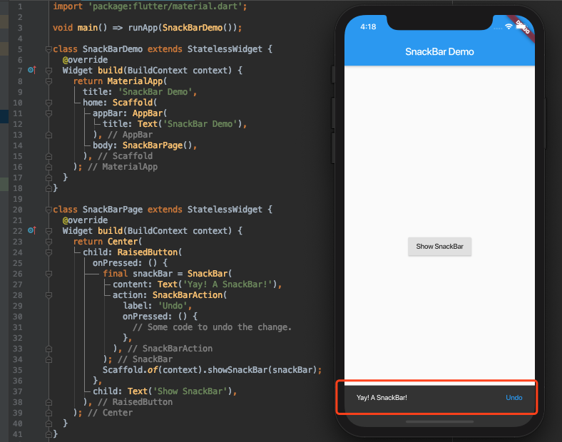
- SnackBar是一种类似弹框展示提示用户信息的小组件,它的使用方式很简单,showSnackBar用于显示,hideSnackBar用于隐藏:
- 如果你觉得SnackBar提示不够明显,也可以选择AlertDialog模态弹框的形式,效果如下图:
实验八
在本节登录例子的基础上进行以下功能扩展:预先设定一对有效的用户名和密码,当输入账号和密码连续三次错误时,提示用户登录锁定,同时将登录按钮变灰,不能使用,并在登录按钮上显示倒计时60秒的动态效果,倒计时结束后方可再次登录验证。
提示:输入信息保存可以考虑使用onSaved,倒计时使用Timer.periodic。
