

先说说三栏布局:整体高度已知,左右两边宽度固定,中间内容宽度自适应。
总共是有五种实现方式,分别是: 浮动解决方案、绝对定位解决方案、flexbox解决方案、table解决方案、网格布局解决方案。 下面,上代码,看效果。 页面初始化
  <style>
    html * {
      margin: 0;
      padding: 0;
    }
    .layout {
      margin-top: 20px;
    }
    .layout article div {
      min-height: 100px;
    }
  </style>
浮动解决方案
  <section class="layout float">
    <style>
      .layout.float .left {
        float: left;
        width: 300px;
        background-color: red;
      }
      .layout.float .right {
        float: right;
        width: 300px;
        background-color: blue;
      }
      .layout.float .center {
        background-color: yellow;
      }
    </style>
    <article class="left-center-right">
      <div class="left"></div>
      <div class="right"></div>
      <div class="center">
        <h2>浮动解决方案</h2>
      </div>
    </article>
  </section>
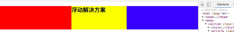
优点:兼容性好 缺点:元素脱离文档流,产生浮动
绝对定位解决方案
  <section class="layout absolute">
    <style>
      .layout.absolute .left-center-right>div {
        position: absolute;
      }
      .layout.absolute .left {
        width: 300px;
        left: 0;
        background-color: red;
      }
      .layout.absolute .center {
        left: 300px;
        right: 300px;
        background-color: yellow;
      }
      .layout.absolute .right {
        width: 300px;
        right: 0;
        background-color: blue;
      }
    </style>
    <article class="left-center-right">
      <div class="left"></div>
      <div class="center">
        <h2>绝对定位解决方案</h2>
      </div>
      <div class="right"></div>
    </article>
  </section>
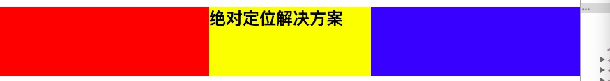
优点:快速的页面开发。 缺点:元素脱离文档流,意味着下面元素也得脱离文档流,可使用性较差。
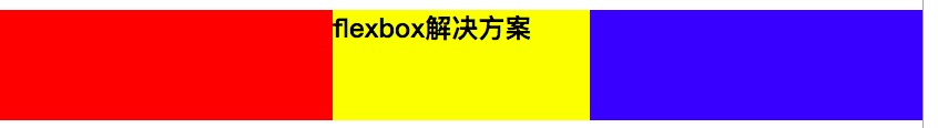
flexbox解决方案
  <section class="layout flexbox">
    <style>
      .layout.flexbox {
        margin-top: 140px;
      }
      .layout.flexbox .left-center-right {
        display: flex;
      }
      .layout.flexbox .left {
        width: 300px;
        background-color: red;
      }
      .layout.flexbox .center {
        flex: 1;
        background-color: yellow;
      }
      .layout.flexbox .right {
        width: 300px;
        background-color: blue;
      }
    </style>
    <article class="left-center-right">
      <div class="left"></div>
      <div class="center">
        <h2>flexbox解决方案</h2>
      </div>
      <div class="right"></div>
    </article>
  </section>
table布局解决方案
  <section class="layout table">
    <style>
      .layout.table .left-center-right {
        display: table;
        width: 100%;
        height: 100px;
      }
      .layout.table .left-center-right>div {
        display: table-cell;
      }
      .layout.table .left {
        width: 300px;
        background-color: red;
      }
      .layout.table .center {
        background-color: yellow;
      }
      .layout.table .right {
        width: 300px;
        background-color: blue;
      }
    </style>
    <article class="left-center-right">
      <div class="left"></div>
      <div class="center">
        <h2>table解决方案</h2>
      </div>
      <div class="right"></div>
    </article>
  </section>
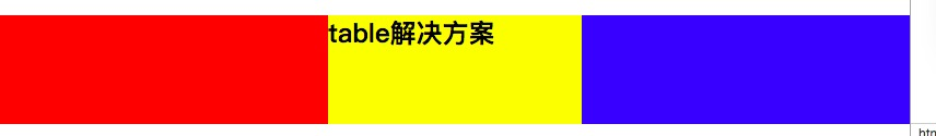
兼容性好,当PC端使用flex布局而IE8不兼容时,可以尝试使用表格布局进行实现。 table布局算是比较老的前端技术了,曾经风靡一时,现在基本已被摒弃。 关于table布局,大家可以看看下面这篇文章。 segmentfault.com/a/119000000…
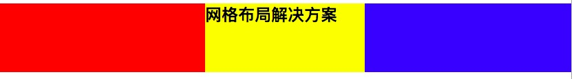
网格布局解决方案
  <section class="layout grid">
    <style>
      .layout.grid .left-center-right {
        display: grid;
        grid-template-rows: 100px;
        grid-template-columns: 300px auto 300px;
      }
      .layout.grid .left {
        background-color: red;
      }
      .layout.grid .center {
        background-color: yellow;
      }
      .layout.grid .right {
        background-color: blue;
      }
    </style>
    <article class="left-center-right">
      <div class="left"></div>
      <div class="center">
        <h2>网格布局解决方案</h2>
      </div>
      <div class="right"></div>
    </article>
  </section>
说完这个,咱说点题外话,关于三栏布局中间部分css代码的编写,不需要单独设置特定的width,看过张鑫旭大神的css世界就可以了解到,整个文档是基于“流”这个概念的,width默认是auto,就像水流一样充满整个容器。
