

最简单的轮播图
这篇文章实现一个最简单的轮播图。
功能
- 点击切换图
- 切换时没有动画过渡
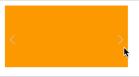
展示
Note: 若无法查看,可将clone该项目, 在本地查看gif图
设计思路
- 将轮播图以行的形式进行排列(每张图大小是一样的)
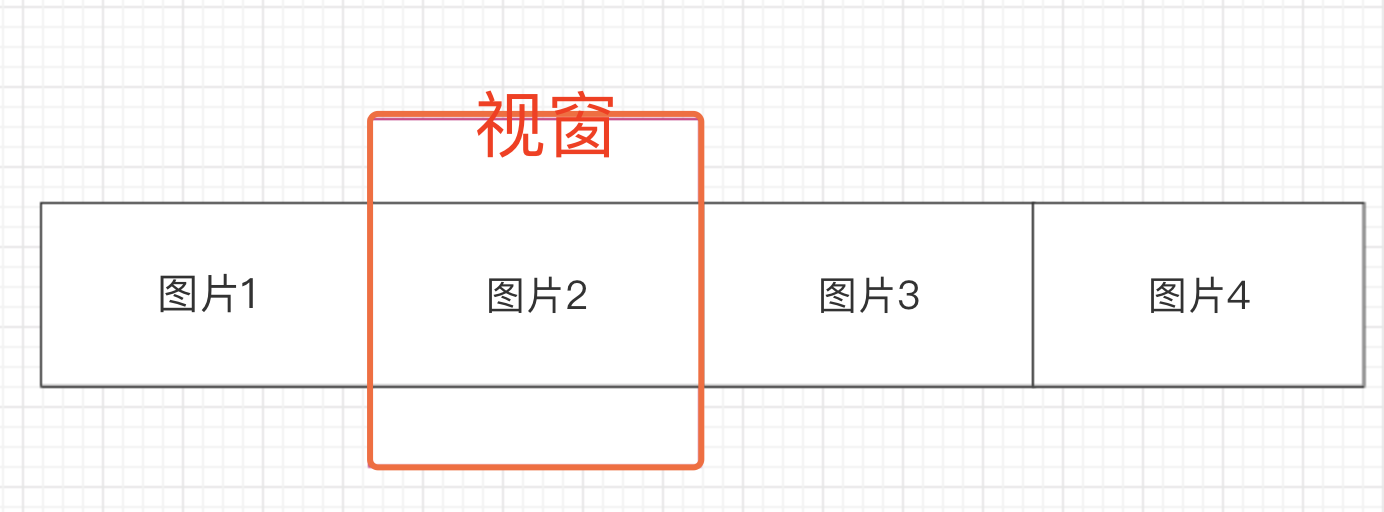
- 增加一个视窗(我们看到的内容区),这个视窗的大小是图片的大小,将视窗之外的内容设置隐藏
- 给以行排列的图片设置成绝对定位
- 每点击一次切换,进行绝对定位的计算,让该显示的图片定位到视窗区域
步骤书写
- 在html页面写出要轮播的图片
- 给轮播图加上宽高样式
- 在html页面加上切换轮播图的按钮
- 给切换按钮赋予点击操作
步骤讲解
- 首先在html里写上要轮播的图片
swipe__pic下是要展示的图片,在此项目中用背景是颜色来替代,表示四个图片
<div class="swipe">
  	<!-- style中的left属性表示图片的绝对定位,当left为负数时,表示图片在轮播,切换 -->
    <div class="swipe__pic" style="left: 0;">
        <div class="swipe__pic_1 swipe__pic-block"></div>
        <div class="swipe__pic_2 swipe__pic-block"></div>
        <div class="swipe__pic_3 swipe__pic-block"></div>
        <div class="swipe__pic_4 swipe__pic-block"></div>
    </div>
  	<!-- 左右箭头 -->
    <div class="swipe__arrow-left"></div>
    <div class="swipe__arrow-right"></div>
</div>
- 书写图片的样式
/* 将图片行的方向排列,并且不换行,每个图片大小是固定的,通过绝对定位来移动图片,进而更改视窗中看到的图片 */
.swipe__pic {
    display: -webkit-flex;
    flex-flow: row nowrap;
    width: 800px;
    height: 100px;
    position: absolute;
    left: 0;
}
/* 视窗大小为每张图片的大小,视窗以外的区域进行隐藏。制造图片更换的假象,实际是图片在移动 */
.swipe {
    position: relative;
    width: 200px;
    height: 100px;
    overflow: hidden;
}
- 添加用于切换的点击箭头
箭头的展示通过伪元素的border边控制,然后进行旋转,伪装成箭头,这样就不影响主元素内容
.swipe__arrow-left {
    position: absolute;
    left: 10px;
    top: 50%;
}

.swipe__arrow-left::before {
    content: '';
    display: block;
    width: 10px;
    height: 10px;
    border-left: 1px solid #cecece;
    border-bottom: 1px solid #cecece;
    -webkit-transform-origin: center;
    -webkit-transform: rotate(45deg);
}

.swipe__arrow-right {
    position: absolute;
    right: 10px;
    top: 50%;
}

.swipe__arrow-right::before {
    content: '';
    display: block;
    width: 10px;
    height: 10px;
    border-top: 1px solid #cecece;
    border-right: 1px solid #cecece;
    -webkit-transform-origin: center;
    -webkit-transform: rotate(45deg);
}
- 添加左箭头和右箭头的点击动作
let swipePic = document.querySelector('.swipe__pic');
let arrowLeft = document.querySelector('.swipe__arrow-left');
let arrowRight = document.querySelector('.swipe__arrow-right');

// parseInt() 会获得字符串中前几位的数字, parseInt('200px') == 200
// 处理临界情况,当left为-800px和0px时,就得回到0px和-800处
arrowLeft.onclick = () => {
    let styleLeft = parseInt(swipePic.style.left) - 200;
    swipePic.style.left = (styleLeft <= -800 ? styleLeft + 800 : styleLeft) + 'px';
}

arrowRight.onclick = () => {
    let styleLeft = parseInt(swipePic.style.left) + 200;
    swipePic.style.left = (styleLeft > 0 ? styleLeft - 800 : styleLeft) + 'px';
}
源码展示
<!DOCTYPE html>
<html lang="en">
<head>
    <meta charset="UTF-8">
    <meta name="viewport" content="width=device-width, initial-scale=1.0">
    <meta http-equiv="X-UA-Compatible" content="ie=edge">
    <title>Document</title>
    <style>
        .swipe {
            position: relative;
            width: 200px;
            height: 100px;
            overflow: hidden;
        }

        .swipe__pic {
            display: -webkit-flex;
            flex-flow: row nowrap;
            width: 800px;
            height: 100px;
            position: absolute;
            left: 0;
        }

        .swipe__pic-block {
            width: 200px;
            height: 100px;
        }

        .swipe__pic_1 {
            background-color: red;
        }

        .swipe__pic_2 {
            background-color: orange;
        }

        .swipe__pic_3 {
            background-color: yellow;
        }

        .swipe__pic_4 {
            background-color: green;
        }

        .swipe__arrow-left {
            position: absolute;
            left: 10px;
            top: 50%;
        }

        .swipe__arrow-left::before {
            content: '';
            display: block;
            width: 10px;
            height: 10px;
            border-left: 1px solid #cecece;
            border-bottom: 1px solid #cecece;
            -webkit-transform-origin: center;
            -webkit-transform: rotate(45deg);
        }

        .swipe__arrow-right {
            position: absolute;
            right: 10px;
            top: 50%;
        }

        .swipe__arrow-right::before {
            content: '';
            display: block;
            width: 10px;
            height: 10px;
            border-top: 1px solid #cecece;
            border-right: 1px solid #cecece;
            -webkit-transform-origin: center;
            -webkit-transform: rotate(45deg);
        }
    </style>
</head>
<body>
    <div class="swipe">
        <div class="swipe__pic" style="left: 0;">
            <div class="swipe__pic_1 swipe__pic-block"></div>
            <div class="swipe__pic_2 swipe__pic-block"></div>
            <div class="swipe__pic_3 swipe__pic-block"></div>
            <div class="swipe__pic_4 swipe__pic-block"></div>
        </div>
        <div class="swipe__arrow-left"></div>
        <div class="swipe__arrow-right"></div>
    </div>
    <script>
        let swipePic = document.querySelector('.swipe__pic');
        let arrowLeft = document.querySelector('.swipe__arrow-left');
        let arrowRight = document.querySelector('.swipe__arrow-right');

        arrowLeft.onclick = () => {
            let styleLeft = parseInt(swipePic.style.left) - 200;
            swipePic.style.left = (styleLeft <= -800 ? styleLeft + 800 : styleLeft) + 'px';
        }

        arrowRight.onclick = () => {
            let styleLeft = parseInt(swipePic.style.left) + 200;
            swipePic.style.left = (styleLeft > 0 ? styleLeft - 800 : styleLeft) + 'px';
        }

    </script>
</body>
</html>
轮播图扩展
添加有过渡动画的轮播图,可查看该项目
