

两栏布局
实现两栏布局
-
定位
-
margin-left:100px;为了把位置让出来,不要覆盖。
先写right后写left,如果反过来,right部分虽然脱离原来位置,但出生位置是在第二行。
<div class="right"></div>
<div class="left"></div>
.right{
	position:absolute;
	left:0;
	width:100px;
	height:100px;
	background-color:#fcc;
	opacity:0.5;       /*设置透明度*/
}
.left{
	margin-left:100px;
	height:100px;
	background-color:#ffc;
}
tips:写class名时尽量语义化,增强可读性。
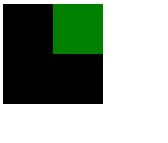
两个经典bug
margin塌陷问题
父子嵌套的元素,父子元素垂直方向的margin值是结合在一起的,会取最大的值。
想要使小方块相对大方块向下移动(如图效果),理论上设置小方块的margin-top值之后,小方块会相对大方块的上边线往下走,但实际上不会这样。
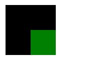
解决方法
顶部加一个线
<div class="wrapper">
	<div class="content"></div>
</div>
.wrapper{
	margin-left:100px;
	margin-top:100px;
	width:100px;
	height:100px;
	background-color:black;
	border-top:1px solid black;/*在顶部加一个线*/
}
.content{
	margin-left:50px;
	margin-top:50px;
	width:50px;
	height:50px;
	background-color:green;
}
虽然能解决问题,但从专业上来说这种方法是不能使用的。
bfc(block format context)
css是把html里的每一个元素都当作一个盒子,每一个盒子里都有一套渲染规则,就是写完一个代码,它能按照你写的代码把这个东西绘制出来。每一个盒子里都有一套一模一样的语法规则。bfc是可以通过特定的手段让其中的几个盒子里面的渲染规则发生改变。在特殊的盒子里可以触发bfc这个语法,让这个盒子所符合的语法规则和原来不一样。
- 如何触发一个盒子的bfc
-
position:absolute;
-
display:inline-block;
-
float:left/right;
-
overflow:hidden;(溢出部分隐藏展示)
.wrapper{
	margin-left:100px;
	margin-top:100px;
	width:100px;
	height:100px;
	background-color:black;
	/*overflow:hidden;*/
	/*display:inline-block;*/
	/*position:absolute;*/
}
.content{
	margin-left:50px;
	margin-top:50px;
	width:50px;
	height:50px;
	background-color:green;
}
几个方法都可以解决margin塌陷的问题。但加上之后又会引发新的问题。所以要针对需求使用,哪个不影响需求用哪个方法。
margin合并
两个兄弟结构的元素垂直方向的margin值合并了
解决方法
可以给它们增加一个父级,使它们处在bfc语法规则里。
<div class="wrapper">
    <div class="demo1">1</div>
</div>
<div class="wrapper">
    <div class="demo2">2</div>
</div>
.demo1{
	background-color:red;
	margin-bottom:200px;
}
.demo2{
	background-color:green;
	margin-top:200px;
}
.wrapper{
	overflow:hidden;
}
但不会使用这种方法。
在开发时,每个html都是一块结构,不能说因为要解决一个bug,随便加一个没有意义的结构。改了一个结构对其他的影响是很大的。
想要实现这样的功能,其实并不需要解决这个bug,想要中间隔开多少距离,只要在上面或者下面设置就可以,不需要在两个上面都设置。
