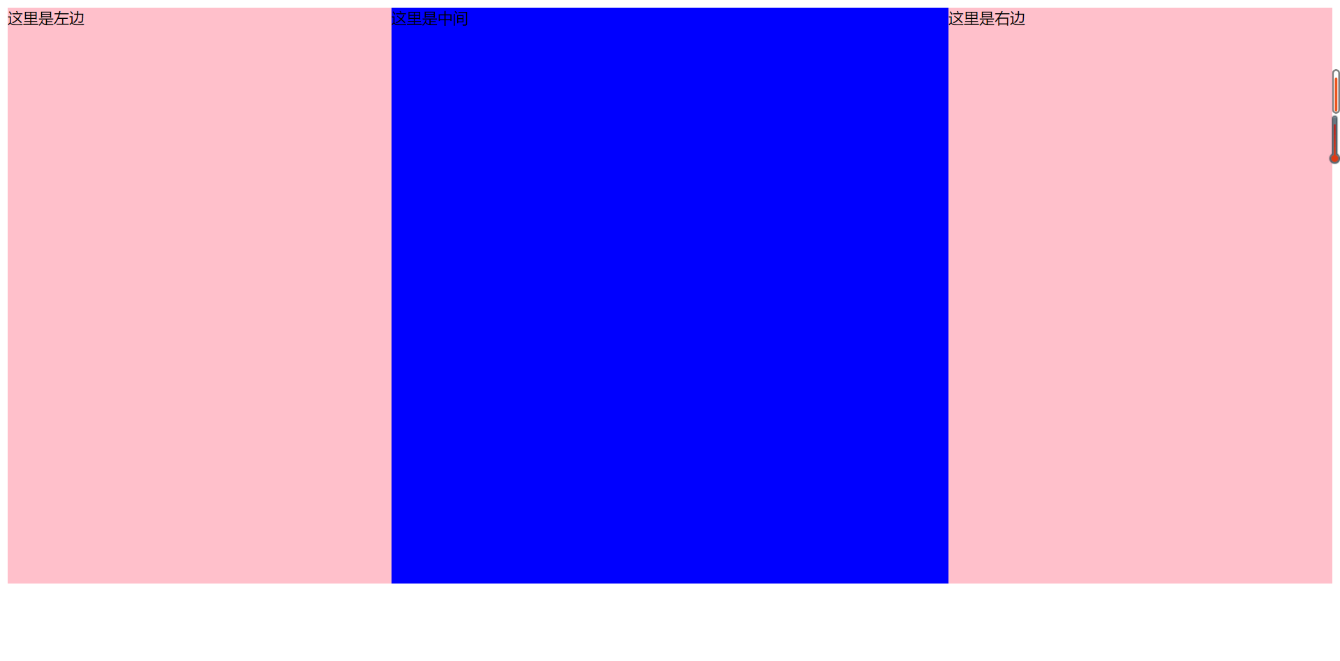
三栏布局
三栏布局方法与两栏布局相似。一般为两边固定,中间自适应。
下面用几种不同的方法来实现...
html部分
<!DOCTYPE html>
<html>
<head>
	<title>三栏布局</title>
</head>
<body>
	<div class="container">
		<div class="left">这里是左边</div>
		<div class="content">这里是中间</div>
		<div class="right">这里是右边</div>
	</div>
</body>
</html>
1. float
代码如下:
<style type="text/css">
		.container{overflow: hidden;}
		.left{float: left;
			width: 400px;
			height: 600px;
			background-color: pink;}
		.right{float: right;
			width: 400px;
			height: 600px;
			background-color: pink;}
		.content{height: 600px;
			background-color: blue;}
	</style>
2. absolute
代码如下:
<style type="text/css">
    		.container{position: relative;
    		}
    		.left{position: absolute;
    			left: 0;
    			width: 400px;
    			height: 600px;
    			background-color: pink;}
    		.right{position: absolute;
    			right: 0;
    			width: 400px;
    			height: 600px;
    			background-color: pink;}
    		.content{position: absolute;
    			left: 400px;
    			right: 400px;
    			height: 600px;
    			background-color: blue;}
    	</style>
3. flex布局
代码如下:
<style type="text/css">
    		.container{display: flex;
    			height: 600px;
    		}
    		.left{flex: 0 0 400px;
    			background-color: pink;}
    		.right{flex: 0 0 400px;
    			background-color: pink;}
    		.content{flex: 1;
    			background-color: blue;}
    	</style>
4. grid布局
代码如下:
	<style type="text/css">

    		.container{
    			display: grid;
    			grid-template-columns: 400px auto 400px;
    			grid-template-rows: 600px;

    		}
    		.content{
    			background-color: blue;
    		}
    		.left{
    			background-color: pink;}
    		.right{
    			background-color: pink;}
    	</style>
5. table布局
代码如下:
<style type="text/css">

    		.container{
    			display: table;
    			width: 100%;
    			height: 600px;
    		}
    		.container div{display: table-cell;}
    		.content{
    			background-color: blue;
    		}
    		.left{
    			width: 400px;
    			background-color: pink;}
    		.right{
    			width: 400px;
    			background-color: pink;}
    	</style>
6. 双飞翼布局
html部分:
<body>
	<div class="container">
		<div class="main">
			<div class="content">这里是中间</div>
		</div>
		<div class="left">这里是左边</div>
		<div class="right">这里是右边</div>
	</div>
</body>
css部分:
<style type="text/css">
    		.container div{height: 600px;}
    		.main{
    			float: left;
    			width: 100%;
    			background-color: blue;}
    		.content{
    			margin-right: 400px;
    			margin-left: 400px;
    		}
    		.left{float: left;
    			width: 400px;
    			margin-left: -100%;
    			background-color: pink;}
    		.right{float: left;
    			width: 400px;
    			margin-left: -400px;
    			background-color: pink;}
    	</style>
7. 圣杯布局
html部分同双飞翼布局。
css部分:
<style type="text/css">
    		.container div{height: 600px;}
    		.container{
    			padding-right: 400px;
    			padding-left: 400px;
    		}
    		.main{
    			float: left;
    			width: 100%;
    			background-color: blue;}
    		.content{
    			margin-right: 400px;
    			margin-left: 400px;
    		}
    		.left{position: relative;
    			float: left;
    			left: -400px;
    			width: 400px;
    			margin-left: -100%;
    			background-color: pink;}
    		.right{position: relative;
    			right: -400px;
    			float: left;
    			width: 400px;
    			margin-left: -400px;
    			background-color: pink;}
    	</style>
以上几种方法实现的结果均为: