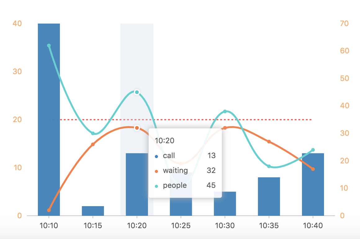
看到这个图,产品是崩溃的。看到这个,我也是懵掉的。这种双轴曲线没做过啊。 不过,干就完了。
import { Chart, Tooltip, Axis, Bar, SmoothLine, Point, Legend, Guide} from 'viser-react';
import * as React from 'react';
import DataSet from '@antv/data-set';
const data = [
    { time: '10:10', call: 40, waiting: 2, people: 62 },
    { time: '10:15', call: 2, waiting: 26, people: 30 },
    { time: '10:20', call: 13, waiting: 32, people: 45 },
    { time: '10:25', call: 9, waiting: 19, people: 11 },
    { time: '10:30', call: 5, waiting: 32, people: 38 },
    { time: '10:35', call: 8, waiting: 27, people: 18 },
    { time: '10:40', call: 13, waiting: 17, people: 24 }
];
const ds = new DataSet();
const dv = ds.createView().source(data);
dv.transform({
    type: 'fold',
    fields: ['waiting', 'people'], // 展开字段集
    key: 'type', // key字段
    value: 'value', // value字段
});
const scale = [{
  dataKey: 'call',
  min: 0
}, {
  dataKey: 'value',
  min: 0
}];

export default class App extends React.Component {
  render() {
    const Vguide:any=Guide;
    return (
      <Chart forceFit height={400} data={dv} scale={scale} padding={[20, 'auto', 70, 'auto']}>
        <Tooltip />
        <Legend
          custom
          allowAllCanceled
          items={[
            {value: 'waiting', marker: {symbol: 'square', fill: '#3182bd', radius: 5} },
            {value: 'people', marker: {symbol: 'hyphen', stroke: '#fdae6b', radius: 5, lineWidth: 3} }
          ]}
          onClick={(ev, chart) => {
            const item = ev.item;
            const value = item.value;
            const checked = ev.checked;
            const geoms = chart.getAllGeoms();
            for (let i = 0; i < geoms.length; i++) {
              const geom = geoms[i];
              if (geom.getYScale().field === value) {
                if (checked) {
                  geom.show();
                } else {
                  geom.hide();
                }
              }
            }
          }}
        />
        <Axis
          dataKey="call"
          grid={null}
          label={{
            textStyle: {
              fill: '#fdae6b'
            }
          }}
        />
        <Axis
          dataKey="value"
          grid={null}
          label={{
            textStyle: {
              fill: '#ffae6b'
            }
          }}
        />
        <Bar position="time*call" color="#3182bd" />
        <SmoothLine position="time*value" size={3}
            color={["type",value=> {
                if(value === 'waiting') return '#FF7D41';
                if(value === 'people') return '#36D1D1';
            }]}
        />
        <Point shape="circle" position="time*value"
            color={["type",value=> {
                if(value === 'waiting') return '#FF7D41';
                if(value === 'people') return '#36D1D1';
            }]}
            size={3}
         />
         <Vguide
            type="line"
            start={['min', 20]}
            end={['max', 20]}
            lineStyle={{
                stroke: '#FF5A5A ',
                lineWidth: 2,
                lineDash: [3, 3]
            }}
            text={{
                position: 'start',
                style: {
                    fill: '##FF5A5A',
                    fontSize: 15,
                    fontWeight: 'normal'
                },
                offsetY: -5
            }}
        />
      </Chart>
    );
  }
}
没错,就是这个了。