

layout布局其实就是栅格排列,以前的boostrap框架是把屏幕的宽分为12等份,现在大多数的UI框架都是实现了24等份,今天我们就来简单的实现一个24等份的layout布局。
- 先看下我们最终实现的结果吧,span代表的是当前元素占屏幕24份中的几份,offset代表的是栅格与栅格之间相距多少等份。
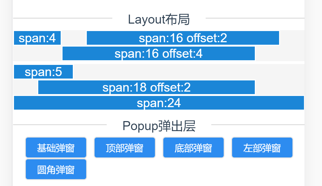
我们在页面中这样子引用
    <v-row>
      <v-col span="4">span:4</v-col>
      <v-col span="16" offset="2" >span:16 offset:2</v-col>
      <v-col span="16" offset="4" >span:16 offset:4</v-col>
    </v-row>
让我们来看下是如何实现的吧
- Row.vue页面, 这里使用的是插槽来插入我们的Col元素,定义我们的共同的一个父元素,因为我们的Col元素是使用float: left;来进行排列的,所以我们需要对父元素进行清楚浮动,避免父元素的高度坍塌。
    <template>
      <div class="v-row">
        <slot></slot>
      </div>
    </template>

    <script>
    export default {
      name: 'v-row'
    }
    </script>

    <style lang="less" scoped>
        .v-row {
          display: inline-block;
          text-align: center;
          width: 100%;
          background: #f5f5f5;
        }
        // 清楚浮动
        .v-row:after {
          content: "";
          height: 0;
          line-height: 0;
          display: block;
          clear: both;
          visibility: hidden;
        }
    </style>
- Col.vue页面,在该页面中,我们接收两个参数:span、offset来实现我们的布局,其实完成栅格布局最主要的代码是css部分。我们把页面的宽度分成24等份,经过计算,一等份差不多为4.16%,这里就需要我们来手动编写没一等份对应的css类。
最关键的一点是我们要给每一个.col-X类加上一个position: relative; 以及float: left;因为他们都有一个共同的父元素,所以设置了position: relative;后元素就会基于父元素向左一个一个排列。
    <template>
      <div>
        <div :class="['col-' + Span, 'col-offset-' + Offset]">
          <div style="background-color: #1b86d7; border: 1px solid #fff;">
            <slot></slot>
          </div>
        </div>
      </div>
    </template>

    <script>
    export default {
      name: 'v-col',
      props: {
        // 屏幕占比
        span: {
          type: String
        },
        // 间隔
        offset: {
          type: String
        }
      },
      computed: {
        Span: function () {
          if (this.span) {
            return this.span
          } else {
            return '0'
          }
        },
        Offset: function () {
          if (this.offset) {
            return this.offset
          } else {
            return '0'
          }
        }
      }
    }
    </script>

    <style lang="less" scoped>

        .col-1 {
          width: 4.16%;
        }

        .col-2 {
          width: 8.32%;
        }

        .col-3 {
          width: 12.48%;
        }

        .col-4 {
          width: 16.64%;
        }

        .col-5 {
          width: 20.8%;
        }

        .col-6 {
          width: 24.96%;
        }

        .col-7 {
          width: 29.12%;
        }

        .col-8 {
          width: 33.28%;
        }

        .col-9 {
          width: 37.44%;
        }

        .col-10 {
          width: 41.6%;
        }

        .col-11 {
          width: 45.76%;
        }

        .col-12 {
          width: 49.92%;
        }

        .col-13 {
          width: 54.08%;
        }

        .col-14 {
          width: 58.24%;
        }

        .col-15 {
          width: 62.4%;
        }

        .col-16 {
          width: 66.56%;
        }

        .col-17 {
          width: 70.72%;
        }

        .col-18 {
          width: 74.88%;
        }

        .col-19 {
          width: 79.04%;
        }

        .col-20 {
          width: 80.32%;
        }

        .col-21 {
          width: 87.36%;
        }

        .col-22 {
          width: 91.52%;
        }

        .col-23 {
          width: 95.68%;
        }

        .col-24 {
          width: 100%;
        }

        .col-offset-0 {
          margin-left: 0;
        }

        .col-offset-1 {
          margin-left: 4.16%;
        }

        .col-offset-2 {
          margin-left: 8.32%;
        }

        .col-offset-3 {
          margin-left: 12.48%;
        }

        .col-offset-4 {
          margin-left: 16.64%;
        }

        .col-offset-5 {
          margin-left: 20.8%;
        }

        .col-offset-6 {
          margin-left: 24.96%;
        }

        .col-offset-7 {
          margin-left: 29.12%;
        }

        .col-offset-8 {
          margin-left: 33.28%;
        }

        .col-offset-9 {
          padding-left: 37.44%;
        }

        .col-offset-10 {
          margin-left: 41.6%;
        }

        .col-offset-11 {
          margin-left: 45.76%;
        }

        .col-offset-12 {
          margin-left: 49.92%;
        }

        .col-offset-13 {
          margin-left: 54.08%;
        }

        .col-offset-14 {
          margin-left: 58.24%;
        }

        .col-offset-15 {
          margin-left: 62.4%;
        }

        .col-offset-16 {
          margin-left: 66.56%;
        }

        .col-offset-17 {
          margin-left: 70.72%;
        }

        .col-offset-18 {
          margin-left: 74.88%;
        }

        .col-offset-19 {
          margin-left: 79.04%;
        }

        .col-offset-20 {
          margin-left: 80.32%;
        }

        .col-offset-21 {
          margin-left: 87.36%;
        }

        .col-offset-22 {
          margin-left: 91.52%;
        }

        .col-offset-23 {
          margin-left: 95.68%;
        }

        .col-offset-24 {
          margin-left: 100%;
        }

        .col-1, .col-2, .col-3, .col-4, .col-5, .col-6, .col-7, .col-8, .col-9, .col-10, .col-11, .col-12, .col-13, .col-14, .col-15, .col-16, .col-17, .col-18, .col-19, .col-20, .col-21, .col-22, .col-23, .col-24 {
          position: relative;
          float: left;
          // display: flex;
          // justify-content: center;
          flex-wrap: wrap;
          box-sizing: border-box;
          text-align: center;
          overflow: hidden;
          color: #fff;
        }
    </style>
