

下几个例子主要是运用了css3中border、bordr-radius、transform、伪元素等属性来完成的,我们先了解下它们的基本原理。 border:简单的来说border语法主要包含(border-width、border-style、border-color)三个属性。
- border-top(上边框):border-width border-style border-color
- border-right(右边框):border-width border-style border-color
- border-bottom(下边框):border-width border-style border-color
- border-left(左边框):border-width border-style border-color
border-radius:border-radius 的语法比我们想像中灵活得多。你可能会惊讶地发现 border-radius 原来是一个简写属性。它所对应的各个展开式属性:
- border-top-left-radius(左上圆角半径)
- border-top-right-radius (右上圆角半径)
- border-bottom-right-radius (右下圆角半径)
- border-bottom-left-radius(左下圆角半径)
border-image:共有三个属性,分别是图片(border-image-source)、剪裁位置(border-image-slice)、重复性(border-image-repeat)。 图片:使用URL调用 剪裁位置:共有1~4个参数,没有单位(默认是像素),也可以用百分比
- 第一个参数a:距离上边相应长度进行裁剪
- 第二个参数b:距离右边相应长度进行裁剪
- 第三个参数c:距离下边相应长度进行裁剪
- 第四个参数d:距离左边相应长度进行裁剪
重复性:有三个参数 stretch(默认值),round,repeat
- 默认值是stretch,拉伸的意思,可以看到上面的效果图中,“2”是垂直拉伸的,“>”是水平拉伸的,而中间的格子是水平垂直一起拉伸的。
- round是平铺
- repeat是重复
话不多说,来直接看下效果:1、三角形系列(三角形、倒三角、左三角、右三角、左上三角、右上三角、左下三角、右下三角) 主要用到的是:宽度高度设置为0, border的各个边的设置(各个边的透明或不透明);[AppleScript] 纯文本查看 复制代码010203040506070809101112131415161718192021222324252627282930313233343536373839404142434445464748495051525354555657585960 .triangle-up { /* 三角形 */ width: 0; height: 0; border-left: 50px solid transparent; border-right: 50px solid transparent; border-bottom: 100px solid #f00; } .triangle-down { /* 倒三角 */ width: 0; height: 0; border-left: 50px solid transparent; border-right: 50px solid transparent; border-top: 100px solid #f00; } .triangle-left { /* 左三角 */ width: 0; height: 0; border-top: 50px solid transparent; border-bottom: 50px solid transparent; border-right: 100px solid #f00; } .triangle-right { /* 右三角 */ width: 0; height: 0; border-top: 50px solid transparent; border-bottom: 50px solid transparent; border-left: 100px solid #f00; } .triangle-topleft { /* 左上三角 */ width: 0; height: 0; border-right: 100px solid transparent; border-top: 100px solid #f00; } .triangle-topright { /* 右上三角 */ width: 0; height: 0; border-left: 100px solid transparent; border-top: 100px solid #f00; } .triangle-downleft { /* 左下三角 */ width: 0; height: 0; border-right: 100px solid transparent; border-bottom: 100px solid #f00; } .triangle-downright { /* 右下三角 */ width: 0; height: 0; border-left: 100px solid transparent; border-bottom: 100px solid #f00; }
2、梯形(三角形的变体,设置左右两条边相等,并且给它设置一个宽度) 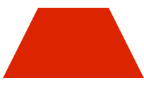 [AppleScript] 纯文本查看 复制代码
1234567 .Trapezium {[/align][align=left]height: 0;[/align][align=left]width: 100px;[/align][align=left]border-bottom: 100px solid #dc2500;[/align][align=left]border-left: 50px solid transparent;[/align][align=left]border-right: 50px solid transparent;[/align][align=left]}
3、爱心(心形的制作是非常复杂的,可以使用伪元素来制作,分别将伪元素旋转不同的角度,并修改transform-origin属性来元素的旋转中心点) [AppleScript] 纯文本查看 复制代码
01020304050607080910111213141516171819202122232425 .love { /* 爱心 */ position: relative;}.love:before { content: ""; width: 70px; height: 110px; background: #f00; position: absolute; border-top-left-radius: 50%; border-top-right-radius: 50%; transform: rotate(45deg);}.love:after { content: ""; width: 70px; height: 110px; background: #f00; position: absolute; border-top-left-radius: 50%; border-top-right-radius: 50%; transform: rotate(-45deg); left: -30px;}
下几个例子主要是运用了css3中border、bordr-radius、transform、伪元素等属性来完成的,我们先了解下它们的基本原理。
border:简单的来说border语法主要包含(border-width、border-style、border-color)三个属性。
- border-top(上边框):border-width border-style border-color
- border-right(右边框):border-width border-style border-color
- border-bottom(下边框):border-width border-style border-color
- border-left(左边框):border-width border-style border-color
border-radius:border-radius 的语法比我们想像中灵活得多。你可能会惊讶地发现 border-radius 原来是一个简写属性。它所对应的各个展开式属性:
- border-top-left-radius(左上圆角半径)
- border-top-right-radius (右上圆角半径)
- border-bottom-right-radius (右下圆角半径)
- border-bottom-left-radius(左下圆角半径)
border-image:共有三个属性,分别是图片(border-image-source)、剪裁位置(border-image-slice)、重复性(border-image-repeat)。
图片:使用URL调用
剪裁位置:共有1~4个参数,没有单位(默认是像素),也可以用百分比
- 第一个参数a:距离上边相应长度进行裁剪
- 第二个参数b:距离右边相应长度进行裁剪
- 第三个参数c:距离下边相应长度进行裁剪
- 第四个参数d:距离左边相应长度进行裁剪
重复性:有三个参数 stretch(默认值),round,repeat
- 默认值是stretch,拉伸的意思,可以看到上面的效果图中,“2”是垂直拉伸的,“>”是水平拉伸的,而中间的格子是水平垂直一起拉伸的。
- round是平铺
- repeat是重复
话不多说,来直接看下效果:
1、三角形系列(三角形、倒三角、左三角、右三角、左上三角、右上三角、左下三角、右下三角)
主要用到的是:宽度高度设置为0, border的各个边的设置(各个边的透明或不透明);
[AppleScript]
纯文本查看
复制代码
01 02 03 04 05 06 07 08 09 10 11 12 13 14 15 16 17 18 19 20 21 22 23 24 25 26 27 28 29 30 31 32 33 34 35 36 37 38 39 40 41 42 43 44 45 46 47 48 49 50 51 52 53 54 55 56 57 58 59 60 | .triangle-up { /* 三角形 */ width: 0; height: 0; border-left: 50px solid transparent; border-right: 50px solid transparent; border-bottom: 100px solid #f00; } .triangle-down { /* 倒三角 */ width: 0; height: 0; border-left: 50px solid transparent; border-right: 50px solid transparent; border-top: 100px solid #f00; } .triangle-left { /* 左三角 */ width: 0; height: 0; border-top: 50px solid transparent; border-bottom: 50px solid transparent; border-right: 100px solid #f00; } .triangle-right { /* 右三角 */ width: 0; height: 0; border-top: 50px solid transparent; border-bottom: 50px solid transparent; border-left: 100px solid #f00; } .triangle-topleft { /* 左上三角 */ width: 0; height: 0; border-right: 100px solid transparent; border-top: 100px solid #f00; } .triangle-topright { /* 右上三角 */ width: 0; height: 0; border-left: 100px solid transparent; border-top: 100px solid #f00; } .triangle-downleft { /* 左下三角 */ width: 0; height: 0; border-right: 100px solid transparent; border-bottom: 100px solid #f00; } .triangle-downright { /* 右下三角 */ width: 0; height: 0; border-left: 100px solid transparent; border-bottom: 100px solid #f00; } |
2、梯形(三角形的变体,设置左右两条边相等,并且给它设置一个宽度)
[AppleScript]
纯文本查看
复制代码
1 2 3 4 5 6 7 | .Trapezium {[/align][align=left]height: 0;[/align][align=left]width: 100px;[/align][align=left]border-bottom: 100px solid #dc2500;[/align][align=left]border-left: 50px solid transparent;[/align][align=left]border-right: 50px solid transparent;[/align][align=left]} |
3、爱心(心形的制作是非常复杂的,可以使用伪元素来制作,分别将伪元素旋转不同的角度,并修改transform-origin属性来元素的旋转中心点)
[AppleScript]
纯文本查看
复制代码
01 02 03 04 05 06 07 08 09 10 11 12 13 14 15 16 17 18 19 20 21 22 23 24 25 | .love { /* 爱心 */ position: relative;}.love:before { content: ""; width: 70px; height: 110px; background: #f00; position: absolute; border-top-left-radius: 50%; border-top-right-radius: 50%; transform: rotate(45deg);}.love:after { content: ""; width: 70px; height: 110px; background: #f00; position: absolute; border-top-left-radius: 50%; border-top-right-radius: 50%; transform: rotate(-45deg); left: -30px;} |
