直接给代码了 网上收集的忘记原文链接了 尴尬 侵权联系我抱歉!
.wave {
position: relative;
width: 200px;
height: 200px;
background-color: rgb(118, 218, 255);
border-radius: 50%;
overflow: hidden;
}
.wave:before,
.wave:after{
content: "";
position: absolute;
width: 400px;
height: 400px;
top: 0;
left: 50%;
background-color: rgba(255, 255, 255, .4);
border-radius: 45%;
transform: translate(-50%, -70%) rotate(0);
animation: rotate 6s linear infinite;
z-index: 10;
}
.wave:after {
border-radius: 47%;
background-color: rgba(255, 255, 255, .9);
transform: translate(-50%, -70%) rotate(0);
animation: rotate 10s linear -5s infinite;
z-index: 20;
}
@keyframes rotate {
50% {
transform: translate(-50%, -73%) rotate(180deg);
} 100% {
transform: translate(-50%, -70%) rotate(360deg);
}
}
/* 其他四种方法 */
html{
font-size: 20px;
}
body{
background:
}
@-webkit-keyframes opac{
from {
opacity: 1;
width:0;
height:0;
top:50%;
left:50%;
}
to {
opacity : 0;
width:100%;
height:100%;
top:0;
left:0;
}
}
.animate .w2{
-webkit-animation-delay:1s;
}
.animate .w3{
-webkit-animation-delay:2s;
}
.animate .w4{
-webkit-animation-delay:3s;
}
.wave1{
width: 22.7rem;
height: 22.7rem;
position: absolute;
top: 0;
left: 0;
right: 0;
margin: 0 auto;
}
.wave1 *{
border:1px solid
position:absolute;
border-radius:50%;
-webkit-animation:opac 4s infinite;
}
body{
/* background:gold; */
}
.circle {
position:absolute;
left:0;
top:0;
right: 0;
margin: 0 auto;
width:90px;
height:90px
}
.circle div {
position:absolute;
top:50%;
left:50%;
background:
width:90px;
height:90px;
margin-left:-45px;
margin-top:-45px;
opacity:1;
border-radius:90px;
animation: 1.2s linear infinite;
-webkit-animation: 1.2s linear infinite;
-ms--webkit-animation: 1.2s linear infinite;
-moz--webkit-animation: 1.2s linear infinite;
-o--webkit-animation: 1.2s linear infinite;
}
.circle div.c1 {
width:20px;
height:20px;
margin-left:-10px;
margin-top:-10px;
opacity:1;
border-radius:90px
}
.circle div.c2 {
-webkit-animation-name:c2;
-webkit-animation-delay:.6s;
-ms-animation-name:c2;
-ms-animation-delay:.6s;
-moz-animation-name:c2;
-moz-animation-delay:.6s;
-o-animation-name:c2;
-o-animation-delay:.6s;
animation-name:c2;
animation-delay:.6s;
}
.circle div.c3 {
-webkit-animation-name:c2;
-webkit-animation-delay:1.2s;
-ms-animation-name:c2;
-ms-animation-delay:1.2s;
-moz-animation-name:c2;
-moz-animation-delay:1.2s;
-o-animation-name:c2;
-o-animation-delay:1.2s;
animation-name:c2;
animation-delay:1.2s;
}
@-webkit-keyframes c2 {
0% {
-webkit-transform:scale(.222);
-ms-transform:scale(.222);
-moz-transform:scale(.222);
-o-transform:scale(.222);
transform:scale(.222);
opacity:1
}
50% {
-webkit-transform:scale(.622);
-ms-transform:scale(.622);
-moz-transform:scale(.622);
-o-transform:scale(.622);
transform:scale(.622);
opacity:.4
}
98% {
-webkit-transform:scale(1);
-ms-transform:scale(1);
-moz-transform:scale(1);
-o-transform:scale(1);
transform:scale(1);
opacity:.2
}
100% {
opacity:0
}
}
@-ms-keyframes c2 {
0% {
-webkit-transform:scale(.222);
-ms-transform:scale(.222);
-moz-transform:scale(.222);
-o-transform:scale(.222);
transform:scale(.222);
opacity:1
}
50% {
-webkit-transform:scale(.622);
-ms-transform:scale(.622);
-moz-transform:scale(.622);
-o-transform:scale(.622);
transform:scale(.622);
opacity:.4
}
98% {
-webkit-transform:scale(1);
-ms-transform:scale(1);
-moz-transform:scale(1);
-o-transform:scale(1);
transform:scale(1);
opacity:.2
}
100% {
opacity:0
}
}
@-moz-keyframes c2 {
0% {
-webkit-transform:scale(.222);
-ms-transform:scale(.222);
-moz-transform:scale(.222);
-o-transform:scale(.222);
transform:scale(.222);
opacity:1
}
50% {
-webkit-transform:scale(.622);
-ms-transform:scale(.622);
-moz-transform:scale(.622);
-o-transform:scale(.622);
transform:scale(.622);
opacity:.4
}
98% {
-webkit-transform:scale(1);
-ms-transform:scale(1);
-moz-transform:scale(1);
-o-transform:scale(1);
transform:scale(1);
opacity:.2
}
100% {
opacity:0
}
}
@-o-keyframes c2 {
0% {
-webkit-transform:scale(.222);
-ms-transform:scale(.222);
-moz-transform:scale(.222);
-o-transform:scale(.222);
transform:scale(.222);
opacity:1
}
50% {
-webkit-transform:scale(.622);
-ms-transform:scale(.622);
-moz-transform:scale(.622);
-o-transform:scale(.622);
transform:scale(.622);
opacity:.4
}
98% {
-webkit-transform:scale(1);
-ms-transform:scale(1);
-moz-transform:scale(1);
-o-transform:scale(1);
transform:scale(1);
opacity:.2
}
100% {
opacity:0
}
}
@keyframes c2 {
0% {
-webkit-transform:scale(.222);
-ms-transform:scale(.222);
-moz-transform:scale(.222);
-o-transform:scale(.222);
transform:scale(.222);
opacity:1
}
50% {
-webkit-transform:scale(.622);
-ms-transform:scale(.622);
-moz-transform:scale(.622);
-o-transform:scale(.622);
transform:scale(.622);
opacity:.4
}
98% {
-webkit-transform:scale(1);
-ms-transform:scale(1);
-moz-transform:scale(1);
-o-transform:scale(1);
transform:scale(1);
opacity:.2
}
100% {
opacity:0
}
}
/* 第三种 */
.container3{
position: relative;
width: 100px;
height: 100px;
margin-left: 100px;
}
.dot{
position: absolute;
left: 15px;
top:15px;
width:6px;
height: 6px;
border-radius: 50%;
}
.wave3{
position: absolute;
left: 2px;
top: 2px;
width: 24px;
height: 24px;
border: 6px solid red;
border-radius: 50%;
opacity: 0;
animation: waveCircle 3s ease-out;
animation-iteration-count: infinite;
}
@-webkit-keyframes waveCircle {
0%{
transform: scale(0);
opacity: 0;
}
10%{
transform: scale(0.1);
opacity: 0.1;
}
20%{
transform: scale(0.2);
opacity: 0.2;
}
30%{
transform: scale(0.3);
opacity: 0.3;
}
75%{
transform: scale(0.6);
opacity: 0.5;
}
100%{
transform: scale(1);
opacity: 0;
}
}
/* 第四种 */
.example {
position:relative;
margin:150px auto;
width:50px;
height:50px;
}
.example .dot:before{
content:' ';
position: absolute;
z-index:2;
left:0;
top:0;
width:10px;
height:10px;
background-color:
border-radius: 50%;
}
.example .dot:after {
content:' ';
position: absolute;
z-index:1;
width:10px;
height:10px;
background-color:
border-radius: 50%;
box-shadow: 0 0 10px rgba(0,0,0,.3) inset;
-webkit-animation: waveCircledot 1s ease infinite normal ;
/*-webkit-animation-name: ripple;
-webkit-animation-duration: 1s;
-webkit-animation-timing-function: ease;
-webkit-animation-delay: 0s;
-webkit-animation-iteration-count: infinite;
-webkit-animation-direction: normal;*/
}
@keyframes waveCircledot {
0% {
left:5px;
top:5px;
width:0;
height:0;
}
100% {
left:-20px;
top:-20px;
opacity: 0;
width:50px;
height:50px;
}
}
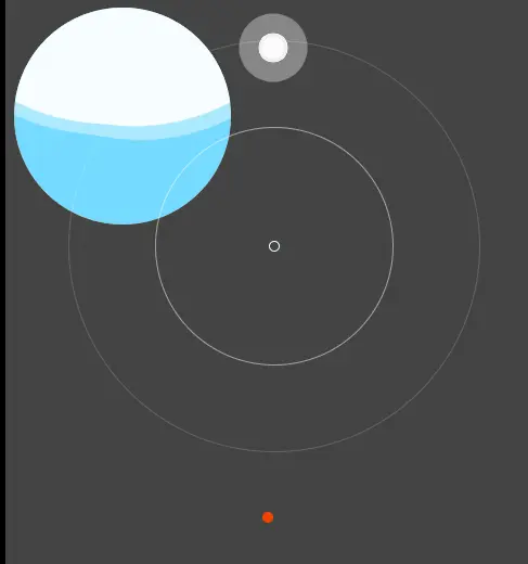
<div class="container">
    <div class="wave"></div>
</div>
<!-- 水波动画1-4 -->
<div class="animate wave1">
    <div class="w1"></div>
    <div class="w2"></div>
    <div class="w3"></div>
    <div class="w4"></div>
</div>
<!-- 水波动画2-4 -->
<div class="circle">
    <div class="c1"></div>
    <div class="c2"></div>
    <div class="c3"></div>
</div>
<!-- 水波动画 3-4 -->
<div class="container3">
    <div class="dot"></div>
    <div class="wave3"></div>
</div>
<!--  4-4  -->
<div class="example">
    <div class="dot"></div>
</div>


