

前言
使用css很多年了,每次使用media都需要上网查询一下,具体用法也没记住,本篇文章就帮你详细完整的介绍@media的用法,希望你可以更加了解@media的用法。如有不正确之处,还望指出,谢谢!
语法
@media: <media_query_list>
<media_query_list>: [<media_query> [',' <media_query>]*]?
<media_query>: ([only | not ]? <media_type> [and <expression>]*) | (<expression> [and <expression>]*)
<expression>: '('<media_feature>[:<value>]?')'
- @media后面可以添加多个query,使用‘,’分隔
- query有两种写法一种使用media_type
一种不使用media_type([only | not ]? <media_type> [and <expression>]*)(<expression> [and <expression>]*) - media_type:媒体类型
- expression: 指定媒体查询使用的媒体特性, 类似于css属性(如:max-width: 200px)
如果不是很明白,看完下面的例子,你就会很清楚了
举例之前,我们先了解media_type和expression都可以有那些值可以选择
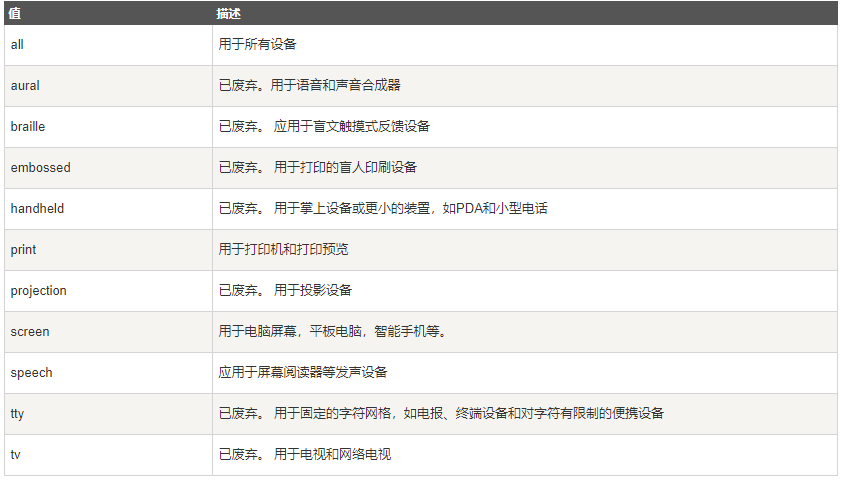
media_type:媒体类型
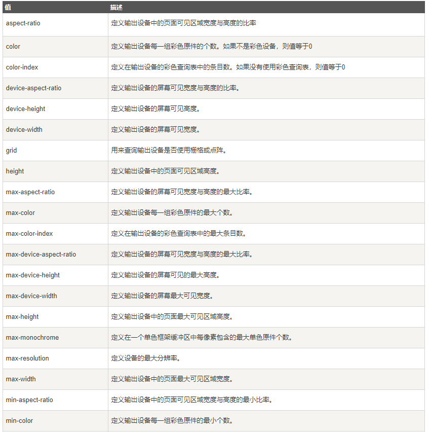
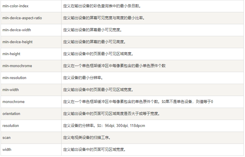
expression 指定媒体查询使用的媒体特性, 类似于css属性(如:max-width: 200px)
用法(4种用法)
1. @import中的使用@import url(test.css) (width:800px);@import url(test.css) (width:800px) and (height:700px);@import url(test.css) screen and (width:800px);@import url(test.css) all and (max-width:500px), only screen and (min-width:1000px);@import url(test.css) only screen and (max-width:500px), only screen and (min-width:1000px);2. link中的使用
<link rel="stylesheet" href="test.css" media="(width:800px)"><link rel="stylesheet" href="test.css" media="(width:800px) and (height:700px)"><link rel="stylesheet" href="test.css" media="screen and (max-width:800px)"><link rel="stylesheet" href="test.css" media="all and (max-width:500px), only screen and (min-width:1000px)"><link rel="stylesheet" href="test.css" media="only screen and (max-width:500px), only screen and (min-width:1000px)">3. css中的使用
@media (width:800px){ … }@media (width:800px) and (height:700px){ … }@media screen and (max-width:800px){ … }@media all and (max-width:500px), only screen and (min-width:1000px){ … }@media only screen and (max-width:500px), only screen and (min-width:1000px){ … }4. xml中的使用
xml中使用较少,用法同上面类似。这里就不举例了
以上就是@media的全部使用方法,如如有不正确之处,还望指出,谢谢!
关注我:前端Jsoning

