<div class='parent'>
   <div class='children'>
   /div>
</div>
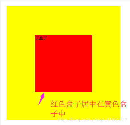
绝对定位居中
.parent {
  position: relative;
}
.children {
    position: absolute;
    left: 50%;
    top: 50%;
    transform: translate(-50%, -50%);
}
flex居中
.parent {
  display: flex;
  justify-content: center;
  align-items: center;
}
gird居中
.parent {
  display: grid;
  align-items: center;
  justify-content: center;
}
table-cell文字居中
.children {
    display:table-cell;
    vertical-align:middle;
    text-align: center;
  }
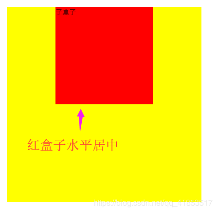
margin盒子水平居中
.children {
    margin: 0 auto;
  }
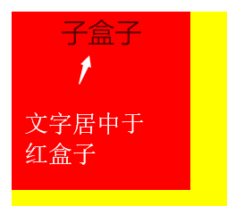
文字水平居中
.children {
    text-align: center;
  }
文字垂直居中(height与line-height等高)
.children {
    height: 200px;
    line-height: 200px;
  }
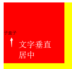
table-cell盒子垂直居中
.parent {
  display: table-cell;
  vertical-align: middle;
}
具体使用还是要根据实际情况来的,需要考虑浏览器兼容性、盒模型、是否存在超量数据等等......


