

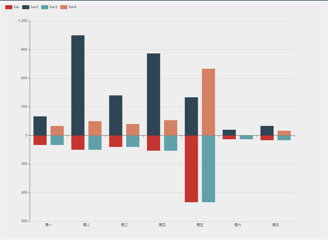
基础双向柱状图
代码如下,实现原理主要为series中的stack属性,此数据为数据堆叠,同个类目轴上系列配置相同的stack值后,后一个系列的值会在前一个系列的值上相加。
var itemStyle = {
    normal: {
    },
    emphasis: {
        barBorderWidth: 1,
        shadowBlur: 10,
        shadowOffsetX: 0,
        shadowOffsetY: 0,
        shadowColor: 'rgba(0,0,0,0.5)'
    }
};
option = {                                  // 基础配置
    backgroundColor: '#eee',
    legend: {                               // 图例
        data: ['bar', 'bar2', 'bar3', 'bar4'],  // 图例 记得和series中的name要和这里保持一致
        align: 'left',  // 设置图例位置
        left: 10        // 调整图例距离右边的距离
    },
    xAxis: {
        data: ['周一', '周二', '周三', '周四', '周五', '周六', '周日',], // x轴数据
    },
    yAxis: {
        inverse: true,
        splitArea: {show: false}
    },
    grid: {
        left: 100
    },
    series: [
        {
            name: 'bar',
            type: 'bar',
            //  都为正就是堆叠柱状图,一个为正一个为负则为双向柱状图
            stack: 'one',
            itemStyle: itemStyle,
            data: [100, 150, 120, 160, 700, 40, 50]
        },
        {
            name: 'bar2',
            type: 'bar',
            stack: 'one',
            itemStyle: itemStyle,
            data: [-200, -1050, -420, -860, -400, -60, -100]
        },
        {
            name: 'bar3',
            type: 'bar',
            stack: 'two',
            itemStyle: itemStyle,
            data: [100, 150, 120, 160, 700, 40, 50]
        },
        {
            name: 'bar4',
            type: 'bar',
            stack: 'two',
            itemStyle: itemStyle,
            data: [-100, -150, -120, -160, -700, -0, -50]
        }
    ]
};
展示结果:
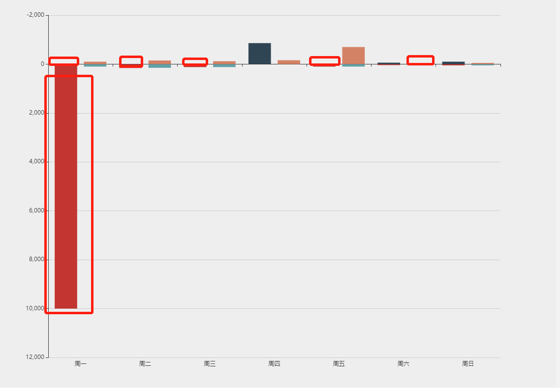
存在问题
当正值和负值相差过大的时候(这种情况比较小,但是数据不是由前端控制,当实际上出现这种数据的时候,并不能避免),小的值展示会很不清晰,如图
解决方法
使用拼接图,上面是一个图表,下面是另一个图表
option = {
    title: {
        text: '示例',
        left:"center",
        subtext: '',
        textStyle:{
            color:"#000"
        }
    },
    color:['#60c4c4','#fca268', '#d48265', '#91c7ae','#749f83',  '#ca8622', '#bda29a','#6e7074', '#546570', '#c4ccd3'],
    tooltip: {
        trigger: 'axis',
        axisPointer: {
            type: 'shadow'
        },
    },
    legend: {
        left:"right",
        data: ['示例1','示例2'],
        textStyle:{fontSize:16}
    },
    toolbox: {
        show: false
    },
    Calculable: true,
    grid: [{bottom:"50%"},{top:'50%'}],
    xAxis: [
        {
            type: 'category',
            axisLine: {show: true, onZero: false},
            axisTick: {show: false},
            axisLabel: {show: false,color:"green",fontSize:20},
            splitArea: {show: false},
            splitNumber: 20,
            splitLine: {show: false},
            data:[],
            position:"bottom",
            zlevel:10,
            show:true,
            min:0,
            nameTextStyle:{fontSize:16},
        },
        {
            type: 'category',
            show:true,
            axisLine: {show: true, onZero: false},
            axisTick: {show: false},
            axisLabel: {show: true,color:"green",fontSize:16},
            splitArea: {show: false},
            splitNumber: 20,
            splitLine: {show: false},
            data:[],
            gridIndex:1,
            position:"bottom",
            zlevel:10,
            min:0,
            nameTextStyle:{fontSize:16},
        }
    ],
    yAxis: [
        {
            type: 'value',
            name:"示例1",
            axisLine: {show: true, onZero: false,lineStyle:{color:"#000"}},
            axisLabel: {formatter: '{value}',fontSize:16},
            minInterval:1,
            splitLine:false,
            nameTextStyle:{fontSize:16},
            min:0
        },
        {
            type: 'value',
            name:"示例2",
            axisLine: {show: true, onZero: false,lineStyle:{color:"#000"}},
            axisLabel: {formatter: '{value}',fontSize:16},
            minInterval:1,
            position:"left",
            splitLine:false,
            gridIndex:1,
            nameGap:30,
            inverse:true,
            nameTextStyle:{fontSize:16},
            min:0
        }
    ],
    series: [
        {type:"bar",name:"示例1",barMaxWidth:40,data:[20, 40, 60, 80, 100]},
        {type:"bar",name:"示例2",barMaxWidth:40,data:[100000, 1, 5000, 50, 40000],xAxisIndex: 1,yAxisIndex: 1}
    ]
};
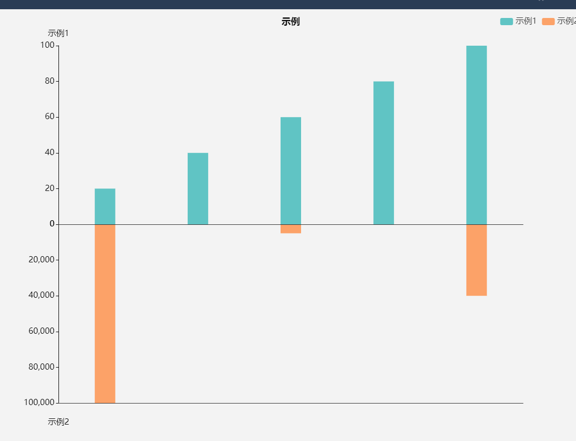
这样设置x轴上下两个部分就是两个不同的echart,会分别以不同的纬度渲染,不会相互影响。
注意
- 会有两个x轴,y轴,要调整只显示一个x轴和y轴
- grid的设置一定要注意,上面图表的bottom和下面图表的top相加要为100%
- 以上option可以直接拿到echart官网实例中直接展示
