

【简介】daterangepicker是bootstrap的一个日历插件,主要用来选择时间段的插件,这个插件很好用也很容易操作。下面主要是日期范围选择实现,单日期时间选择【常用参数的介绍】l // startDate: (Date 对象, moment 对象或者string类型) 初始化日期范围选中的开始时间。l // endDate: (Date 对象, moment 对象或者string类型) 初始化日期范围选中的结束时间。l // minDate: (Date 对象, moment 对象或者string类型) 用户可以选择的最早时间。l // maxDate: (Date 对象, moment 对象或者string类型) 用户可以选择的最晚时间。l // dateLimit: (object类型) 选中的开始和结束日期之间最大时间间隔。 可以是能够添加到moment对象( moment.add()) 中的任何属性( 如: days, months)。l // showDropdowns: (boolean类型) 在日历上面显示年和月的下拉框, 选中后将跳到指定的年和月l // showWeekNumbers: (boolean类型) 在日历上每周开始的地方显示本地化的周编号。l // showISOWeekNumbers: (boolean类型) 在日历上每周开始的地方显示国际标准的周编号。l // timePicker: (boolean类型) 允许选择日期和时间, 而不是局限于日期。l // timePickerIncrement: (number类型) 时间选择框中分钟列的增加步长( 如: 设置为30后只允许选择以0和30结束的时间)。l // timePicker24Hour: (boolean类型) 使用24小时制来代替12小时制, 同时删除AM / PM选择框。l // timePickerSeconds: (boolean类型) 在时间选择框中显示秒选择列。l // ranges: (object类型) 设置用户可以选择的预定义日期范围。 每个键名即范围的标签名, 对应值是两个日期组成的数组, 来表示范围的界限。l // showCustomRangeLabel: (boolean类型) 当使用范围选项时, 在预定义范围列表的末尾显示标记为 "Custom Range"l // 的标签。 当选择的日期范围与任何一个预定义的范围都不匹配时, 该选项将被高亮显示。 单击它显示日历可以选择新的范围。l // alwaysShowCalendars: (boolean类型) 通常, 如果使用范围选项指定了预定义日期范围, 则用户除了单击 "Custom Range"l // 之外, 日期选择器都不会显示用于选择自定义日期范围的日历。 当选项设置为true时, 将始终显示用于选择自定义日期范围的日历。l // opens: (string: 'left' / 'right' / 'center') 设置日期选择器以绑定元素左对齐、 右对齐或者居中显示。l // drops: (string: 'down'l // or 'up') 设置日期选择器在绑定元素的下面( 默认) 或者上面显示。l // buttonClasses: (array类型) 为日期选择器中的所有button元素添加CSS类。l // applyClass: (string类型) 为日期选择器中的apply按钮添加类。l // cancelClass: (string类型) 为日期选择器中的cancel按钮添加类。l // locale: (object类型) 允许为按钮和标签提供本地化的字符串, 自定义日期格式, 并更改日历中周的第一天。 查看配置生成器中的“ locale配置( 包含设置示例)”, 以了解如何自定义这些选项。l // singleDatePicker: (boolean类型) 只显示一个日历来选择一个日期, 而不是带有两个日历的范围选择器; 回调函数中提供的开始和结束日期将和选择的单个日期相同。l // autoApply: (boolean类型) 隐藏apply和cancel按钮。 选择两个日期或预定义范围时, 会自动应用新的日期范围。l // linkedCalendars: (boolean类型) 启用时, 显示的两个日历将始终为两个连续的月份( 如: 1 月和2月), 并且当单击日历上方的左侧或右侧箭头时, 两个日历都将变化。 禁用时, 两个日历可以单独变化并显示任何月 / 年。l // isInvalidDate: (function类型) 在显示两个日历之前传递一个日期参数, 然后通过返回true或false, 标示该日期是否可供选择。l // isCustomDate: (function类型) 在显示两个日历之前传递一个日期参数, 然后将返回的CSS类名字符串传或者数组应用在日历中的该日期上。l // autoUpdateInput: (boolean类型) 标示日期范围选择器是否应在初始化和所选日期改变时, 自动更新绑定在 < input > 元素上的值。l // parentEl: (string类型) 给日期选择器添加父元素的jQuery选择器, 如果没有提供, body将被作为父元素。【代码与效果】1.日期时间范围选择(双日历,可选择范围)Html代码[HTML] 纯文本查看 复制代码1234567 <div class="box"> <label for="datePicker">双日历</label> <input type="text" name="datePicker" class="datePicker" id="datePicker"> </div>
Js代码[JavaScript] 纯文本查看 复制代码010203040506070809101112131415161718192021222324252627282930313233343536373839404142434445464748495051525354555657585960616263 $('input[name="datePicker"]').daterangepicker({ timePicker: true, //显示时间 timePicker24Hour: true, //时间制 timePickerSeconds: true, //时间显示到秒 startDate: moment().hours(0).minutes(0).seconds(0), //设置开始日期 endDate: moment(new Date()), //设置结束器日期 maxDate: moment(new Date()), //设置最大日期 "opens": "center", ranges: { // '今天': [moment(), moment()], '昨天': [moment().subtract(1, 'days'), moment().subtract(1, 'days')], '上周': [moment().subtract(6, 'days'), moment()], '前30天': [moment().subtract(29, 'days'), moment()], '本月': [moment().startOf('month'), moment().endOf('month')], '上月': [moment().subtract(1, 'month').startOf('month'), moment().subtract(1, 'month').endOf('month')] }, showWeekNumbers: true, locale: { format: "YYYY-MM-DD HH:mm:ss", //设置显示格式 applyLabel: '确定', //确定按钮文本 cancelLabel: '取消', //取消按钮文本 customRangeLabel: '自定义', daysOfWeek: ['日', '一', '二', '三', '四', '五', '六'], monthNames: ['一月', '二月', '三月', '四月', '五月', '六月', '七月', '八月', '九月', '十月', '十一月', '十二月' ], firstDay: 1 }, }, function(start, end, label) { timeRangeChange = [start.format('YYYY-MM-DD HH:mm:ss'), end.format('YYYY-MM-DD HH:mm:ss')]; console.log(timeRangeChange); });
效果: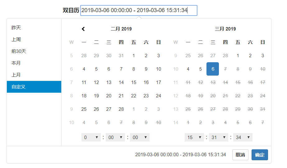 2. 单日期时间选择Html代码[HTML] 纯文本查看 复制代码
1234567 <div class="box"> <label for="singledatePicker">单日历</label> <input type="text" name="singledatePicker" class="singledatePicker" id="singledatePicker"> </div>
Js代码[JavaScript] 纯文本查看 复制代码0102030405060708091011121314151617181920212223242526272829303132333435363738394041424344454647 $('input[name="singledatePicker"]').daterangepicker({ "autoApply": true, //选择日期后自动提交;只有在不显示时间的时候起作用timePicker:false singleDatePicker: true, //单日历 showDropdowns: true, //年月份下拉框 timePicker: true, //显示时间 timePicker24Hour: true, //时间制 timePickerSeconds: true, //时间显示到秒 startDate: moment().hours(0).minutes(0).seconds(0), //设置开始日期 maxDate: moment(new Date()), //设置最大日期 "opens": "center", showWeekNumbers: true, locale: { format: "YYYY-MM-DD HH:mm:ss", //设置显示格式 applyLabel: '确定', //确定按钮文本 cancelLabel: '取消', //取消按钮文本 daysOfWeek: ['日', '一', '二', '三', '四', '五', '六'], monthNames: ['一月', '二月', '三月', '四月', '五月', '六月', '七月', '八月', '九月', '十月', '十一月', '十二月' ], firstDay: 1 }, }, function(start) { console.log(start.format('YYYY-MM-DD HH:mm:ss')); });
效果: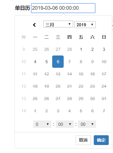
是
bootstrap
的一个日历插件
,
主要用来选择时间段的插件,这个插件很好用也很容易操作。下面主要是日期范围选择实现
,
单日期时间选择
对象
, moment
对象或者
string
类型
)
初始化日期范围选中的开始时间。
对象
, moment
对象或者
string
类型
)
初始化日期范围选中的结束时间。
对象
, moment
对象或者
string
类型
)
用户可以选择的最早时间。
对象
, moment
对象或者
string
类型
)
用户可以选择的最晚时间。
类型
)
选中的开始和结束日期之间最大时间间隔。 可以是能够添加到
moment
对象(
moment.add()
) 中的任何属性( 如:
days, months
)。
类型
)
在日历上面显示年和月的下拉框, 选中后将跳到指定的年和月
类型
)
在日历上每周开始的地方显示本地化的周编号。
类型
)
在日历上每周开始的地方显示国际标准的周编号。
类型
)
允许选择日期和时间, 而不是局限于日期。
类型
)
时间选择框中分钟列的增加步长( 如: 设置为
30
后只允许选择以
0
和
30
结束的时间)。
类型
)
使用
24
小时制来代替
12
小时制, 同时删除
AM / PM
选择框。
类型
)
在时间选择框中显示秒选择列。
类型
)
设置用户可以选择的预定义日期范围。 每个键名即范围的标签名, 对应值是两个日期组成的数组, 来表示范围的界限。
类型
)
当使用范围选项时, 在预定义范围列表的末尾显示标记为
"Custom Range"
的标签。 当选择的日期范围与任何一个预定义的范围都不匹配时, 该选项将被高亮显示。 单击它显示日历可以选择新的范围。
类型
)
通常, 如果使用范围选项指定了预定义日期范围, 则用户除了单击
"Custom Range"
之外, 日期选择器都不会显示用于选择自定义日期范围的日历。 当选项设置为
true
时, 将始终显示用于选择自定义日期范围的日历。
设置日期选择器以绑定元素左对齐、 右对齐或者居中显示。
设置日期选择器在绑定元素的下面( 默认) 或者上面显示。
类型
)
为日期选择器中的所有
button
元素添加
CSS
类。
类型
)
为日期选择器中的
apply
按钮添加类。
类型
)
为日期选择器中的
cancel
按钮添加类。
类型
)
允许为按钮和标签提供本地化的字符串, 自定义日期格式, 并更改日历中周的第一天。 查看配置生成器中的“
locale
配置( 包含设置示例)”, 以了解如何自定义这些选项。
类型
)
只显示一个日历来选择一个日期, 而不是带有两个日历的范围选择器; 回调函数中提供的开始和结束日期将和选择的单个日期相同。
类型
)
隐藏
apply
和
cancel
按钮。 选择两个日期或预定义范围时, 会自动应用新的日期范围。
类型
)
启用时, 显示的两个日历将始终为两个连续的月份( 如:
1
月和
2
月), 并且当单击日历上方的左侧或右侧箭头时, 两个日历都将变化。 禁用时, 两个日历可以单独变化并显示任何月
/
年。
类型
)
在显示两个日历之前传递一个日期参数, 然后通过返回
true
或
false
, 标示该日期是否可供选择。
类型
)
在显示两个日历之前传递一个日期参数, 然后将返回的
CSS
类名字符串传或者数组应用在日历中的该日期上。
类型
)
标示日期范围选择器是否应在初始化和所选日期改变时, 自动更新绑定在
< input >
元素上的值。
类型
)
给日期选择器添加父元素的
jQuery
选择器, 如果没有提供,
body
将被作为父元素。
代码
[HTML]
纯文本查看
复制代码
1 2 3 4 5 6 7 | <div class="box"><label for="datePicker">双日历</label><input type="text" name="datePicker" class="datePicker" id="datePicker"></div> |
代码
[JavaScript]
纯文本查看
复制代码
01 02 03 04 05 06 07 08 09 10 11 12 13 14 15 16 17 18 19 20 21 22 23 24 25 26 27 28 29 30 31 32 33 34 35 36 37 38 39 40 41 42 43 44 45 46 47 48 49 50 51 52 53 54 55 56 57 58 59 60 61 62 63 | $('input[name="datePicker"]').daterangepicker({timePicker: true, //显示时间timePicker24Hour: true, //时间制timePickerSeconds: true, //时间显示到秒startDate: moment().hours(0).minutes(0).seconds(0), //设置开始日期endDate: moment(new Date()), //设置结束器日期maxDate: moment(new Date()), //设置最大日期"opens": "center",ranges: {// '今天': [moment(), moment()],'昨天': [moment().subtract(1, 'days'), moment().subtract(1, 'days')],'上周': [moment().subtract(6, 'days'), moment()],'前30天': [moment().subtract(29, 'days'), moment()],'本月': [moment().startOf('month'), moment().endOf('month')],'上月': [moment().subtract(1, 'month').startOf('month'), moment().subtract(1, 'month').endOf('month')]},showWeekNumbers: true,locale: {format: "YYYY-MM-DD HH:mm:ss", //设置显示格式applyLabel: '确定', //确定按钮文本cancelLabel: '取消', //取消按钮文本customRangeLabel: '自定义',daysOfWeek: ['日', '一', '二', '三', '四', '五', '六'],monthNames: ['一月', '二月', '三月', '四月', '五月', '六月','七月', '八月', '九月', '十月', '十一月', '十二月'],firstDay: 1},}, function(start, end, label) {timeRangeChange = [start.format('YYYY-MM-DD HH:mm:ss'), end.format('YYYY-MM-DD HH:mm:ss')];console.log(timeRangeChange);}); |
代码
[HTML]
纯文本查看
复制代码
1 2 3 4 5 6 7 | <div class="box"><label for="singledatePicker">单日历</label><input type="text" name="singledatePicker" class="singledatePicker" id="singledatePicker"></div> |
代码
[JavaScript]
纯文本查看
复制代码
01 02 03 04 05 06 07 08 09 10 11 12 13 14 15 16 17 18 19 20 21 22 23 24 25 26 27 28 29 30 31 32 33 34 35 36 37 38 39 40 41 42 43 44 45 46 47 | $('input[name="singledatePicker"]').daterangepicker({"autoApply": true, //选择日期后自动提交;只有在不显示时间的时候起作用timePicker:falsesingleDatePicker: true, //单日历showDropdowns: true, //年月份下拉框timePicker: true, //显示时间timePicker24Hour: true, //时间制timePickerSeconds: true, //时间显示到秒startDate: moment().hours(0).minutes(0).seconds(0), //设置开始日期maxDate: moment(new Date()), //设置最大日期"opens": "center",showWeekNumbers: true,locale: {format: "YYYY-MM-DD HH:mm:ss", //设置显示格式applyLabel: '确定', //确定按钮文本cancelLabel: '取消', //取消按钮文本daysOfWeek: ['日', '一', '二', '三', '四', '五', '六'],monthNames: ['一月', '二月', '三月', '四月', '五月', '六月','七月', '八月', '九月', '十月', '十一月', '十二月'],firstDay: 1},}, function(start) {console.log(start.format('YYYY-MM-DD HH:mm:ss'));}); |
