

浏览器渲染原理
可以在这些地方找到最准确的原理:
- Google团队的文章(有中文)
- 查看CSS各属性触发什么
浏览器渲染过程
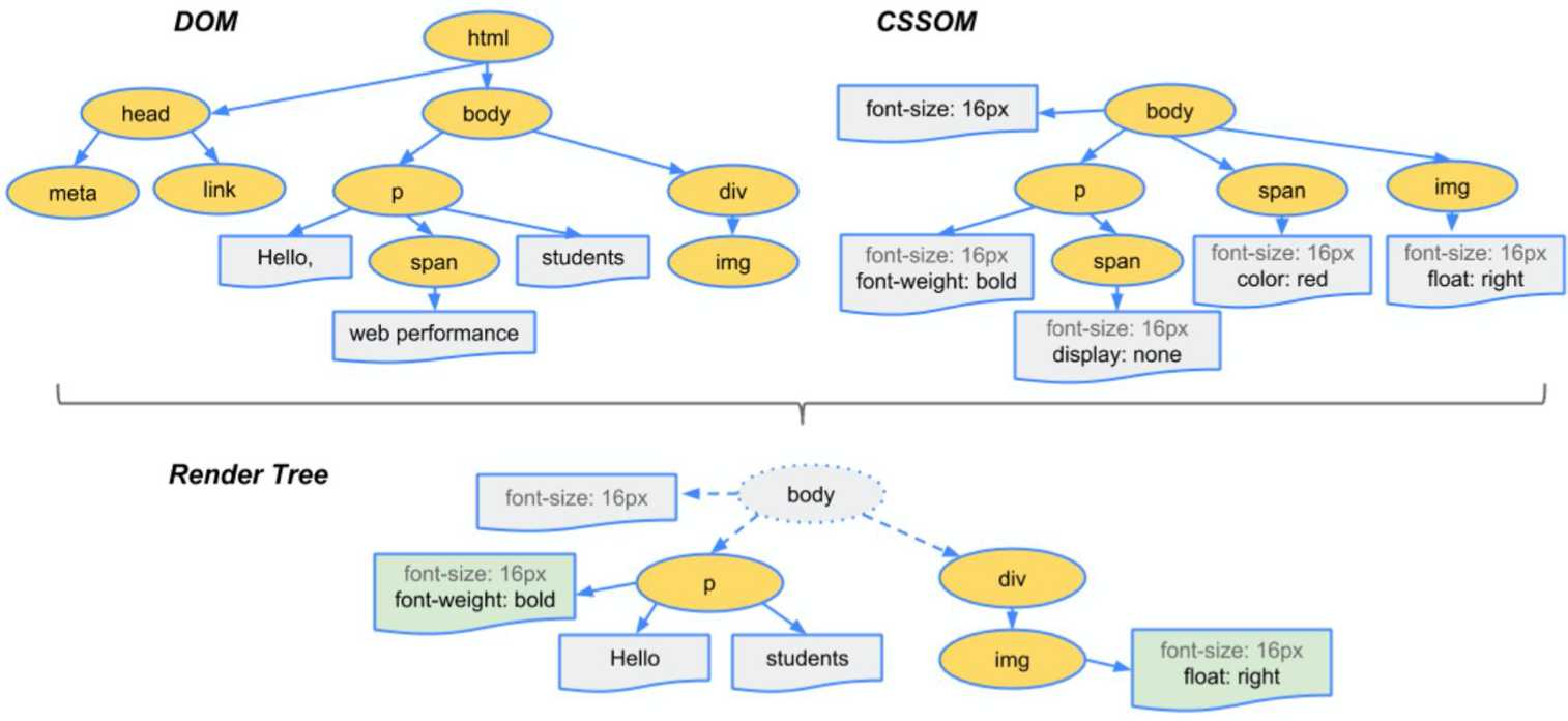
- 根据HTML构建HTML树(DOM)
- 根据CSS构建CSS树(CSSOM)
- 将两棵树合并成一颗渲染树(render tree)
- Layout布局(文档流、盒模型、计算大小和位置
- Paint绘制(把边框颜色、文字颜色、阴影等画出来)
- Composite合成(根据层叠关系展示画面)
如图:
如何更新样式
一般通过使用以下4种JS来更新样式:
div.style.background='red'
div.style.display='none'
div.classList.add('red')
div.remove()直接删掉节点
三种不同的渲染方式
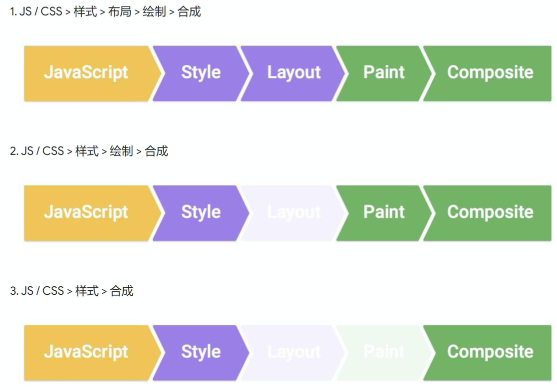
第一种:
div.remove()会触发当前消失,其他元素relayout
第二种:
改变背景颜色,直接repaint+composite
第三种:
改变transform,只需composite 需全屏查看效果,在iframe看有问题
CSS动画两种做法
transition(过渡)
过渡可以为一个元素在不同状态之间切换的时候定义不同的过渡效果。比如在不同的伪元素之间切换,像是 :hover,:active 或者通过 JavaScript 实现的状态变化。
作用
补充中间帧
标准语法
<single-transition>#
where
<single-transition> = [ none | <single-transition-property> ] || <time> || <timing-function> || <time>

where
<single-transition-property> = all | <custom-ident>
<timing-function> = linear | <cubic-bezier-timing-function> | <step-timing-function>

where
<cubic-bezier-timing-function> = ease | ease-in | ease-out | ease-in-out | cubic-bezier(<number>, <number>, <number>, <number>)
<step-timing-function> = step-start | step-end | steps(<integer>[, <step-position>]?)

where
<step-position> = jump-start | jump-end | jump-none | jump-both | start | end
注意
并不是所有属性都可以过渡:
display:none➡block无法使用
需要改成visibility:hidden➡visible
animation(动画)
animation 属性用来指定一组或多组动画,每组之间用逗号相隔。
作用
声明关键帧(添加动画)
标准语法
<single-animation>#
where
<single-animation> = <time> || <timing-function> || <time> || <single-animation-iteration-count> || <single-animation-direction> || <single-animation-fill-mode> || <single-animation-play-state> || [ none | <keyframes-name> ]

where
<timing-function> = linear | <cubic-bezier-timing-function> | <step-timing-function>
<single-animation-iteration-count> = infinite | <number>
<single-animation-direction> = normal | reverse | alternate | alternate-reverse
<single-animation-fill-mode> = none | forwards | backwards | both
<single-animation-play-state> = running | paused
<keyframes-name> = <custom-ident> | <string>

where
<cubic-bezier-timing-function> = ease | ease-in | ease-out | ease-in-out | cubic-bezier(<number>, <number>, <number>, <number>)
<step-timing-function> = step-start | step-end | steps(<integer>[, <step-position>]?)

where
<step-position> = jump-start | jump-end | jump-none | jump-both | start | end
其中,比较重要的值:
<single-animation-iteration-count>
动画播放的次数。
<single-animation-direction>
动画播放的方向。
<single-animation-fill-mode>
确定动画在执行之前和之后这两个阶段应用的样式。
<single-animation-play-state>
确定动画是否正在播放。
关于CSS的Tips
- CSS除了常用的东西不用特别记忆,用的时候去查MDN。
- CSS很多时候没有为什么(自己都不正交),跟着做就行。
- CSS达到效果就OK,都正确,不过要注意浏览器性能优化。
- CSS关乎想象力,有些东西需要自己一步一步去试。
部分内容来源:饥人谷&MDN。
