开发软件:visual studio code、node.js
开发框架:vue、vue-router、vuex
开发依赖:axios、qs
- 默认背景色:#fff —— wd_bg_def
- 系统背景底色:#fafafa —— wd_bg
- 菜单栏背景色:#f5f5f5 —— wd_bg_nav
- 表格标题背景色:#f7f7f7 —— wd_bg_table
- 强调背景色:#ff7477——wd_bg_error
- 埋字颜色:#ccc —— wd_color_tip
- 标题颜色:#333 —— wd_color_title
- 副标题颜色:#666 —— wd_color_title_low
- 已读消息颜色:#999 —— wd_color_read
- 文字警告颜色:#ff7477——wd_color_error
- 采用wd_flex来进行定义,如:默认不允许换行,竖排
- 采用wrap属性来定义允许换行,如
- 采用row属性来定义横向排版,如
- 布局呈现四种不同的组合,分别是:xs(超小屏幕,如手机)、sm(小屏幕,如平板)、md(桌面中等屏幕)、lg(桌面大型屏幕),以呈现更加动态灵活的布局。
| 超小屏幕 | 小屏幕 | 中等屏幕 | 大型屏幕 |
|---|
| 浏览器窗口大小 | 320px | 768px | 992px | 1200px |
| 标记 | xs | sm | md | lg |
| 响应行为 | 始终按设定的比例水平排列 | | |
| 类名 | 说明 |
|---|
| wd_show_* | 定义不同设备下的列显示情况,可选自有:xs、sm、md、lg |
| Wd_grow[1-9]_* | 定义不同设备下列宽,可选自同上 |
为适应低版本中Flex布局的兼容性,特做了flex布局的列元素(wd-col)
Prop
| 属性名 | 描述 | 类型 | 是否必须 |
|---|
| col | 当前列占用几列的大小,默认值为1 | Number | 否 |
| block | 是否为block布局,默认为flex布局 | Bollean | 否 |
| row | 是否为横向展示,默认为竖向展示 | Number | 否 |
| offset | 当前列的偏移量,默认不偏移,当该值小于0,设置该列右边的填充距离 | Number | 否 |
通过“列间距”的预设类,来设定列之间的间距。且一行中最左的列不会出现左边距,最右的列不会出现右边距。列间距在保证排版美观的同时,还可以进一步保证分列的宽度精细程度。我们结合网页常用的边距,预设了3种不同尺寸的外边距以及1种内边距,分别是:
| 类名 | 说明 |
|---|
| wd_split5[_*] | 支撑列之间常用列间距,通过设置*号为以下值:l(left)、r(right)、b(bottom)、t(top)、lr(left and right)、bt(bottom and top)设置左右上下间距 |
| wd_split14[_*] | 同上 |
| wd_split36[_*] | 同上 |
| 类名 | 说明 |
|---|
| wd_pd20[_*] | 支撑列之间常用列间距,通过设置*号为以下值:l(left)、r(right)、b(bottom)、t(top)、lr(left and right)、bt(bottom and top)设置左右上下间距 |
| wd_shadow[_*] | 支撑列之间常用阴影效果,通过设置*为以下值:l(left)、r(right)、b(bottom)、t(top)、lr(left and right)、bt(bottom and top)设置左右上下阴影 |
|---|
| wd_border[_*] | 支撑列之间常用边框,通过设置*为以下值:l(left)、r(right)、b(bottom)、t(top)、lr(left and right)、bt(bottom and top)设置左右上下的边框 |
|---|
| wd_border_error | 设置边框颜色为警告色 |
Form表单常用组件的使用方法
通过鼠标或键盘输入字符
例子
<template>
<div class="wd_flex test">
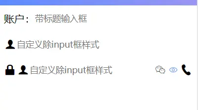
<wd-input v-model="value" label="账户:" placeholder="带标题输入框"/>
<wd-input v-model="value1" placeholder="自定义除input框样式">
<span class="wd_icon wd_user icon"></span>
</wd-input>
<wd-pwd v-model="val1" disabled placeholder="自定义除input框样式">
<span class="wd_icon wd_pwd icon"></span>
<span order='1' class="wd_icon wd_user icon"></span>
<span order='2' class="wd_icon wd_email icon"></span>
<span order='3' class="wd_icon wd_phone icon"></span>
</wd-pwd>
</div>
</template>
<script>
export default {
name: 'CInput',
data() {
return {
value: '',
value1: '',
val: '',
val1: ''
}
}
}
</script>
<style lang="scss" scope>
</style>
例子展示
prop
| 属性 | 描述 | 类型 | 是否必须 |
|---|
| value | 返回当前输入框的值。 | String | 是 |
| label | 定义文本框标题 | String | 否 |
| placeholder | 参考input->placeholder属性。 | String | 否 |
| disabled | 参考input->disabled属性。 | Boolean | 否 |
| isVerify | 唯一标识符,结合<wd-form></wd-form>使用,判断当前输入框在提交时是否需要验证,以及验证内容 | String | 否 |
| pwd | 默认是否禁止切换密码明文/密文模式,默认:false,仅用于wd-pwd | Boolean | 否 |
| required | 必填项样式设置 | Boolean | 否 |
slot
| name | 描述 |
|---|
| - | 设置input左右两侧的内容,右侧显示的内容加上right属性 |
Event
注意
- input、select中label默认字体大小为1.2em
- slot中自定义内容可通过设置属性order值更改所在位置,取值为-1~9
按钮
例子
<template>
<div class="wd_flex test">
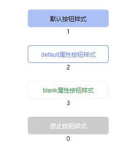
<wd-button @click="a=1">默认按钮样式</wd-button>
<span>{{a}}</span>
<wd-button default @click="b=2">default属性按钮样式</wd-button>
<span>{{b}}</span>
<wd-button blank @click="c=3">blank属性按钮样式</wd-button>
<span>{{c}}</span>
<wd-button disabled @click="d=4">禁止按钮样式</wd-button>
<span>{{d}}</span>
</div>
</template>
<script>
export default {
data() {
return {
a: 0,
b: 0,
c: 0,
d: 0
}
}
}
</script>
<style lang="scss" scoped>
.wd_button{
width: 50%;
height: 35px;
margin: 20px 0 0;
}
</style>
例子展示
Event
slot
| name | 描述 |
|---|
| - | 设置button显示内容,涉及html内容请使用v-html |
注意
除default和disabled 属性以外的button默认背景色透明
进程,进度条
例子
<template>
<div>
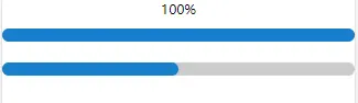
<wd-progress :value="val" :delay="1000"/>
<wd-progress :text="false" :value="val1" :delay="1000"/>
</div>
</template>
<script>
export default {
data() {
return {
val: 0,
val1: 0
}
},
mounted() {
this.val = 100
this.val1 = 50
}
}
</script>
例子展示
prop
| 名称 | 描述 | 参数 | 是否必须 |
|---|
| value | 当前进度数值 | Number | 是 |
| delay | 每次数据变化间隔时间 | Number | 否 |
开关,二选一
例子
<template>
  <div>
    <wd-switch v-model="val">记住密码</wd-switch>
  </div>
</template>
<script>
export default {
  name: 'CSwitch',
  data() {
    return {
      val: true
    }
  }
}
</script>
<style lang="scss" scoped>
  .wd_switch{
    font-size: 16px;
  }
</style>
例子展示

prop
| 名称 | 描述 | 参数 | 是否必须 |
|---|
| text | 显示文本 | String | 否 |
| value | 是否被选中true/false | Boolean | 是 |
slot
| name | 描述 |
|---|
| - | 设置switch显示内容,代替prop中的text功能 |
注意
switch组件的大小可通过设置switch字体大小控制


