

结构、样式、行为分离
尽量确保文档和模板只包含 HTML 结构。
样式都放到样式表里,自定义样式在入口文件中引入,第三方样式在link标签中引入。
行为都放到脚本里。
例外:当第三包是通过HTML中直接引入的,那么相关的脚本和样式建议放在同一个template中,以免在更改中遗漏。
<script src="https://frontend-alioss.learnta.com/lib/redactor/lib/eruda/1.9.0/eruda.min.js" defer></script>
<script>
  window.addEventListener('DOMContentLoaded', function(event) {
    var UA = navigator.userAgent;
    var isMobile = /(android|iphone|ipad|ipod)/i.test(UA);
    if (isMobile) {
      eruda.init();
    }
  });
</script>
缩进
统一四个空格缩进。
在.editorconfig中定义indent。
通过prettier自动格式化。
# EditorConfig is awesome: https://EditorConfig.org

# top-most EditorConfig file
root = true

[*]
charset = utf-8
end_of_line = lf
insert_final_newline = true
indent_style = space
indent_size = 4

[*.md]
trim_trailing_whitespace = false

[Makefile]
indent_style = tab
文件编码
使用utf-8。且指定字符编码的 meta 必须是 head 的第一个直接子元素;
<meta charset="utf-8"> ;
语言设置
lang属性的取值应该遵循 BCP 47 - Tags for Identifying Languages。
问题主要在于,zh 现在不是语言code了,而是macrolang,能作为语言code的是cmn(国语)、yue(粤语)、wuu(吴语)等。
<!--简体中文-->
<html lang="zh-cmn-Hans">
<!--繁体中文-->
<html lang="zh-cmn-Hant">
<!--英文-->
<html lang="en">
外链资源引用
资源类型
样式文件用link标签引入(需要制定rel="stylesheet"),脚本文件用script标签引入,均不需要加type属性
<link rel="stylesheet" src="index.css" />
<script src="index.js" />
资源协议
禁止引用http协议的静态资源,由于目前大多数都是基于https协议开发的网站,https协议的网站引用http协议的资源,会出现混合内容(mixed content)安全性问题:
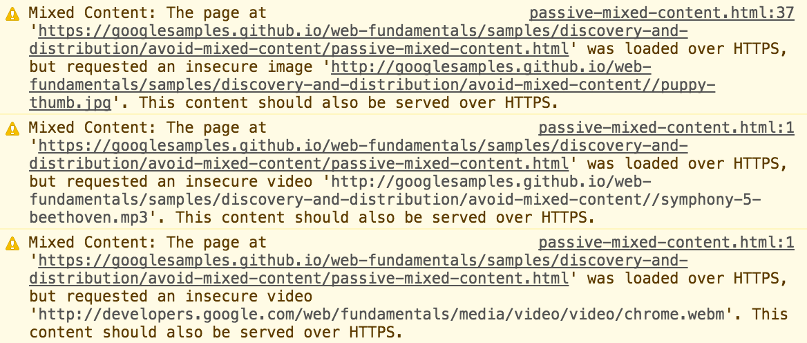
- 被动混合内容:不与页面其余部分进行交互的内容,从而使中间人攻击在拦截或更改该内容时能够执行的操作受限。被动混合内容包括图像、视频和音频内容,以及无法与页面其余部分进行交互的其他资源。在浏览器中会报warning,但不影响正常加载,表现如下图:
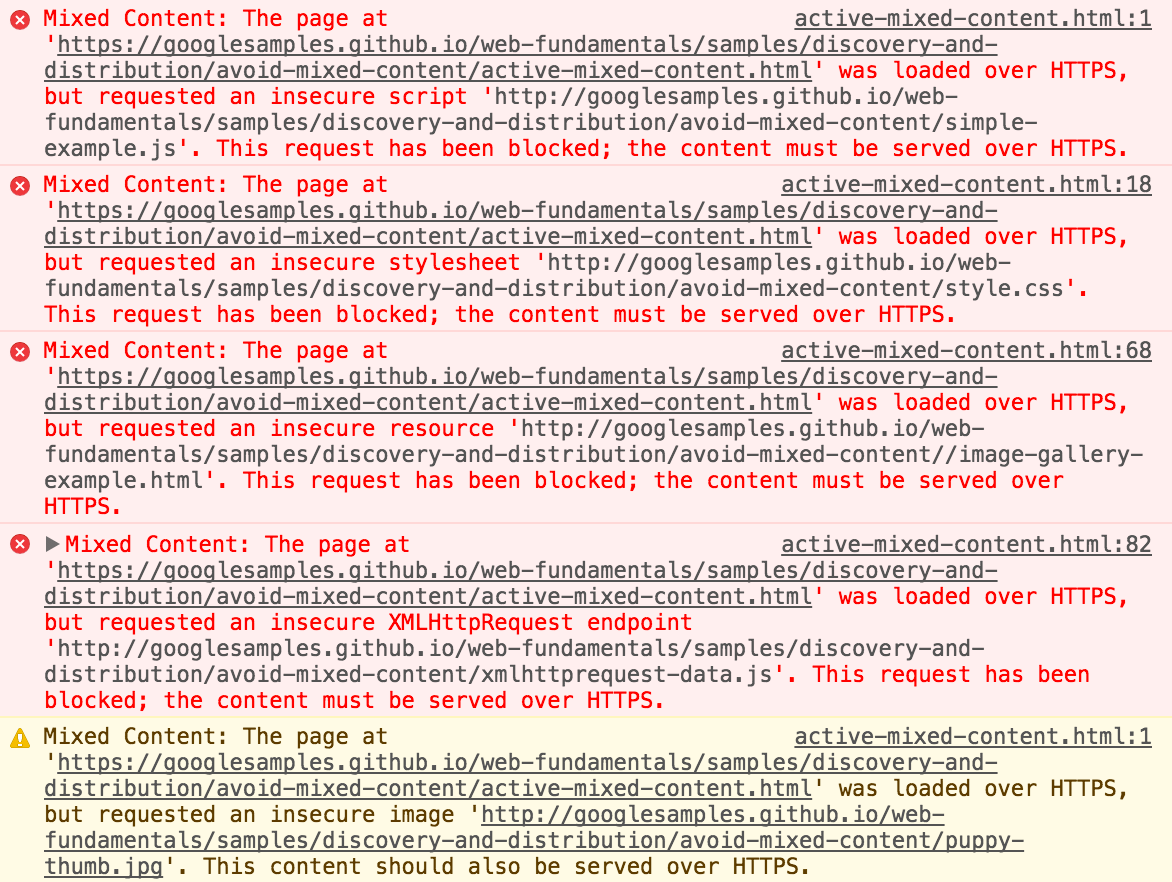
- 主动混合内容:作为整体与页面进行交互,并且几乎允许攻击者对页面进行任何操作。 主动混合内容包括浏览器可下载和执行的脚本、样式表、iframe、flash 资源及其他代码。在浏览器中会阻止此类型的内容以保护用户,表现如下图:
所以,我们引用的资源必须是https协议或者是用相对地址而不要直接引用http协议的资源。
<!-- recommended -->
<script src="//cdn.bootcss.com/jquery/3.4.1/core.js"></script>

<!-- not recommended -->
<script src="http://cdn.bootcss.com/jquery/3.4.1/core.js"></script>
统一注释
- 单行注释
<h1>html 注释标签的详细介绍</h1><!-- 文章标题-->
- 多行注释
<!--
<p>这是文章的一个段落</p>
<p>这是文章的一个段落</p>
-->
标签闭合
- 非闭合标签必须有开始和结束标签
<a href="demo.html">simple</a>
- 自闭合标签必须没有结束标签
<img src="demo.png" alt="demo"/>
标签嵌套
标签嵌套一般来说,只要你正确的闭合和匹配开始标签和结束标签,就不会有太大的问题(只是没有按照规范来,但并不会引起渲染错误),但是有些情况必须引起我们的重视。
- a元素里不可以嵌套交互式元素(a、button、select等)
<a>
  <a>aaa</a>
</a>
-
里面不可以嵌套div、h1~h6、p、ul、ol、li、dl、dt、dd、form等。
<p>
  <div>aaa</div>
</p>
meta设置
SEO优化
页面关键字
<meta name="keywords" content="your tags" />
页面描述
<meta name="description" content="150 words" />
搜索引擎索引方式
面向对外用户的采用all。面向内部用户的采用none。
<!--
    all:文件将被检索,且页面上的链接可以被查询;
    none:文件将不被检索,且页面上的链接不可以被查询;
    index:文件将被检索;
    follow:页面上的链接可以被查询;
    noindex:文件将不被检索;
    nofollow:页面上的链接不可以被查询。
 -->
<meta name="robots" content="all" />
IE兼容模式
<meta http-equiv="X-UA-Compatible" content="IE=edge,chrome=1" />
上面这行代码基本上在每个网站中都可以看到,但具体是什么意思呢?这里稍作解释,首先,这个标签只对IE浏览器管用。
- ie=edge,是指以此客户端支持的最新版本渲染,如ie9就以9方式渲染,即使用户在浏览器上设置了其他版本ie兼容模式也无效。
- chrome=1几乎无用,因为这个是基于使用IE的用户还下载了chrome frame这个插件,但是晓得去下载chrome frame 的用户根本不会去用IE,而且chrome frame在14年之后也不提供支持服务了。但最好还是加上。
浏览器内核
目前国内很多浏览器都采用双内核甚至多内核。那么这时候我们最好指定我们优先使用的内核。
<meta name="renderer" content="webkit">
屏蔽百度转码
在百度移动搜索引擎中,为了更好地满足用户需求,会同时为用户提供PC网页和mobile网页,但目前受交互、兼容和流量等因素影响,PC页在移动终端中的直接浏览体验较差。因此,百度移动搜索对缺乏可替代mobile资源的PC页进行格式转码,将其转换为适合手机浏览的mobile页,使其能够在移动终端浏览器有较好的浏览体验。为了最大程度改善PC页在手机上的浏览体验,转码时会去除PC页中不能在手机浏览器上浏览的内容,并改善不适用mobile的交互功能。
这是官方说明,但实际上百度很有可能在转码时把你的页面样式弄没了,或者说给你加一条广告之类。那么,如果不希望自己的站点被转码、依然希望手机端用户浏览PC页该如何操作呢?可以使用no-transform协议,no-transform协议为如下两种形式:
<!-- 旧版的语法 -->
<meta http-equiv="Cache-Control" content="no-transform"/>
<!-- 新版的语法,据说比较可靠,但其实即使都用了,也未必100%不转码 -->
<meta http-equiv="Cache-Control" content="no-siteapp">
<!-- 告诉百度你的页面时适配手机和pc的,不用他帮忙转 -->
<meta name="applicable-device" content="pc,mobile"/>
禁止自动翻译
禁止chrome自动翻译。
<meta name="google" value="notranslate">
移动端设置
viewport
<!--
width:宽度(数值 / device-width)(范围从200 到10,000,默认为980 像素)
height:高度(数值 / device-height)(范围从223 到10,000)
initial-scale:初始的缩放比例 (范围从>0 到10)
minimum-scale:允许用户缩放到的最小比例
maximum-scale:允许用户缩放到的最大比例
user-scalable:用户是否可以手动缩 (no,yes)
-->
<meta name="viewport" content="width=device-width, initial-scale=1.0,maximum-scale=1.0, user-scalable=no"/>
忽略数字自动识别为电话号码
<meta content="telephone=no" name="format-detection" />
忽略识别邮箱
<meta content="email=no" name="format-detection" />
其他
项目中由于种种原因并未使用,故放在”其他“一栏中,不代表不重要,而是根据项目需求而定。
- 强制竖屏(由于不是所有浏览器都支持的,所以不敢在项目中使用)
<!-- uc强制竖屏 -->
<meta name="screen-orientation" content="portrait">
<!-- QQ强制竖屏 -->
<meta name="x5-orientation" content="portrait">
<!-- UC强制全屏 -->
<meta name="full-screen" content="yes">
<!-- QQ强制全屏 -->
<meta name="x5-fullscreen" content="true">
- WebApp全屏模式(离线应用)
<!-- 启用 WebApp 全屏模式 -->
<meta name="apple-mobile-web-app-capable" content="yes" />
- 隐藏状态栏/设置状态栏颜色(只有在开启WebApp全屏模式时才生效)
<!-- content的值为default | black | black-translucent -->
<meta name="apple-mobile-web-app-status-bar-style" content="black-translucent" />
- 添加到主屏后的标题(只有在开启WebApp全屏模式时才生效)
<meta name="apple-mobile-web-app-title" content="标题">
- 禁止浏览器从本地计算机的缓存中访问页面内容(禁止在非联网的情况下访问本页内容)
<meta http-equiv="Pragma" content="no-cache">
总结
上述规范主要是根据项目使用场景制定,这里整理了一份通用模板,可供大多数项目使用。
<!DOCTYPE html>
<html lang="zh-cmn-Hans">
  <head>
    <!-- 编码格式 -->
    <meta charset="UTF-8" />
    <!-- seo 页面关键词 -->
    <meta name="keywords" content="your tags" />
    <!-- seo 页面描述 -->
    <meta name="description" content="150 words" />
    <!-- 移动端显示 -->
    <meta name="viewport" content="width=device-width, initial-scale=1.0,maximum-scale=1.0, user-scalable=no"/>    <meta http-equiv="X-UA-Compatible" content="ie=edge" />
    <!-- IE浏览器使用IE最新版本渲染,如果安装了插件则使用chrome渲染 -->
    <meta http-equiv="X-UA-Compatible" content="IE=edge,chrome=1" />
    <!-- 多核浏览器有限使用webkit内核渲染 -->
    <meta name="renderer" content="webkit" />
    <!-- 移动端禁止识别手机号 -->
    <meta content="telephone=no" name="format-detection" />
    <!-- 移动端禁止识别邮箱 -->
    <meta content="email=no" name="format-detection" />
    <!-- 禁止chrome自动翻译 -->
    <meta name="google" value="notranslate">
    <!-- 禁止百度转码 旧版的语法 -->
    <meta http-equiv="Cache-Control" content="no-transform"/>
    <!-- 禁止百度转码 新版的语法,据说比较可靠,但其实即使都用了,也未必100%不转码 -->
    <meta http-equiv="Cache-Control" content="no-siteapp">
    <!-- 告诉百度你的页面时适配手机和pc的,不用他帮忙转 -->
    <meta name="applicable-device" content="pc,mobile"/>
    <!-- 搜索引擎 文件将被检索,且页面上的链接可以被查询 -->
    <meta name="robots" content="all" />
    <title>Document</title>
    <link rel="stylesheet" src="//xxx.com/index.css" />
  </head>
  <body>
    <h1>hello world</h1>

    <script src="//xxx.com.index.js"></script>
  </body>
</html>
