

flutter中有很多box,下面我们一一介绍
- ConstraintedBox:用于对子组件添加额外的约束,构造方法为:ConstrainedBox({Key key, @required BoxConstraints constraints, Widget child })
- child:用于约束的子组件
- constraints:约束条件,他的构造函数为BoxConstraints({double minWidth: 0.0, double maxWidth: double.infinity, double minHeight: 0.0, double maxHeight: double.infinity })
如果constraintedBox中的child指定了大小,但是不满足ConstraintedBox设置的限制,那么会以constraintedBox中限制为准。如果出现ConstraintedBox嵌套的情况,最里层的widget的尺寸限制为(min:所有限制中的最大值,max:取所有限制中的最小值)
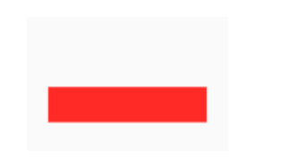
比如定义一个redBox
Widget redBox=DecoratedBox(
  decoration: BoxDecoration(color: Colors.red),
);
我们实现一个最小高度为50,宽度尽可能大的红色容器。
ConstrainedBox(
  constraints: BoxConstraints(
    minWidth: double.infinity, //宽度尽可能大
    minHeight: 50.0 //最小高度为50像素
  ),
  child: Container(
      height: 5.0,
      child: redBox
  ),
)
可以看到,我们虽然将Container的高度设置为5像素,但是最终却是50像素,这正是ConstrainedBox的最小高度限制生效了。如果将Container的高度设置为80像素,那么最终红色区域的高度也会是80像素,因为在此示例中,ConstrainedBox只限制了最小高度,并未限制最大高度
SizedBox:其实就是对ConstraintedBox的一个定制,将其中的最大最小宽度设置为同一个值,高度也是同样的道理 UnconstrainedBox:与ConstraintedBox正好相反,对于child不添加任何约束一般情况下,我们会很少直接使用此组件,但在"去除"多重限制的时候也许会有帮助
ConstrainedBox(
   	     constraints: BoxConstraints(minWidth: 60.0, minHeight: 100.0),  //父
    	     child: UnconstrainedBox( //“去除”父级限制
      	     child: ConstrainedBox(
            constraints: BoxConstraints(minWidth: 90.0, minHeight: 20.0),//子
            child: redBox,
          ),))
上面代码中,如果没有中间的UnconstrainedBox,那么根据上面所述的多重限制规则,那么最终将显示一个90×100的红色框。但是由于UnconstrainedBox “去除”了父ConstrainedBox的限制,则最终会按照子ConstrainedBox的限制来绘制redBox,即90×20:
UnconstrainedBox对父组件限制的“去除”并非是真正的去除:上面例子中虽然红色区域大小是90×20,但上方仍然有80的空白空间。也就是说父限制的minHeight(100.0)仍然是生效的,只不过它不影响最终子元素redBox的大小,但仍然还是占有相应的空间,可以认为此时的父ConstrainedBox是作用于子UnconstrainedBox上,而redBox只受子ConstrainedBox限制,这一点请读者务必注意。
- OverflowBox:一个小部件,对其子项施加的约束与其从其父项获得的约束不同,这可能会使子项溢出父项。具体的使用方法跟ConstraintedBox一样
- SizedOverflowBox:其实跟OverflowBox差不多,就是minWidh=maxWidth,minHeight=maxHeight
- DecoratedBox:在child绘制前或者绘制后,添加额外的限制条件到child的widget上。构造函数为DecoratedBox({Key key, @required Decoration decoration, DecorationPosition position: DecorationPosition.background, Widget child })
- decoration:通常使用BoxDecoration
BoxDecoration({Color color, DecorationImage image, BoxBorder border, BorderRadiusGeometry borderRadius, List boxShadow, Gradient gradient, BlendMode backgroundBlendMode, BoxShape shape: BoxShape.rectangle })
- image:An image to paint above the background color or gradient
- border:A border to draw above the background color, gradient, or image
- borderRadius:If non-null, the corners of this box are rounded by this BorderRadius
- boxShadow:A list of shadows cast by this box behind the box
- gradient:A gradient to use when filling the box
- shape:The shape to fill the background color, gradient, and image into and to cast as the boxShadow
- position:修饰的是这个装饰应用于背景还是前景
- child:被修饰的widget
- decoration:通常使用BoxDecoration
BoxDecoration({Color color, DecorationImage image, BoxBorder border, BorderRadiusGeometry borderRadius, List boxShadow, Gradient gradient, BlendMode backgroundBlendMode, BoxShape shape: BoxShape.rectangle })
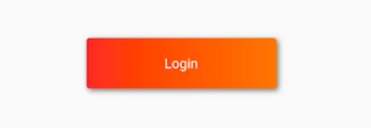
我们实现一个带阴影的背景色渐变的按钮:
 DecoratedBox(
       decoration: BoxDecoration(
       gradient: LinearGradient(colors:[Colors.red,Colors.orange[700]]), //背景渐变
       borderRadius: BorderRadius.circular(3.0), //3像素圆角
       boxShadow: [ //阴影
         BoxShadow(
             color:Colors.black54,
             offset: Offset(2.0,2.0),
             blurRadius: 4.0
        )
      ]
    ),
   child: Padding(padding: EdgeInsets.symmetric(horizontal: 80.0, vertical: 18.0),
     child: Text("Login", style: TextStyle(color: Colors.white),),
   )
 )
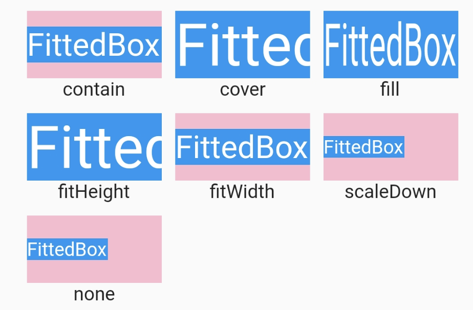
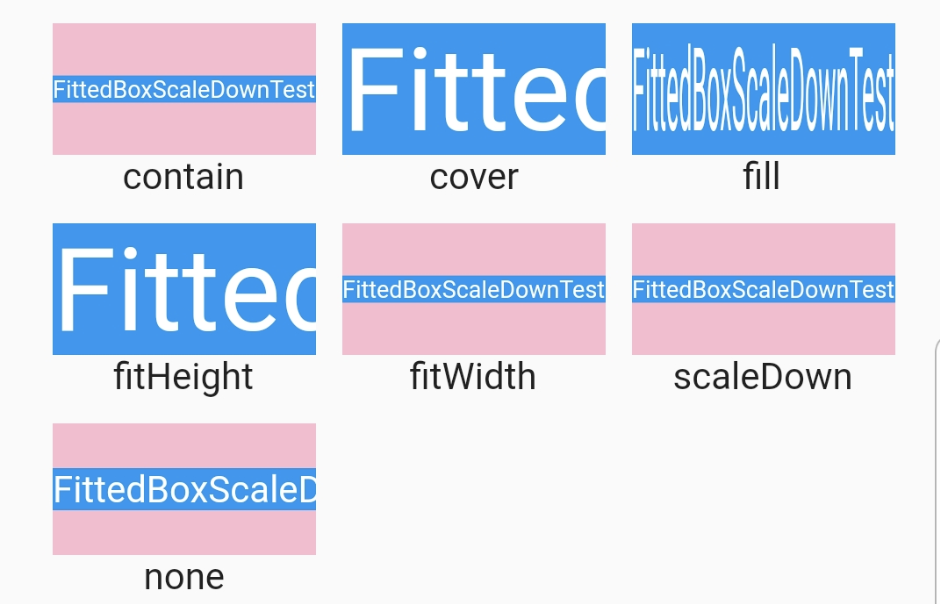
FittedBox:根据自身的需要对child进行缩放和定位,它是根据外部约束(BoxFit)来调整child大小
const FittedBox({
  Key key,
  this.fit = BoxFit.contain,
  this.alignment = Alignment.center,
  Widget child,
})
其中的fit用来调整BoxFit中的child写入时分配的空间(指的是父widget的空间),alignment也是相对于父空间。 fit有7种值:
- contain:将child尽可能的放大或缩小,但是保证child所有都能显示
- fill:不保证child的原比例,充满整个父空间
- cover:等比放缩,填满整个父空间
- fitHeight:等比例放缩,直到childHeight=parentHeight为止
- fitWidth:等比例放缩,直到childWidth=parentWidth为止
- none:不进行任何缩放
- scaleDown:当child大于parent时,会用到,等比例缩小,使其全部展示在父空间中
